
Litepie Datepicker is a date range picker component for Vue.js and Tailwind CSS, dependent to day.js.
---
## Documentation
For full documentation, visit [litepie.com](https://litepie.com).
## Simple Usage
How it works,
```vue
```
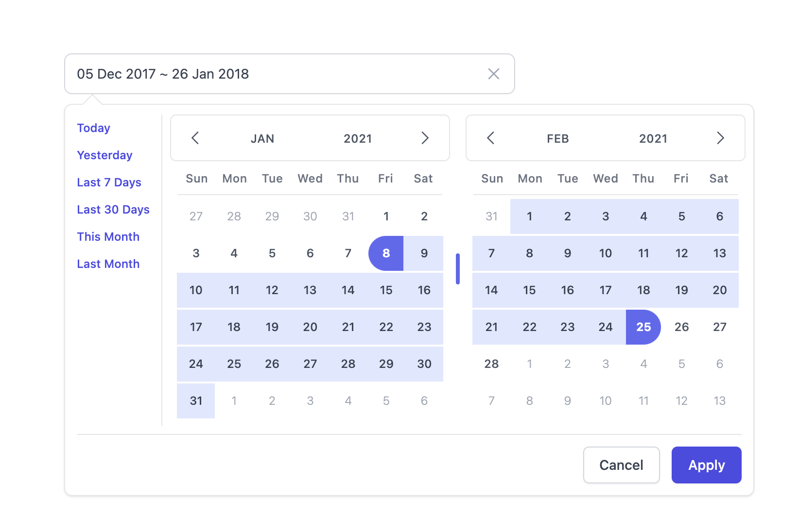
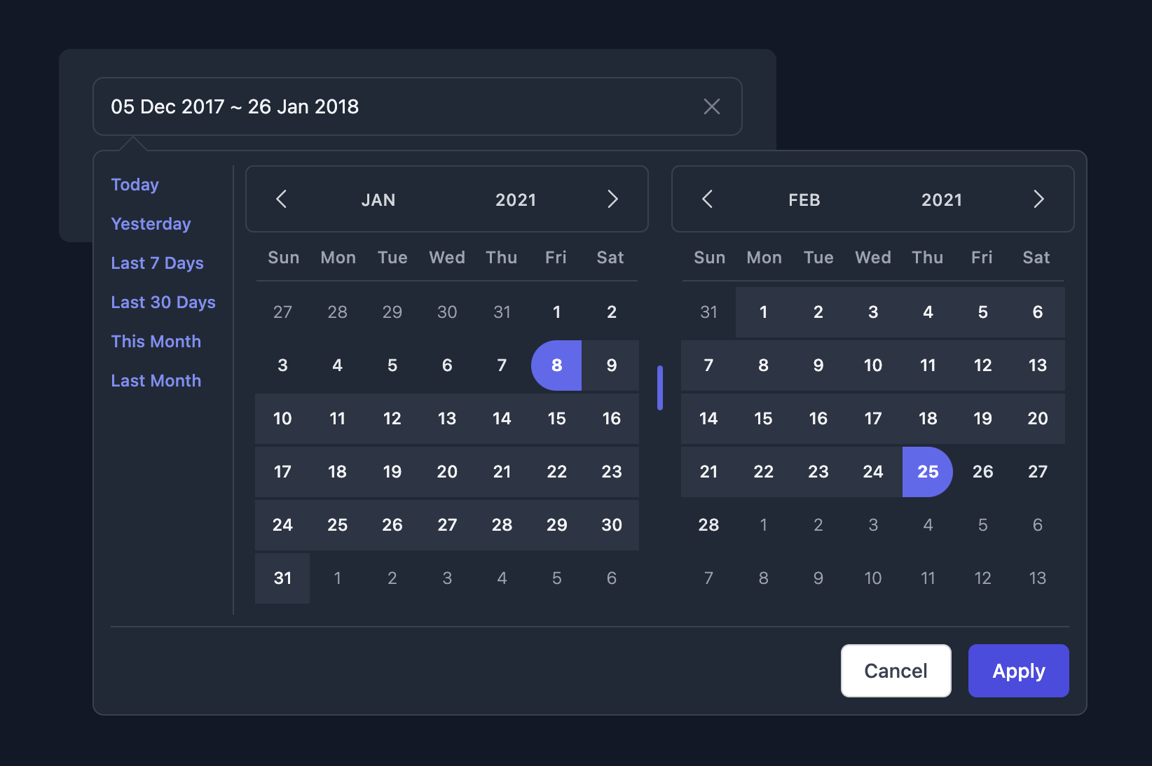
## Theming options
- Light mode
- Dark mode
## Changelog
All notable changes to this project will be documented in this file, [Read](CHANGELOG.md).
## License
The [MIT](LICENSE) License. Please [see](http://opensource.org/licenses/MIT) for more information.
## Thanks to
- [Vue](https://v3.vuejs.org/)
- [Tailwind CSS](https://tailwindcss.com/)
- [day.js](https://day.js.org/)
- and other support...