# MatDaterangepicker
This is an extension library for the native [Angular Material Datepicker](https://material.angular.io/components/datepicker/overview). Then you can use all the options provided by the ```Matdatepicker``` material component.
[Demo](https://brauliodavid.github.io/mat-daterangepicker)
## Requirements
| Angular | Version |
|-------------------|----------|
| angular | >= 9.0.0 |
| @angular/material | >= 9.0.0 |
## Installation
`npm i mat-daterangepicker`
import `MatDaterangepickerModule` in your module
```typescript
import { MatDaterangepickerModule } from 'mat-daterangepicker';
@NgModule({
imports: [
MatDaterangepickerModule
],
declarations: [AppComponent],
bootstrap: [AppComponent]
})
export class AppModule {}
```
### Angular Material Theme
import code bellow in your material style theme to have compatibility with your current material theme.
```scss
@import 'mat-daterangepicker/mat-daterangepicker.theme.scss';
@include mat-daterangepicker-theme($theme);
```
## Usage
```typescript
// in your component
export class DaterangepickerExampleComponent {
startDate = new Date()
endDate = new Date()
}
```
```html
```
## Options
| Option | Description |
| ----------------------------------- | ------------------------------------------------------------------------- |
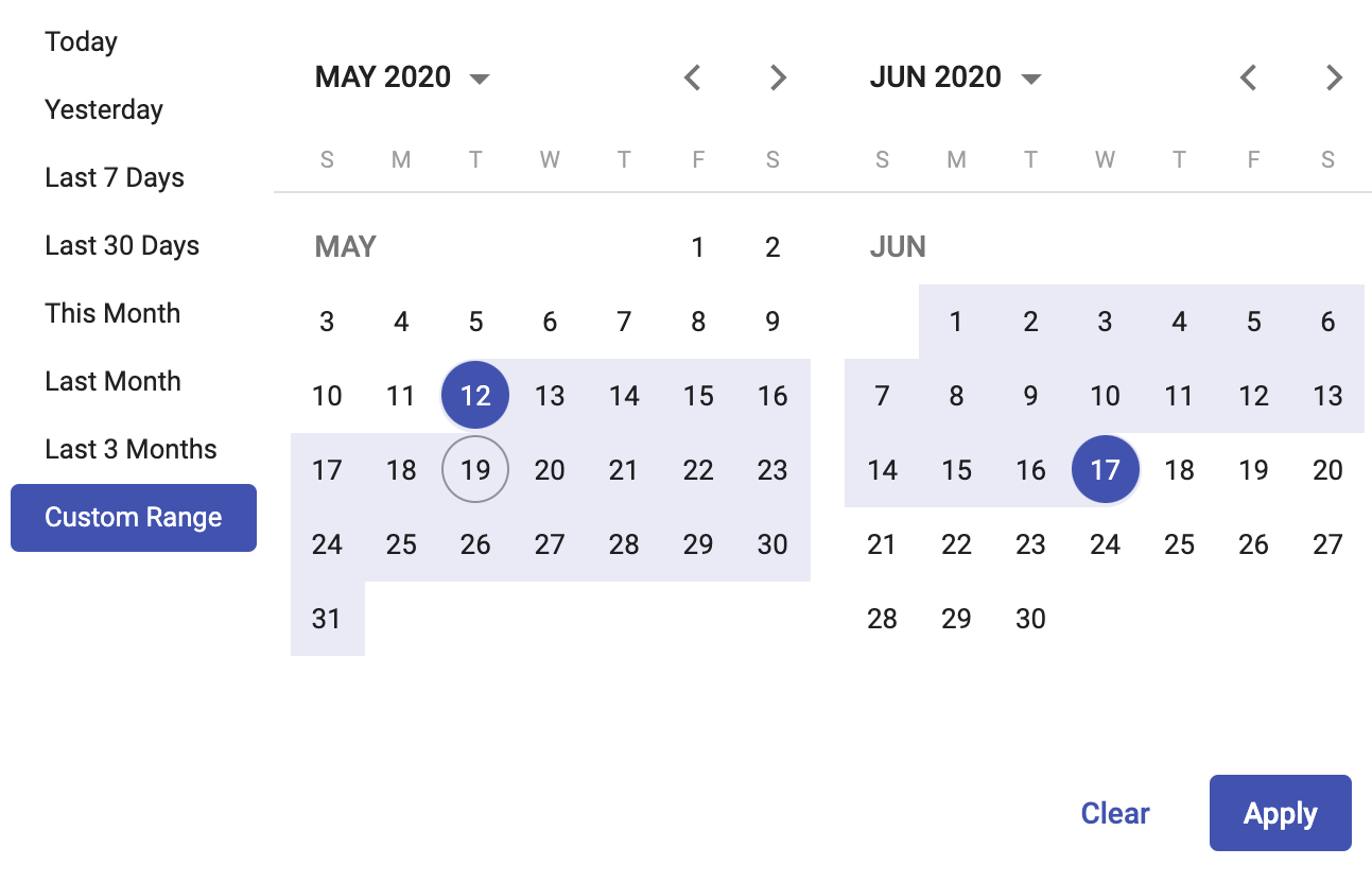
| @Input() dualView: boolean | An input to display two calendars when selecting dates |
| @Input() applyButton: boolean | An input to display an apply button to close the calendar picker |
| @Input() showCustomRanges: boolean | An input to display default custom ranges options in the calendar picker |
| @Ouput() apply: EventEmitter | Fired when apply button is clicked |
### Mehods
| Method | Description |
| ------------- | ---------------------------------------------- |
| applyRange | Apply the range and close the calendar picker |
| clearRange | Clear the selected dates |
 [Demo](https://brauliodavid.github.io/mat-daterangepicker)
## Requirements
| Angular | Version |
|-------------------|----------|
| angular | >= 9.0.0 |
| @angular/material | >= 9.0.0 |
## Installation
`npm i mat-daterangepicker`
import `MatDaterangepickerModule` in your module
```typescript
import { MatDaterangepickerModule } from 'mat-daterangepicker';
@NgModule({
imports: [
MatDaterangepickerModule
],
declarations: [AppComponent],
bootstrap: [AppComponent]
})
export class AppModule {}
```
### Angular Material Theme
import code bellow in your material style theme to have compatibility with your current material theme.
```scss
@import 'mat-daterangepicker/mat-daterangepicker.theme.scss';
@include mat-daterangepicker-theme($theme);
```
## Usage
```typescript
// in your component
export class DaterangepickerExampleComponent {
startDate = new Date()
endDate = new Date()
}
```
```html
[Demo](https://brauliodavid.github.io/mat-daterangepicker)
## Requirements
| Angular | Version |
|-------------------|----------|
| angular | >= 9.0.0 |
| @angular/material | >= 9.0.0 |
## Installation
`npm i mat-daterangepicker`
import `MatDaterangepickerModule` in your module
```typescript
import { MatDaterangepickerModule } from 'mat-daterangepicker';
@NgModule({
imports: [
MatDaterangepickerModule
],
declarations: [AppComponent],
bootstrap: [AppComponent]
})
export class AppModule {}
```
### Angular Material Theme
import code bellow in your material style theme to have compatibility with your current material theme.
```scss
@import 'mat-daterangepicker/mat-daterangepicker.theme.scss';
@include mat-daterangepicker-theme($theme);
```
## Usage
```typescript
// in your component
export class DaterangepickerExampleComponent {
startDate = new Date()
endDate = new Date()
}
```
```html