Carousel
Need to show slides? There's nothing easier, use the carousel component.
About
In Metro 4 the process of the creating carousel it very easy. To create carousel you mus add attribute data-role="carousel" to element and define slides.
Also you can set any options with additional attributes.

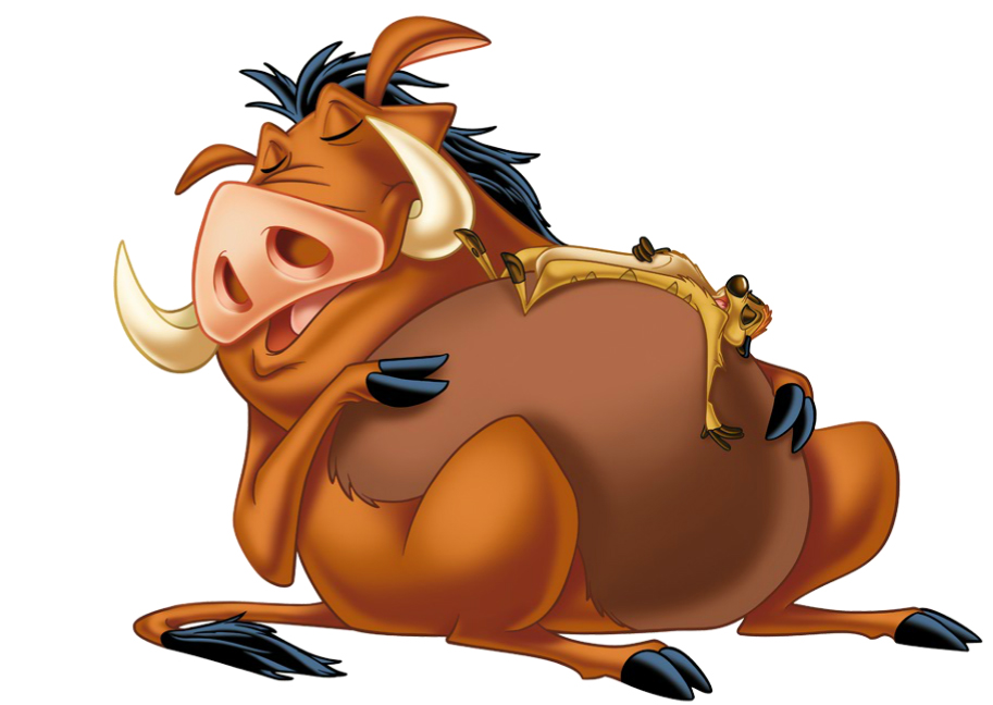
Pumba
Lorem Ipsum is simply dummy text of the printing and typesetting industry. Lorem Ipsum has been the industry's standard dummy text ever since the 1500s, when an unknown printer took a galley of type and scrambled it to make.
Lorem Ipsum is simply dummy text of the printing and typesetting industry. Lorem Ipsum has been the industry's standard dummy text ever since the 1500s, when an unknown printer took a galley of type and scrambled it to make.
                    <div data-role="carousel"
                         data-cls-bullet="bullet-big"
                         data-auto-start="true"
                         data-cls-controls="fg-white"
                         data-bullets-position="right"
                         data-control-next="<span class='mif-chevron-right fg-cyan'></span>"
                         data-control-prev="<span class='mif-chevron-left fg-cyan'></span>"
                    >
                        <div class="slide p-2 pl-10 pr-10">
                            <div class="row flex-align-center h-100">
                                <div class="cell-md-4 text-center">
                                    <img src="images/pumba.png" class="img-fluid">
                                </div>
                                <div class="cell-md-8">
                                    <h1 class="text-light">Pumba</h1>
                                    <p class="mt-4 mb-4">Lorem Ipsum is simply dummy text of the printing and typesetting...</p>
                                    <button class="button alert">Show more...</button>
                                </div>
                            </div>
                        </div>

                        <div class="slide" data-cover="images/pumba-bg.jpg"></div>

                        <div class="slide p-2 pl-10 pr-10" data-cover="images/bg-4.jpg">
                            <div class="row flex-align-center h-100">
                                <div class="cell-md-8">
                                    <p class="indent-letter">Lorem Ipsum is simply dummy text of the printing and typesetting...</p>
                                </div>
                                <div class="cell-md-4 text-center">
                                    <div class="img-container drop-shadow">
                                        <img src="images/timon_pumba.jpg">
                                    </div>
                                </div>
                            </div>
                        </div>
                    </div>
Carousel size
You can set carousel size with attributes data-width (default: 100%) and data-height (default: 16/9).
For data-width you can set % value or px value.
For height you can set: 16/9 (default), 21/9, 4/3 or px value.
Also you can set media values for carousel height. Value can be in format:
@ (media_query), value | (media_query), value | ....
                    <div data-role="carousel"
                         data-height="@ (max-width: 992px),500 | (max-width: 768px),350 | (max-width: 576px),100">
                        <div class="slide d-flex flex-justify-center flex-align-center">
                            <span class="h3">Slide</span>
                        </div>
                    </div>

                    <div data-role="carousel"
                         data-height="@ (max-width: 992px),21/9 | (max-width: 768px),16/9 | (max-width: 576px),4/3">
                        <div class="slide d-flex flex-justify-center flex-align-center">
                            <span class="h3">Slide</span>
                        </div>
                    </div>
Controls
For sliding the slides user can use carousel controls, such as left, right and bullets.
By default controls placed are inside the carousel slides area. To put controls outside the carousel set attribute data-controls-outside="true".
Inside
Outside
                    <div data-role="carousel">
                        <div class="slide" data-cover="images/1.jpg"></div>
                        <div class="slide" data-cover="images/2.jpg"></div>
                        <div class="slide" data-cover="images/3.jpg"></div>
                    </div>

                    <div data-role="carousel" data-controls-outside="true">
                        <div class="slide" data-cover="images/1.jpg"></div>
                        <div class="slide" data-cover="images/2.jpg"></div>
                        <div class="slide" data-cover="images/3.jpg"></div>
                    </div>
Show controls when mouse enter
With attribute data-controls-on-mouse="true" you can set visible controls only if mouse enter to carousel.
                    <div data-role="carousel"
                         data-controls-on-mouse="true" data-cls-controls="fg-white">
                        <div class="slide" data-cover="images/1.jpg"></div>
                        <div class="slide" data-cover="images/2.jpg"></div>
                        <div class="slide" data-cover="images/3.jpg"></div>
                    </div>
Hide controls
You can hide controls with attributes data-controls="false" and data-bullets="false".
No left, right
No bullets
                    <div data-role="carousel"
                         data-controls="false">
                        <div class="slide" data-cover="images/1.jpg"></div>
                        <div class="slide" data-cover="images/2.jpg"></div>
                        <div class="slide" data-cover="images/3.jpg"></div>
                    </div>

                    <div data-role="carousel"
                         data-bullets="false">
                        <div class="slide" data-cover="images/1.jpg"></div>
                        <div class="slide" data-cover="images/2.jpg"></div>
                        <div class="slide" data-cover="images/3.jpg"></div>
                    </div>
Left and right symbols
You can change left and right slides switchers symbols with attributes data-control-next and data-control-prev.
                    <div data-role="carousel"
                         data-cls-controls="fg-white"
                         data-control-next="<span class='mif-chevron-right'></span>"
                         data-control-prev="<span class='mif-chevron-left'></span>">
                        <div class="slide" data-cover="images/1.jpg"></div>
                        <div class="slide" data-cover="images/2.jpg"></div>
                        <div class="slide" data-cover="images/3.jpg"></div>
                    </div>
Bullets
You can use one of three predefined variants of bullets.
To set bullet type use attribute data-bullets-style with values: circle, square (default), rect or diamond.
To set bullet size use attribute data-bullets-size with values: mini, small, default or large.
Also you can set bullets position via attribute data-bullets-position. You can set bullet on the left, right or center.
The default value for data-bullets-position is a center.
                    <div data-role="carousel" data-bullet-style="circle">
                        <div class="slide" data-cover="images/1.jpg"></div>
                        <div class="slide" data-cover="images/2.jpg"></div>
                        <div class="slide" data-cover="images/3.jpg"></div>
                    </div>
                    <div data-role="carousel" data-bullet-style="square">
                        <div class="slide" data-cover="images/1.jpg"></div>
                        <div class="slide" data-cover="images/2.jpg"></div>
                        <div class="slide" data-cover="images/3.jpg"></div>
                    </div>
                    <div data-role="carousel"
                        data-bullet-style="rect" data-bullets-position="left">
                        <div class="slide" data-cover="images/1.jpg"></div>
                        <div class="slide" data-cover="images/2.jpg"></div>
                        <div class="slide" data-cover="images/3.jpg"></div>
                    </div>
                    <div data-role="carousel"
                        data-bullet-style="diamond" data-bullets-position="right">
                        <div class="slide" data-cover="images/1.jpg"></div>
                        <div class="slide" data-cover="images/2.jpg"></div>
                        <div class="slide" data-cover="images/3.jpg"></div>
                    </div>
Slides
The slide is a block element with class .slide.
For each slide you can set background image.
To set background image for slide, add attribute data-cover="..." to slide.
By default, slide not have margin or padding. You must set it manually if need.
                    <div data-role="carousel" data-cls-controls="fg-cyan">
                        <div class="slide" data-cover="images/bg-1.jpg"></div>
                        <div class="slide" data-cover="images/bg-2.jpg"></div>
                        <div class="slide" data-cover="images/bg-3.jpg"></div>
                        <div class="slide" data-cover="images/bg-4.jpg"></div>
                    </div>
Effects
Slide change is accompanied by various effects. Currently supports four effects:
slide,
slide-v,
switch and
fade.
switch
fade
slide
slide-v
                    <div data-role="carousel" data-effect="slide">
                    ...
                    </div>

                    <div data-role="carousel" data-effect="switch">
                    ...
                    </div>

                    <div data-role="carousel" data-effect="fade">
                    ...
                    </div>
Duration and period
The speed of applying the effect is determined by the duration parameter, which can be set via the attribute data-duration. The default value for duration is 1s.
The interval between slides is determined by the period parameter and can be specified via the attribute data-period. The default value for data-period is 5s.
                    <div data-role="carousel"
                         data-period="3000"
                         data-duration="500">
                    ...
                    </div>
Slide timings
Also, you can set duration and period option individual for each slide in carousel.
                    <div data-role="carousel"
                         data-cls-controls="fg-cyan"
                         data-effect="slide"
                         data-controls="false"
                         data-bullets="false"
                         data-auto-start="true">
                        <div class="slide" data-cover="images/bg-1.jpg"
                             data-period="3000">This slide showing 3sec</div>
                        <div class="slide" data-cover="images/bg-2.jpg"
                             data-period="5000">This slide showing 5sec</div>
                        <div class="slide" data-cover="images/bg-3.jpg"
                             data-period="1000">This slide showing 1sec</div>
                        <div class="slide" data-cover="images/bg-4.jpg"
                             data-period="10000">This slide showing 10sec</div>
                    </div>
Easing function
For effect slide you can use additional parameter: effectFunc, which can be set via the data-effect-func="..." attribute.
Value for this parameter you can found on this page
                    <div data-role="carousel"
                        data-effect="slide"
                        data-effect-func="easeOutBounce">
                    ...
                    </div>

                    <div data-role="carousel"
                        data-effect="slide"
                        data-effect-func="easeInQuart">
                    ...
                    </div>
Options
The carousel component has a number of options. You can use that options to set style and behavior of component.
| Option | Data-* | Default | Desc |
|---|---|---|---|
| autoStart | data-auto-start |
false | If true, carousel started automatically |
| width | data-width |
100% | The width of carousel, can be percent or int value |
| height | data-height |
16/9 | The height of carousel, can be: 16/9, 21/9, 4/3 or pixel value |
| effect | data-effect |
slide | The effect for carousel, can be slide, slide-v, switch or fade |
| effectFunc | data-effect-func |
linear | The easing function for effect for carousel |
| direction | data-direction |
left | The direction for sliding for carousel. Can be left or right |
| duration | data-duration |
1000 | The duration sliding own slide. Value in milliseconds |
| period | data-period |
5000 | The period sliding own slide. Value in milliseconds |
| stopOnMouse | data-stop-on-mouse |
true | If true and autoStart is true carousel stopped when mouse is entered |
| controls | data-controls |
true | Show or hide left, right controls |
| bullets | data-bullets |
true | Show or hide bullets |
| bulletsStyle | data-bullets-style |
square | Set bullets style. Can be square, circle, rect or diamond |
| bulletsSize | data-bullets-size |
default | Set bullets size. Can be default, mini, small, large |
| controlsOnMouse | data-controls-on-mouse |
false | if true controls and bullets can visible on mouse over |
| controlsOutside | data-controls-outside |
false | Put controls and bullets to outside the slides area |
| bulletsPosition | data-bullets-position |
center | Bullets position. Can be center, left or right |
You can set a number of option for each slide:
period,
duration,
cover.
Events
When carousel works, it generated the numbers of events. You can use callback for this events to behavior with component.
| Event | Data-* | Desc |
|---|---|---|
| onStop(el) | data-on-stop |
Fired when carousel stopped |
| onStart(el) | data-on-start |
Fired when carousel started |
| onPlay(el) | data-on-play |
Fired when carousel started when play method |
| onSlideClick(slide, el, event) | data-on-slide-click |
Fired when user click on slide |
| onBulletClick(bullet, el, event) | data-on-bullet-click |
Fired when user click on bullet |
| onMouseEnter(element, event) | data-on-mouse-enter |
Fired when mouse entered on component |
| onMouseLeave(element, event) | data-on-mouse-leave |
Fired when mouse leave the component |
| onNextClick(el, event) | data-on-next-click |
Fired click next (to right) switch |
| onPrevClick(el, event) | data-on-next-click |
Fired click prev (to left) switch |
| onSlideShow(slide) | data-on-slide-show |
Fired when slide show |
| onSlideHide(slide) | data-on-slide-hide |
Fired when slide hide |
| onCarouselCreate(el) | data-on-carousel-create |
Fired when carousel is created |
Methods
Component carousel has a number of methods to manipulate component.
| Method | Desc |
|---|---|
toSlide(index) |
Go to specific slide |
next() |
Go to next slide |
prev() |
Go to prev slide |
stop() |
Stop the carousel |
play() |
Play the carousel |
                    var car = $(element).data('carousel');
                    car.stop();
                    car.play();
                    car.next();
                    car.prev();
Customize
You can customise carousel with special parameters. You can set customisation parameters with a specific attributes.
| Option | Data-* | Desc |
|---|---|---|
| controlPrev | data-control-prev |
Icon for prev control |
| controlNext | data-control-next |
Icon for next control |
| clsCarousel | data-cls-carousel |
Additional class for carousel |
| clsSlides | data-cls-slides |
Additional class for slides container |
| clsSlide | data-cls-slide |
Additional class for slides |
| clsControls | data-cls-controls |
Additional class for left, right controls |
| clsControlNext | data-cls-control-next |
Additional class for next control |
| clsControlPrev | data-cls-control-prev |
Additional class for prev control |
| clsBullets | data-cls-bullets |
Additional class bullets |
| clsBullet | data-cls-bullet |
Additional class bullet |
| clsBulletOn | data-cls-bullet-on |
Additional class active bullet |
                    <div data-role="carousel"
                         data-height="21/9"
                         data-cls-controls="fg-red"
                         data-cls-bullet="bullet-big"
                         data-cls-bullet-on="bg-red drop-shadow"
                         data-cls-slides="rounded"
                         data-control-next="<span class='mif-arrow-right'></span>"
                         data-control-prev="<span class='mif-arrow-left'></span>"
                         data-auto-start="true"
                         data-period="3000"
                         data-duration="1000">
                        <div class="slide" data-cover="images/bg-1.jpg"></div>
                        <div class="slide" data-cover="images/bg-2.jpg"></div>
                        <div class="slide" data-cover="images/bg-3.jpg"></div>
                        <div class="slide" data-cover="images/bg-4.jpg"></div>
                    </div>