Streamer
Create an event program with the streamer component. Metro 4 contains css classes and plugin to create streamer component.
About
Streamer is a complex element for creating an event program. The component includes a special HTML structure, styles, and a javascript code to interact with this structure.
Create streamer
To create streamer you must execute three steps: add container with data-role="streamer" attribute, then define other options over data-* attributes and
define streamer data with data-source or data-data attributes. Also you must define id attribute for your streamer.
                    <div id="streamer"
                         data-role="streamer"
                         data-source="data/streamer_data.json"
                         data-start-from="09:00"
                         data-slide-to-start="false">
                    </div>
Options
The streamer contains a number of options for defining behavior:
| Option | Data-* | Default | Desc |
| defaultClosedIcon | data-default-closed-icon | Default icon for closed event | |
| defaultOpenIcon | data-default-open-icon | Default icon for open event | |
| changeUri | data-change-uri | true | If true, browser url will be changed when event selected |
| encodeLink | data-encode-link | true | If true, streamer link will be encoded with Base64 |
| closed | data-closed | false | Streamer is closed. Event are not can be selected |
| startFrom | data-start-from | null | Streamer can be slided to this time pint after create |
| slideToStart | data-slide-to-start | false | If true, Streamer will be slided to time pint defined in startFrom options after create |
| startSlideSleep | data-start-slide-sleep | 1000 | Timeout before sliding to start time point |
| source | data-source | Link to stream data | |
| data | data-data | Object with stream data | |
| eventClick | data-event-click | select | Behavior when clicking on a event. This value can be select or click |
| streamSelect | data-stream-select | false | If true, user can be select one stream on click them and disable others. |
| onStreamerCreate | data-on-streamer-create | Metro.noop | Callback |
| onStreamClick | data-on-stream-click | Metro.noop | Callback |
| onStreamSelect | data-on-stream-select | Metro.noop | Callback |
| onEventClick | data-on-event-click | Metro.noop | Callback |
| onEventSelect | data-on-event-select | Metro.noop | Callback |
Streamer data
An important parameter of the streamer is the parameter that determines the data for the streamer. Data for the streamer can be determined in two ways:
data-source=* attribute,
data-data=* attribute.
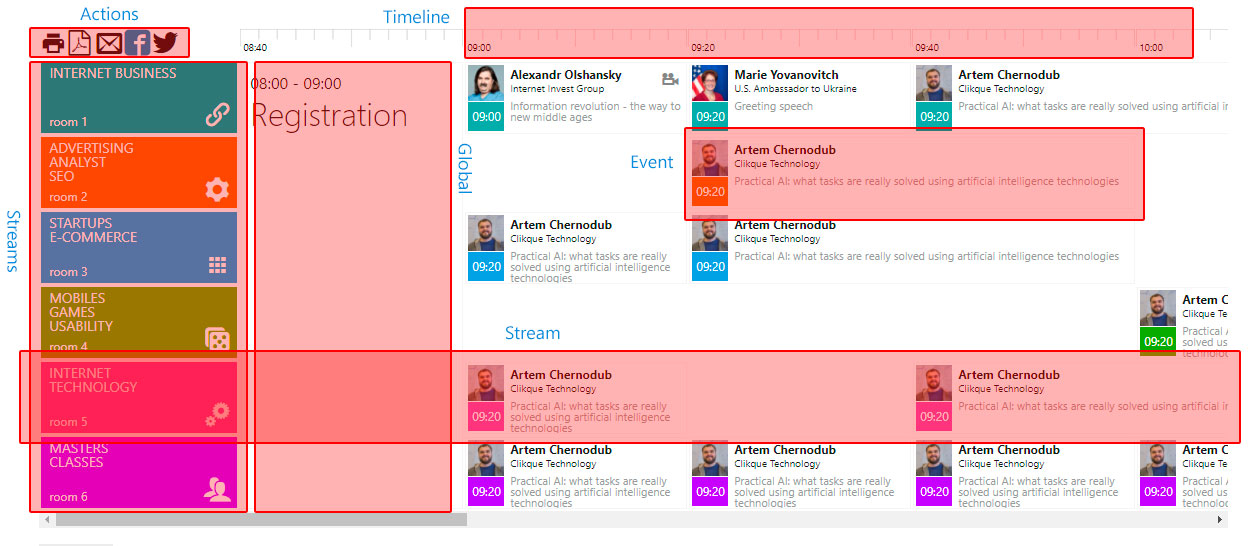
Data for a streamer is an object of a certain format. This is a link to demo data. This object contains four main section:
- actions - user defined actions
- timeline - timeline definition
- streams - streams definition
- global - additions events
                    {
                        actions: {...}
                        timeline: {...}
                        streams: {...}
                        global: {...}
                    }
Actions
User define action showing in top left corner of streamer and hide when streamer collapsed (default). For details see streamer responsive feature.
Each action is described by three parameters:
html - html value for action,
cls - additional classes for action,
onclick - click event for action (rules for defining events in Metro 4).
                    {
                        actions: [
                            {
                                html: "<span class='mif-print'></span>",
                                cls: "fg-red",
                                onclick: "alert('Printed!!!')"
                            }
                        ]
                    }
Timeline
To define timeline you can use same name section. This section contains three parameters:
start - begin time,
stop - end time,
step - step in minutes.
                    {
                        timeline: {
                            start: "09:00",
                            stop: "18:00",
                            step: 20
                        }
                    }
Streams
Streams are defined in streams section. Each stream is described with next parameters:
title,
secondary,
icon,
cls,
data,
events.
                    {
                        streams: [
                            {
                                title: "Internet business",
                                secondary: "room 1",
                                icon: "",
                                cls: "bg-teal fg-white",
                                data: "any data, stored to stream object",
                                events: [...]
                            }
                        ]
                    }
Events
Each stream can be contains events. Events is described with next parameters:
icon,
time,
title,
subtitle,
desc,
size,
selected,
closed,
closedIcon,
openIcon,
clsClosedIcon,
clsOpenIcon,
data,
cls,
target.
                    {
                        events: [
                            {
                                icon: "images/olshanskysmall.jpg",
                                time: "09:00",
                                title: "Alexandr Olshansky",
                                subtitle: "Internet Invest Group",
                                desc: "Information revolution - the way to new middle ages",
                                size: 1,
                                selected: 0,
                                closed: true,
                                data: {},
                                closedIcon: "<span class='mif-video-camera'></span>",
                                openIcon: "<span class='mif-apps'></span>",
                                target: "https://2017.iforum.ua/reporter/?id=99#video-365",
                                cls: ""
                            }
                        ]
                    }
| Param | Desc |
| icon | html tag for event icon |
| time | Event time point |
| title | Event title |
| subtitle | Event subtitle |
| desc | Event short description |
| size | Event size. Can be from 1 to 10 |
| shift | Event shift (shift the event to the right of the previous one). Can be from 1 to 10 |
| selected | Event mark as selected. Can be 1 or 0 |
| closed | Event mark as close. Can be 1 or 0 |
| closedIcon | If event is closed, this icon showing on top right corner |
| openIcon | If event is open, this icon showing on top right corner |
| target | If event is closed, this param contains target. When user click on closed event browser switched to this target. |
| data | Any data, can be stored to event |
| cls | Additional class for event |
| clsClosedIcon | Additional class for closed event icon |
| clsOpenIcon | Additional class for open event icon |
Additions Events
Before and after main events you can define additional global events. To define global event use section global.
Each event in global stream must be described with six parameters:
time,
size,
cls,
title,
subtitle,
html.
                    {
                        global: {
                            before: [
                                {
                                    time: "08:40",
                                    size: 1,
                                    cls: 0,
                                    title: "Registration",
                                    subtitle: "08:40 - 09:00",
                                    html: "Any valid html code",
                                }
                            ],
                            after: [
                                {
                                    time: "12:00",
                                    size: 2,
                                    cls: "p-2",
                                    title: "Closing ceremony"
                                },
                                {
                                    time: "12:40",
                                    size: 2,
                                    cls: "p-2",
                                    title: "Banquet"
                                }
                            ]
                        }
                    }
Methods
Streamer contains the numbers of usefulness methods:
getLink()- return link to same streamer with pre-selected eventsgetTimes()- return array with time pointsgetEvents(type, include_global)- return array with events. Type can be: selected, non-selected or all (default)slideTo(time)- slide streamer to required time, time must be string in format HH:MIenableStream(stream)- enable stream after it can be disableddisableStream(stream)- disable streamtoggleStream(stream)- toggle stream statesource(src)- change streamer source and redrawdata(src)- change streamer data and redrawsource()- get streamer sourcedata()- get streamer datagetStreamerData()- get streamer internal data
Responsive
On default, streamer showing in collapsed mode:
                    <div data-role="streamer"
                        data-source="data/streamer_data3.json"
                        data-start-from="09:00"></div>
                    <div class="streamer-expand-sm"
                        data-role="streamer"
                        data-source="data/streamer_data3.json"
                        data-start-from="09:00"></div>
To expand streams markers, add one of classes:
.streamer-expand,
.streamer-expand-sm,
.streamer-expand-md,
.streamer-expand-lg,
.streamer-expand-xl,
.streamer-expand-xxl. See media breakpoints.
Observe
You can change attributes data-source, data-data, data-stream-select at runtime and streamer will be updated.