
<p align="center">
<a href="http://preview.binlive.cn/mpvue-calendar#/">
<img width="100" src="https://raw.githubusercontent.com/Hzy0913/hanlibrary/master/mpvue-calendar.png" alt="mpvue-calendar logo">
</a>
</p>
<p align="center">
  <a href="https://npmcharts.com/compare/mpvue-calendar?minimal=true">
  <img src="https://img.shields.io/npm/dm/mpvue-calendar.svg" alt="Downloads">
  </a>
  <a href="https://www.npmjs.com/package/mpvue-calendar">
  <img src="https://img.shields.io/npm/v/mpvue-calendar.svg" alt="Version">
  </a>
  <a href="https://www.npmjs.com/package/mpvue-calendar">
  <img src="https://img.shields.io/npm/l/mpvue-calendar.svg" alt="License">
  </a>
</p>

<h1 align="center">mpvue-calendar</h1>

> A feature-rich calendar component, support multiple modes and gesture sliding. For vue 3.0+

> 说明：本项目基于mpvue-calendar，以下为mpvue-calendar的参数配置；此项目增加展示时颜色配置；

<p align="center">
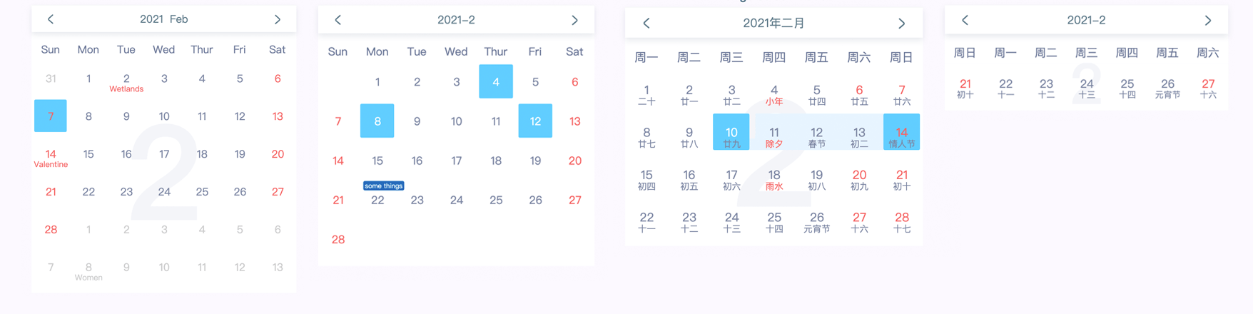
<img width="940" src="http://img.binlive.cn/687474703a2f2f696d672e62696e6c6976652e636e2f75706c6f61642f3136313339373433383732383363616c656e6461722d707265766965772e706e67.png" alt="mpvue-calendar preview">
</p>

- #### [Preview](http://preview.binlive.cn/mpvue-calendar#/ "Preview")
- #### [Demo](https://github.com/Hzy0913/mpvue-calendar/blob/master/example/App.vue "Demo")
- #### [中文文档](https://github.com/Hzy0913/mpvue-calendar/blob/master/README.zh.md "Docs")

## 💻 Install
mpvue-calendar only support **vue@3.0+**

```
npm i mpvue-calendar-xg -S
```
## 🔨 Usage

```javascript
<Calendar
  backgroundText
  class-name="select-mode"
  :remarks="remarks"
/>

import { ref } from 'vue'
import Calendar from 'mpvue-calendar'

export default {
  components: {
    Calendar,
  },
  setup() {
    const remarks = ref({'2021-1-13': 'some tings'})

    return {
      remarks,
    }
  }
}
```
## ⚙️ API
| name           |  type  | default  | description                                                                                                                                                                                                                                                      |
|----------------| ------------ |----------|------------------------------------------------------------------------------------------------------------------------------------------------------------------------------------------------------------------------------------------------------------------|
| selectMode     | String  | 'select' | For the selection mode of calendar component, can be used by **'select'**, **'multi'**,**'range'**, **'multiRange'** mode                                                                                                                                        |
| mode           | String  | 'month'  | Configure calendar display mode, the modes has **'month'**, **'week'**,**'monthRange'**                                                                                                                                                                          |
| selectDate     | String / String[] / {start: String; end: String} / {start: String; end: String} [] |          | In different selection modes, there are use different types.  `String` type for **select** mode, `String[]` type for **multi** mode, `{start: String; end: String}` type for **range** mode, and `{start: String; end: String} []` type for **multiRange** mode. |
| monthRange     |  String[]  |          | If you use **monthRange mode**,  you need to set the content of the month to be displayed. for example `[2021-1, 2021-2, 2021-6, 2021-9]`                                                                                                                        |
| remarks        | Object  |          | Create remark for a day, key is date string, and value is remark content. for example `{ '2021-1-13': 'some things' }`                                                                                                                                           |
| tileContent    |  Object |          | Create tile content  for a day, key is date string, and value is `object`, object have **className** and **content**. for example `{ '2021-1-5': { className: 'tip-class', content: 'some tip' } } `                                                             |
| holidays       |  Object  |          | Custom holiday information,  for example `{'2021-1-1': 'New Year'}`                                                                                                                                                                                              |
| completion     | Boolean  | false    | Complete the calendar table with 6 lines                                                                                                                                                                                                                         |
| useSwipe       | Boolean  | true     | The mobile terminal supports gesture sliding to switch calendar                                                                                                                                                                                                  |
| arrowLeft      | String  |          | Left arrow image url of toolbar                                                                                                                                                                                                                                  |
| arrowRight     | String  |          | Right arrow image url of toolbar                                                                                                                                                                                                                                 |
| monFirst       | Boolean  | false    | The first day of the week begins on Monday                                                                                                                                                                                                                       |
| backgroundText | Boolean  | false    | Displays the background text of the current month calendar                                                                                                                                                                                                       |
| language       |  String  |          | use **'en'** or **'cn'** language                                                                                                                                                                                                                                |
| format         |  (year, month) => [String, String]  |          | Format the date display at the header. you need return a array,  the contents of the array are year and month                                                                                                                                                    |
| weeks          |  String[]  |          | Weekly display content of custom header, for example ['S', 'M', 'T', 'W', 'T', 'F', 'S']                                                                                                                                                                         |
| begin          |  String  |          | Set the available date of the start, and the date before it will be disabled, for example ` '2021-1-5' `                                                                                                                                                         |
| end            |  String  |          | Set the available date of the end, and the date after it will be disabled, for example `'2021-2-5'`                                                                                                                                                              |
| disabled       |  String[]  |          | Disable certain dates , for example `['2021-1-9', '2021-2-5']`                                                                                                                                                                                                   |
| markDate       | Object|          | {'2022-7-1': 'color-1'}                                                                                                                                                                                                                                          |
#### Chinese lunar
If you need show chinese lunar, you need import lunar module.
```javascript
<Calendar
  :lunar="lunar"
/>

import lunar from 'mpvue-calendar/dist/lunar'
export default {
  ...,
  setup() {
    return {
      lunar,
    }
  }
}
```

## ⚙️ methods
|  name | type  |  description |
| ------------ | ------------ | ------------ |
| onSelect  |  (selectDate) => void |   This function is triggered when the date is selected  |
| onMonthChange | (year, month, day) => void  |   The callback is triggered when the month is change  |
| next | (year, month) => void  |    Callback this method when triggered next month   |
| prev | (year, month) => void  |    Callback this method when triggered prev month   |
| setToday | ref method |   Back today, you need to pass the ref parameter to call the internal method |