# mui-elapsing-bars
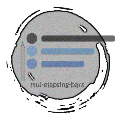
**mui-elapsing-bars** is a React component for displaying an animated progress-bar list which gets changed by time-elapsing. It is made with the flavour of our popular framework: [material-ui][mui] 😋

## Installation
```bash
npm install mui-elapsing-bars
```
OR
```bash
yarn add mui-elapsing-bars
```
----
## Quick Start
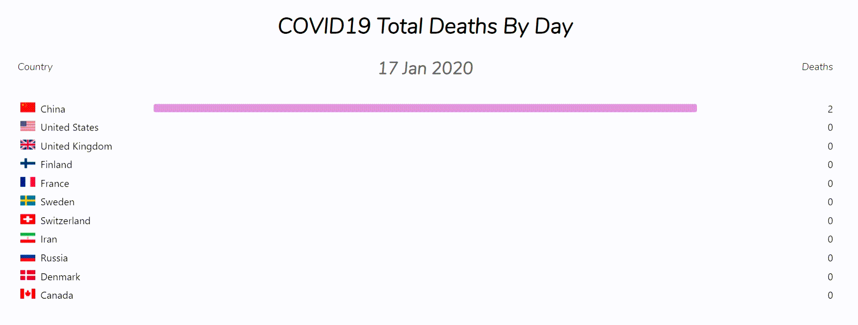
You can see the live examples here: [The Demo][demo]
```jsx
import { ElapBars } from 'mui-elapsing-bars';
const data = [
{
key: {text: "EURUSD"},
value: 1.2,
date: "2018",
},
{
key: {text: "GBPJPY"},
value: 147.19,
date: "2018",
},
{
key: {text: "EURUSD"},
value: 1.19,
date: "2019",
},
{
key: {text: "GBPJPY"},
value: 139.27,
date: "2019",
},
{
key: {text: "EURUSD"},
value: 1.18,
date: "2020",
},
{
key: {text: "GBPJPY"},
value: 137.42,
date: "2020",
},
];
export default function App(){
return (
// ElapBars has one required props: `data`
);
}
```
----
The **Default Props** is as it is shown below:
```js
const defaultProps = {
className: '',
style: {},
title: null,
keyOptions: {
title: "",
display: {
xs: 'icon',
sm: 'both',
md: 'both',
lg: 'both',
xl: 'both',
},
},
dateOptions: {
titleVariant: 'default',
order: 'asc',
},
valueOptions: {
title: '',
order: 'desc',
digitsCommaSeparation: true,
},
barOptions: {
colorVariant: 'primary',
n: undefined,
},
pure: false,
run: false,
restart: null,
loop: false,
delay: 1000,
interval: 700,
onStart: () => { },
onRestart: () => { },
onPause: () => { },
onResume: () => { },
onEnd: () => { },
};
```
## More Docs
- To see the full documentation for the props, take a look at **[PROPS Document][props.md]**.
- To see more examples, take a look at the **src/examples/** folder in the github repo.
----
Thank you for using this repo. **Please feel free to open new issues and contributing to this repository**.
## Future Roadmap
The future works will be taken into consideration if I see there is interests from YOU in this project.
- improve perfomance by decreasing RAM usage: perform better data structures for getting `data` array.
- implement another component named: `PureElapBars` optimized for occupying less resources.
- add a way for passing arbitrary color for all the bars **inplace**.
- add a way for choosing whether find the maximum value in current interval or the whole data
- add more features ...
[mui]: https://material-ui.com
[demo]: https://mui-elapsing-bars.vercel.app
[props.md]: https://github.com/alirezakay/mui-elapsing-bars/blob/main/elap-bars-props.md