## Introduction
This project contains [Material Design](https://material.io/design/) components built with Angular and Angular Material. Its goal is to provide components that are not yet implemented in [Angular Material](https://material.angular.io/).
It follows the Angular Material project approach, meaning that each component will be inside of its own module, so that you only have to import the one you are interested in, and not the whole library.
Feel free to follow and/or contribute to [the project](https://github.com/nereolopez/nereo-material).
## Add it to your project
### Step 1. Install the npm package
Inside of your Angular project, run the following command:
```
npm install nereo-material --save
```
### Step 2. Add Dependencies
- In order to have the [Material Icons](https://material.io/tools/icons/) displayed correctly, make sure to add them by including the following line in your `index.html` file:
```html
```
- Import the `BrowserAnimationsModule` into your `AppModule`.
```ts
import { BrowserAnimationsModule } from '@angular/platform-browser/animations';
@NgModule({
declarations: [
// your components here
],
imports: [
// your imports here
BrowserAnimationsModule,
],
providers: [
// your providers here
],
bootstrap: [AppComponent],
entryComponents: []
})
export class AppModule { }
```
- Install Angular Material
```
npm install --save @angular/material @angular/cdk
```
- Add an Angular Material theme. You can create one ([learn how](https://material.angular.io/guide/theming)) or import an existing one by adding it in your `styles.scss` file as follows:
```css
@import '~@angular/material/prebuilt-themes/deeppurple-amber.css';
```
## Available Components
### Backdrop
This component is what is referred to as the [Backdrop](https://material.io/design/components/backdrop.html#usage) in Material Design docs. See the image below to understand it easily:
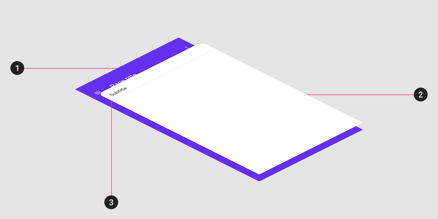
*Image from Material Design documentation site*
It is indeed a set of components (`Backdrop`, `BackdropBackLayer`, `BackdropBackLayerToolbar`. `BackdropBackLayerContent`, `BackdropFrontLayer`, `BackdropFrontLayerSubtitle` and `BackdropFrontLayerContent`).
#### API Reference
```ts
import { BackdropModule } from 'nereo-material';
```
#### Methods
| Name | Description |
|---|---|
| reveal() | It pulls the Front Layer down revealing the Back Layer. It will usually be triggered from a menu, search, filter (or whatever other) button on the toolbar. If the content of the Back Layer is larger, it will become scrollable. You should remember to disable your Front Layer's content when the Back Layer is revealed. |
| conceal() | Pulls the Front Layer up covering the Back Layer. |
#### Using the Backdrop
Add it to your template as shown below:
```html
folderSponge Bob's drive
```
To use the Backdrop functionality like revealing or concealing it, in the component where you want to call it from:
```ts
@ViewChild(BackdropComponent)
backdrop: BackdropComponent;
revealBackdrop(){
this.backdrop.reveal();
}
concealBackdrop() {
this.backdrop.conceal();
}
```
#### Backdrop Demo
This demo cannot be viewed in the Demo site as the Backdrop itself becomes a shell, but you can see how to use it in the [Github Repo](https://github.com/nereolopez/nereo-material-demo/tree/master/src/app/backdrop-demo).
### Banner
This is the [Banner](https://material.io/design/components/banners.html) in Material Design docs. See the image below to understand it easily:
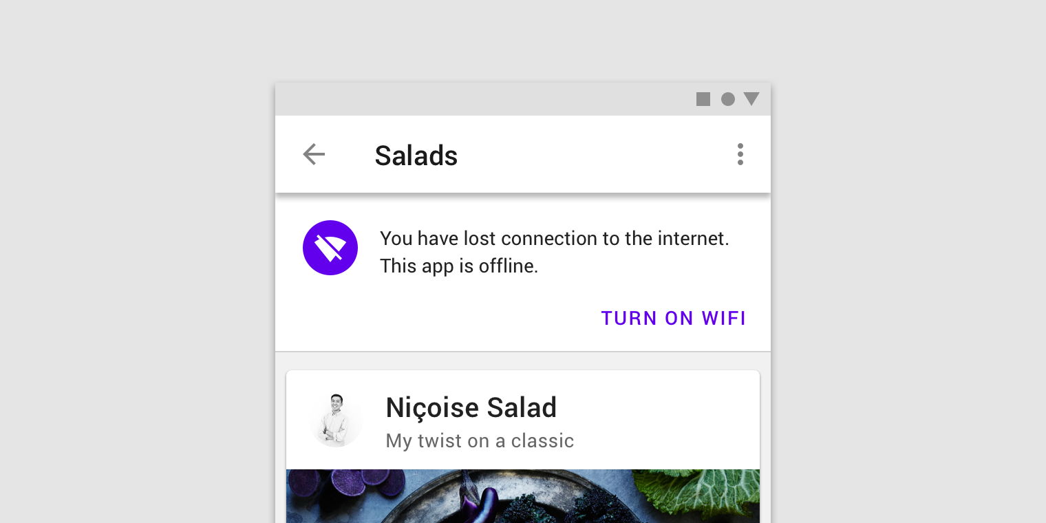
*Image from Material Design documentation site*
Keep in mind that this is intended to be used only for mid-priority messages where the user action is optional. It requires user dismissal and can have a maximum of 2 actions.
#### API Reference
```ts
import { BannerModule } from 'nereo-material';
```
#### Properties
| Name | Description |
|---|---|
| @Input() show: boolean | Receives whether the component has to be shown or not. |
| @Input() icon: string | Receives the name of the [Material Icon](https://material.io/tools/icons/) to be displayed. If no icon shown, the text will take its space. |
| @Input() firstSentence: string | Text to be displayed in the first line. |
| @Input() secondSentence: string | Text to be displayed on the second line. This is optional. If no text provider, the first line will be vertically centered.|
| @Input() mainActionText: string | Text to be displayed in the main action button. |
| @Input() secondaryActionText: string | Text to be displayed in the secondary action button. If no text is passed, the button will not be shown. |
| @Output() mainActionClick: EventEmitter(); | Emits an event when the main button is clicked. |
| @Output() mainActionClick: EventEmitter(); | Emits an event when the secondary button is clicked. |
#### Using the Banner
Add it as shown below to the component where you want to use it.
```html
```
Note that the `BannerComponent` is a dumb component, meaning that it does not perform any action whenever one of its buttons are clicked. Instead, it notifies you. Also keep in mind that **the `BannerComponent` does not hide itself, you will have to hide it with the `show` input property after receiving one of the output events.**
#### Banner Demo
Check the [demo code](https://github.com/nereolopez/nereo-material-demo/tree/master/src/app/banner-demo) to see how to use the component and the [demo page](https://nereo-material-demo.firebaseapp.com/banner) to see how it looks like.
### Contextual Toolbar
This component is what is referred to as the [Contextual Action Bar](https://material.io/design/components/app-bars-top.html#usage) in Material Design docs. See the image below to understand it easily:
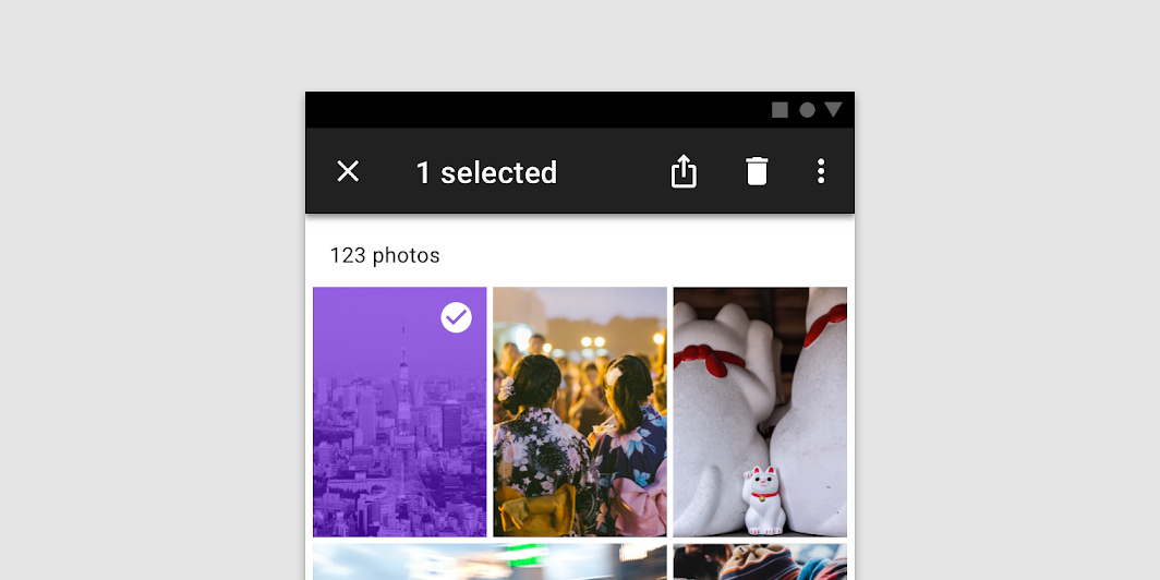
*Image from Material Design documentation site*
Whenever you have items selected, no matter what they are, it will position itself covering the default `MatToolbar` (or positioned on the top of the card, based on what you contextualize it to) offering the actions you need it to.
It can also display the progress of the actions by using the method `setProgress(string)`. When invoked, the icons disappear and only a progress indicator together with the given message will be displayed. Once in *progress mode*, you can keep passing new messages with the same method to update the progress message as it internally uses a `BehaviorSubject`. To go back to the normal state, just invoke its `stopProgress()` method.
#### API Reference
```ts
import { ContextualToolbarModule } from 'nereo-material';
```
#### Appearance
By default, it will have the regular `MatToolbar` appearance with grey background and black font. As custom themes are not accessible from the libraries' mixins, you can customize the appearance with plain CSS by setting the variable `--primary` for the Contextual Toolbar Font Color, and the `--primary-lighter` for the Contextual Toolbar Background.
Here is an example of what you need to include in your CSS corresponding to the default Indigo color palette, being the primary the hue 500, and the lighter the hue 100 (you can add the colors according to your to your palette):
```scss
:root {
--primary: #3F51B5;
--primary-lighter: #C5CAE9;
}
```
#### Properties
| Name | Description |
|---|---|
| @Input() count: number | Receives the number of items that have been selected |
| @Input() actions: ActionElement[] | Receives an array of actions to be displayed in the right corner. [See below what an action looks like](#actions) |
| @Input() displayMode: ContextualToolbarDisplayMode | Receives whether to show Icons, Text or both in the Contextual Toolbar Actions.|
| @Input() moreActions: ActionElement[] | Receives an array of additional actions that will be shown as a menu under the `more` button that will be automatically created. [See below what an additional action looks like](#more-actions) |
| @Input() contextualizeTo: string | Contextualizes the toolbar either to the `page` or to the parent `card`. It is defaulted to `page` mode. [See below the different contextualizations it can have](#contextualization) |
| @Output() selectedAction: EventEmitter(); | Emits an event with the selected action so that you can process it. |
| @Output() clearSelection: EventEmitter(); | Emits an event when the clear button (on the left side) is clicked. |
#### Methods
| Name | Description |
|---|---|
| setProgress(progressMessage: string) | Changes the Contextual Toolbar state to progress mode and displays the given progress message. |
| stopProgress() | Changes the Contextual Toolbar state to normal mode, hiding the progress mode. |
#### Model
##### Actions
The `actions` property receives an array of `ActionElement`.
```ts
export interface ActionElement {
name: string;
icon: string;
text?: string;
tooltip: string;
}
```
##### Contextual Toolbar Display Mode
The possible display modes for Contextual Toolbar Actions.
```ts
export enum ContextualToolbarDisplayMode {
icons = "icons",
text = "text",
all = "all"
}
```
##### More Actions
Same as with the actions, it expects an array of `ActionElement`.
#### Contextualization
The Contextual Toolbar gives actions related to the selected content. It can currently be contextualized to the page (which will cover the main toolbar of the application on the top) or to the parent card (it will occupy the parent card's header - **be aware that the parent card has to have its `position: relative` in order to display the toolbar correctly, which would be placed inside the card's content**).
You can use the [`contextualizeTo` property](#properties) with the values `page` or `card`.
#### Using Contextual Toolbar
Add it to as shown below components where you will have selections:
```html
```
Note that the `ContextualToolbarComponent` itself does not do any action, but notifies you instead. This means that you need to listen to the events it emits and take action. For instance, when the component emits the `clearSelection` event, you will need to clear the selection on your component. In this way, when the `count` is 0, the `ContextualToolbarComponent` will dissappear.
#### i18n
There is no much text in this component if you consider internationalization, only the number of selected items, the tooltip of the icons or the name of the menu items when clicking on the `more` button.
- For the number of selected items, it has an `i18n` attribute set to `@@contextualSelectedItems`. You just need to have this key in your translations if you want to localize it, otherwise, it will show the number of selected items plus the "selected" word in English.
- For the tooltips of the buttons, you can use the `tooltip` attribute of the `ActionElement` when passing the `actions` input property to the component.
- The `more` button also has an `i18n` attribute, in this case, set to `@@moreActions`. If no key is found in your project, it will show the word "more".
- For the items in the menu when clicking on `more`, you can use again the `tooltip`attribute of the `ActionElement` when passing the `moreActions` input property to the component.
#### Contextual Toolbar Demo
Check the [demo code](https://github.com/nereolopez/nereo-material-demo/tree/master/src/app/contextual-toolbar-demo) to see how to use the component and the [demo page](https://nereo-material-demo.firebaseapp.com/contextual-toolbar) to see how it looks like.
### (FAB) Speed Dial
This component is what is referred to as the [FAB Speed Dial](https://material.io/design/components/buttons-floating-action-button.html#types-of-transitions) in Material Design docs. See the image below to understand it easily:
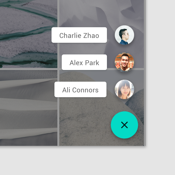
*Image from Material Design documentation site*
#### API Reference
```ts
import { FabSpeedDialModule } from 'nereo-material';
```
#### Properties
| Name | Description |
|---|---|
| @Input() mainIcon: string | Receives the name of the Material Icon to be displayed in the main FAB |
| @Input() actions: ActionElement[] | Receives an array of actions to be displayed in the right corner. [See above what an action looks like](#actions) |
| @Output() selectedAction: EventEmitter(); | Emits an event with the selected action so that you can process it. |
#### Using the Speed Dial
```html
```
#### Speed Dial Demo
Check the [demo code](https://github.com/nereolopez/nereo-material-demo/tree/master/src/app/speed-dial-demo) to see how to use the component and the [demo page](https://nereo-material-demo.firebaseapp.com/speed-dial) to see how it looks like.