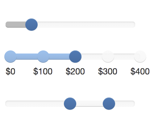
ngx-bootstrap-slider
This is an Angular component for the popular and very flexible seiyria/bootstrap-slider (https://github.com/seiyria/bootstrap-slider).
Some demos are available here: https://seiyria.com/bootstrap-slider/
## Install
```
npm install ngx-bootstrap-slider
```
| Angular Version | ngx-bootstrap-slider Version |
| --------------- | ---------------------------- |
| Until v12 | 1.9.0 |
| From v13 | 2.0.0 |
## Setup
### Include the module
Import the module in your app.module.ts:
```
import { NgxBootstrapSliderModule } from 'ngx-bootstrap-slider';
```
Add the module to the imports in your app.module.ts:
```
imports: [
...
NgxBootstrapSliderModule,
...
]
```
### Configure the Angular CLI
Add the CSS and JavaScript files to your angular.json:
```
"styles": [
"node_modules/bootstrap-slider/dist/css/bootstrap-slider.min.css"
],
"scripts": [
"node_modules/bootstrap-slider/dist/bootstrap-slider.min.js"
]
```
## Getting started
Add a slider element to your component:
```
```
## Attributes
All available properties are described here: https://github.com/seiyria/bootstrap-slider#options
The names have been unified to camel-casing (e.g. `[ticksLabels]` not `[ticks_labels]`).
## Events
All available events are described here: https://github.com/seiyria/bootstrap-slider#events
Currently, only the following events are implemented:
- slide
- slideStart
- slideStop
- change