# Ngx Flip Card
Angular component to animate a double-sided card.
Allows control over direction of rotation, speed of animation and easing function.
Can be performed on click or by external event.
Easily stylable.
Also contains a component to animate a tilt effect on the card.
This library was generated with [Angular CLI](https://github.com/angular/angular-cli) version 13.3.0.
## Examples
### Flip card on click
[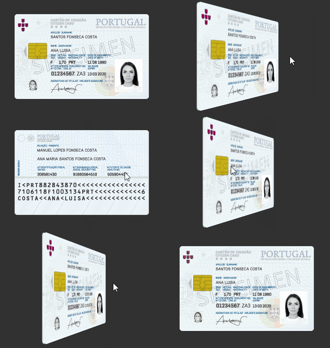 ](https://raw.githubusercontent.com/SpecialOne88/angular-libraries/9c157f3649a17e109c8207f2c8943c79681fd0f0/src/assets/Animation1.gif)
### Tilt card and flip
[
](https://raw.githubusercontent.com/SpecialOne88/angular-libraries/9c157f3649a17e109c8207f2c8943c79681fd0f0/src/assets/Animation1.gif)
### Tilt card and flip
[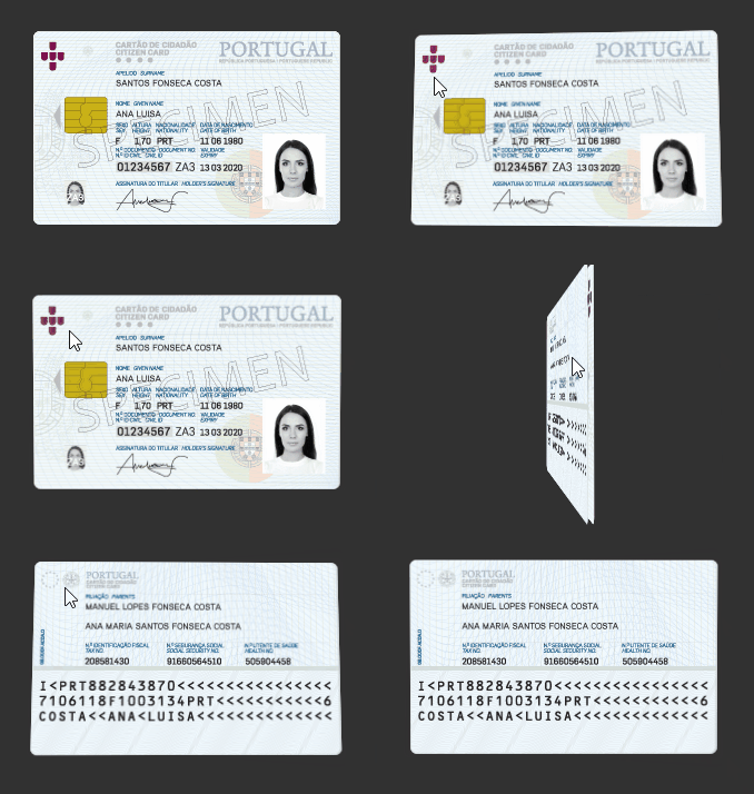 ](https://raw.githubusercontent.com/SpecialOne88/angular-libraries/master/src/assets/Animation2.gif)
## Usage
Import the NgxFlipCardModule and add the ngx-flip-card to the html of your components.
ngx-flip-card should have two children, one for the front side and another for the back side with specific directives.
```html
```
To add the tilt, add the component ngx-tilt-card
```html
```
## API
### Flip card
| Property | Type | Default | Description |
|-------------------|--------------------------------------------------|--------------|-----------------------------------------------|
| isBackSide | boolean | false | Sets the back side as the current position |
| isBackSideChange | EventEmitter boolean | N/A | Event for when isBackSide changes |
| animate | boolean | true | Play animation when turning |
| animationDuration | number | 2500 | Animation duration in milliseconds |
| animationEnd | EventEmitter | N/A | Fires when animation ends |
| TranslationZ | number | 2 | Depth of the card (during rotation) in pixels |
| easing | 'linear' \| 'easeIn' \| 'easeOut' \| 'easeInOut' | 'linear' | Easing function |
| direction | 'horizontal' \| 'vertical' | 'horizontal' | Direction of the rotation |
| flipOnClick | boolean | true | Should the card rotate when clicked |
| flipCard() | function | N/A | Call this function to flip the card |
### Tilt card
| Property | Type | Default | Description |
|------------------|--------|---------|-------------------------------------------|
| rotationDegreesX | number | 5 | Maximum degrees of rotation in the X axis |
| rotationDegreesY | number | 5 | Maximum degrees of rotation in the Y axis |
](https://raw.githubusercontent.com/SpecialOne88/angular-libraries/master/src/assets/Animation2.gif)
## Usage
Import the NgxFlipCardModule and add the ngx-flip-card to the html of your components.
ngx-flip-card should have two children, one for the front side and another for the back side with specific directives.
```html
```
To add the tilt, add the component ngx-tilt-card
```html
```
## API
### Flip card
| Property | Type | Default | Description |
|-------------------|--------------------------------------------------|--------------|-----------------------------------------------|
| isBackSide | boolean | false | Sets the back side as the current position |
| isBackSideChange | EventEmitter boolean | N/A | Event for when isBackSide changes |
| animate | boolean | true | Play animation when turning |
| animationDuration | number | 2500 | Animation duration in milliseconds |
| animationEnd | EventEmitter | N/A | Fires when animation ends |
| TranslationZ | number | 2 | Depth of the card (during rotation) in pixels |
| easing | 'linear' \| 'easeIn' \| 'easeOut' \| 'easeInOut' | 'linear' | Easing function |
| direction | 'horizontal' \| 'vertical' | 'horizontal' | Direction of the rotation |
| flipOnClick | boolean | true | Should the card rotate when clicked |
| flipCard() | function | N/A | Call this function to flip the card |
### Tilt card
| Property | Type | Default | Description |
|------------------|--------|---------|-------------------------------------------|
| rotationDegreesX | number | 5 | Maximum degrees of rotation in the X axis |
| rotationDegreesY | number | 5 | Maximum degrees of rotation in the Y axis |

