# International Telephone Input for Angular Material (ngxMatInputTel)
An Angular Material package for entering and validating international telephone numbers. It adds a flag dropdown to any input, detects the user's country, displays a relevant placeholder and provides formatting/validation methods.
[](https://www.npmjs.com/package/ngx-mat-input-tel)



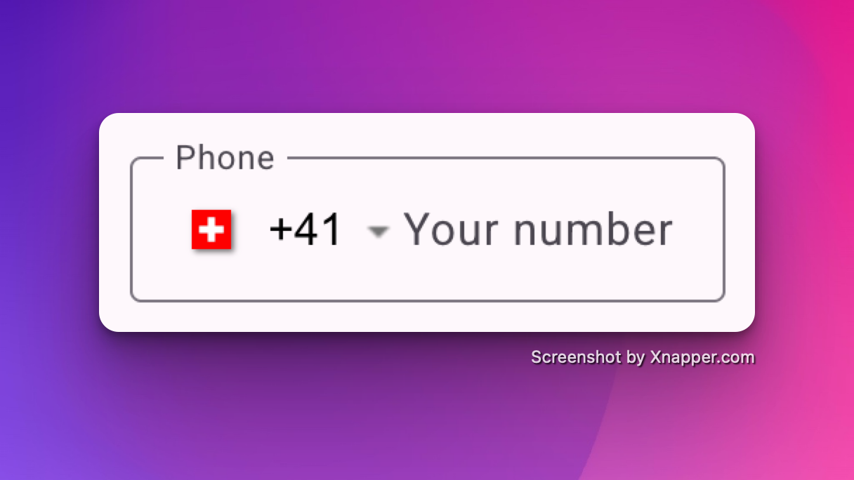
## Demo
- https://stackblitz.com/~/github.com/rbalet/ngx-mat-input-tel
## Caution
This is a fork from the [ngx-mat-intl-tel-input](https://github.com/tanansatpal/ngx-mat-intl-tel-input) library whish is not maintained anymore.
**Supports:**
| Angular | x-mat-input-tel |
| ------- | --------------------------- |
| >= 22 | >= 22.1 (Signal form ready) |
| >= 22 | >= 19.2.0 (Non Signal form) |
| >= 18 | >= 19.2.0 |
| >= 15 | < 19.2.0 |
- Validation with [libphonenumber-js](https://github.com/catamphetamine/libphonenumber-js)
## Installation
### Install This Library
`$ npm i ngx-mat-input-tel@latest`
### Install Dependencies _Optional_
`$ npm i libphonenumber-js@latest`
## Usage
### Import
Add `NgxMatInputTelComponent` to your component file:
```ts
imports: [NgxMatInputTelComponent];
```
## Example
Refer to main app in this repository for working example.
Signal Form usage (Angular 22+):
```html
```
```html
```
```html
```
If you want to show the sample number for the country selected or errors, use mat-hint and mat-error as
```html
```
## Inputs
| Options | Type | Default | Description |
| ------------------ | ------------------------- | ---------------- | -------------------------------------------------------------------------------------------------------------- |
| ariaLabel | `string` | `Select country` | Aria label for the country selector button |
| autocomplete | `off` \| `tel` | `off` | For input autocompletion |
| cssClass | `string` | `undefined` | If input custom class are needed |
| countriesName | `Record` | `COUNTRIES_NAME` | For using different country names in the dropdown (Eg. Multilingual website) |
| defaultCountry | `CountryCode` | `undefined` | Default country code |
| enablePlaceholder | `boolean` | `false` | Input placeholder text, which adapts to the country selected. |
| enableSearch | `boolean` | `false` | Whether to display a search bar to help filter down the list of countries |
| format | `string` \*\*\*\* | `default` | Format of "as you type" input. Possible values: national, international, default |
| hideAreaCodes | `boolean` | `false` | Hide the Area codes in the country dropdown selection |
| maxLength | `number` | `15` | max length of the input. |
| onlyCountries | `string[]` | `[]` | List of manually selected country abbreviations, which will appear in the dropdown. |
| placeholder | `string` | `undefined` | Placeholder for the input component. |
| preferredCountries | `string[]` | `[]` | List of country abbreviations, which will appear at the top. |
| resetOnChange | `boolean` | `false` | Reset input on country change |
| searchPlaceholder | `string` | `Search ...` | Placeholder for the search input |
| validation | `isPossible` \| `isValid` | `isValid` | Change the validation type |
| separateDialCode | `boolean` | `false` | Whether to separate the dial code from the input _Note: you'll have to manually add margin-left to your input_ |
## Outputs
| Options | Type | Default | Description |
| -------------- | ----------------------- | ----------- | ----------------- |
| countryChanged | `EventEmitter` | `undefined` | On country change |
## Css variable
| Name | Default | Explanation |
| -------------------------------------- | -------------- | ------------------------------------------------------------------------------------------------------- |
| `--ngxMatInputTel-opacity` | `0` | If you wish both, the country flag and the placeholder to be shown by default |
| `--ngxMatInputTel-selector-opacity` | `0` | If you wish the country flag to be shown by default |
| `--ngxMatInputTel-placeholder-opacity` | `0` | If you wish the placeholder flag to be shown by default |
| `--ngxMatInputTel-flag-display` | `inline-block` | If you wish to hide the country flag |
| `--ngxMatInputTel-menu-flag-display` | `inline-block` | If you wish to hide the country flag inside the menu only |
| `--ngxMatInputTel-gap` | `32px` | If you wish to change the gap between the flag and the input field (Only works with `separateDialCode`) |
## Validator
#### Manual validator usage
If you need to manually add the validator, use the factory:
| Name | Description | Example |
| -------------------------------- | --------------------------------------------------- | --------------------------------------------------------------------------- |
| `ngxMatInputTelValidatorFactory` | Validator factory for phone and country restriction | `phoneControl.addValidators([ngxMatInputTelValidatorFactory(['US','GB'])])` |
## Library Contributions
- Fork repo.
- Go to `./projects/ngx-mat-input-tel`
- Update `./src/lib` with new functionality.
- Update README.md
- Pull request.
### Helpful commands
- Build lib: `$ npm run build_lib`
- Copy license and readme files: `$ npm run copy-files`
- Create package: `$ npm run npm_pack`
- Build lib and create package: `$ npm run package`
### Use locally
After building and creating package, you can use it locally too.
In your project run:
`$ npm install --save {{path to your local '*.tgz' package file}}`
## Authors and acknowledgment
- maintainer [Raphaël Balet](https://github.com/rbalet)
- Forked from [ngx-mat-intl-tel-input](https://github.com/tanansatpal/ngx-mat-intl-tel-input)
### Contributors
Contributions are welcome! See our [contribution notes](CONTRIBUTING.md).
[ ](https://github.com/rbalet)
[
](https://github.com/rbalet)
[ ](https://github.com/ChristianLoosliVGT)
[](https://www.buymeacoffee.com/widness)
](https://github.com/ChristianLoosliVGT)
[](https://www.buymeacoffee.com/widness)