
<p align="center">
  <img src="/_assets/ngx-scrolltop_logo.svg?sanitize=true" width="120">
  <h1 align="center">Angular ScrollTop Button</h1>
</p>

[![npm version](https://badge.fury.io/js/ngx-scrolltop.svg)](https://badge.fury.io/js/ngx-scrolltop)
[![NPM Downloads](https://img.shields.io/npm/dm/ngx-scrolltop.svg)](https://www.npmjs.com/ngx-scrolltop)
[![Join the chat at https://gitter.im/ngx-scrolltop/Lobby](https://badges.gitter.im/ngx-scrolltop/Lobby.svg)](https://gitter.im/ngx-scrolltop/Lobby?utm_source=badge&utm_medium=badge&utm_campaign=pr-badge&utm_content=badge)

![](https://github.com/bartholomej/ngx-scrolltop/workflows/Build%20&%20Tests%20&%20Publish/badge.svg)
[![volkswagen status](https://auchenberg.github.io/volkswagen/volkswargen_ci.svg?v=1)](https://github.com/auchenberg/volkswagen)

> Lightweight, **Material Design inspired button for scroll-to-top** of the page.
> No dependencies.
> **Pure Angular!**

> ✓ **Angular 20**, **Signals**, **Standalone Components** and Angular Universal (**SSR**) compatible

Just hit the button to smoothly scroll back to the top of the page. [Here's the demo.](http://bartholomej.github.io/ngx-scrolltop/)

- No dependencies! _(only smooth scroll-behavior polyfill for old iOS versions)_
- Lightweight _(~2 kB gzipped)_
- **Angular 20** compatible
- **Standalone Components** compatible
- **Signals** compatible
- Material Design inspired
- `@angular/material` compatible ([example](#angular-material-example-directive))
- Component or directive way
- Smoothly animated
- a11y ready
- Highly customizable [options](#%EF%B8%8F-options)...
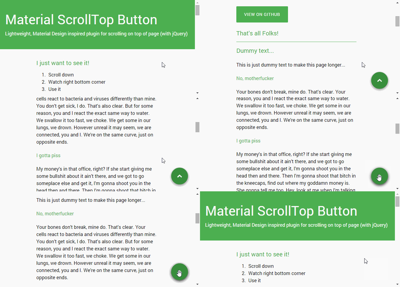
![Demo animation](https://github.com/bartholomej/material-scrollTop/blob/master/demo/images/material-scrolltop-animation.gif?raw=true)

## 🎯 Demo (example)

Watch this [demo page](http://bartholomej.github.io/ngx-scrolltop/)

Or play with it live on [stackblitz.com/edit/ngx-scrolltop](https://stackblitz.com/edit/ngx-scrolltop?file=src/app/app.component.html)

## 📦 Install

> You're not using the latest version of Angular?
> [See our Angular compatibility instructions…](#compatibility)

Via **npm** or **yarn**

```bash
npm install ngx-scrolltop --save # for lastest Angular only! See our compatibility table

# yarn add ngx-scrolltop
```

### Compatibility

| Angular version | ngx-scrolltop | Install                            |
| --------------- | ------------- | ---------------------------------- |
| ng20            | v20.x.x       | `npm install ngx-scrolltop@latest` |
| ng19            | v19.x.x       | `npm install ngx-scrolltop@19`     |
| ng18            | v18.x.x       | `npm install ngx-scrolltop@18`     |
| ng17            | v17.x.x       | `npm install ngx-scrolltop@17`     |
| ng16            | v6.x.x        | `ng add ngx-scrolltop@6`           |
| ng15            | v6.x.x        | `ng add ngx-scrolltop@6`           |
| ng14            | v4.x.x        | `ng add ngx-scrolltop@4`           |
| ng13            | v4.x.x        | `ng add ngx-scrolltop@4`           |
| ng12            | v4.x.x        | `ng add ngx-scrolltop@4`           |
| ng5 – ng11      | v2.x.x        | `ng add ngx-scrolltop@2`           |

## 🗜️ Setup and usage (`Standalone` or `Modules`)

> You have some options how to use this library.
> As a component or as a directive.

> You can also use it as a Standalone component (new angular way) or as a module (the original angular way).

### Standalone Component

In your root standalone component (e.g. `app.component.ts`) you need to add `NgxScrollTopComponent` into your `imports` array.

```diff
...
+ import { NgxScrollTopComponet } from 'ngx-scrolltop';
...

@Component({
  selector: 'app',
  standalone: true,
  templateUrl: './app.component.html',
  styleUrls: ['./app.component.scss'],
  imports: [
+   NgxScrollTopComponent
  ],
})
export class AppComponent { }
```

And then in `app.component.html` you just need to add your new button. Usually at the end of your file.

```html
<ngx-scrolltop></ngx-scrolltop>
```

_See [options](#%EF%B8%8F-options) and [examples](#-examples) for more details..._

### Standalone Directive

In your root standalone component (e.g. `app.component.ts`) you need to add `NgxScrollTopDirective` into your `imports` array.

```diff
...
+ import { NgxScrollTopDirective } from 'ngx-scrolltop';
...

@Component({
  selector: 'app',
  standalone: true,
  templateUrl: './app.component.html',
  styleUrls: ['./app.component.scss'],
  imports: [
+   NgxScrollTopDirective
  ],
})
export class AppComponent { }
```

And then in `app.component.html` you just need to create your new custom element... _(e.g. `<span>`, `<div>`, `<button>`, ...)_

```html
<span ngxScrollTop class="my-custom-element-with-my-style__no-lib-style-applied-here">
  ↑ My Custom Element. ↑
</span>
```

**Important note**: _No style applied, everything is up to you. Of course I recommend `position: fixed`, ..._

_See more in [examples](#-examples)_

### Modules (the original Angular way)

> This is the original Angular way how to import libraries (via modules).
> You can use it as a component or as a directive as well.

In your root module (e.g. `app.module.ts`) you need to add `NgxScrollTopModule` into your `imports` array.

```diff
...
+ import { NgxScrollTopModule } from 'ngx-scrolltop';
...

@NgModule({
  imports: [
    ...
+   NgxScrollTopModule
  ],
  ...
  bootstrap: [AppComponent]
})
export class AppModule { }
```

_Next steps you can see above in [Standalone Component](#standalone-component) or [Standalone Directive](#standalone-directive)_ or in [examples](#-examples).

## ⚙️ Options

### Component

| Option              | Type                                                                           | Default     | Description                                                                                                                                                                                              |
| ------------------- | ------------------------------------------------------------------------------ | ----------- | -------------------------------------------------------------------------------------------------------------------------------------------------------------------------------------------------------- |
| **mode**            | `'smart'` \| `'classic'`                                                       | `'classic'` | **Smart** mode shows button only when you scroll more than two screens down and then you will try to go back to top. **Classic** mode shows button immediately when you scroll at least one screen down. |
| **backgroundColor** | string                                                                         | #212121     | Background color (you can use all values for `backgroud-color` css property). _You can override `theme` color_                                                                                           |
| **symbolColor**     | string                                                                         | #fafafa     | Symbol color (you can use all values for `fill` svg property). _You can override `theme` color_                                                                                                          |
| **size**            | number                                                                         | 40          | Button size [in pixels]. _(Symbol will be resized automatically_)                                                                                                                                        |
| ~~**symbol**~~      | ~~string~~                                                                     |             | ~~You can use utf8 chars for customizing symbol. For example: `↑`~~ Removed in v2.0.0. Use _content projection_. See example [here](#symbol)                                                             |
| **position**        | `'left'` \| `'right'`                                                          | `'right'`   | Left or right, that is the question...                                                                                                                                                                   |
| **theme**           | [NgxScrollTopTheme](projects/ngx-scrolltop/src/lib/ngx-scrolltop.interface.ts) | `'gray'`    | Choose from [official Material color themes](https://material.io/resources/color)                                                                                                                        |

#### Symbol

You can use _content projection_ for your own symbol.

```html
<ngx-scrolltop> ↑ </ngx-scrolltop>
```

Or you can even use your own components or fonts (e.g. fontAwesome)

```html
<ngx-scrolltop>
  <i class="fa fa-arrow-up"></i>
</ngx-scrolltop>
```

### Directive

| Option                 | Type                     | Default     | Description                                                                                                                                                                                             |
| ---------------------- | ------------------------ | ----------- | ------------------------------------------------------------------------------------------------------------------------------------------------------------------------------------------------------- |
| **[ngxScrollTopMode]** | `'smart'` \| `'classic'` | `'classic'` | **Smart** mode shows button only when you scroll more than two screens down and then you will try to go back to top.**Classic** mode shows button immediately when you scroll at least one screen down. |

## 🎨 Examples

### Advanced example (component)

**app.component.html**

```html
<ngx-scrolltop
  [size]="50"
  backgroundColor="#33691e"
  symbolColor="#fff"
  mode="smart"
  position="left"
  theme="pink"
>
  ↑
</ngx-scrolltop>
```

### Angular Material example (directive)

_[@angular/material](https://material.angular.io/components/button/overview) required_

**app.component.html**

```html
<button
  ngxScrollTop
  [ngxScrollTopMode]="'smart'"
  class="my-custom-style"
  color="primary"
  mat-mini-fab
>
  top
</button>
```

**app.component.scss**

```css
.my-custom-style {
  position: fixed;
  right: 20px;
  bottom: 20px;
}
```

## 🔌 Dependencies

Pure Angular! _(with smooth scroll-behaviour polyfill for iOS)_

## 🙋 FAQ

### Old version of Angular

#### Error

If you are using older Angular (5 – 11) you will see this error on build or start:

> ERROR in node_modules/ngx-scrolltop/lib/ngx-scrolltop.core.service.d.ts:13:21 - error TS2694: Namespace '"/Users/user/projects/my-project/node_modules/@angular/core/core"' has no exported member 'ɵɵFactoryDeclaration'.

#### Solution

Easy! Use compatibility version of this library `npm install ngx-scrolltop@2 --save`

[See our Angular compatibility instructions…](#compatibility)

#### Error

If you are using Angular 14 with latest ngx-scrolltop library, you will see this error on build or start:

```bash
Error: node_modules/ngx-scrolltop/lib/ngx-scrolltop.component.d.ts:21:18 - error TS2707: Generic type 'ɵɵComponentDeclaration' requires between 7 and 8 type arguments.

21     static ɵcmp: i0.ɵɵComponentDeclaration<NgxScrollTopComponent, "ngx-scrolltop", never, { "backgroundColor": "backgroundColor"; "symbolColor": "symbolColor"; "size": "size"; "symbol": "symbol"; "position": "position"; "theme": "theme"; "mode": "mode"; }, {}, never, ["*"], false, never>;
                    ~~~~~~~~~~~~~~~~~~~~~~~~~~~~~~~~~~~~~~~~~~~~~~~~~~~~~~~~~~~~~~~~~~~~~~~~~~~~~~~~~~~~~~~~~~~~~~~~~~~~~~~~~~~~~~~~~~~~~~~~~~~~~~~~~~~~~~~~~~~~~~~~~~~~~~~~~~~~~~~~~~~~~~~~~~~~~~~~~~~~~~~~~~~~~~~~~~~~~~~~~~~~~~~~~~~~~~~~~~~~~~~~~~~~~~~~~~~~~~~~~~~~~~~~~~~~~~~~~~~~~~~~~~~~~~~


Error: node_modules/ngx-scrolltop/lib/ngx-scrolltop.directive.d.ts:17:18 - error TS2707: Generic type 'ɵɵDirectiveDeclaration' requires between 6 and 8 type arguments.

17     static ɵdir: i0.ɵɵDirectiveDeclaration<NgxScrollTopDirective, "[ngxScrollTop]", never, { "mode": "ngxScrollTopMode"; }, {}, never, never, false, never>;
```

#### Solution

Easy! Use compatibility version of this library `npm install ngx-scrolltop@4 --save`

[See our Angular compatibility instructions…](#compatibility)

## ⭐️ Show your support

Give a ⭐️ if this project helped you!

Or if you are brave enough consider [making a donation](https://github.com/sponsors/bartholomej) for some 🍺 or 🍵 ;)

## 📝 License

Copyright &copy; 2025 [Lukas Bartak](http://bartweb.cz)

Proudly powered by nature 🗻, wind 💨, tea 🍵 and beer 🍺 ;)

All contents are licensed under the [MIT license].

[mit license]: LICENSE
