# react-native-popup-ui
A simple and fully customizable React Native component that implements a popup UI.
- Easy to customize, has prop to change background color
- Function to close automatically
- Receives callback prop to set button action
## Example popup
| Example One | Example Two | Example Three |
| :-----------------------------------------------------------: | :-----------------------------------------------------------: | :-----------------------------------------------------------: |
|  [examples/App.js](examples/App.js) | 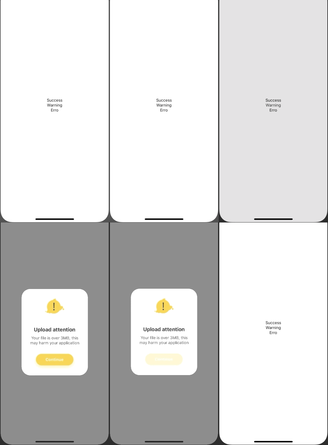 [examples/App.js](examples/App.js) | 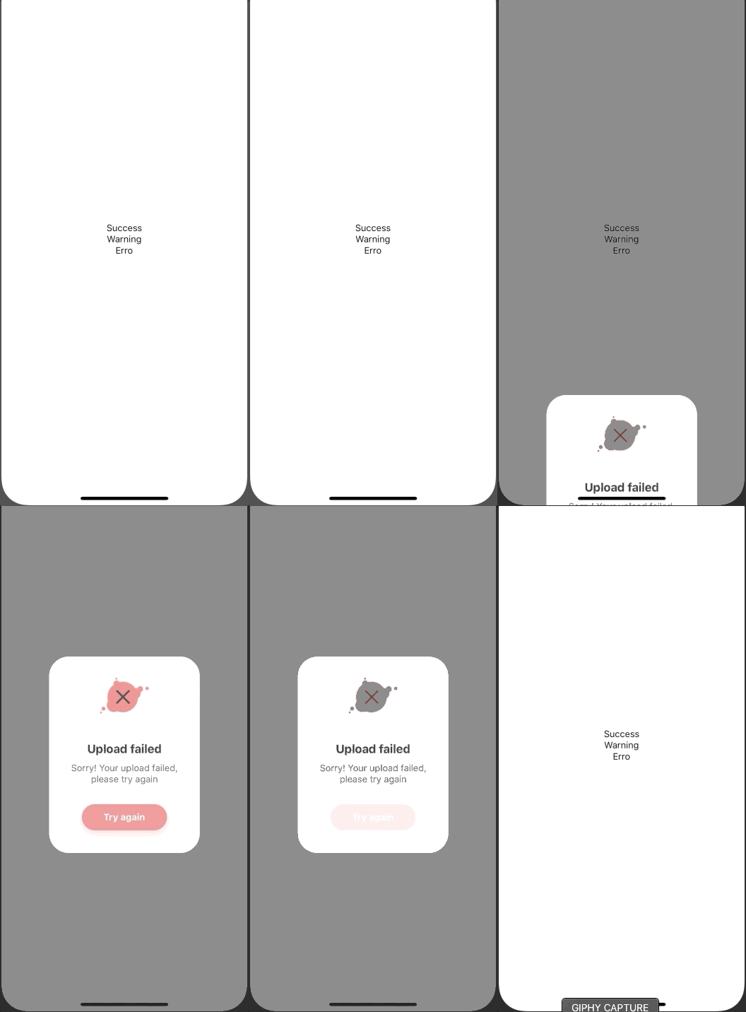 [examples/App.js](examples/App.js) |
## Example toast
| Example One | Example Two | Example Three |
| :-----------------------------------------------------------: | :-----------------------------------------------------------: | :-----------------------------------------------------------: |
| 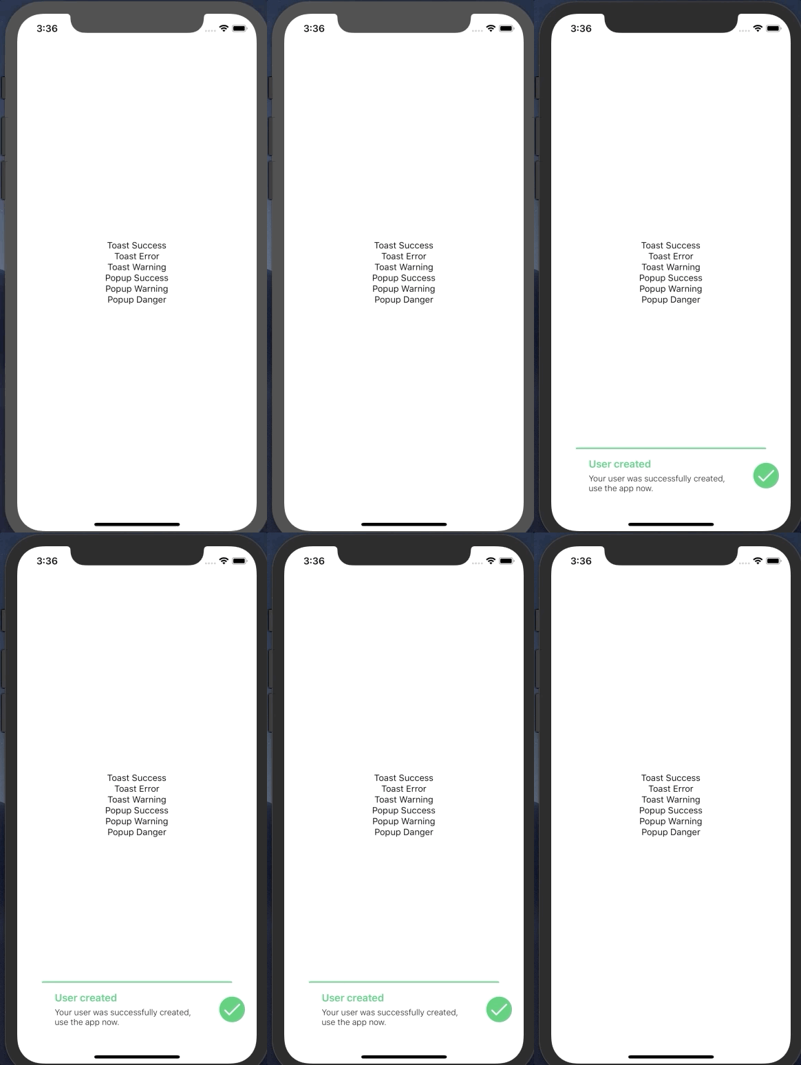 [examples/App.js](examples/App.js) | 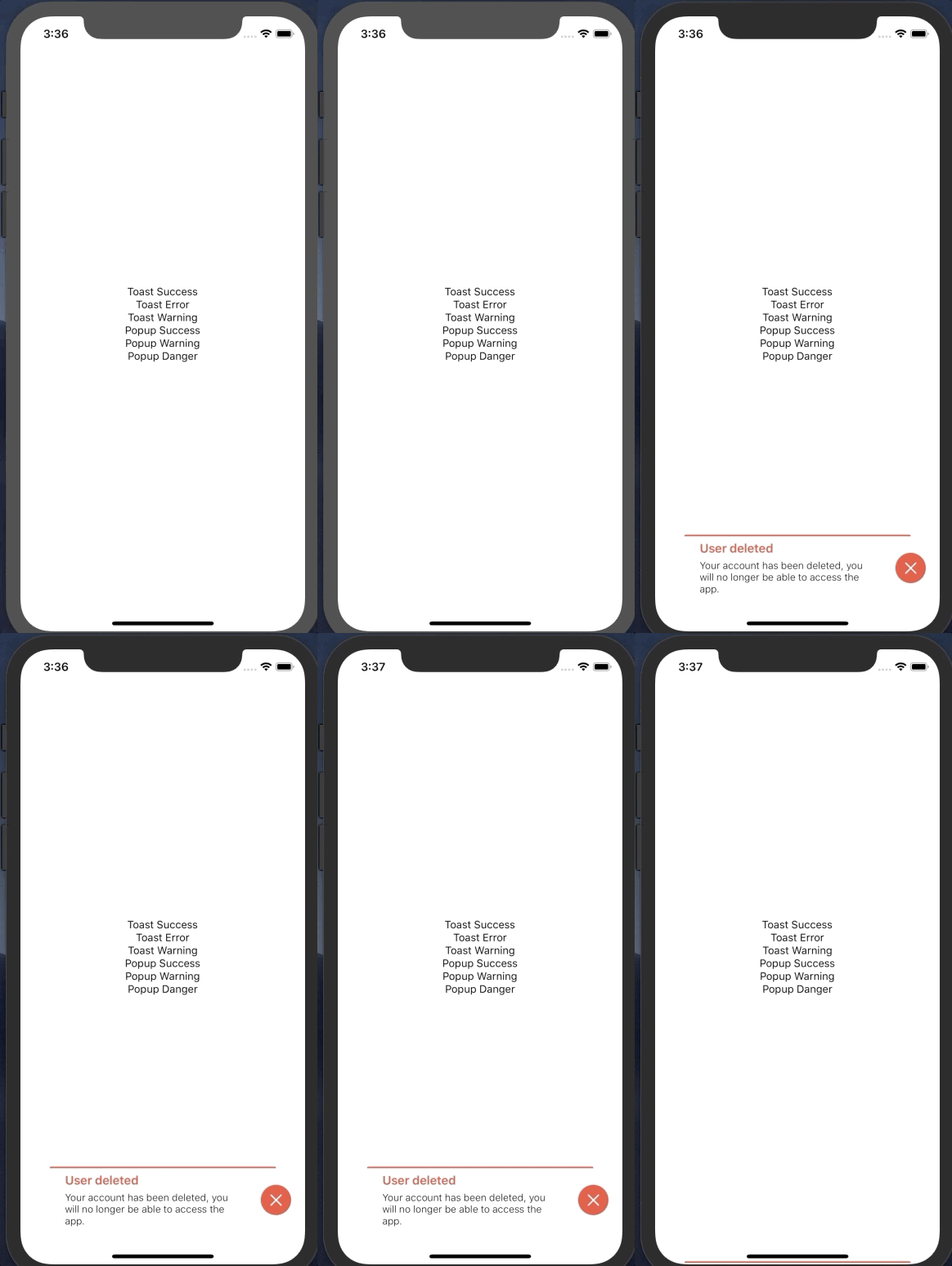 [examples/App.js](examples/App.js) | 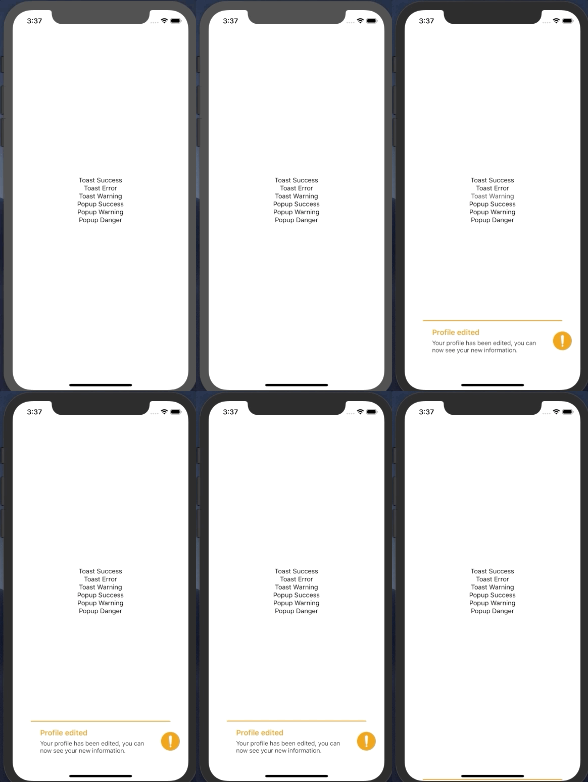 [examples/App.js](examples/App.js) |
## Installation
If using yarn:
```
yarn add popup-ui
```
If using npm:
```
npm i popup-ui
```
## Usage
```
import { View, TouchableOpacity, Text } from 'react-native'
import { Root, Popup } from 'popup-ui'
```
Simply declare the method in your event `Popup.show({...})` in its component.
```
Popup.show({
type: 'Success',
title: 'Upload complete',
button: false,
textBody: 'Congrats! Your upload successfully done',
buttonText: 'Ok',
callback: () => Popup.hide()
})
}
>
Open Popup
```
You can also use the `Toast` component.
```
// Is necessary make the import to Toast (import { Root, Toast } from 'popup-ui')
Toast.show({
title: 'User created',
text: 'Your user was successfully created, use the app now.',
color: '#2ecc71'
})
}
>
Call Toast
```
### Popup Type Usage
Popup contains a type-customization scheme `Type` props.
Example success usage:
```
Popup.show({
type: 'Success'
})
```
Example warning usage:
```
Popup.show({
type: 'Warning'
})
```
Example error usage:
```
Popup.show({
type: 'Danger'
})
```
### Popup Style Background
Popup contains a customization in `Background` props.
Example usage:
```
Popup.show({
background: 'red'
})
```
### Popup Callback Function
Popup contains a callback function in button popup `Callback` props.
Example usage:
```
Popup.show({
callback: Popup.hide()
})
```
## Documentation
### Popup Component
| Name | Description | Default | Type |
| ---------- | ----------------------------------------------- | ------------------ | ----------- |
| title | Sets the main popup title | Upload complete | String |
| type | Defines the type (Success, Warning or Error) | Success | String |
| textBody | Defines the text body of popup | | String |
| button | Whether or not to display the | true | Bool |
| buttonText | Defines the text button of popup | Ok | String |
| callback | Defines the function of button | Alert() | Func |
| background | Sets the backgroundColor | rgba(0, 0, 0, 0.5) | String |
| timing | Sets the time for the popup to close by itself | 5000 | Number |
| autoclose | sets whether the popup will close automatically | false | Bool |
| icon | use costum icon | false | Component |
### Toast Component
| Name | Description | Default | Type |
| ---------- | ----------------------------------------------- | ------------------ | --------- |
| title | Sets the main toast title | | String |
| text | Defines the text to toast | | String |
| color | Defines the color to title, border and iconC | #e1e1e1 | String |
| timing | Define your timing to close toast | 6s | Int |
| icon | Choose your the best icon to toast | | Component |
## Contributing
Pull requests are always welcome! Feel free to open a new GitHub issue for any changes that can be made.
## Author
Rafael Augusto | [https://linkedin.com/in/rafaelaugustos/](https://linkedin.com/in/rafaelaugustos/)
## Roadmap
- Toast
- Alert/Confirm
- Create a function to close toast with gesture
## License
[MIT](./LICENSE)