# qui-badge

> 徽章组件

## 预览

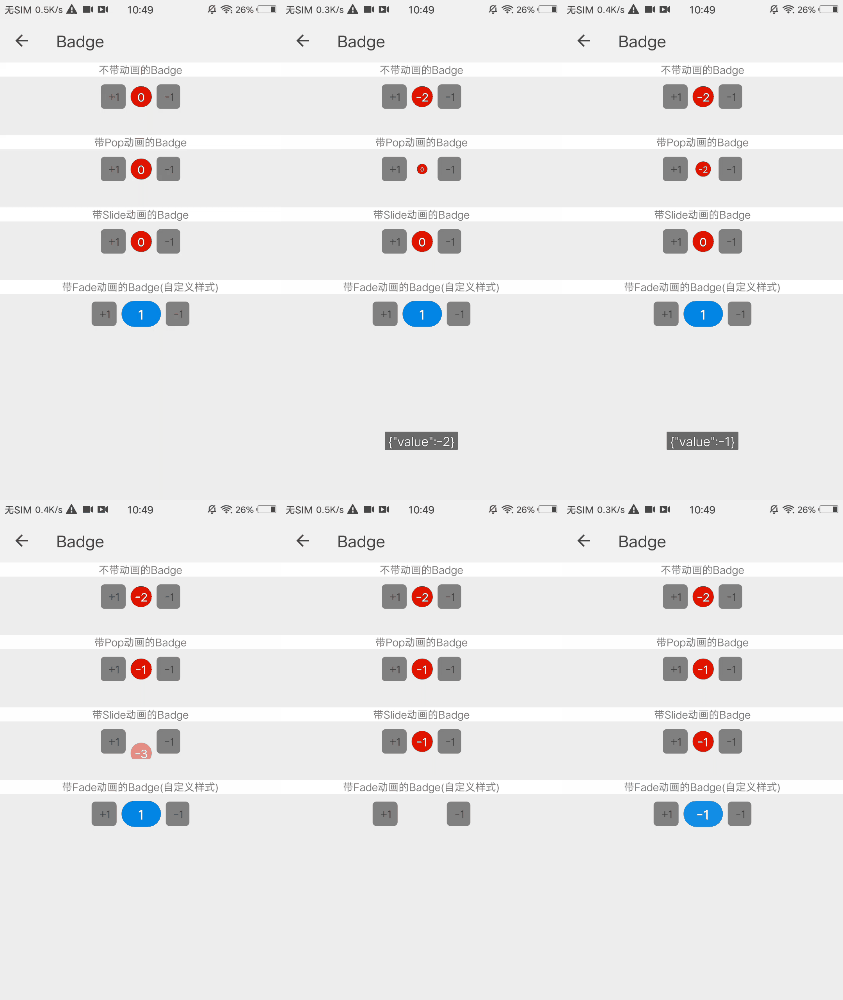
<img src="https://qapp-ui.github.io/qapp-ui/docs/assets/qui-badge.gif" width="300"/>

## 依赖接口

无依赖

## 使用方法
	
```ux
<import name='qui-badge' src='@qapp-ui/qui-badge/index'></import>

<template>
  <div class="page-doc">
    <div class="badge-box">
      <text class="text">带Fade动画的Badge(自定义样式)</text>
      <div class="qui-badge-page-item">
        <text class="btn" @click="addDelta('qui-badge-3',1)"> +1</text>
        <qui-badge animation-type='fade' height='100px' width='150px' border-radius='100px' font-size='50px' font-style='bold' background='#0F8DE8' text-color='#ffffff' badge="{{number}}" id="qui-badge-3"></qui-badge>
        <text class="btn " @click="addDelta( 'qui-badge-3', -1) "> -1</text>
      </div>
    </div>
  <div>
</template>

<script>
  export default {
    data: {
      number: "1"
    },
    onInit() {
      this.$page.setTitleBar({text: 'Badge'})
    },
    addDelta(id, delta) {
      this.$child(id).addDelta(delta)
    },
    change(data) {
      prompt.showToast({
        message: JSON.stringify(data.detail)
      })
    }
  }
</script>

```

更详细代码可以参考 [qui-badge demo](https://github.com/qapp-ui/qapp-ui/blob/master/src/Badge/index.ux)

### 参数

| 属性名 | 类型 | 是否必填 | 默认值 | 描述 |
|-------------|------------|--------|-----|-----|
| fontStyle | `String` |`N`| `bold` | 字体样式 |
| background | `String` |`N`| `#d00000` | 背景色|
| textColor | `String` |`N`| `#ffffff` | 文字颜色 |
| animationType | `String` |`N`| `none` | 动画类型(支持none, pop, slide, fade)|
| badge | `String` |`N`| `0` | 徽章数值 |
| height | `String` |`N`| `80px` | 组件高度(单位px) |
| width | `String` |`N`| `80px` | 组件宽度(单位px) |
| borderRadius | `String` |`N`| `80px` | 边框圆角 |
| fontSize | `String` |`N`| `44px` | 徽章字体大小 |


### 事件

| 事件名 | 参数 | 描述 | 
|-------|-----|-----|
| qui-badge-change | `{value: this.badge}` | badge数据变化 |