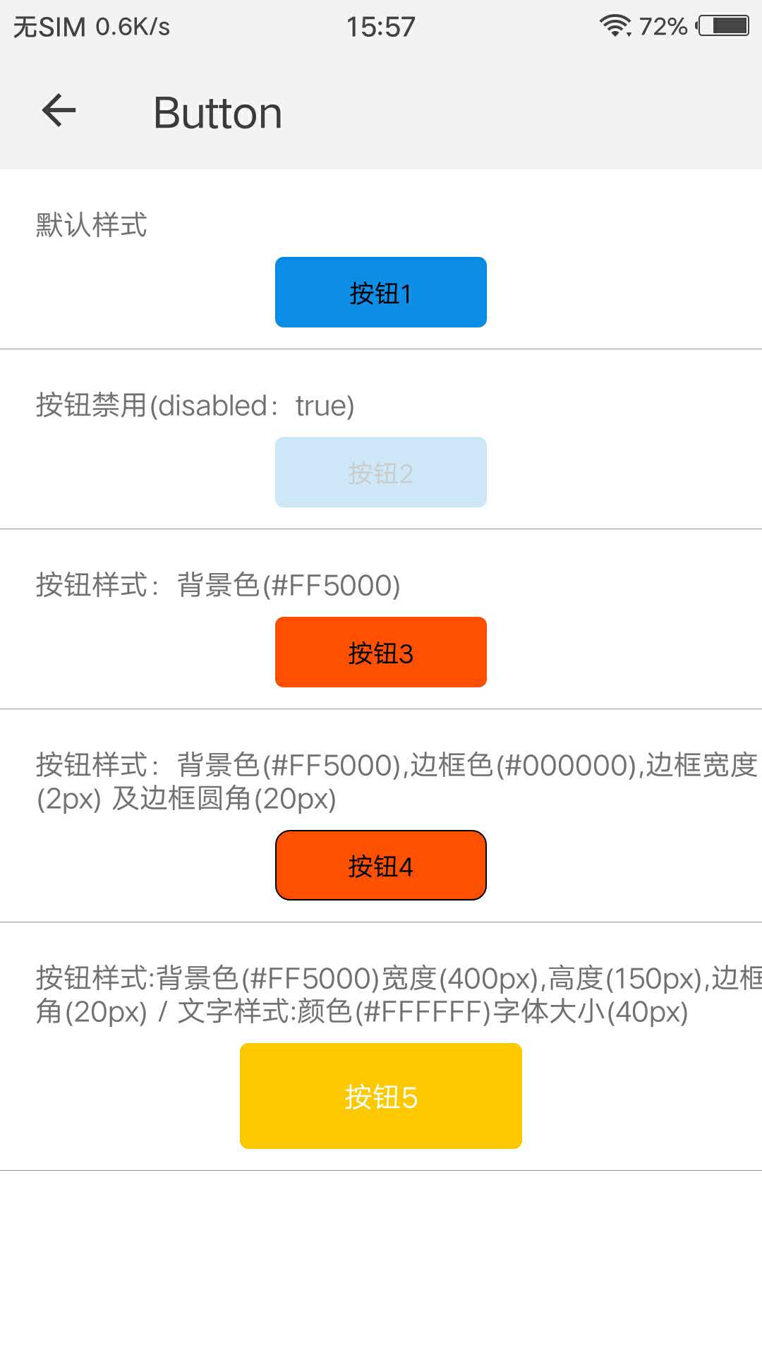
按钮样式:背景色(#FF5000)宽度(400px),高度(150px),边框圆角(20px)/文字样式:颜色(#FFFFFF)字体大小(40px)
```
更详细代码可以参考 [qui-button demo](https://github.com/qapp-ui/qapp-ui/blob/master/src/Button/index.ux)
### 参数
| 属性名 | 类型 | 是否必填 | 默认值 | 描述 |
|-------------|------------|--------|-----|-----|
| tid | `String` |`N`| `-` | button的标识 |
| text | `String` |`N`| `按钮` | 展现的文字 |
| disabled | `String` |`N`| `0` | 是否 disabled,`'1'`表示是,`'0'`表示否 |
| backgroundColor | `String` |`N`| `#0F8DE8` | 按钮背景色 |
| borderColor | `String` |`N`| `-` | 按钮边框颜色 |
| borderWidth | `String` |`N`| `0px` | 按钮边框宽度 |
| borderRadius | `String` |`N`| `12px` | 按钮边框圆角 |
| width | `String` |`N`| `300px` | 按钮宽度 |
| height | `String` |`N`| `100px` | 按钮高度 |
| color | `String` |`N`| `#000000` | 文字颜色 |
| fontSize | `String` |`N`| `36px` | 文字字体大小 |
### 事件
| 事件名 | 参数 | 描述 |
|----------|-----|-----|
| qui-clicked | `{tid: this.tid}` | 按钮响应事件,返回标识 |
 ## 依赖接口
无依赖
## 使用方法
```ux
## 依赖接口
无依赖
## 使用方法
```ux