# qui-cell
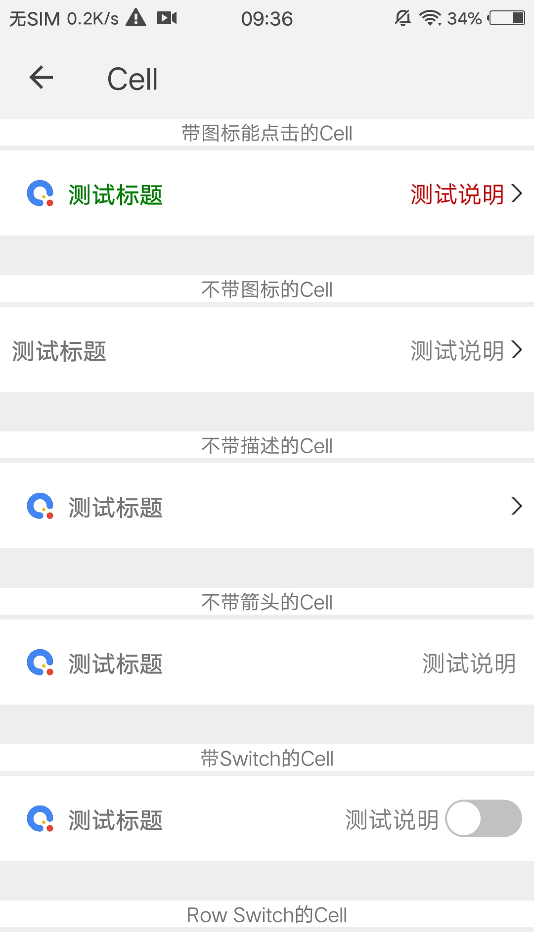
> 单元格组件,可用作展示列表信息
## 预览
 ## 依赖接口
无依赖
## 使用方法
```ux
```
更详细代码可以参考 [qui-cell demo](https://github.com/qapp-ui/qapp-ui/blob/master/src/Cell/index.ux)
### 参数
| 属性名 | 类型 | 是否必填 | 默认值 | 描述 |
|-------------|------------|--------|-----|-----|
| backgroundColor | `String` |`N`| `#FFFFFF` | 背景色 |
| leftImg | `String` |`N`| `-` | 图片url|
| title | `String` |`N`| `-` | 标题 |
| titleColor | `String` |`N`| `-` | 标题颜色|
| desc | `String` |`N`| `-` | 描述 |
| descColor | `String` |`N`| `#808080` | 描述颜色 |
| hasArrow | `String` |`N`| `1` | 是否有箭头,`'1'`表示有,`'0'`表示没有 |
| height | `String` |`N`| `100px` | 高度(direction为row时默认高度是100px,column时默认高度是120px) |
| direction | `String` |`N`| `row` | title和desc的布局 (支持row,column方式) |
### 事件
| 事件名 | 参数 | 描述 |
|----------|-----|-----|
| qui-cell-click | `-` | cell点击事件 |
## 依赖接口
无依赖
## 使用方法
```ux
```
更详细代码可以参考 [qui-cell demo](https://github.com/qapp-ui/qapp-ui/blob/master/src/Cell/index.ux)
### 参数
| 属性名 | 类型 | 是否必填 | 默认值 | 描述 |
|-------------|------------|--------|-----|-----|
| backgroundColor | `String` |`N`| `#FFFFFF` | 背景色 |
| leftImg | `String` |`N`| `-` | 图片url|
| title | `String` |`N`| `-` | 标题 |
| titleColor | `String` |`N`| `-` | 标题颜色|
| desc | `String` |`N`| `-` | 描述 |
| descColor | `String` |`N`| `#808080` | 描述颜色 |
| hasArrow | `String` |`N`| `1` | 是否有箭头,`'1'`表示有,`'0'`表示没有 |
| height | `String` |`N`| `100px` | 高度(direction为row时默认高度是100px,column时默认高度是120px) |
| direction | `String` |`N`| `row` | title和desc的布局 (支持row,column方式) |
### 事件
| 事件名 | 参数 | 描述 |
|----------|-----|-----|
| qui-cell-click | `-` | cell点击事件 |