# qui-switch

> 开/关切换器组件

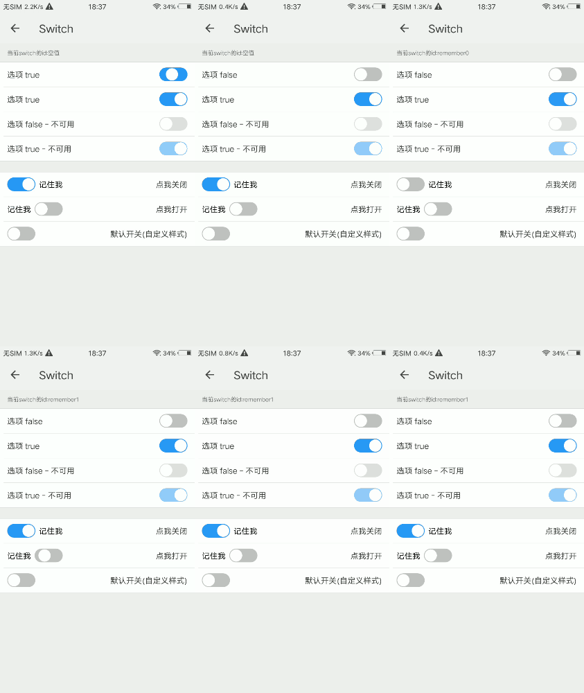
## 预览

<img src="https://qapp-ui.github.io/qapp-ui/docs/assets/qui-switch.gif" width="300"/>

## 依赖接口

无依赖

## 使用方法
	
```ux
<import name='qui-switch' src='@qapp-ui/qui-switch/index'></import>

<template>
    <div class="page-doc">
      <text class="console">当前switch的id:{{text}}</text>
      <div class="item">
        <qui-switch disabled="0" value="{{dataValue}}" id='remember' label='记住我'
         label-margin='20px' is-left="1" @qui-switch-change="callback"></qui-switch>
        <text class="item-dt" @click="checkStatus(0)">点我打开</text>
      </div>
    <div>
</template>

<script>
  export default {
    data: {
      dataValue: '0',
      text: '空值'
    },
    onInit() {
      this.$page.setTitleBar({ text: 'Switch' })
    },
    callback(data) {
      this.text = data.detail.id || '空值'
      if (data.detail.value=="0") {
        this.dataValue = "0"
      }
    },
    checkStatus(type) {
      if (type === 0) {
        this.dataValue = "1"
      }
    }
  }
</script>
```

更详细代码可以参考 [qui-switch demo](https://github.com/qapp-ui/qapp-ui/blob/master/src/Switch/index.ux)

### 参数

| 属性名 | 类型 | 是否必填 | 默认值 | 描述 |
|-------------|------------|--------|-----|-----|
| disabled | `String` |`N`| `0` | 是否可用，`'1'`表示是，`'0'`表示否 |
| value | `String` |`N`| `0` | 是否默认选中，`'1'`表示是，`'0'`表示否 |
| id | `String` |`N`| `-` | id，同显示的标签配合使用，点击标签同样触发效果 |
| label | `String` |`N`| `-` | 显示的标签文字 |
| labelMargin | `String` |`N`| `30px` | 显示的标签文字与切换器之间的距离 |
| labelFontSize | `String` |`N`| `44px` | 显示的标签文字大小 |
| labelColor | `String` |`N`| `#000000` | 显示的标签文字颜色 |
| isLeft | `String` |`N`| `0` | 标签文字是否在左边，默认在右边，`'1'`表示是，`'0'`表示否 |
| checkedColor | `String` |`N`| `#2998F9` | track样式 开状态背景色 |

### 事件

| 事件名 | 参数 | 描述 | 
|-------|-----|-----|
| qui-switch-change | `{id: this.id, value: this.value}` | 开关状态切换响应事件 |