# react-configurable-carousel
A simple and responsive configurable 2D/3D carousel React component to display anything you like!
Latest Update:
Now you can use custom buttons to navigate the carousel!
[Jump to Section - Custom Buttons](#using-custom-elements-as-buttons)
### [Online Storybook Demo](https://daniel-ilin.github.io/react-configurable-carousel/?path=/story/carousel--first-story)
### 3D-Style
### 2D-Style
### Installation
```console
npm install react-configurable-carousel
```
## Code Examples
```js
import { Carousel } from "react-configurable-carousel";
Hello, world!
;
```
### Using custom elements as buttons
Carousel's navigation functionality can be exposed with `useRef` hook
#### JavaScript
```js
const controllerRef = useRef();
;
```
#### TypeScript
```js
import { CarouselControllerHandle } from "react-configurable-carousel"
const controllerRef = useRef(null);
;
```
### Options
`` displays the components passed in as children
It takes the following props:
| Property | Type | Description |
| ---------------------------- | ---------------- | ----------------------------------------------------------------------------- |
| `arrows` | `boolean` | Shows/hides navigation arrows |
| `dotsNavigation` | `boolean` | Shows/hides navigation dots |
| `width` | `string` | CSS Property for carousel width |
| `height` | `string` | CSS Property for carousel height |
| `children?` | `ReactNode` | Components that will be displayed in the Carousel |
| `carouselStyle?` | `"flat" \| "3d"` | Carousel style |
| `dotsNavigationInside?` | `boolean` | Places navigation dots inside of carousel (Defaults to false) |
| `dotNavigationOutlineColor?` | `string` | Navigation dots border color |
| `dotNavigationFillColor?` | `number` | Navigation dots active fill color |
| `autoScrollInterval?` | `number` | Time interval for auto-scro ll. Auto-scroll will be disabled if not specified |
| `autoScrollClickDelay?` | `number` | Time delay for auto-scroll after user interacts with the carousel |
| `outOfFocusDarken?` | `boolean` | Whether the elements that are not currently selected will be darkened (Defaults to false) |
| `ref?` | `React.RefObject` | CarouselControllerHandle that exposes the Carousel navigation functionality |
### Exposed navigation functionality
Type `CarouselControllerHandle` has the following methods:
| Property | Type | Description |
| ---------------------------- | ---------------- | ----------------------------------------------------------------------------- |
| `ShiftLeft` | `() => void` | Shifts the carousel left from current position |
| `ShiftRight` | `() => void` | Shifts the carousel right from current position |
| `JumpToIndex` | `(index: number) => void` | Shifts the carousel to certain index |
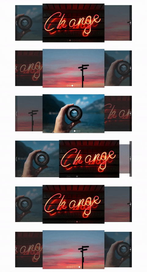 ### 2D-Style
 ### Installation
```console
npm install react-configurable-carousel
```
## Code Examples
```js
import { Carousel } from "react-configurable-carousel";
### Installation
```console
npm install react-configurable-carousel
```
## Code Examples
```js
import { Carousel } from "react-configurable-carousel";