[](http://opensource.org/licenses/MIT)



# 🍟 react-custom-chips 🍟
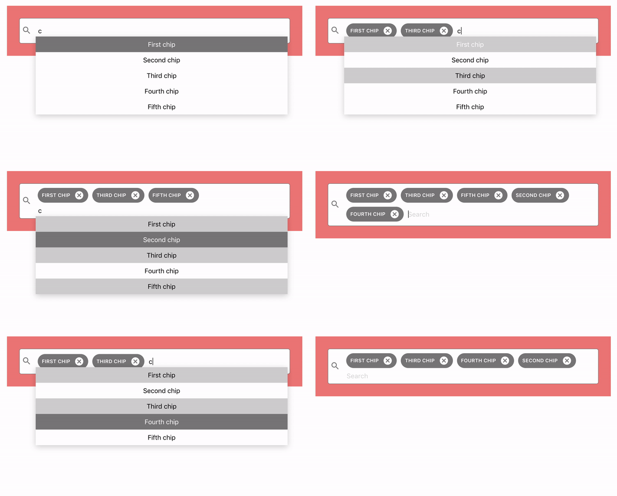
A lightweight and customizable input field which can contain multiple nice aligned "chips" components.
It also provides a debounced input showing the result in a list, which can be controlled with arrow keys.
## Getting Started 🏂
### Install
```
npm i react-custom-chips
```
### Import in component 🖥️
```
import CustomChips from 'react-custom-chips'
```
### Use it as a simple Component 🔑
```
import CustomChips from 'react-custom-chips'
...
const onChange = (chipsData) => {
/* ... */
}
return (
)
```
### Supported properties
```
renderItem?: (selected: boolean, value: ChipData, handleSelect: (val: ChipData) => void) => JSX.Element;
onChange?: (item: ChipData[]) => void;
renderChip?: (chip: RemovableChipData) => JSX.Element;
inputPlaceholder?: string;
chipsData?: ChipData[];
emptyMessage?: string;
fetchSearchSuggestions?: (value: string) => Promise;
searchIcon?: JSX.Element;
suggestionList?: ChipData[];
chipsWrapperClassName?: string;
loadingSpinner?: JSX.Element;
```
### ChipsData Format:
```
id: string
name: string
```
#### renderChip(chip): Element (optional)
A function that gets the data about one chip in the ChipData format and returns a JSX Element which will be the rendered
chip. A default chip element is provided by the component.
#### renderItem(selected, value, handleSelect): Element (optional)
A function that gets the data of one element of the suggestion list and returns an element representing one part
of the rendered suggestionlist.
the selected parameter is boolean representing if the element is selected right now.
the handleSelect function needs to be added to every element in order to make it possible to add it as a chip.
There is also a default element provided by the component.
#### onChange(items): void
A function that gets called when the list of chips has changed. It gets an array of the chipsData, representing the current
status of the chips.
#### inputPlaceholder: string (optional)
The placeholder of the input. There is a text provided by the component
#### chipsData: ChipData[]
An array representing the initial list of chips in the component. Changing this will not update the component.
#### emptyMessage: string (optional)
If the suggestion list is empty there is a text show. This string is representing this text. There is
default text provided by the component.
#### fetchSearchSuggestions(value: string): Promise (optional)
This function gets called when the input changes. It needs to return a promise with the new suggestion list in
the chipsData format. It will get a string which is the text from the input field.
The function is debounced by in input field.
#### searchIcon: Element (optional)
An Element for the left side of the input ( most likely an icon ). There is also a default icon provided
by the component.
#### suggestionList: ChipData[] (optional)
If there is no fetching suggestions function, you can also pass a static list of elements, which will always
be displayed fully, when changing the input field.
#### chipsWrapperClassName: string (optional)
A className for styling the chips wrapper.
#### loadingSpinner: JSX.Element (optional)
Pass in an Element that will be shown as a loading spinner
#### inputClassName: string (optional)
A class that will be added to the input component to be styled.
#### noIcon: boolena (optional)
If set to true the icon in the search will not be shown. By default there
will be a simple search icon.