# react-gauge-component
React Gauge Chart Component for data visualization.
This is forked from [@Martin36/react-gauge-chart](https://github.com/Martin36/react-gauge-chart) [0b24a45](https://github.com/Martin36/react-gauge-chart/pull/131).
🔑Key differences
- Added min/max values
- Added grafana based gauge
- Added arcs limits in value instead of percent
- Added inner/outer ticks to the gauge for reference of the values
- Added blob pointer type
- Added arrow pointer type
- Added tooltips on hover for the arcs
- Added arc with linear gradient colors
- Full responsive
- All render flow fixed and optimized avoiding unecessary resource usage. Performance test, left is original: https://user-images.githubusercontent.com/45375617/239447916-217630e7-8e34-4a3e-a59f-7301471b9855.png
- Refactored project structure to separated files
- Refactored to Typescript
- Added complex objects for better modulation and organization of the project
- Fixed Rerenderings making arcs to be repeated in different sizes
- Fixed needing to set height bug
- Fixed needing to set id bug
# Demo
https://antoniolago.github.io/react-gauge-component/
# Usage
Install it by running `npm install react-gauge-component --save` or `yarn add react-gauge-component`. Then to use it:
```jsx
import GaugeComponent from 'react-gauge-component';
//or
import { GaugeComponent } from 'react-gauge-component';
//Component with default values
```
For next.js you'll have to do dynamic import:
```jsx
import dynamic from "next/dynamic";
const GaugeComponent = dynamic(() => import('react-gauge-component'), { ssr: false });
//Component with default values
```
## Examples
### Simple Gauge.
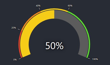
Show Simple Gauge code
### Simple Gauge
```jsx
```
### Custom Bandwidth Gauge.
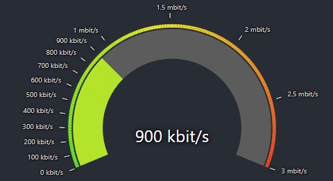
Show Bandwidth Gauge code
### Bandwidth Gauge
```jsx
const kbitsToMbits = (value) => {
if (value >= 1000) {
value = value / 1000;
if (Number.isInteger(value)) {
return value.toFixed(0) + ' mbit/s';
} else {
return value.toFixed(1) + ' mbit/s';
}
} else {
return value.toFixed(0) + ' kbit/s';
}
}
```
### Custom Temperature Gauge
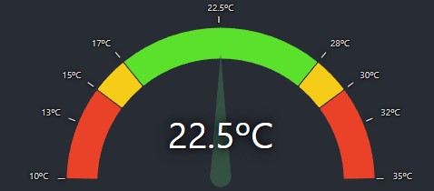
Show Temperature Gauge code
### Temperature Gauge
```jsx
console.log("AAAAAAAAAAAAAAAAAAAAAAAAAAAAAAAA"),
onMouseMove: () => console.log("BBBBBBBBBBBBBBBBBBBBBBBBBBBBBBBB"),
onMouseLeave: () => console.log("CCCCCCCCCCCCCCCCCCCCCCCCCCCCCCCC"),
},
{
limit: 17,
color: '#F5CD19',
showTick: true,
tooltip: {
text: 'Low temperature!'
}
},
{
limit: 28,
color: '#5BE12C',
showTick: true,
tooltip: {
text: 'OK temperature!'
}
},
{
limit: 30, color: '#F5CD19', showTick: true,
tooltip: {
text: 'High temperature!'
}
},
{
color: '#EA4228',
tooltip: {
text: 'Too high temperature!'
}
}
]
}}
pointer={{
color: '#345243',
length: 0.80,
width: 15,
// elastic: true,
}}
labels={{
valueLabel: { formatTextValue: value => value + 'ºC' },
tickLabels: {
type: 'outer',
defaultTickValueConfig: {
formatTextValue: (value: any) => value + 'ºC' ,
style: {fontSize: 10}
},
ticks: [
{ value: 13 },
{ value: 22.5 },
{ value: 32 }
],
}
}}
value={22.5}
minValue={10}
maxValue={35}
/>
```
### Gauge with blob.
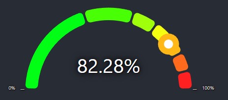
Show Gauge with blob code
### Custom gauge with blob
```jsx
```
### Gradient with arrow gauge.
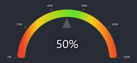
Show Gradient with arrow code
### Custom gradient with arrow
```jsx
```
### Custom radial gauge.
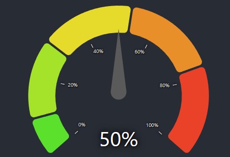
Show Custom Radial Gauge code
### Custom Radial Gauge
```jsx
```
# API
Props:
type: string: The type of the gauge, values can be "grafana", "semicircle and "radial". Default: "grafana".id: string: A unique identifier for the div surrounding the chart. Default: "".className: string: Adds a className to the div container. Default: "gauge-component-class".style: React.CSSProperties: Adds a style object to the div container. Default: {width: 100}.marginInPercent: number | {left: number, right: number, top: number, bottom: number}: Sets the margin for the chart inside the containing SVG element. Default:
"grafana": { top: 0.12, bottom: 0.00, left: 0.07, right: 0.07 }.
"semicircle": { top: 0.08, bottom: 0.00, left: 0.07, right: 0.07 }
"radial": { top: 0.07, bottom: 0.00, left: 0.07, right: 0.07 }value: number: The value of the gauge. Default: 33.minValue: number: The minimum value of the gauge. Default: 0.maxValue: number: The maximum value of the gauge. Default: 100.arc: object: The arc of the gauge.
cornerRadius: number: The corner radius of the arc. Default: 7.padding: number: The padding between subArcs, in rad. Default: 0.05.width: number: The width of the arc given in percent of the radius. Default:
"grafana": 0.25.
"semicircle": 0.15
"radial": 0.2.nbSubArcs: number: The number of subArcs. This overrides subArcs. Default: undefinedcolorArray: Array<string>: The colors of the arcs. This overrides subArcs colors. Default: undefinedemptyColor: string: The default color of the grafana's "empty" subArc color. Default: "#5C5C5C"gradient: boolean: This will draw a single arc with all colors provided in subArcs, using limits as references to draw the linear-gradient result. (limits may not be accurate in this mode) Default: false.subArcs: Array<object>: The subArcs of the gauge.
limit: number: The subArc length using value as reference. When no limits or lengths are defined will auto-calculate remaining arcs limits. Example of valid input: subArcs: [{limit: 50}, {limit: 100}] this will render 2 arcs 50/50length: number: The subArc length in percent of the arc (as the behavior of the original project). Example of
a valid input: subArcs: [{length: 0.50}, {length: 0.50}], this will render 2 arcs 50/50color: string: The subArc color. When not provided, it will use default subArc's colors and interpolate first and last colors when subArcs number is greater than colorArray.showTick: boolean: Whether or not to show the tick. Default: false.tooltip: object: Tooltip object.
text: stringtext that will be displayed in the tooltip when hovering the subArc.style: React.CSSProperties: Overrides tooltip styles.
onClick: (event: any) => void: onClick callback. Default: undefined.onMouseMove: (event: any) => void: onMouseMove callback. Default: undefined.onMouseLeave: (event: any) => void: onMouseLeave callback. Default: undefined.
subArcs default value:
          [
            { limit: 33, color: "#5BE12C"},
            { limit: 66, color: "#F5CD19"},
            { color: "#EA4228"},
          ]
pointer: object: The value pointer of the gauge. Grafana gauge have it's own pointer logic, but animation properties will be applied.
type: string This can be "needle", "blob" or "arrow". Default: "needle"hide: boolean Enabling this flag will hide the pointer. Default: falsecolor: string: The color of the pointer. Default: #464A4FbaseColor: string: The color of the base of the pointer. Default: #464A4Flength: number: The length of the pointer 0-1, 1 being the outer radius length. Default: 0.70animate: boolean: Whether or not to animate the pointer. Default: trueelastic: boolean: Whether or not to use elastic pointer. Default: falseanimationDuration: number: The duration of the pointer animation. Default: 3000animationDelay: number: The delay of the pointer animation. Default: 100width: number: The width of the pointer. Default: 20strokeWidth: number: Only available for blob type. Set the width of the stroke. Default: 8
labels: object: The labels of the gauge.
valueLabel: object: The center value label of the gauge.
matchColorWithArc: boolean: when enabled valueLabel color will match current arc colorformatTextValue: (value: any) => string: The format of the value label. Default: undefined.style: React.CSSProperties: Overrides valueLabel styles. Default: {fontSize: "35px", fill: "#fff", textShadow: "black 1px 1px 0px, black 0px 0px 2.5em, black 0px 0px 0.2em"}maxDecimalDigits: number: this is the number of decimal digits the value will round up to. Default: 2hide: boolean: Whether or not to hide the value label. Default: false.
tickLabels: object The tickLabels of the gauge.
type: string: This makes the ticks "inner" or "outer" the radius. Default:"outer"hideMinMax: boolean: Whether or not to hide the min and max labels. Default: falseticks: Array<object>: The ticks of the gauge. When not provided, it will use default gauge ticks with five values.
value: number: The value of the tick.valueConfig: object: The config of the tick's value label. When not provided, it will use default config.lineConfig: object: The config of the tick's line. When not provided, it will use default config.
defaultTickValueConfig: object: The default config of the tick's value label.
formatTextValue: (value: any) => string: The format of the tick's value label. Default: undefinedstyle: React.CSSProperties: Overrides tick's valueConfig styles. Default: {fontSize: "10px", fill: "#464A4F", textShadow: "black 1px 1px 0px, black 0px 0px 2.5em, black 0px 0px 0.2em"}maxDecimalDigits: number: this is the number of decimal digits the value will round up to. Default: 2hide: boolean: Whether or not to hide the tick's value label. Default: false
defaultTickLineConfig: object: The default config of the tick's line.
width: number: The width of the tick's line. Default: 1length: number: The length of the tick's line. Default: 7color: string: The color of the tick's line. Default: rgb(173 172 171)distanceFromArc: number: The distance of the tick's line from the arc. Default: 3hide: boolean: Whether or not to hide the tick's line. Default: false
##### Colors for the chart
The 'colorArray' prop could either be specified as an array of hex color values, such as `["#FF0000", "#00FF00", "#0000FF"]` where
each arc would a color in the array (colors are assigned from left to right). If that is the case, then the **length of the array**
must match the **number of levels** in the arc.
If the number of colors does not match the number of levels, then the **first** and the **last** color from the colors array will
be selected and the arcs will get colors that are interpolated between those. The interpolation is done using [d3.interpolateHsl](https://github.com/d3/d3-interpolate#interpolateHsl).