# A Gear-style Chart Component for React
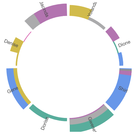
Actively maintained. Welcome to PR/Issue. �� 🤡👉 [Demo](https://noru.github.io/react-gear-chart/storybook-static/index.html) 👈🤡
## Instal
```
npm install react-gear-chart
```
## Usage
```javascript
import GearListChart from 'react-gear-chart'
// in your render() or whatever
```
## Props
Name | Type |Default| Description
--------- | ---- | ------|-----------
startAngle | `number`| | **Required**. Start angle of your chart in degree with [this convention](https://en.wikipedia.org/wiki/Polar_coordinate_system#/media/File:Polar_graph_paper.svg)
endAngle | `number` | | **Required**. End angle of your chart.
innerRadius | `number` | | **Required**. Inner radius of your chart in pixel.
outerRadius | `number` | | **Required**. Outer radius of your chart in pixel.
items | `Array` | | **Required**. Chart data. See [ToothOption](#ToothOption)
margin | `number` | 0 | Default angle between teeth.
mode | `string` |
clockwise | `boolean` | true | The line-up direction of your items(teeth).
animate | `boolean` | true | In-Out animation on/off. Turn off animation to gain performance.
clockwiseAnimate | `boolean` | true | Teeth In/out animation direction.
motionConfig | `object` | {} | Config for react-motion. See [SpringHelperConfig](https://github.com/chenglou/react-motion#helpers)
onClick | `function` | | `click` event handler. Strip data is passed with the event, access it by `evt.stripData` & `evt.strips`
onMouseMove/Leave/Enter/Over | `function` | | Similar to prop `onClick`
extra | `React$Element` | | `props` of a tooth is sent to this function and allow you to render whatever you want over the chart.
### ToothOption
ToothOption is a configuration object with following properties
Name | Type |Default| Description
--------- | ---- | ------|-----------
mode | `string` | `spokerib` | `spokerib`, `layer` or `bar`. See [demo](https://github.build.ge.com/pages/foundry-sh/dew-gear-chart/storybook-static/index.html) for details
label | `string` | | Text to show on a tooth
strips | `object` or `array` | | See [StripOption](#StripOption). Can be a single `StripOption` or an array of `StripOption`
### StripOption
StripOption is a configuration object with following properties
Name | Type |Default| Description
--------- | ---- | ------|-----------
color | `string` | | Valid css color, to fill current strip.
weight | `nubmer` | | Alone with the tooth height (outerRadius - innerRadius), determine the "size" of the current strip, like bar height, or Annulus portion in different mode.
**Note: other properties can be attached to ToothOption/StripOption and accessed n every mouse event hanlder from the event object.**