# React Grid Resizable
> [Demo site](https://react-grid-resizable.netlify.com)
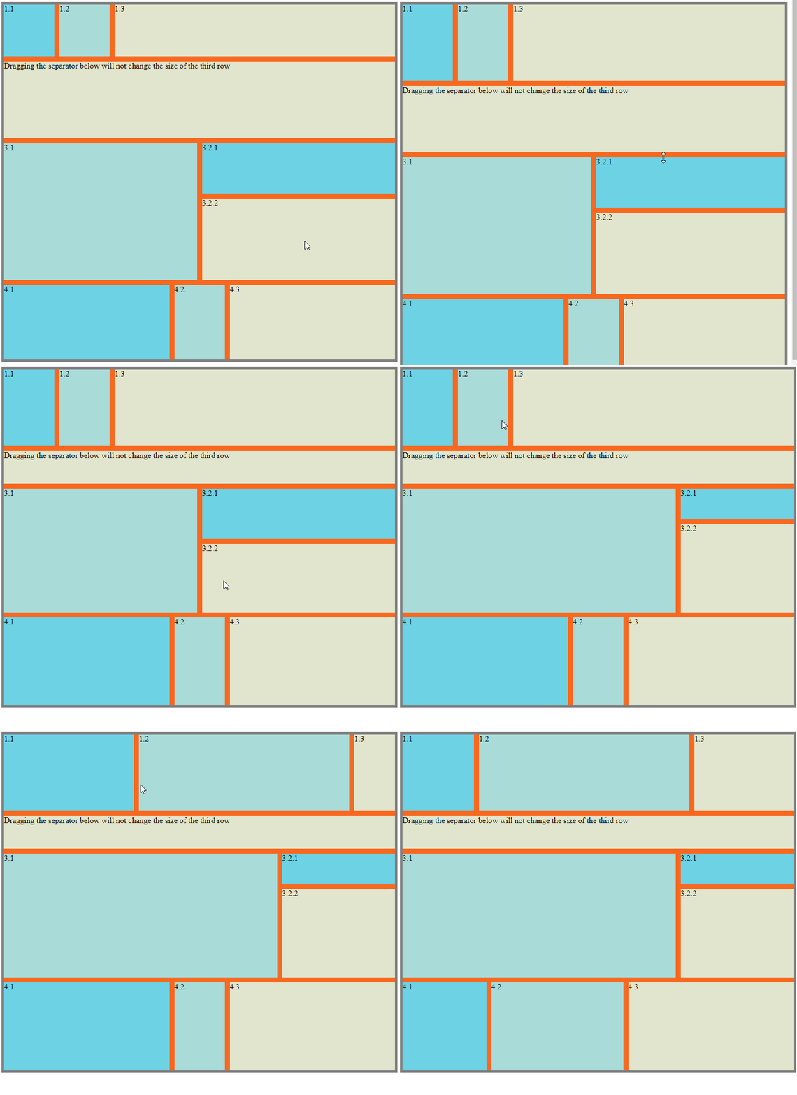
# Install
```
npm install --save netcell/react-grid-resizable
```
# Development
```
npm install
npm start
```
Navigate to the url displayed in the terminal. (Normally `http://localhost:1234`)
# Usage
```js
import { Col, ColsWrapper, Row, RowsWrapper } from '../src';
```
Put multiple `Row` tags inside a `RowsWrapper` tag for a grid of rows and multiple `Col` tags inside a `ColsWrapper` tag for a grid of columns.
```html
// Grid of rows
|
|
|
// Grid of columns
```
These tags can also be nested :
```html
// Columns inside a row
|
// Rows inside a column
|
|
```
## Wrappers
`RowWrapper` and `CellWrapper` tags accept an object props `separatorProps` that allows you to pass `children`, `style` and `className` props to the separators of the grid.
```ts
interface SeparatorDivProps {
style? : CSSProperties;
className? : string;
children? : ReactElement | ReactElement[];
}
```
For example:
```html
```
## Rows & Cols
`Row` and `Col` tags accept `style` and `className` props for customizing the rows and columns.
### Initial Size
`Row` and `Col` tags accept `initialHeight` for `Row` tag and `initialWidth` for `Col` tag to set the initial size of the rendered elements. If these props are omitted, the rendered element will be assigned css property `flex: 1`.
```html
|
```
### Disable Separator
`Row` and `Col` tags accept a set of resize options to disable specific separators from resizing it.
```ts
interface ResizeDirectionOptions {
/**
* Default `true`
* Set to `false` to disable resizing by separator above
*/
top? : boolean;
/**
* Default `true`
* Set to `false` to disable resizing by separator below
*/
bottom? : boolean;
/**
* Default `true`
* Set to `false` to disable resizing by separator on the left
*/
left? : boolean;
/**
* Default `true`
* Set to `false` to disable resizing by separator on the right
*/
right? : boolean;
/**
* Default `false`
* Set to `true` to disable resizing
*/
disabled? : boolean;
}
```
For example:
```html
// This row won't be resized by the separator above it
|
// This column won't be resized by the separator after it
// This column won't be resized at all
```
Setting props `top` and `bottom` doesn't have any effect on `Col` tags and setting props `left` and `right` doesn't have any effect on `Row` tags.