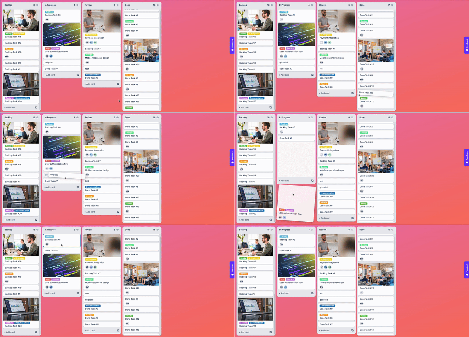
# React Kanban Kit

A flexible and customizable Kanban board component for React applications, built with TypeScript and modern drag-and-drop functionality powered by Atlassian's pragmatic-drag-and-drop.

## Demo

<img src="https://dl.dropboxusercontent.com/scl/fi/18zb79la4t5xgmt07eihn/1758020089915_GIF-ScreenRecording2025-09-16at11.52.15AM-ezgif.com-video-to-gif-converter.gif?rlkey=ikdmkrl4swpcqht09v4fvm3bo&dl=0"/>

Check out the live demo: [https://react-kanban-kit.netlify.app/](https://react-kanban-kit.netlify.app/)

## Features

- 🎯 **Drag and Drop**: Cards and columns with smooth animations
- 📱 **Responsive Design**: Works on desktop, tablet, and mobile
- 🎨 **Highly Customizable**: Custom renderers for cards, headers, footers, and more
- 🔄 **Virtual Scrolling**: Optimized performance for large datasets
- 📦 **TypeScript Support**: Full type safety and IntelliSense
- 🎮 **View-Only Mode**: Disable interactions when needed
- 🎯 **Skeleton Loading**: Built-in loading states with animations
- 🎨 **Custom Styling**: Function-based styling with access to data context
- 🔥 **Modern Architecture**: Built with React hooks and clean separation of concerns

## Installation

```bash
npm install react-kanban-kit
# or
yarn add react-kanban-kit
# or
pnpm add react-kanban-kit
```

## Basic Usage

```tsx
import { Kanban, dropHandler } from "react-kanban-kit";
import type { BoardData } from "react-kanban-kit";

const MyKanbanBoard = () => {
  const [dataSource, setDataSource] = useState<BoardData>({
    root: {
      id: "root",
      title: "Root",
      children: ["col-1", "col-2", "col-3"],
      totalChildrenCount: 3,
      parentId: null,
    },
    "col-1": {
      id: "col-1",
      title: "To Do",
      children: ["task-1", "task-2"],
      totalChildrenCount: 2,
      parentId: "root",
    },
    "col-2": {
      id: "col-2",
      title: "In Progress",
      children: ["task-3"],
      totalChildrenCount: 1,
      parentId: "root",
    },
    "col-3": {
      id: "col-3",
      title: "Done",
      children: ["task-4"],
      totalChildrenCount: 1,
      parentId: "root",
    },
    "task-1": {
      id: "task-1",
      title: "Design Homepage",
      parentId: "col-1",
      children: [],
      totalChildrenCount: 0,
      type: "card",
      content: {
        description: "Create wireframes and mockups for the homepage",
        priority: "high",
      },
    },
    "task-2": {
      id: "task-2",
      title: "Setup Database",
      parentId: "col-1",
      children: [],
      totalChildrenCount: 0,
      type: "card",
    },
    "task-3": {
      id: "task-3",
      title: "Build Auth Flow",
      parentId: "col-2",
      children: [],
      totalChildrenCount: 0,
      type: "card",
    },
    "task-4": {
      id: "task-4",
      title: "Deploy to Production",
      parentId: "col-3",
      children: [],
      totalChildrenCount: 0,
      type: "card",
    },
  });

  const configMap = {
    card: {
      render: ({ data }) => (
        <div className="kanban-card">
          <h3>{data.title}</h3>
          {data.content?.description && <p>{data.content.description}</p>}
          {data.content?.priority && (
            <span className={`priority ${data.content.priority}`}>
              {data.content.priority}
            </span>
          )}
        </div>
      ),
      isDraggable: true,
    },
  };

  return (
    <Kanban
      dataSource={dataSource}
      configMap={configMap}
      onCardMove={(move) => {
        setDataSource(dropHandler(move, dataSource, () => {}));
      }}
    />
  );
};
```

## Advanced Usage

### Custom Card Types and Renderers

```tsx
const configMap = {
  card: {
    render: ({ data, column, index, isDraggable }) => (
      <div className="task-card">
        <h4>{data.title}</h4>
        <p>{data.content?.description}</p>
        <div className="card-footer">
          <span className="assignee">{data.content?.assignee}</span>
          <span className="due-date">{data.content?.dueDate}</span>
        </div>
      </div>
    ),
    isDraggable: true,
  },

  divider: {
    render: ({ data }) => (
      <div className="divider">
        <hr />
        <span>{data.title}</span>
      </div>
    ),
    isDraggable: false,
  },

  footer: {
    render: ({ data, column }) => (
      <button className="add-card-btn">+ Add card to {column.title}</button>
    ),
    isDraggable: false,
  },
};
```

### Custom Column Headers and Footers

```tsx
<Kanban
  dataSource={dataSource}
  configMap={configMap}
  renderColumnHeader={(column) => (
    <div className="custom-header">
      <h3>{column.title}</h3>
      <span className="count">{column.totalChildrenCount}</span>
      <button className="column-menu">⋯</button>
    </div>
  )}
  renderColumnFooter={(column) => (
    <div className="column-footer">
      <button>Add New Card</button>
    </div>
  )}
  // Column adder
  allowColumnAdder={true}
  renderColumnAdder={() => (
    <button className="add-column-btn">+ Add Column</button>
  )}
  // List footer (shown at the bottom of each column's card list)
  allowListFooter={(column) => column.id !== "done"}
  renderListFooter={(column) => (
    <div className="list-footer">
      <button>+ Add another card</button>
    </div>
  )}
/>
```

### Column Drag and Drop

Enable column reordering by dragging column headers. Columns are dragged by their header element and show a placeholder indicator at the drop position.

```tsx
import { Kanban, dropColumnHandler } from "react-kanban-kit";

<Kanban
  dataSource={dataSource}
  configMap={configMap}
  allowColumnDrag
  onColumnMove={(move) => {
    setDataSource(dropColumnHandler(move, dataSource));
  }}
  renderColumnHeader={(column) => (
    <div style={{ cursor: "grab" }}>
      <h3>{column.title}</h3>
    </div>
  )}
/>;
```

#### How it works

- The column **header** is the drag handle users grab the header to drag the entire column
- While dragging, the source column dims (40% opacity), then hides once the cursor leaves it
- A **drop indicator** (column-sized placeholder) appears between columns to show the landing position
- On drop, `onColumnMove` fires with `{ columnId, fromIndex, toIndex }`
- Use the `dropColumnHandler` utility to produce the updated `dataSource`

#### Custom Column Drag Preview

By default, the drag preview is a DOM clone of the column. Override it with `renderColumnDragPreview`:

```tsx
<Kanban
  allowColumnDrag
  renderColumnDragPreview={(column, info) => (
    <div
      style={{
        width: info.state.dragging.width,
        height: info.state.dragging.height,
        backgroundColor: "#fff",
        borderRadius: "12px",
        padding: "12px",
        boxShadow: "0 12px 30px rgba(0,0,0,0.2)",
        transform: "rotate(4deg)",
      }}
    >
      <strong>{column.title}</strong>
      <p>{column.totalChildrenCount} cards</p>
    </div>
  )}
/>
```

#### Custom Column Drop Indicator

By default, the drop indicator is a column-sized placeholder box. Override it with `renderColumnDragIndicator`:

```tsx
<Kanban
  allowColumnDrag
  renderColumnDragIndicator={(column, info) => (
    <div
      style={{
        width: 4,
        height: info.height,
        backgroundColor: "#4a90d9",
        borderRadius: 4,
      }}
    />
  )}
/>
```

The `info` object provides `{ width, height, edge }` where `edge` is `"left"` or `"right"` indicating which side of the target column the indicator appears on.

#### Disable Drag for Specific Columns

Set `isDraggable: false` on individual `BoardItem` entries to lock specific columns in place:

```tsx
const dataSource = {
  // ...
  "col-1": {
    id: "col-1",
    title: "Backlog",
    isDraggable: false, // This column cannot be dragged
    // ...
  },
};
```

### Card Drag and Drop Customization

```tsx
<Kanban
  renderCardDragPreview={(card, info) => (
    <div className="drag-preview">
      <h4>{card.title}</h4>
    </div>
  )}
  renderCardDragIndicator={(card, info) => (
    <div className="drop-indicator" style={{ height: info.height }} />
  )}
  onCardDndStateChange={(info) => {
    if (info.state.type === "is-dragging") {
      // Card is being dragged
    }
  }}
  onColumnDndStateChange={(info) => {
    if (info.state.type === "is-card-over") {
      // A card is being dragged over this column
    }
  }}
/>
```

### Advanced Styling

```tsx
<Kanban
  rootClassName="my-kanban-board"
  rootStyle={{ backgroundColor: "#f5f5f5", padding: "20px" }}
  columnWrapperStyle={(column) => ({
    border: `2px solid ${column.content?.color || "#ddd"}`,
  })}
  columnWrapperClassName={(column) =>
    `column-wrapper ${column.content?.theme || "default"}`
  }
  columnHeaderStyle={(column) => ({
    backgroundColor: column.content?.headerColor || "#f8f9fa",
  })}
  columnStyle={(column) => ({
    minHeight: column.totalChildrenCount > 10 ? "800px" : "400px",
  })}
  columnClassName={(column) =>
    column.totalChildrenCount === 0 ? "empty-column" : "has-items"
  }
  cardWrapperStyle={(card, column) => ({
    opacity: card.content?.archived ? 0.5 : 1,
  })}
  cardWrapperClassName="custom-card-wrapper"
  cardsGap={12}
  columnListContentStyle={(column) => ({
    padding: column.totalChildrenCount === 0 ? "40px 16px" : "8px",
  })}
  columnListContentClassName={(column) =>
    `column-content ${column.totalChildrenCount === 0 ? "empty" : "filled"}`
  }
/>
```

### View-Only Mode

```tsx
<Kanban dataSource={dataSource} configMap={configMap} viewOnly={true} />
```

---

## Infinite Scroll

Infinite scroll lets each column load cards on demand as the user scrolls, instead of loading everything upfront.

### How it works

The library uses `totalChildrenCount` and the actual `children` array to determine how many skeleton placeholders to render. When `totalChildrenCount > children.length`, the board renders skeleton cards to fill the gap. As the user scrolls and those skeletons become visible in the viewport, the library automatically calls your `loadMore(columnId)` callback.

For a full working implementation, see the [Infinite Scroll example in the demo](https://github.com/braiekhazem/react-kanban-kit/tree/main/rkk-demo/src/pages/InfiniteScrollExample) or try it live at [react-kanban-kit.netlify.app](https://react-kanban-kit.netlify.app).

---

## `dropHandler` utility

When a card is dropped, `onCardMove` gives you the move details. Use `dropHandler` to produce the updated `dataSource`:

```tsx
import { dropHandler } from "react-kanban-kit";

onCardMove={(move) => {
  setDataSource(
    dropHandler(
      move,
      dataSource,
      () => {},             // called with the moved card (optional)
      (targetColumn) => ({  // optional: update the target column
        ...targetColumn,
        totalChildrenCount: targetColumn.totalChildrenCount + 1,
      }),
      (sourceColumn) => ({  // optional: update the source column
        ...sourceColumn,
        totalChildrenCount: sourceColumn.totalChildrenCount - 1,
      })
    )
  );
}}
```

## `dropColumnHandler` utility

When a column is dropped, `onColumnMove` gives you the move details. Use `dropColumnHandler` to produce the updated `dataSource`:

```tsx
import { dropColumnHandler } from "react-kanban-kit";

onColumnMove={(move) => {
  setDataSource(dropColumnHandler(move, dataSource));
}}
```

`dropColumnHandler` reorders the `root.children` array to move the column from `fromIndex` to `toIndex`.

---

## Props Reference

### Core Props

| Prop         | Type        | Description                                          |
| ------------ | ----------- | ---------------------------------------------------- |
| `dataSource` | `BoardData` | **Required.** The data structure for the board       |
| `configMap`  | `ConfigMap` | **Required.** Configuration for different card types |
| `viewOnly`   | `boolean`   | Disable all drag and drop interactions               |

### Data Loading

| Prop                 | Type                               | Description                                                               |
| -------------------- | ---------------------------------- | ------------------------------------------------------------------------- |
| `loadMore`           | `(columnId: string) => void`       | Called automatically when skeleton cards scroll into view for that column |
| `renderSkeletonCard` | `({ index, column }) => ReactNode` | Custom skeleton card rendered for items not yet loaded                    |

### Drag and Drop Events

| Prop                     | Type                         | Description                    |
| ------------------------ | ---------------------------- | ------------------------------ |
| `onCardMove`             | `(move: CardMove) => void`   | Fired when a card is dropped   |
| `onColumnMove`           | `(move: ColumnMove) => void` | Fired when a column is dropped |
| `onCardDndStateChange`   | `(info: DndState) => void`   | Card drag state changes        |
| `onColumnDndStateChange` | `(info: DndState) => void`   | Column drag state changes      |

### Drag and Drop Customization

| Prop                        | Type                          | Description                  |
| --------------------------- | ----------------------------- | ---------------------------- |
| `allowColumnDrag`           | `boolean`                     | Enable column reordering     |
| `renderCardDragPreview`     | `(card, info) => ReactNode`   | Custom card drag preview     |
| `renderCardDragIndicator`   | `(card, info) => ReactNode`   | Custom card drop indicator   |
| `renderColumnDragPreview`   | `(column, info) => ReactNode` | Custom column drag preview   |
| `renderColumnDragIndicator` | `(column, info) => ReactNode` | Custom column drop indicator |

### Column Customization

| Prop                  | Type                               | Description                   |
| --------------------- | ---------------------------------- | ----------------------------- |
| `renderColumnHeader`  | `(column: BoardItem) => ReactNode` | Custom column header          |
| `renderColumnFooter`  | `(column: BoardItem) => ReactNode` | Custom column footer          |
| `renderColumnWrapper` | `(column, props) => ReactNode`     | Wrap entire column            |
| `allowColumnAdder`    | `boolean`                          | Show add column button        |
| `renderColumnAdder`   | `() => ReactNode`                  | Custom add column button      |
| `renderListFooter`    | `(column: BoardItem) => ReactNode` | Footer at bottom of card list |
| `allowListFooter`     | `(column: BoardItem) => boolean`   | Show list footer per column   |

### Styling Props (Functions)

| Prop                     | Type                                   | Description                |
| ------------------------ | -------------------------------------- | -------------------------- |
| `columnWrapperStyle`     | `(column: BoardItem) => CSSProperties` | Column wrapper styles      |
| `columnHeaderStyle`      | `(column: BoardItem) => CSSProperties` | Column header styles       |
| `columnStyle`            | `(column: BoardItem) => CSSProperties` | Column inner styles        |
| `columnListContentStyle` | `(column: BoardItem) => CSSProperties` | Column content area styles |
| `cardWrapperStyle`       | `(card, column) => CSSProperties`      | Card wrapper styles        |

### Styling Props (Class Names)

| Prop                         | Type                            | Description          |
| ---------------------------- | ------------------------------- | -------------------- |
| `rootClassName`              | `string`                        | Root container class |
| `columnWrapperClassName`     | `(column: BoardItem) => string` | Column wrapper class |
| `columnHeaderClassName`      | `(column: BoardItem) => string` | Column header class  |
| `columnClassName`            | `(column: BoardItem) => string` | Column inner class   |
| `columnListContentClassName` | `(column: BoardItem) => string` | Column content class |
| `cardWrapperClassName`       | `string`                        | Card wrapper class   |

### Performance & Behavior

| Prop             | Type      | Description                              |
| ---------------- | --------- | ---------------------------------------- |
| `virtualization` | `boolean` | Enable virtual scrolling (default: true) |
| `cardsGap`       | `number`  | Gap between cards in pixels              |

### Event Handlers

| Prop            | Type                  | Description           |
| --------------- | --------------------- | --------------------- |
| `onColumnClick` | `(e, column) => void` | Column click handler  |
| `onCardClick`   | `(e, card) => void`   | Card click handler    |
| `onScroll`      | `(e, column) => void` | Column scroll handler |

---

## Data Structure

### BoardData

```typescript
interface BoardData {
  root: BoardItem;
  [key: string]: BoardItem;
}

interface BoardItem {
  id: string;
  title: string;
  parentId: string | null;
  children: string[]; // IDs of loaded children
  totalChildrenCount: number; // Real total (including unloaded items)
  content?: any; // Your custom data
  type?: keyof ConfigMap; // Card type key into configMap
  isDraggable?: boolean; // Override per-item draggability
}
```

### ConfigMap

```typescript
type ConfigMap = {
  [type: string]: {
    render: (props: CardRenderProps) => React.ReactNode;
    isDraggable?: boolean;
  };
};

type CardRenderProps = {
  data: BoardItem;
  column: BoardItem;
  index: number;
  isDraggable: boolean;
};
```

---

## Event Types

### CardMove

```typescript
interface CardMove {
  cardId: string;
  fromColumnId: string;
  toColumnId: string;
  taskAbove: string | null;
  taskBelow: string | null;
  position: number;
}
```

### ColumnMove

```typescript
interface ColumnMove {
  columnId: string;
  fromIndex: number;
  toIndex: number;
}
```

---

## CSS Classes

```css
.rkk-board {
} /* Root board container */
.rkk-column-outer {
} /* Column outer wrapper */
.rkk-column {
} /* Column inner container */
.rkk-column-header {
} /* Column header area */
.rkk-column-content {
} /* Column scrollable area */
.rkk-column-content-list {
} /* Virtual / normal list */
.rkk-generic-item-wrapper {
} /* Wrapper around each card */
.rkk-card-outer {
} /* Card outer element */
.rkk-card-inner {
} /* Card inner draggable element */
.rkk-card-shadow {
} /* Card drop position indicator */
.rkk-column-shadow-container {
} /* Column drop indicator wrapper */
.rkk-column-shadow {
} /* Column drop position indicator */
.rkk-skeleton {
} /* Default skeleton card */
```

---

## TypeScript Support

```typescript
import type {
  BoardData,
  BoardItem,
  ConfigMap,
  CardRenderProps,
  BoardProps,
} from "react-kanban-kit";
```

## Contributing

Contributions are welcome! Please feel free to submit a Pull Request.

## License

MIT © Hazem braiek
