# React Multi-Segment Progress
A **flexible and reusable circular progress component** with multiple segments, customizable colors, and a smooth UI. Ideal for visualizing segmented progress bars with gaps and labels inside the circle.
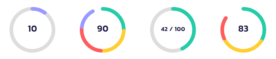
---
## 🚀 Installation
Install the package via npm or yarn:
```sh
npm install react-multi-segment-circle-progress
```
or
```sh
yarn add react-multi-segment-circle-progress
```
---
## 🔧 Usage
Import and use the `MultiSegmentAuto` component in your project:
```tsx
import React from "react";
import { MultiSegmentAuto } from "react-multi-segment-circle-progress";
const App = () => {
return (
);
};
export default App;
```
---
## 🎨 Examples
### 1️⃣ **Basic Usage**
```tsx
```
### 2️⃣ **With Gaps & Custom Stroke Width**
```tsx
```
### 3️⃣ **With Custom Label**
```tsx
70%}
/>
```
### 4️⃣ **With Background Circle**
```tsx
42 / 100}
/>
```
---
## 🎛️ Props
| Prop | Type | Default | Description |
|------|------|---------|-------------|
| `size` | `number` | `120` | Diameter of the circle (px) |
| `strokeWidth` | `number` | `10` | Thickness of the progress stroke |
| `totalValue` | `number` | `80` | The current value of the progress |
| `maxValue` | `number` | `100` | The maximum value for progress calculation |
| `segmentsCount` | `number` | `4` | Number of segments in the progress circle |
| `segmentColors` | `string[]` | `[#24CCA7, #FFCE31, #FF5C5C, #9999FF]` | Colors for each segment |
| `gap` | `number` | `2` | Gap size between segments (px) |
| `label` | `React.ReactNode` | `""` | Custom label in the center of the circle |
| `outerPadding` | `number` | `0` | Padding between SVG boundary and outermost stroke |
| `innerPadding` | `number` | `0` | Padding inside the progress ring |
| `strokeLinecap` | `"butt" \| "round" \| "square"` | `"round"` | Shape of segment ends |
| `showBackgroundCircle` | `boolean` | `false` | Show a background track circle |
| `backgroundCircleColor` | `string` | `"#ddd"` | Color of the background track |
| `className` | `string` | `""` | Custom class for styling |
| `style` | `React.CSSProperties` | `{}` | Inline styles for the SVG |
| `onClick` | `function` | `undefined` | Click event handler |
| `onMouseEnter` | `function` | `undefined` | Mouse enter event handler |
| `onMouseLeave` | `function` | `undefined` | Mouse leave event handler |
---
## 📌 Notes
- Ensure `totalValue <= maxValue` to avoid unexpected behavior.
- `segmentColors` will cycle through if there are fewer colors than segments.
- Use `strokeLinecap="round"` for smooth segment ends.
- The `label` prop accepts **text or JSX elements**, so you can pass icons, numbers, or custom designs.
---
## 🌎 Links
- **GitHub Repository:** [github.com/react-multi-segment-circle-progress](https://github.com/ehsanmolaei991/react-multi-segment-circle-progress)
- **NPM Package:** [npmjs.com/package/react-multi-segment-circle-progress](https://npmjs.com/package/react-multi-segment-circle-progress)
---
## 📜 License
MIT © 2025 ehsanmolaei991