# react-native-advanced-select
[](https://www.npmjs.com/package/react-native-advanced-select) [](LICENSE)
> Simple select component with in-built search for React-Native.
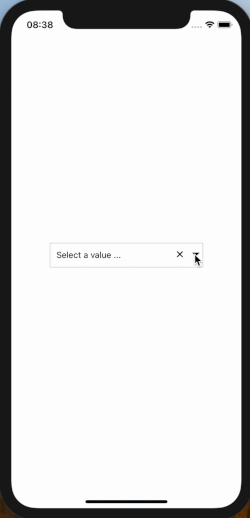
## Demo
 ## Installation
```bash
$ npm install react-native-advanced-select --save
```
or use yarn
```bash
$ yarn add react-native-advanced-select
```
## Usage
Note: Ensure to add and configure [react-native-vector-icons](https://github.com/oblador/react-native-vector-icons) to your project before using this package.
The snippet below shows how the component can be used
```javascript
import React from 'react';
import { View, Text } from 'react-native';
import Select from 'react-native-advanced-select';
class SelectExample extends React.Component {
constructor(props, state) {
super(props, state);
this.state = {
selectedKey: '',
items: [
{ myKey: 1, myLabel: "Fruits" },
{ myKey: 2, myLabel: "Red Apples" },
{ myKey: 3, myLabel: "Cherries" },
{ myKey: 4, myLabel: "Cranberries" },
{ myKey: 5, myLabel: "Pink Grapefruit" },
{ myKey: 6, myLabel: "Raspberries" },
{ myKey: 7, myLabel: "Vegetables" },
{ myKey: 8, myLabel: "Beets" },
{ myKey: 9, myLabel: "Red Peppers" },
{ myKey: 10, myLabel: "Radishes" },
{ myKey: 11, myLabel: "Radicchio" },
{ myKey: 12, myLabel: "Red Onions" },
{ myKey: 13, myLabel: "Red Potatoes" },
{ myKey: 14, myLabel: "Rhubarb" },
{ myKey: 15, myLabel: "Tomatoes" }
]
};
}
onSelectedItemsChange = (item, index) => {
const key = item.myKey
this.setState({ selectedKey: key });
};
render() {
const { selectedKey, items } = this.state;
return (
);
}
}
```
## Props
| Prop Name | Prop Type | Default Values | Description |
|:-----------------------:|:----------------:|:--------------------------------:|:-------------------------------------------------------------------------------------------------------------:|
| onSelect | func | (item, index) => {} | Callback function invoked on option select that takes (selectedOptionItem, selectedOptionindex) as parameters |
| placeholder | string | Select | Text to show as default text |
| searchPlaceholder | string | Search | Text to show as default search text |
| style | object | {} | To style the select box |
| optionTextStyle | object | {} | To style the text shown in the box |
| optionContainerStyle | object | {} | To style the options shown |
| search | bool | false | Use search in Component |
| selectedKey | string or number | "" | Key of the item which is selected whose label will be displayed |
| parentScrollEnable | func | null | Hack for Android nested ScrollView |
| parentScrollDisable | func | null | Hack for Android nested ScrollView |
| keyExtractor | func | (item) => item.key \|\| "" | Function that extracts the key to uniquely identify an item |
| labelExtractor | func | (item) => item.label \|\| "" | Function that extracts the label to be displayed for an item |
| disabled | bool | false | To disable dropdown toggle/click |
| disabledTextStyle | object | { color: 'lightgrey' } | To style text displayed when disabled is true |
| optionNumberOfLines | number | 1 | To set certain number of lines to text rendered in select value and select options' labels |
| placeholderTextStyle | object | {} | To style the placeholder text displayed when no option is selected |
| showCustomRightIconView | boolean | false | To decide if you want to render custom right icon for dropdown or not |
| customRightIconView | func | null | To render custom right icon view in dropdown |
| selectedRowStyle | object | { backgroundColor: '#D1D1D6FF' } | To style the selected option view when dropdown is opened |
## Installation
```bash
$ npm install react-native-advanced-select --save
```
or use yarn
```bash
$ yarn add react-native-advanced-select
```
## Usage
Note: Ensure to add and configure [react-native-vector-icons](https://github.com/oblador/react-native-vector-icons) to your project before using this package.
The snippet below shows how the component can be used
```javascript
import React from 'react';
import { View, Text } from 'react-native';
import Select from 'react-native-advanced-select';
class SelectExample extends React.Component {
constructor(props, state) {
super(props, state);
this.state = {
selectedKey: '',
items: [
{ myKey: 1, myLabel: "Fruits" },
{ myKey: 2, myLabel: "Red Apples" },
{ myKey: 3, myLabel: "Cherries" },
{ myKey: 4, myLabel: "Cranberries" },
{ myKey: 5, myLabel: "Pink Grapefruit" },
{ myKey: 6, myLabel: "Raspberries" },
{ myKey: 7, myLabel: "Vegetables" },
{ myKey: 8, myLabel: "Beets" },
{ myKey: 9, myLabel: "Red Peppers" },
{ myKey: 10, myLabel: "Radishes" },
{ myKey: 11, myLabel: "Radicchio" },
{ myKey: 12, myLabel: "Red Onions" },
{ myKey: 13, myLabel: "Red Potatoes" },
{ myKey: 14, myLabel: "Rhubarb" },
{ myKey: 15, myLabel: "Tomatoes" }
]
};
}
onSelectedItemsChange = (item, index) => {
const key = item.myKey
this.setState({ selectedKey: key });
};
render() {
const { selectedKey, items } = this.state;
return (
);
}
}
```
## Props
| Prop Name | Prop Type | Default Values | Description |
|:-----------------------:|:----------------:|:--------------------------------:|:-------------------------------------------------------------------------------------------------------------:|
| onSelect | func | (item, index) => {} | Callback function invoked on option select that takes (selectedOptionItem, selectedOptionindex) as parameters |
| placeholder | string | Select | Text to show as default text |
| searchPlaceholder | string | Search | Text to show as default search text |
| style | object | {} | To style the select box |
| optionTextStyle | object | {} | To style the text shown in the box |
| optionContainerStyle | object | {} | To style the options shown |
| search | bool | false | Use search in Component |
| selectedKey | string or number | "" | Key of the item which is selected whose label will be displayed |
| parentScrollEnable | func | null | Hack for Android nested ScrollView |
| parentScrollDisable | func | null | Hack for Android nested ScrollView |
| keyExtractor | func | (item) => item.key \|\| "" | Function that extracts the key to uniquely identify an item |
| labelExtractor | func | (item) => item.label \|\| "" | Function that extracts the label to be displayed for an item |
| disabled | bool | false | To disable dropdown toggle/click |
| disabledTextStyle | object | { color: 'lightgrey' } | To style text displayed when disabled is true |
| optionNumberOfLines | number | 1 | To set certain number of lines to text rendered in select value and select options' labels |
| placeholderTextStyle | object | {} | To style the placeholder text displayed when no option is selected |
| showCustomRightIconView | boolean | false | To decide if you want to render custom right icon for dropdown or not |
| customRightIconView | func | null | To render custom right icon view in dropdown |
| selectedRowStyle | object | { backgroundColor: '#D1D1D6FF' } | To style the selected option view when dropdown is opened |