# react-native-beauty-tabs
A lightweight and customizable tab navigation component for React Native, built with full Expo support. Perfect for creating beautiful tabbed interfaces, modals, action sheets, and more — with smooth animations and flexible styling.
---
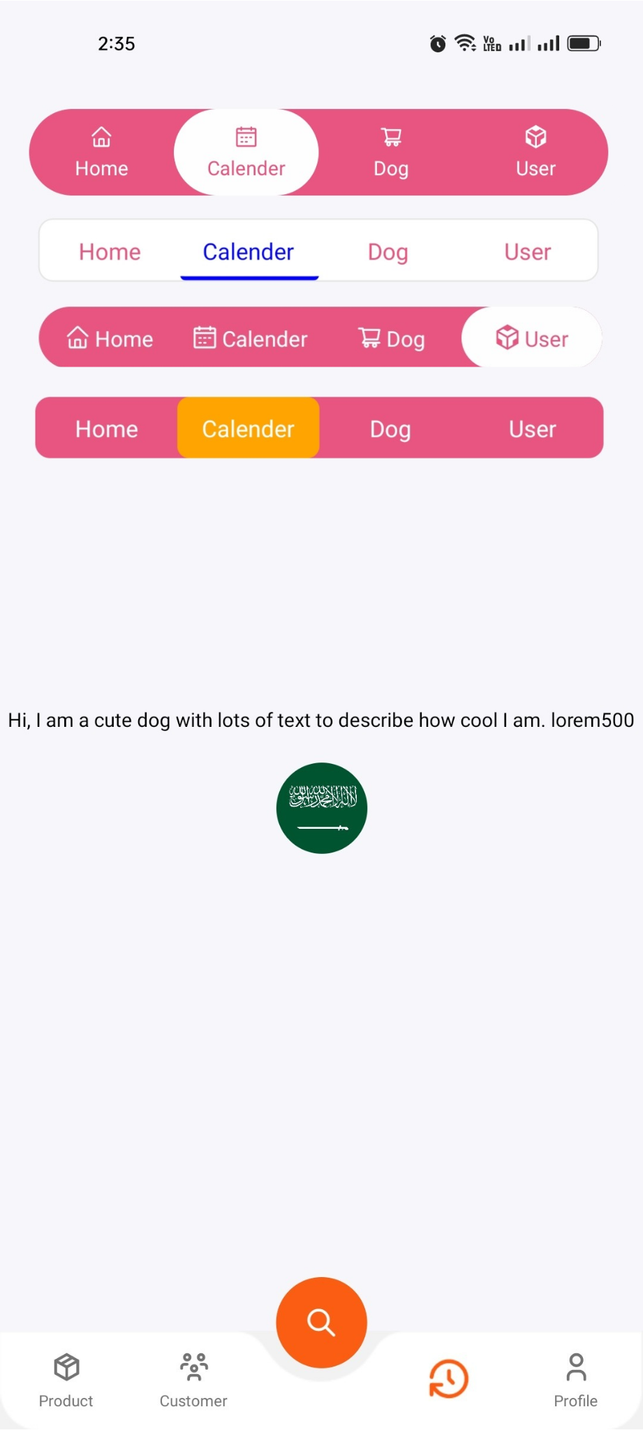
## ✨ Features
- ⚡ Built for Expo & React Native
- 🎯 Smooth animations
- 💅 Fully customizable tabs and styling
- 🧩 Icon support for each tab
📐 Dynamic width ratio support
---
## 🐱🏍 Coming Soon
🔄 More exciting features are on the way!
🛠️ Planned updates include new enhancements and improved performance.
---
## 🤳 Best Practices
. If you encounter an error, stop the Terminal and run the project again.
---
## 🖼 Demo Screenshot
 ---
## 🔗 Connect with me
- 🌐 [Portfolio Website](https://www.expertsquad.net)
- ✨ [Facebook](https://www.facebook.com/naem.nizam.2024)
- 💻 [GitHub](https://github.com/nizamuddin15bd)
---
## 📦 Installation
```bash
npm install react-native-beauty-tabs
# or
yarn add react-native-beauty-tabs
```
## 🧪 Example Usage
```tsx
import React from "react";
import { View, Text } from "react-native";
import { AntDesign } from "@expo/vector-icons";
import { NativeTabs } from "react-native-beauty-tabs";
const Example = () => {
return (
,
Content: (
Your Content
),
},
{
label: "Calendar",
Icons: ,
Content: (
Your Content
),
},
{
label: "Cart",
Icons: ,
Content: (
Your Content
),
},
{
label: "Profile",
Icons: ,
Content: (
Your Content
),
},
]}
/>
);
};
export default Example;
```
## ⚙️ Props
| Prop | Type | Default | Description |
| -------------------- | ----------- | ----------- | ------------------------------------------------------------------- |
| `Tabs` | `Tab[]` | `[]` | Array of tab objects (label, Icons, Content) |
| `ContainerStyle` | `ViewStyle` | `null` | Style for the main container |
| `Tabcontainer` | `ViewStyle` | `null` | Style for the tab wrapper container |
| `TabsRowStyle` | `ViewStyle` | `null` | Style for the row of tabs |
| `IndicatorStyle` | `ViewStyle` | `null` | Style for the active tab indicator |
| `TabTextStyle` | `TextStyle` | `null` | Style applied to each tab label text |
| `ActiveTextColors` | `string` | `"#fff"` | Text color for the active tab |
| `InActiveTextColors` | `string` | `"#007aff"` | Text color for inactive tabs |
| `TabContentStyle` | `ViewStyle` | `null` | Style for each tab's icon + label container |
| `PageContentStyle` | `ViewStyle` | `null` | Style for the tab content wrapper |
| `widthRatio` | `number` | `0.9` | Width ratio of the whole tab layout (0–1, relative to screen width) |
---
## 🔗 Connect with me
- 🌐 [Portfolio Website](https://www.expertsquad.net)
- ✨ [Facebook](https://www.facebook.com/naem.nizam.2024)
- 💻 [GitHub](https://github.com/nizamuddin15bd)
---
## 📦 Installation
```bash
npm install react-native-beauty-tabs
# or
yarn add react-native-beauty-tabs
```
## 🧪 Example Usage
```tsx
import React from "react";
import { View, Text } from "react-native";
import { AntDesign } from "@expo/vector-icons";
import { NativeTabs } from "react-native-beauty-tabs";
const Example = () => {
return (
,
Content: (
Your Content
),
},
{
label: "Calendar",
Icons: ,
Content: (
Your Content
),
},
{
label: "Cart",
Icons: ,
Content: (
Your Content
),
},
{
label: "Profile",
Icons: ,
Content: (
Your Content
),
},
]}
/>
);
};
export default Example;
```
## ⚙️ Props
| Prop | Type | Default | Description |
| -------------------- | ----------- | ----------- | ------------------------------------------------------------------- |
| `Tabs` | `Tab[]` | `[]` | Array of tab objects (label, Icons, Content) |
| `ContainerStyle` | `ViewStyle` | `null` | Style for the main container |
| `Tabcontainer` | `ViewStyle` | `null` | Style for the tab wrapper container |
| `TabsRowStyle` | `ViewStyle` | `null` | Style for the row of tabs |
| `IndicatorStyle` | `ViewStyle` | `null` | Style for the active tab indicator |
| `TabTextStyle` | `TextStyle` | `null` | Style applied to each tab label text |
| `ActiveTextColors` | `string` | `"#fff"` | Text color for the active tab |
| `InActiveTextColors` | `string` | `"#007aff"` | Text color for inactive tabs |
| `TabContentStyle` | `ViewStyle` | `null` | Style for each tab's icon + label container |
| `PageContentStyle` | `ViewStyle` | `null` | Style for the tab content wrapper |
| `widthRatio` | `number` | `0.9` | Width ratio of the whole tab layout (0–1, relative to screen width) |