# react-native-cn-richtext-editor
> ## Deprecated. Use [react-native-cn-quill](https://github.com/imnapo/react-native-cn-quill#readme) instead.
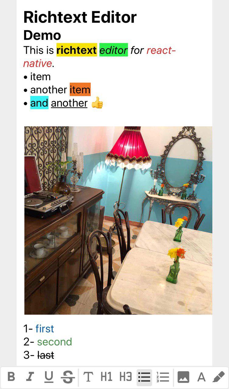
Richtext editor for react native
 ## Installation
#### Install using npm:
```
npm i react-native-cn-richtext-editor
```
#### Install using yarn:
```
yarn add react-native-cn-richtext-editor
```
### Usage
Here is a simple overview of our components usage.
``` jsx
import React, { Component } from 'react';
import { View, StyleSheet, Keyboard
, TouchableWithoutFeedback, Text
, KeyboardAvoidingView } from 'react-native';
import CNRichTextEditor , { CNToolbar, getInitialObject , getDefaultStyles } from "react-native-cn-richtext-editor";
const defaultStyles = getDefaultStyles();
class App extends Component {
constructor(props) {
super(props);
this.state = {
selectedTag : 'body',
selectedStyles : [],
value: [getInitialObject()]
};
this.editor = null;
}
onStyleKeyPress = (toolType) => {
this.editor.applyToolbar(toolType);
}
onSelectedTagChanged = (tag) => {
this.setState({
selectedTag: tag
})
}
onSelectedStyleChanged = (styles) => {
this.setState({
selectedStyles: styles,
})
}
onValueChanged = (value) => {
this.setState({
value: value
});
}
render() {
return (
this.editor = input}
onSelectedTagChanged={this.onSelectedTagChanged}
onSelectedStyleChanged={this.onSelectedStyleChanged}
value={this.state.value}
style={{ backgroundColor : '#fff'}}
styleList={defaultStyles}
onValueChanged={this.onValueChanged}
/>
image
}]
},
{
type: 'tool',
iconArray: [{
toolTypeText: 'bold',
buttonTypes: 'style',
iconComponent:
bold
}]
},
{
type: 'seperator'
},
{
type: 'tool',
iconArray: [
{
toolTypeText: 'body',
buttonTypes: 'tag',
iconComponent:
body
},
]
},
{
type: 'tool',
iconArray: [
{
toolTypeText: 'ul',
buttonTypes: 'tag',
iconComponent:
ul
}
]
},
{
type: 'tool',
iconArray: [
{
toolTypeText: 'ol',
buttonTypes: 'tag',
iconComponent:
ol
}
]
},
]}
selectedTag={this.state.selectedTag}
selectedStyles={this.state.selectedStyles}
onStyleKeyPress={this.onStyleKeyPress}
/>
);
}
}
var styles = StyleSheet.create({
main: {
flex: 1,
marginTop: 10,
paddingLeft: 30,
paddingRight: 30,
paddingBottom: 1,
alignItems: 'stretch',
},
toolbarButton: {
fontSize: 20,
width: 28,
height: 28,
textAlign: 'center'
},
italicButton: {
fontStyle: 'italic'
},
boldButton: {
fontWeight: 'bold'
},
underlineButton: {
textDecorationLine: 'underline'
},
lineThroughButton: {
textDecorationLine: 'line-through'
},
});
export default App;
```
## More Advanced TextEditor
You need to put more effort :) to use more advanced features of CNRichTextEditor such as:
- Image Uploading
- Highlighting Text
- Change Text Color
Actually we did not implement 'Toolbar buttons and menus' and 'Image Uploading Process' because it totally depends on using expo or pure react-native and also what other packages you prefer to use.
To see an example of how to implement more advanced feature of this editor please check this [Link](https://github.com/imnapo/react-native-cn-richtext-editor/blob/master/expo-demo/App.js).
Also be noticed that this example is writen with expo and required 'react-native-popup-menu' package.
## API
### CNRichTextEditor
#### Props
| Name | Description | Required |
| ------ | ----------- | ---- |
| onSelectedTagChanged | this event triggers when selected tag of editor is changed. | No |
| onSelectedStyleChanged | this event triggers when selected style of editor is changed. | No |
| onValueChanged | this event triggers when value of editor is changed. | No |
| onRemoveImage | this event triggers when an image is removed. Callback param in the form `{ url, id }`. | No |
| value | an array object which keeps value of the editor | Yes |
| styleList | an object consist of styles name and values (use getDefaultStyles function) | Yes |
| ImageComponent | a React component (class or functional) which will be used to render images. Will be passed `style` and `source` props. | No |
| style | Styles applied to the outermost component. | No |
| textInputStyle | TextInput style | No |
| contentContainerStyle | Styles applied to the scrollview content. | No |
| onFocus | Callback that is called when one of text inputs are focused. | No |
| onBlur | Callback that is called when one of text inputs are blurred. | No |
| placeholder | The string that will be rendered before text input has been entered. | No |
| textInputProps | An object containing additional props to be passed to the TextInput component| No |
#### Instance methods
| Name | Params | Description |
| ------ | ---- | ----------- |
| applyToolbar | `toolType` | Apply the given transformation to selected text. |
| insertImage | `uri, id?, height?, width?` | Insert the provided image where cursor is positionned. |
| focus | | Focus to the last `TextInput` |
### CNToolbar
#### Props
| Name | Required | Description |
| ------ | ------ | ----------- |
| selectedTag | Yes | selected tag of the editor |
| selectedStyles | Yes | selected style of the editor |
| onStyleKeyPress | Yes | this event triggers when user press one of toolbar keys |
| size | No | font size of toolbar buttons |
| bold | No | a component which renders as bold button (as of 1.0.41, this prop is deprecated) |
| italic | No | a component which renders as italic button (as of 1.0.41, this prop is deprecated) |
| underline | No | a component which renders as underline button (as of 1.0.41, this prop is deprecated) |
| lineThrough | No | a component which renders as lineThrough button (as of 1.0.41, this prop is deprecated) |
| body | No | a component which renders as body button (as of 1.0.41, this prop is deprecated) |
| title | No | a component which renders as title button (as of 1.0.41, this prop is deprecated) |
| ul | No | a component which renders as ul button (as of 1.0.41, this prop is deprecated) |
| ol | No | a component which renders as ol button (as of 1.0.41, this prop is deprecated) |
| image | No | a component which renders as image button (as of 1.0.41, this prop is deprecated) |
| highlight | No | a component which renders as highlight button (as of 1.0.41, this prop is deprecated) |
| foreColor | No | a component which renders as foreColor button (as of 1.0.41, this prop is deprecated) |
| style | No | style applied to container |
| color | No | default color passed to icon |
| backgroundColor | No | default background color passed to icon |
| selectedColor | No | color applied when icon is selected |
| selectedBackgroundColor | No | background color applied when icon is selected |
| iconContainerStyle | No | a style prop assigned to icon container |
| iconSet | Yes | array of icons to display |
| iconSetContainerStyle | No | a style props assigned to icon set container|
### CNRichTextView
#### Props
| Name | Required | Description |
| ------ | ------ | ----------- |
| text | Yes | html string (created by convertToHtmlString function |
| style | No | style applied to container (req. {flex:1}) |
| styleList | No | an object consist of styles name and values (use getDefaultStyles function) |
### Functions
| Name | Param | Returns | Description |
| ------ | ------ | ------ |----------- |
| getInitialObject | - | javascript object | create a initial value for the editor. |
| convertToHtmlString | array | string | this function converts value of editor to html string (use it to keep value as html in db) |
| convertToObject | string | array | converts html back to array for RichTextEditor value (use this function only for html string created by convertToHtmlString function) |
| getDefaultStyles | - | javascript object | creates required styles for the editor. |
## Expo Demo App
Checkout the
[expo-demo App](https://expo.io/@imnapo/expo-demo)
on Expo which uses react-native-cn-richtext-editor components.
If you are looking to test and run expo-demo App locally, click
[here](https://github.com/imnapo/react-native-cn-richtext-editor/tree/master/expo-demo) to
view the implementation & run it locally.
## License
[MIT](https://github.com/imnapo/react-native-cn-richtext-editor/blob/master/LICENSE)
## Installation
#### Install using npm:
```
npm i react-native-cn-richtext-editor
```
#### Install using yarn:
```
yarn add react-native-cn-richtext-editor
```
### Usage
Here is a simple overview of our components usage.
``` jsx
import React, { Component } from 'react';
import { View, StyleSheet, Keyboard
, TouchableWithoutFeedback, Text
, KeyboardAvoidingView } from 'react-native';
import CNRichTextEditor , { CNToolbar, getInitialObject , getDefaultStyles } from "react-native-cn-richtext-editor";
const defaultStyles = getDefaultStyles();
class App extends Component {
constructor(props) {
super(props);
this.state = {
selectedTag : 'body',
selectedStyles : [],
value: [getInitialObject()]
};
this.editor = null;
}
onStyleKeyPress = (toolType) => {
this.editor.applyToolbar(toolType);
}
onSelectedTagChanged = (tag) => {
this.setState({
selectedTag: tag
})
}
onSelectedStyleChanged = (styles) => {
this.setState({
selectedStyles: styles,
})
}
onValueChanged = (value) => {
this.setState({
value: value
});
}
render() {
return (
this.editor = input}
onSelectedTagChanged={this.onSelectedTagChanged}
onSelectedStyleChanged={this.onSelectedStyleChanged}
value={this.state.value}
style={{ backgroundColor : '#fff'}}
styleList={defaultStyles}
onValueChanged={this.onValueChanged}
/>
image
}]
},
{
type: 'tool',
iconArray: [{
toolTypeText: 'bold',
buttonTypes: 'style',
iconComponent:
bold
}]
},
{
type: 'seperator'
},
{
type: 'tool',
iconArray: [
{
toolTypeText: 'body',
buttonTypes: 'tag',
iconComponent:
body
},
]
},
{
type: 'tool',
iconArray: [
{
toolTypeText: 'ul',
buttonTypes: 'tag',
iconComponent:
ul
}
]
},
{
type: 'tool',
iconArray: [
{
toolTypeText: 'ol',
buttonTypes: 'tag',
iconComponent:
ol
}
]
},
]}
selectedTag={this.state.selectedTag}
selectedStyles={this.state.selectedStyles}
onStyleKeyPress={this.onStyleKeyPress}
/>
);
}
}
var styles = StyleSheet.create({
main: {
flex: 1,
marginTop: 10,
paddingLeft: 30,
paddingRight: 30,
paddingBottom: 1,
alignItems: 'stretch',
},
toolbarButton: {
fontSize: 20,
width: 28,
height: 28,
textAlign: 'center'
},
italicButton: {
fontStyle: 'italic'
},
boldButton: {
fontWeight: 'bold'
},
underlineButton: {
textDecorationLine: 'underline'
},
lineThroughButton: {
textDecorationLine: 'line-through'
},
});
export default App;
```
## More Advanced TextEditor
You need to put more effort :) to use more advanced features of CNRichTextEditor such as:
- Image Uploading
- Highlighting Text
- Change Text Color
Actually we did not implement 'Toolbar buttons and menus' and 'Image Uploading Process' because it totally depends on using expo or pure react-native and also what other packages you prefer to use.
To see an example of how to implement more advanced feature of this editor please check this [Link](https://github.com/imnapo/react-native-cn-richtext-editor/blob/master/expo-demo/App.js).
Also be noticed that this example is writen with expo and required 'react-native-popup-menu' package.
## API
### CNRichTextEditor
#### Props
| Name | Description | Required |
| ------ | ----------- | ---- |
| onSelectedTagChanged | this event triggers when selected tag of editor is changed. | No |
| onSelectedStyleChanged | this event triggers when selected style of editor is changed. | No |
| onValueChanged | this event triggers when value of editor is changed. | No |
| onRemoveImage | this event triggers when an image is removed. Callback param in the form `{ url, id }`. | No |
| value | an array object which keeps value of the editor | Yes |
| styleList | an object consist of styles name and values (use getDefaultStyles function) | Yes |
| ImageComponent | a React component (class or functional) which will be used to render images. Will be passed `style` and `source` props. | No |
| style | Styles applied to the outermost component. | No |
| textInputStyle | TextInput style | No |
| contentContainerStyle | Styles applied to the scrollview content. | No |
| onFocus | Callback that is called when one of text inputs are focused. | No |
| onBlur | Callback that is called when one of text inputs are blurred. | No |
| placeholder | The string that will be rendered before text input has been entered. | No |
| textInputProps | An object containing additional props to be passed to the TextInput component| No |
#### Instance methods
| Name | Params | Description |
| ------ | ---- | ----------- |
| applyToolbar | `toolType` | Apply the given transformation to selected text. |
| insertImage | `uri, id?, height?, width?` | Insert the provided image where cursor is positionned. |
| focus | | Focus to the last `TextInput` |
### CNToolbar
#### Props
| Name | Required | Description |
| ------ | ------ | ----------- |
| selectedTag | Yes | selected tag of the editor |
| selectedStyles | Yes | selected style of the editor |
| onStyleKeyPress | Yes | this event triggers when user press one of toolbar keys |
| size | No | font size of toolbar buttons |
| bold | No | a component which renders as bold button (as of 1.0.41, this prop is deprecated) |
| italic | No | a component which renders as italic button (as of 1.0.41, this prop is deprecated) |
| underline | No | a component which renders as underline button (as of 1.0.41, this prop is deprecated) |
| lineThrough | No | a component which renders as lineThrough button (as of 1.0.41, this prop is deprecated) |
| body | No | a component which renders as body button (as of 1.0.41, this prop is deprecated) |
| title | No | a component which renders as title button (as of 1.0.41, this prop is deprecated) |
| ul | No | a component which renders as ul button (as of 1.0.41, this prop is deprecated) |
| ol | No | a component which renders as ol button (as of 1.0.41, this prop is deprecated) |
| image | No | a component which renders as image button (as of 1.0.41, this prop is deprecated) |
| highlight | No | a component which renders as highlight button (as of 1.0.41, this prop is deprecated) |
| foreColor | No | a component which renders as foreColor button (as of 1.0.41, this prop is deprecated) |
| style | No | style applied to container |
| color | No | default color passed to icon |
| backgroundColor | No | default background color passed to icon |
| selectedColor | No | color applied when icon is selected |
| selectedBackgroundColor | No | background color applied when icon is selected |
| iconContainerStyle | No | a style prop assigned to icon container |
| iconSet | Yes | array of icons to display |
| iconSetContainerStyle | No | a style props assigned to icon set container|
### CNRichTextView
#### Props
| Name | Required | Description |
| ------ | ------ | ----------- |
| text | Yes | html string (created by convertToHtmlString function |
| style | No | style applied to container (req. {flex:1}) |
| styleList | No | an object consist of styles name and values (use getDefaultStyles function) |
### Functions
| Name | Param | Returns | Description |
| ------ | ------ | ------ |----------- |
| getInitialObject | - | javascript object | create a initial value for the editor. |
| convertToHtmlString | array | string | this function converts value of editor to html string (use it to keep value as html in db) |
| convertToObject | string | array | converts html back to array for RichTextEditor value (use this function only for html string created by convertToHtmlString function) |
| getDefaultStyles | - | javascript object | creates required styles for the editor. |
## Expo Demo App
Checkout the
[expo-demo App](https://expo.io/@imnapo/expo-demo)
on Expo which uses react-native-cn-richtext-editor components.
If you are looking to test and run expo-demo App locally, click
[here](https://github.com/imnapo/react-native-cn-richtext-editor/tree/master/expo-demo) to
view the implementation & run it locally.
## License
[MIT](https://github.com/imnapo/react-native-cn-richtext-editor/blob/master/LICENSE)