React Native Copilot
Step-by-step walkthrough for your react native app!
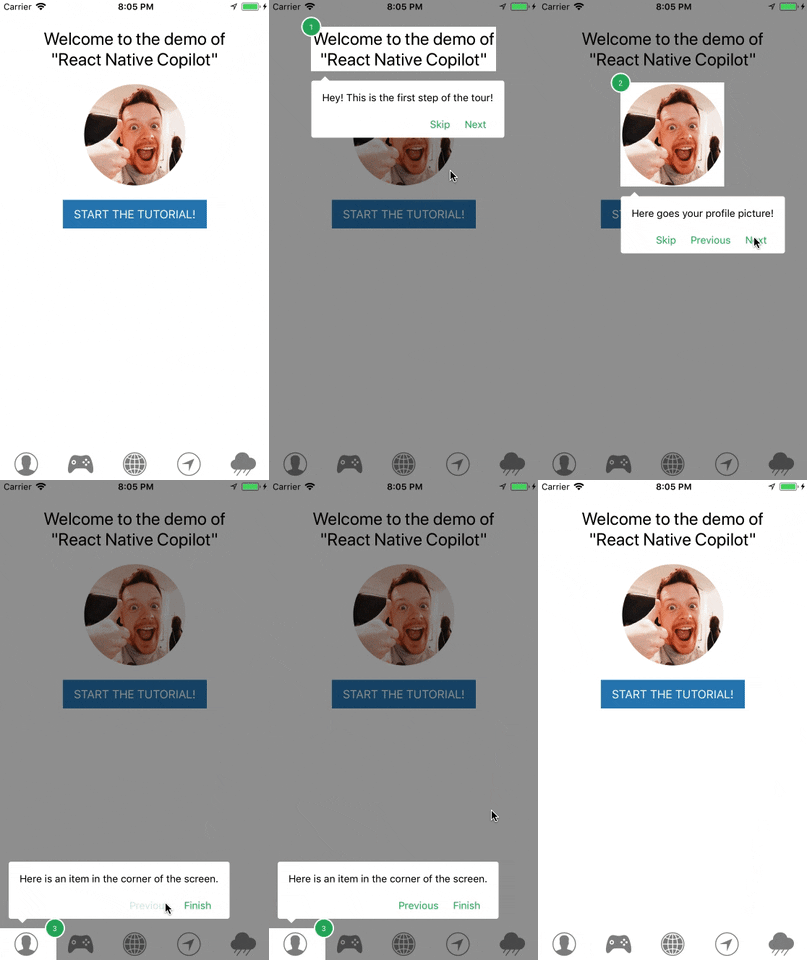
Demo
Creation of this project was sponsored by **[OK GROW!](https://www.okgrow.com/)**
## Installation
```
npm install --save react-native-copilot
```
**Optional**: If you want to have the smooth SVG animation, you should install and link `react-native-svg`. If you are using Expo, **you can skip** this as Expo comes with `react-native-svg`.
```
npm install --save react-native-svg
react-native link react-native-svg
```
## Usage
Use the `copilot()` higher order component for the screen component that you want to use copilot with:
```js
import { copilot } from "react-native-copilot";
class HomeScreen extends Component {
/* ... */
}
export default copilot()(HomeScreen);
```
Before defining walkthrough steps for your react elements, you must make them `walkthroughable`. The easiest way to do that for built-in react native components, is using the `walkthroughable` HOC. Then you must wrap the element with `CopilotStep`.
```js
import { copilot, walkthroughable, CopilotStep } from "react-native-copilot";
const CopilotText = walkthroughable(Text);
class HomeScreen {
render() {
return (
Hello world!
);
}
}
```
Every `CopilotStep` must have these props:
1. **name**: A unique name for the walkthrough step.
2. **order**: A positive number indicating the order of the step in the entire walkthrough.
3. **text**: The text shown as the description for the step.
In order to start the tutorial, you can call the `start` prop function in the root component that is injected by `copilot`:
```js
class HomeScreen extends Component {
handleStartButtonPress() {
this.props.start();
}
render() {
// ...
}
}
export default copilot()(HomeScreen);
```
If you are looking for a working example, please check out [this link](https://github.com/mohebifar/react-native-copilot/blob/master/example/App.js).
### Overlays and animation
The overlay in react-native copilot is the component that draws the dark transparent over the root component. React-native copilot comes with two overlay components: `view` and `svg`.
The `view` overlay uses 4 rectangles drawn around the target element using the `` component. We don't recommend using animation with this overlay since it's sluggish on some devices specially on Android devices.
The `svg` overlay uses an SVG path component for drawing the overlay. It offers a nice and smooth animation but it depends on `react-native-svg`. If you are using expo, you don't need to install anything and the svg overlay works out of the box. If not, you need to install and this package:
```
npm install --save react-native-svg
react-native link react-native-svg
```
You can specify the overlay when applying the `copilot` HOC:
```js
copilot({
overlay: "svg", // or 'view'
animated: true // or false
})(RootComponent);
```
### Custom tooltip component
You can customize the tooltip by passing a component to the `copilot` HOC maker. If you are looking for an example tooltip component, take a look at [the default tooltip implementation](https://github.com/mohebifar/react-native-copilot/blob/master/src/components/Tooltip.js).
```js
const TooltipComponent = ({
isFirstStep,
isLastStep,
handleNext,
handlePrev,
handleStop,
currentStep,
}) => (
// ...
);
copilot({
tooltipComponent: TooltipComponent
})(RootComponent)
```
### Custom tooltip styling
You can customize tooltip's style:
```js
const style = {
backgroundColor: "#9FA8DA",
borderRadius: 10,
paddingTop: 5
};
copilot({
tooltipStyle: style
})(RootComponent);
```
### Custom step number component
You can customize the step number by passing a component to the `copilot` HOC maker. If you are looking for an example step number component, take a look at [the default step number implementation](https://github.com/mohebifar/react-native-copilot/blob/master/src/components/StepNumber.js).
```js
const StepNumberComponent = ({
isFirstStep,
isLastStep,
currentStep,
currentStepNumber,
}) => (
// ...
);
copilot({
stepNumberComponent: StepNumberComponent
})(RootComponent)
```
### Custom mask color
You can customize the mask color - default is `rgba(0, 0, 0, 0.4)`, by passing a color string to the `copilot` HOC maker.
```js
copilot({
backdropColor: "rgba(50, 50, 100, 0.9)"
})(RootComponent);
```
### Custom svg mask Path
You can customize the mask svg path by passing a function to the `copilot` HOC maker.
function signature:
```js
SvgMaskPathFn = (args: {
size: Animated.valueXY,
position: Animated.valueXY,
canvasSize: {
x: number,
y: number
}
}) => string;
```
Example with circle:
```js
const circleSvgPath = ({ position, canvasSize }): string =>
`M0,0H${canvasSize.x}V${canvasSize.y}H0V0ZM${position.x._value},${position.y._value}Za50 50 0 1 0 100 0 50 50 0 1 0-100 0`;
copilot({
svgMaskPath: circleSvgPath
})(RootComponent);
```
### Custom components as steps
The components wrapped inside `CopilotStep`, will receive a `copilot` prop of type `Object` which the outermost rendered element of the component or the element that you want the tooltip be shown around, must extend.
```js
import { copilot, CopilotStep } from "react-native-copilot";
const CustomComponent = ({ copilot }) => (
Hello world!
);
class HomeScreen {
render() {
return (
);
}
}
```
### Custom labels (for i18n)
You can localize labels:
```js
copilot({
labels: {
previous: "Vorheriger",
next: "Nächster",
skip: "Überspringen",
finish: "Beenden"
}
})(RootComponent);
```
### Adjust vertical position
In order to adjust vertical position pass `verticalOffset` to the `copilot` HOC.
```js
copilot({
verticalOffset: 36
})(RootComponent);
```
### Triggering the tutorial
Use `this.props.start()` in the root component in order to trigger the tutorial. You can either invoke it with a touch event or in `componentDidMount`. Note that the component and all its descendants must be mounted before starting the tutorial since the `CopilotStep`s need to be registered first.
### Usage inside a ScrollView
Pass the ScrollView reference as the second argument to the `this.props.start()` function.
eg `this.props.start(false, ScrollViewRef)`
```js
import { ScrollView } from "react-native";
import { copilot } from "@okgrow/react-native-copilot";
class HomeScreen {
componentDidMount() {
// Starting the tutorial and passing the scrollview reference.
this.props.start(false, this.scrollView);
}
componentWillUnmount() {
// Don't forget to disable event handlers to prevent errors
this.props.copilotEvents.off("stop");
}
render() {
(this.scrollView = ref)}>// ...;
}
}
export default copilot()(HomeScreen);
```
### Listening to the events
Along with `this.props.start()`, `copilot` HOC passes `copilotEvents` function to the component to help you with tracking of tutorial progress. It utilizes [mitt](https://github.com/developit/mitt) under the hood, you can see how full API there.
List of available events is:
- `start` — Copilot tutorial has started.
- `stop` — Copilot tutorial has ended or skipped.
- `stepChange` — Next step is triggered. Passes [`Step`](https://github.com/mohebifar/react-native-copilot/blob/master/src/types.js#L2) instance as event handler argument.
**Example:**
```js
import { copilot, CopilotStep } from "react-native-copilot";
const CustomComponent = ({ copilot }) => (
Hello world!
);
class HomeScreen {
componentDidMount() {
this.props.copilotEvents.on("stop", () => {
// Copilot tutorial finished!
});
}
componentWillUnmount() {
// Don't forget to disable event handlers to prevent errors
this.props.copilotEvents.off("stop");
}
render() {
// ...
}
}
```
## Contributing
Issues and Pull Requests are always welcome.
Please read OK GROW!'s global [contribution guidelines](https://okgrow.github.io/guides/docs/open-source-contributing.html).
If you are interested in becoming a maintainer, get in touch with us by sending an email or opening an issue. You should already have code merged into the project. Active contributors are encouraged to get in touch.
Please note that all interactions in 's repos should follow our [Code of Conduct](https://okgrow.github.io/guides/docs/open-source-code-of-conduct.html).
## License
[MIT](LICENSE) © 2017 OK GROW!, https://www.okgrow.com.


