# react-native-country-codes-picker
:zap: :zap: :zap: This lib. provide multi lang. country picker or country list with search functionality. Fully crossplatform and supported on React-native and expo.
Didn't find your country ? Just add the required countries or locales and make a PR. :zap: :zap: :zap:
## :exclamation: Before you start! :exclamation:
I'm looking to enhance this library and would love to hear your thoughts on what features you'd like to see in the next version. Currently, I'm drafting a roadmap for the upcoming release of react-native-country-codes-picker.
Considering whether the next version should be based on reanimated v3 for improved performance or if it's better to introduce a flexible hook instead of a new component. Your input is crucial in guiding the development, so please share your ideas on the most valuable additions or changes you'd like to see.
## Coming soon :muscle: :pray:
1. Custom search input rendering.
2. Docs update/improve for the best user experience.
3. Animation improvements.
If you have something interesting ! Just write to us :)
# :grey_exclamation: Installation :grey_exclamation:
expo: `expo install react-native-country-codes-picker`
npm: `npm i react-native-country-codes-picker`
yarn: `yarn add react-native-country-codes-picker`
# Example
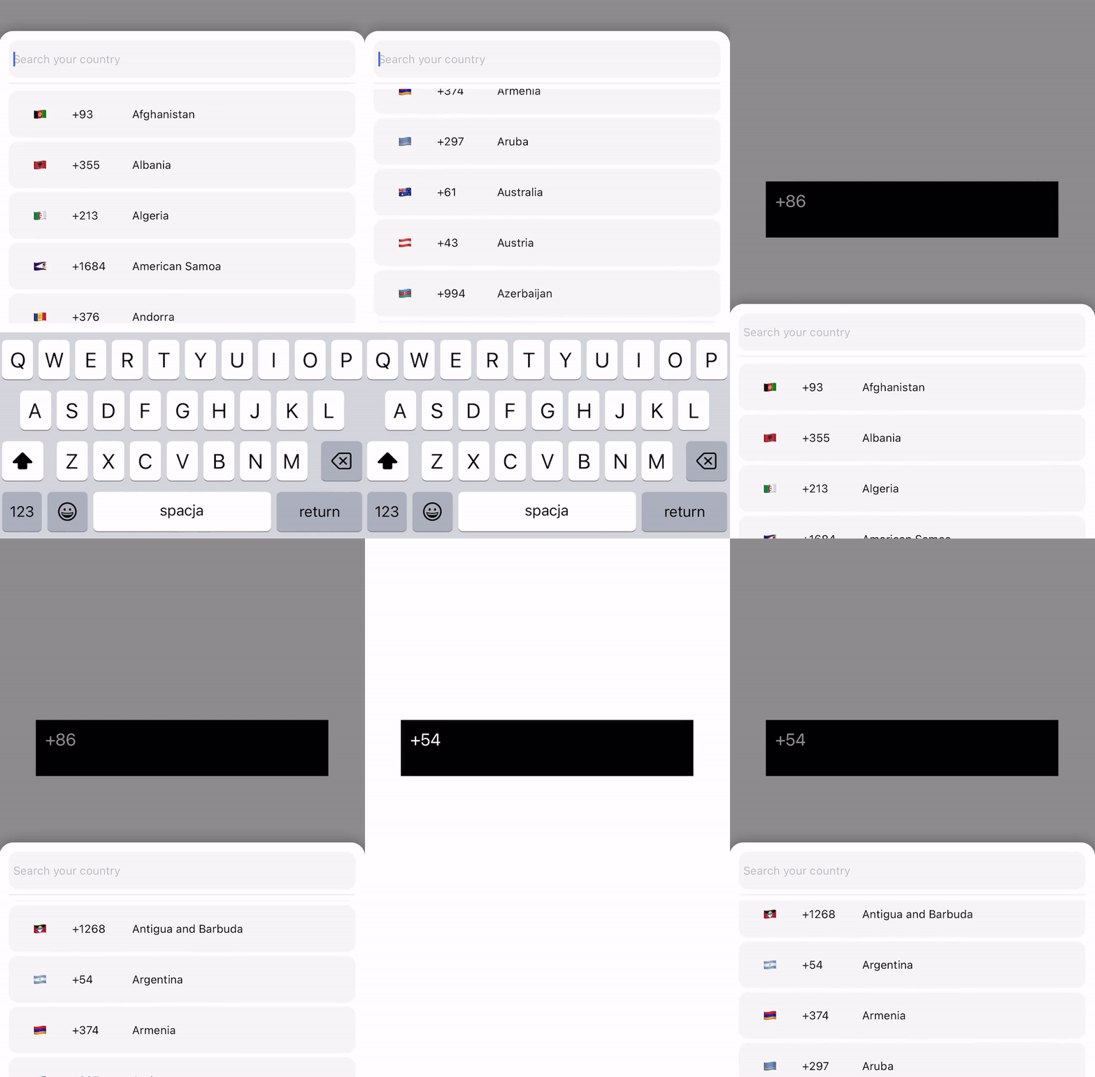
# Basic usage
### Modal
```JS
import {CountryPicker} from "react-native-country-codes-picker";
export default function App() {
const [show, setShow] = useState(false);
const [countryCode, setCountryCode] = useState('');
return (
setShow(true)}
style={{
width: '80%',
height: 60,
backgroundColor: 'black',
padding: 10,
}}
>
{countryCode}
// For showing picker just put show state to show prop
{
setCountryCode(item.dial_code);
setShow(false);
}}
/>
);
}
```
### Modal with list header
```JS
import {CountryPicker} from "react-native-country-codes-picker";
function ListHeaderComponent({countries, lang, onPress}) {
return (
Popular countries
{countries?.map((country, index) => {
return (
onPress(country)} />
)
})}
)
}
export default function App() {
const [show, setShow] = useState(false);
const [countryCode, setCountryCode] = useState('');
return (
setShow(true)}
style={{
width: '80%',
height: 60,
backgroundColor: 'black',
padding: 10,
}}
>
{countryCode}
// For showing picker just put show state to show prop
{
setCountryCode(item.dial_code);
setShow(false);
}}
ListHeaderComponent={ListHeaderComponent}
popularCountries={['en', 'ua', 'pl']}
/>
);
}
```
### List
```js
import {CountryList} from "react-native-country-codes-picker";
export default function App() {
const [countryCode, setCountryCode] = useState('');
return (
{countryCode}
// All props the same as for picker
{
setCountryCode(item.dial_code);
}}
/>
);
}
```
# Props
Below are the props you can pass to the React Component.
| Prop | Type | Default | Example | Description |
| -------------------------- | --------- | ------- | ------------------------------------------ | ------------------------------------------------------------------------------------------------------------------------------------------------------------------------- |
| show | boolean | | | This prop using for displaying the modal. Put your show state here. |
| pickerButtonOnPress | function | | (country) => setCode(country.dial_code) | Put your function/functions here for getting country data from picker. |
| inputPlaceholder | string | | inputPlaceholder={'Your placeholder'} | If you need a custom placeholder for your input you may need this prop. |
| searchMessage | string | | searchMessage={'Some search message here'} | If you want to customize search message just use this prop. |
| lang | string | 'en' | lang={'pl'} | If you need to change the lang. just put one of supported lang. Or if you didn't find required lang just add them and make a PR :) |
| enableModalAvoiding | boolean | false | enableModalAvoiding={true} | Is modal should avoid keyboard ? On android to work required to use with androidWindowSoftInputMode with value pan, by default android will avoid keyboard by itself |
| androidWindowSoftInputMode | string | | androidWindowSoftInputMode={'pan'} | Basicaly android avoid keyboard by itself, if you want to use custom avoiding you may use this prop |
| itemTemplate | ReactNode | CountryButton | itemTemplate={YourTemplateComponentsHere} | This parameter gets a React Node element to render it as a template for each item of the list. These properties are sent to the item: key, item, style, name, and onPress |
| style | Object | | style={{yoursStylesHere}} | If you want to change styles for component you probably need this props. You can check the styling part below. |
| disableBackdrop | boolean | false | disableBackdrop | if you don't wanna show modal backdrop pass this prop.|
| onBackdropPress | function | null | onBackdropPress={() => setShow(false)} | If you want to close modal when user taps on the modal background. |
| initialState | string | | initialState={'+380'} | Sometimes you need to pre-select country for example by user current location so you may use this prop. |
| excludedCountries | array | | excludedCountries={['RU', 'BY']} | In this prop you can define list of countries which you want to remove by adding their codes. |
| showOnly | array | | showOnly={['UA', 'EN']} | This prop allow you to configure which countries you want to show. |
| popularCountries | array | | popularCountries={['UA', 'EN']} | This prop allow you to send popular countries array to your ListHeaderComponent. |
| ListHeaderComponent | JSX.Element | | ListHeaderComponent={ListHeaderComponent} | This prop allow you to create header component to show popular countries on top of list! Check example section with ListHeaderComponent |
:grey_exclamation: Also you can use all other FlatList and TextInput props if you need. :grey_exclamation:
# Styling
```JS
{
setCountryCode(item.dial_code);
setShow(false);
}}
/>
```
# :crossed_flags: Supported langs. :crossed_flags:
```JS
"name": {
"en": "English",
"ru": "Russian",
"pl": "Polish",
"ua": "Ukrainian",
"cz": "Czech",
"by": "Belarusian",
"pt": "Portuguese",
"es": "Espanol",
"ro": "Romanian",
"bg": "Bulgarian",
"de": "German",
"fr": "French",
"nl": "Dutch",
"it": "Italian",
"cn": "Chinese",
"ee": "Estonian",
"jp": "Japanese",
"he": "Hebrew",
"tr": "Turkish"
},
```
You can add your lang. if you need !!! But after that make a PR please, it will help other people.
# Testing
If you are using this package and need to target one of the components in your automated tests, we currently do provide a `testID` for the following components:
- The wrapping `FlatList` component: 'countryCodesPickerFlatList'
- The country search `TextInput` component: 'countryCodesPickerSearchInput'
- The country button (`TouchableOpacity`) component: 'countryCodesPickerCountryButton'