# react-native-country-phone-input
A customizable React Native component for country-based phone number input. This package provides a user-friendly interface for selecting countries and entering phone numbers with automatic country code handling. It includes features like country flag selection, search, and phone number formatting.
## Features
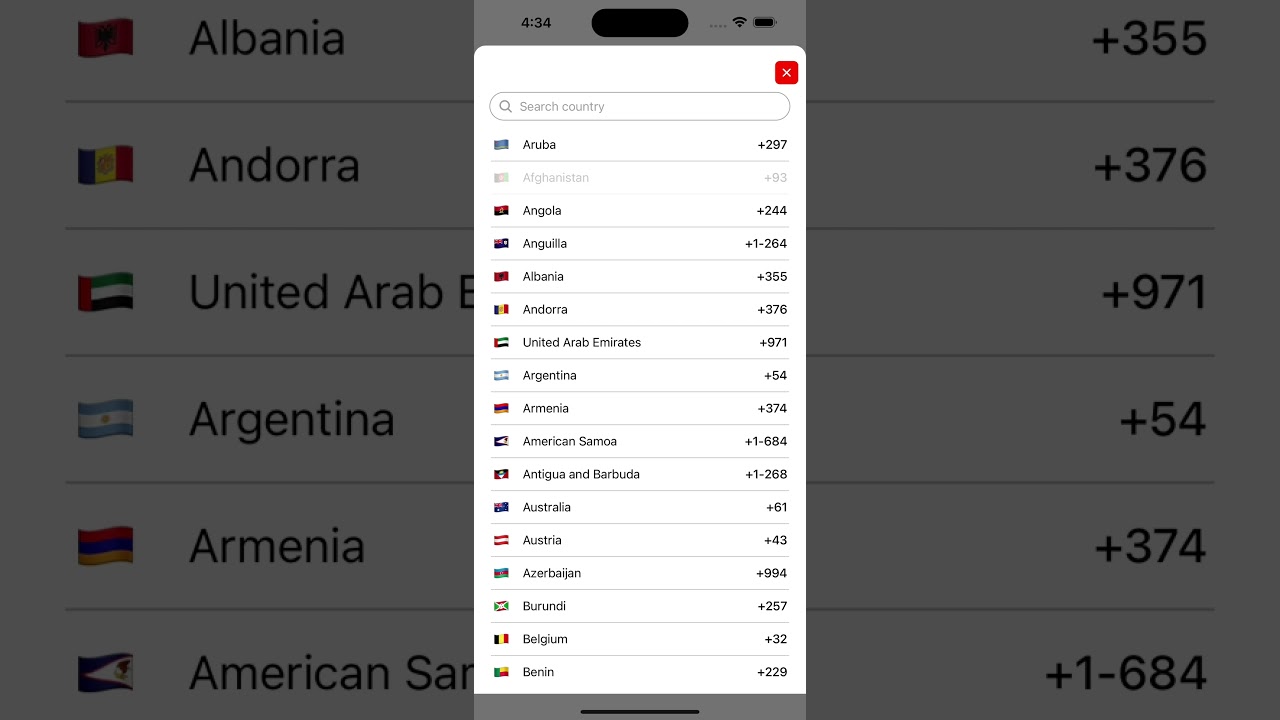
- **Country Picker**: Allows users to select their country from a list with flags.
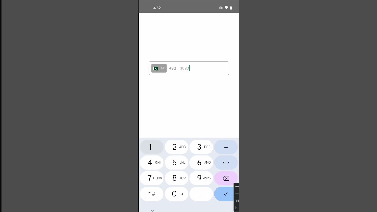
- **Phone Number Input**: Supports phone number entry with automatic country code formatting.
- **Search**: Built-in search functionality to filter countries by name.
- **Customizable Styles**: Highly customizable styles for various parts of the component.
- **Modal Animation**: Smooth animations for showing and hiding the country picker modal.
## Demo
Check out the demo videos to see how the `react-native-country-phone-input` component works:
### For iOS:
[](https://www.youtube.com/shorts/PHU9erw86iY)
Or visit the demo on YouTube: [Watch the iOS demo](https://www.youtube.com/shorts/PHU9erw86iY)
### For Android:
[](https://www.youtube.com/shorts/Y6FqExKLgME)
Or visit the demo on YouTube: [Watch the Android demo](https://www.youtube.com/shorts/Y6FqExKLgME)
---
## Installation
To install the package, run the following command in your project directory:
```bash
npm install react-native-country-phone-input
```
or
```bash
yarn add react-native-country-phone-input
```
Ensure you have the required dependencies:
- `react-native-vector-icons`: Make sure this is installed for icon support.
## Usage
Here's an example of how to use the `react-native-country-phone-input` component:
```tsx
import React from "react";
import { View, StyleSheet } from "react-native";
import CountryPickerPhoneInput from "react-native-country-phone-input";
const App = () => {
return (
{
console.log(country);
}}
onPhoneNumberChange={(phone) => {
console.log(phone);
}}
onFormattedPhoneNumberChange={(phone) => {
console.log("onFormattedPhoneNumberChange", phone);
}}
containerStyle={{ borderColor: "#aaa" }}
flagContainerStyle={{ backgroundColor: "#aaa" }}
countryCodeStyle={{ color: "#aaa" }}
phoneInputStyle={{ color: "#aaa" }}
chevronColor={"#FFF"}
chevronSize={22}
closeIconSize={20}
closeIconColor="#FFF"
searchContainerStyle={{ borderColor: "#aaa", borderRadius: 50 }}
placeholderTextColor="#aaa"
searchIconColor="#aaa"
searchInputStyle={{ color: "#aaa" }}
countryItemStyle={{ backgroundColor: "#FFF" }}
countryItemFlagStyle={{}}
countryItemNameStyle={{ color: "#000" }}
countryItemCodeStyle={{ color: "#000" }}
/>
);
};
const styles = StyleSheet.create({
container: {
flex: 1,
justifyContent: "center",
alignItems: "center",
},
});
export default App;
```
### Props
Here are the available props for the `CountryPickerPhoneInput` component:
| Prop | Type | Description |
| ------------------------------ | ---------------------------------- | ---------------------------------------------------------------------------- |
| `defaultCountryCode` | `string` | Default country code (e.g., 'US', 'PK'). Default is 'PK'. |
| `customCountries` | `Array` | Custom list of countries (default uses `countries.json`). |
| `onCountrySelect` | `(country: Country) => void` | Callback function that is triggered when a country is selected. |
| `onPhoneNumberChange` | `(phone: string) => void` | Callback function that is triggered when the phone number changes. |
| `onFormattedPhoneNumberChange` | `(formattedPhone: string) => void` | Callback function that is triggered when the formatted phone number changes. |
| `containerStyle` | `ViewStyle` | Custom style for the container. |
| `flagContainerStyle` | `ViewStyle` | Custom style for the flag container. |
| `countryCodeStyle` | `TextStyle` | Custom style for the country code text. |
| `phoneInputStyle` | `TextStyle` | Custom style for the phone input text. |
| `placeholder` | `string` | Placeholder text for the phone input field. |
| `chevronColor` | `string` | Color for the chevron icon. |
| `chevronSize` | `number` | Size of the chevron icon. |
| `closeButtonStyle` | `ViewStyle` | Custom style for the close button. |
| `closeIconColor` | `string` | Color for the close icon. |
| `closeIconSize` | `number` | Size of the close icon. |
| `searchContainerStyle` | `ViewStyle` | Custom style for the search container. |
| `searchIconStyle` | `ViewStyle` | Custom style for the search icon. |
| `searchIconColor` | `string` | Color for the search icon. |
| `searchIconSize` | `number` | Size of the search icon. |
| `searchInputStyle` | `TextStyle` | Custom style for the search input field. |
| `countryItemStyle` | `ViewStyle` | Custom style for each country item. |
| `countryItemFlagStyle` | `TextStyle` | Custom style for the country flag in the list. |
| `countryItemNameStyle` | `TextStyle` | Custom style for the country name in the list. |
| `countryItemCodeStyle` | `TextStyle` | Custom style for the country code in the list. |
### Country Data Format
The default country data is provided from a `countries.json` file. Each country object should have the following format:
```json
{
"name": "Pakistan",
"code": "PK",
"iso": "PK",
"flag": "🇵🇰"
}
```
You can pass a custom list of countries using the `customCountries` prop.
## License
This package is licensed under the MIT License.