# react-native-draggable-grid
[](https://996.icu) [-blue.svg)](https://github.com/996icu/996.ICU/blob/master/LICENSE)
[中文文档](./README_CN.md)
## Demo
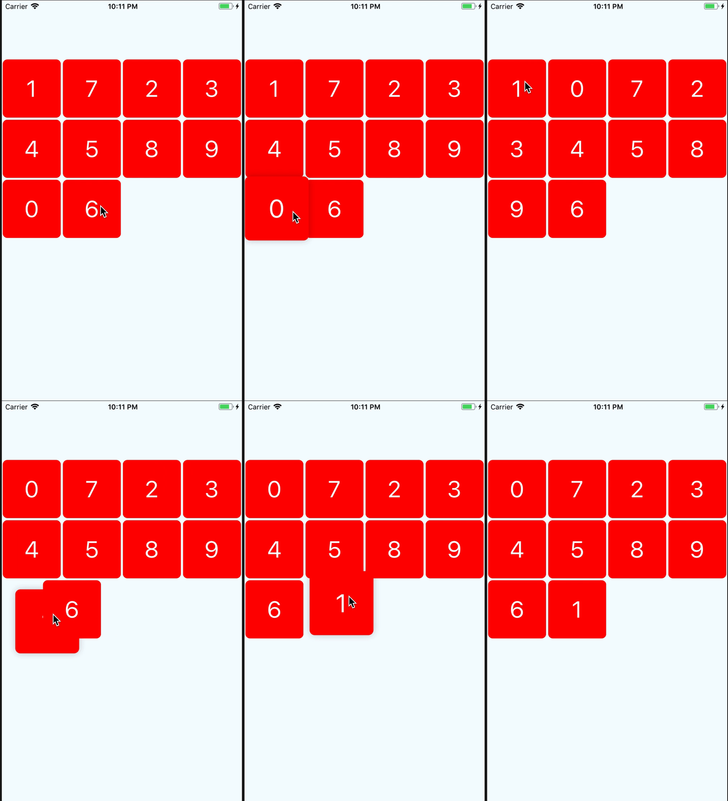
## Getting Started
## Installation
```bash
npm install react-native-draggable-grid --save
```
## Usage
```javascript
import React from 'react';
import {
View,
StyleSheet,
Text,
} from 'react-native';
import { DraggableGrid } from 'react-native-draggable-grid';
interface MyTestProps {
}
interface MyTestState {
data:{key:string, name:string}[];
}
export class MyTest extends React.Component{
constructor(props:MyTestProps) {
super(props);
this.state = {
data:[
{name:'1',key:'one'},
{name:'2',key:'two'},
{name:'3',key:'three'},
{name:'4',key:'four'},
{name:'5',key:'five'},
{name:'6',key:'six'},
{name:'7',key:'seven'},
{name:'8',key:'eight'},
{name:'9',key:'night'},
{name:'0',key:'zero'},
],
};
}
public render_item(item:{name:string, key:string}) {
return (
{item.name}
);
}
render() {
return (
{
this.setState({data});// need reset the props data sort after drag release
}}
/>
);
}
}
const styles = StyleSheet.create({
button:{
width:150,
height:100,
backgroundColor:'blue',
},
wrapper:{
paddingTop:100,
width:'100%',
height:'100%',
justifyContent:'center',
},
item:{
width:100,
height:100,
borderRadius:8,
backgroundColor:'red',
justifyContent:'center',
alignItems:'center',
},
item_text:{
fontSize:40,
color:'#FFFFFF',
},
});
```
## Props
| parameter | type | required | description |
| :-------- | :---- | :------- | :---------- |
| numColumns | number | yes | how many items should be render on one row|
| data | array | yes | data's item must have unique key,item's render will depend on the key|
| renderItem |(item, order:number) => ReactElement| yes | Takes an item from data and renders it into the list |
| itemHeight | number | no | if not set this, it will the same as itemWidth |
| dragStartAnimation | object | no | custom drag start animation |
| style | object | no | grid styles |
## Event Props
| parameter | type | required | description |
| :-------- | :---- | :------- |:------------------------------------------------------------------------------|
| onItemPress | (item) => void | no | Function will execute when item on press |
| onDragStart | (startDragItem) => void | no | Function will execute when item start drag |
| onDragRelease | (data) => void | no | Function will execute when item release, and will return the new ordered data |
| onResetSort | (data) => void | no | Function will execute when dragged item change sort |
| onDragging | (gestureState: PanResponderGestureState) => void| no | Function will execute when dragging item |
| onDragItemActive | (item) => void| no | Function will execute when any item active |
## Item Props
| parameter | type | required | description |
| :-------- | :---- | :------- | :---------- |
| disabledDrag | boolean | no | It will disable drag for the item |
| disabledReSorted | boolean | no | It will disable resort the item |
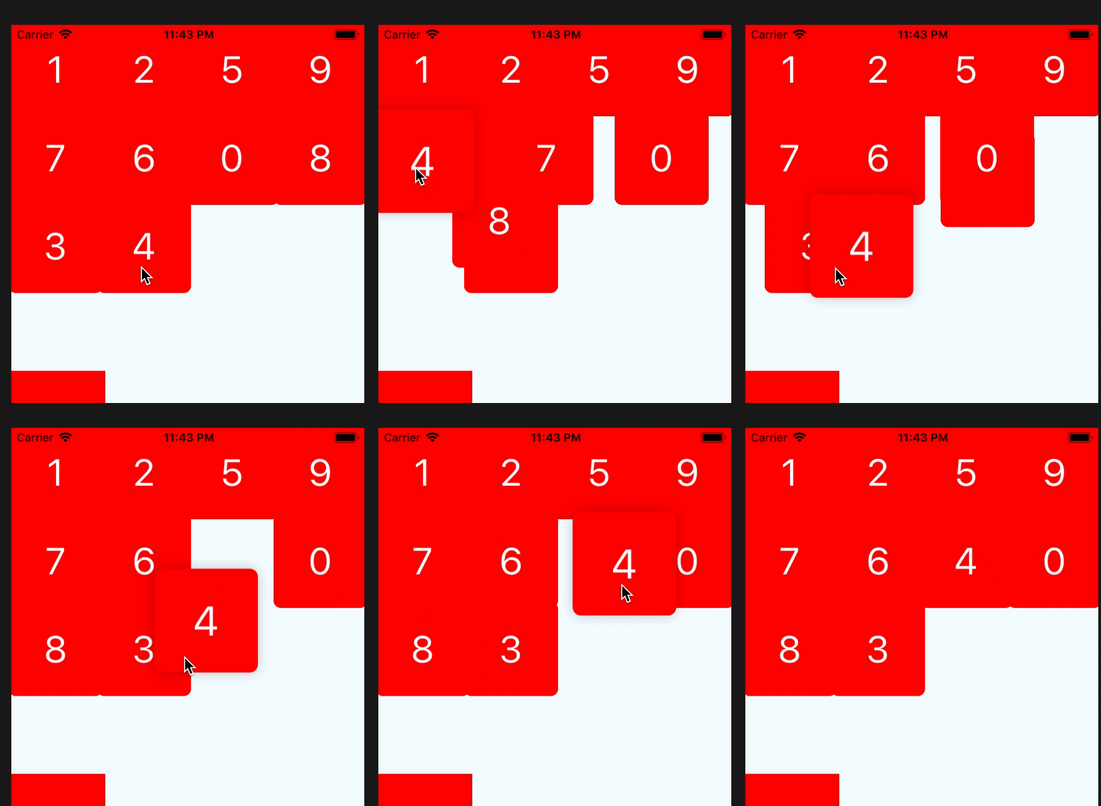
if you set disabledResorted be true, it will look like that
## Custom Drag Start Animation
If you want to use your custom animation, you can do like this
```javascript
render() {
return (
);
}
private onDragStart = () => {
this.state.animatedValue.setValue(1);
Animated.timing(this.state.animatedValue, {
toValue:3,
duration:400,
}).start();
}
```
## Resort item
if you want resort item yourself,you only need change the data's sort, and the draggable-grid will auto resort by your data.
> the data's key must unique