
## Cross Platform React Native UI Toolkit
## Get Started
*If you are using Exponent, you can run* `npm i react-native-elements github:exponentjs/react-native-vector-icons --save` *and skip to step 5.*
#### Step 1
Install rnpm if not already installed on your machine
`npm install rnpm -g`
#### Step 2
Install react-native-vector-icons (if you do not already have it)
`npm i react-native-vector-icons --save && rnpm link react-native-vector-icons`
*If you have any issues with icons not working or installation of React Native Vector Icons, check out their installation guide [here](https://github.com/oblador/react-native-vector-icons#installation)*
#### Step 3
Install React Native Elements
`npm i react-native-elements --save`
#### Step 4
Start using components
```js
import {
Button
} from 'react-native-elements'
```
## Included
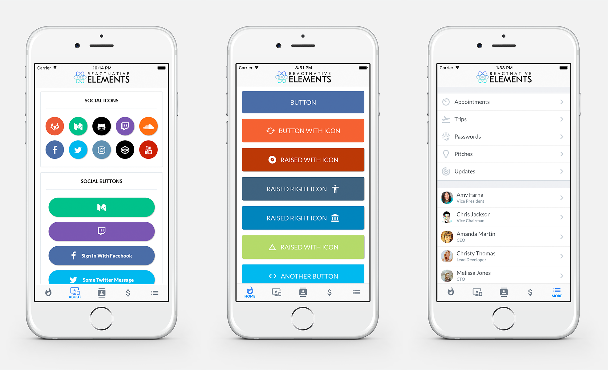
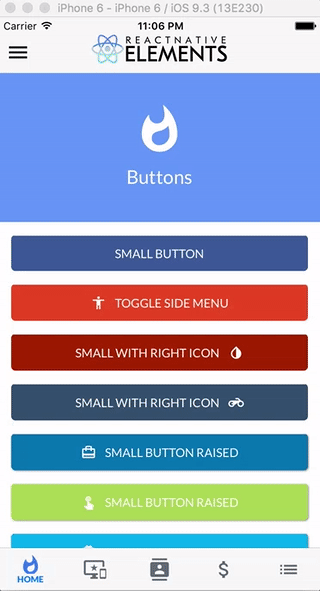
- [x] [Buttons](https://github.com/react-native-community/React-Native-Elements#buttons)
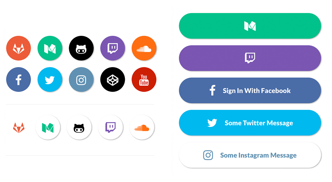
- [x] [Social Icons / Buttons](https://github.com/react-native-community/React-Native-Elements#social-icons--buttons)
- [x] [Side Menu](https://github.com/react-native-community/React-Native-Elements#sidemenu)
- [x] [Form Elements](https://github.com/react-native-community/React-Native-Elements#forms)
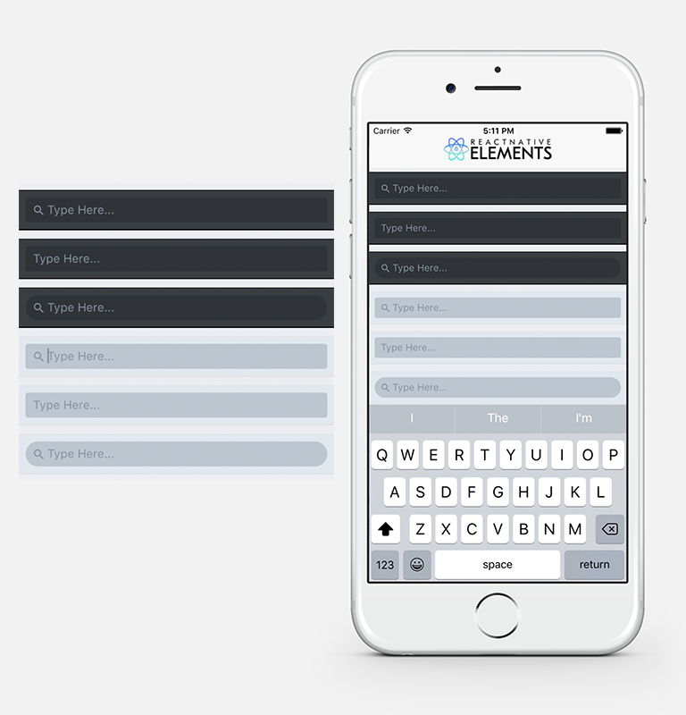
- [x] [Search Bar](https://github.com/react-native-community/React-Native-Elements#search-bar)
- [x] [ButtonGroup](https://github.com/react-native-community/React-Native-Elements#buttongroup)
- [x] [Checkboxes](https://github.com/react-native-community/React-Native-Elements#checkboxes)
- [x] [List Element](https://github.com/react-native-community/React-Native-Elements#lists)
- [x] [Linked List Element](https://github.com/react-native-community/React-Native-Elements#lists)
- [x] HTML style headings (h1, h2, etc...)
- [x] [Card component](https://github.com/react-native-community/React-Native-Elements#card)
- [x] [Pricing Component](https://github.com/react-native-community/React-Native-Elements#pricing-component)
## Roadmap
- [ ] Add radio buttons
- [ ] Add icons to TextInputs
- [ ] Profile Component
- [ ] Custom Picker
- [ ] Side Menu Improvements
- [ ] Cross Platform Tab Bar
- [ ] Something you's like to see? Submit an [issue](https://github.com/dabit3/React-Native-Elements/issues) or a [pull request](https://github.com/dabit3/React-Native-Elements/pulls)
## Examples
Check out the pre built and configured [React Native Hackathon Starter Project](https://github.com/dabit3/react-native-hackathon-starter) which uses all of these elements.
## Notes
#### Fonts
React Native Elements uses the Sytem font as the default font family for iOS and Roboto as the default font family for Android.
**In the example screenshots, we are using Lato which can be downloaded [here](https://fonts.google.com/specimen/Lato?selection.family=Lato).**
> We are working on a way to make a custom font family configurable through the command line.
[Here](https://github.com/dabit3/react-native-fonts) is a list of fonts available out of the box for each platform, or you can install and use a custom font of your own.
To override the fontFamily in any element, simply provide a fontFamily prop:
```js
```
# API
## Buttons

```js
import { Button } from 'react-native-elements'
```
#### Button props
| prop | default | type | description |
| ---- | ---- | ----| ---- |
| buttonStyle | none | object (style) | add additional styling for button component (optional) |
| title | none | string | button title (required) |
| small | false | boolean | makes button small |
| fontFamily | System font (iOS), Roboto (android) | string | specify different font family |
| iconRight | false | boolean | moves icon to right of title |
| onPress | none | function | onPress method (required) |
| icon | none | object {name(string), color(string), size(number)} | [Material Icon Name](https://design.google.com/icons/) (optional) |
| backgroundColor | #397af8 | string (color) | background color of button (optional) |
| color | white | string(color) | font color (optional) |
| textStyle | none | object (style) | text styling (optional) |
| fontSize | 18 | number | font size (optional) |
| underlayColor | transparent | string(color) | underlay color for button press (optional) |
| raised | false | boolean | flag to add raised button styling (optional) |
## Social Icons & Buttons
```js
import { SocialIcon } from 'react-native-elements'
// Icon
// Button
```
#### SocialIcon props
| prop | default | type | description |
| ---- | ---- | ----| ---- |
| title | none | string | title if made into a button (optional) |
| type | none | social media type (facebook, twitter, google-plus-official, pinterest, linkedin, youtube, vimeo, tumblr, instagram, quora, foursquare, wordpress, stumbleupon, github, github-alt, twitch, medium, soundcloud, gitlab, angellist, codepen) | social media type (required) |
| raised | true | boolean | raised adds a drop shadow, set to false to remove |
| button | false | boolean | creates button (optional) |
| onPress | none | function | onPress method (optional) |
| light | false | boolean | reverses icon color scheme, setting background to white and icon to primary color |
| iconStyle | none | object (style) | extra styling for icon component (optional) |
| style | none | object (style) | button styling (optional) |
| iconColor | white | string | icon color (optional) |
| component | TouchableHighlight | React Native Component | type of button (optional) |
| fontFamily | System font bold (iOS), Roboto-Black (android) | string | specify different font family |
| fontStyle | none | object (style) | specify text styling |
## Lists

#### Using Map Function. Implemented with icons.
```js
import { List, ListItem } from 'react-native-elements'
const list = [
{
title: 'Appointments',
icon: 'av-timer'
},
{
title: 'Trips',
icon: 'flight-takeoff'
}
]
{
list.map((item, i) => (
))
}
```
#### Using RN ListView. Implemented with avatars.
```js
import { List, ListItem } from 'react-native-elements'
const list = [
{
name: 'Amy Farha',
avatar_url: 'https://s3.amazonaws.com/uifaces/faces/twitter/ladylexy/128.jpg',
subtitle: 'Vice President'
},
{
name: 'Chris Jackson',
avatar_url: 'https://s3.amazonaws.com/uifaces/faces/twitter/adhamdannaway/128.jpg',
subtitle: 'Vice Chairman'
}
]
renderRow (rowData, sectionID) {
return (
)
}
render () {
return (
)
}
```
#### List Props
| prop | default | type | description |
| ---- | ---- | ----| ---- |
| containerStyle | none | object (style) | style the list container |
#### ListItem props
| prop | default | type | description |
| ---- | ---- | ----| ---- |
| avatar | none | string | left avatar (optional) |
| avatarStyle | none | object (style) | avatar styling (optional) |
| chevronColor | #bdc6cf | string | set chevron color |
| component | View or TouchableHighlight if onPress method is added as prop | React Native element | replace element with custom element (optional) |
| containerStyle | none | object (style) | additional main container styling (optional) |
| hideChevron | false | boolean | set if you do not want a chevron (optional) |
| icon | none | object {name, color, style} | icon configuration for left icon (optional) |
| onPress | none | function | onPress method for link (optional) |
| rightIcon | chevron | string | right icon (optional) ([material icon name](https://design.google.com/icons/)) |
| roundAvatar | false | boolan | make left avatar round |
| subtitle | none | string | subtitle text (optional) |
| subtitleStyle | none | object (style) | additional subtitle styling (optional ) |
| title | none | string | main title for list item (required) |
| titleStyle | none | object (style) | additional title styling (optional) |
| wrapperStyle | none | object (style) | additional wrapper styling (optional) |
| underlayColor | white | string | define underlay color for TouchableHighlight (optional) |
| fontFamily | HelevticaNeue (iOS), Roboto (android) | string | specify different font family |
## SideMenu
```js
import { SideMenu, ListItem } from 'react-native-elements'
constructor () {
super()
this.state = { toggled: false }
}
toggleSideMenu () {
this.setState({
toggled: true
})
}
render () {
// SideMenu takes a React Native element as a prop for the actual Side Menu
const MenuComponent = (
{
list.map((item, i) => (
console.log('something')}
avatar={item.avatar_url}
key={i}
title={item.name}
subtitle={item.subtitle} />
))
}
)
return (
)
}
```
#### SideMenu props
| prop | default | type | description |
| ---- | ---- | ----| ---- |
| toggled | false | boolean | toggles side menu when true (required) |
| toggledContainerStyle | none | object (style) | toggled state menu styling |
| easing | Easing.inout | Easing method | specifies different easing method (optional) |
| duration | 250 | animation length | specifies length of animation (optional) |
| menuWidth | window width - 80 | number | the width and offset of the menu (optional) |
| MenuComponent | none | React Native Component | the actual side menu component you would like to use (required) |
| children | none | React Native Component | wrap RNSideMenu around the component you would like to animate (required) |
## Search Bar
```js
import { SearchBar } from 'react-native-elements'
'
```
#### SearchBar props
##### This component inherits [all native TextInput props that come with a standard React Native TextInput element](https://facebook.github.io/react-native/docs/textinput.html), along with the following:
| prop | default | type | description |
| ---- | ---- | ----| ---- |
| containerStyle | inherited styling | object (style) | style the container of the TextInput |
| inputStyle | inherited styling | object (style) | style the TextInput |
| icon | { color: '#86939e', name: 'search' } | object {name (string), color (string), style (object)} | specify color, styling, or another [Material Icon Name](https://design.google.com/icons/) |
| noIcon | false | boolean | remove icon from textinput |
| lightTheme | false | boolean | change theme to light theme |
| round | false | boolean | change TextInput styling to rounded corners |
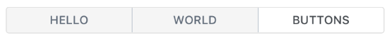
## ButtonGroup
```js
constructor () {
super()
this.state = {
selectedIndex: 2
}
this.updateIndex = this.updateIndex.bind(this)
}
updateIndex (selectedIndex) {
this.setState({selectedIndex})
}
render () {
const buttons = ['Hello', 'World', 'Buttons']
const { selectedIndex } = this.state
return (
)
}
```
#### ButtonGroup props
##### This component inherits [all native TouchableHighlight and TouchableOpacity props that come with React Native TouchableHighlight or TouchableOpacity elements](https://facebook.github.io/react-native/docs/touchablehighlight.html), along with the following:
| prop | default | type | description |
| ---- | ---- | ----| ---- |
| selectedIndex | none | number | current selected index of array of buttons (required) |
| onPress | none | function | method to update Button Group Index (required) |
| buttons | none | array | array of buttons for component (required) |
| component | TouchableHighlight | React Native Component | Choose other button component such as TouchableOpacity (optional) |
| containerStyle | inherited styling | object (style) | specify styling for main button container (optional) |
| selectedBackgroundColor | white | string | specify color for selected state of button (optional) |
| textStyle | inherited styling | object (style) | specify specific styling for text (optional) |
| selectedTextStyle | inherited styling | object (style) | specify specific styling for text in the selected state (optional)|
| underlayColor | white | string | specify underlayColor for TouchableHighlight (optional) |
| borderStyle | inherited styling | object (style) | update the styling of the interior border of the list of buttons (optional) |
## Checkboxes

```js
import { CheckBox } from 'react-native-elements'
```
#### Checkbox props
> This component uses FontAwesome icons out of the box. You can also specify one of the following types of icons by specifying an iconType prop: Zocial, Octicons, MaterialIcons, Ionicons, Foundation, EvilIcons, or Entypo
| prop | default | type | description |
| ---- | ---- | ----| ---- |
| iconType | fontawesome | string | icon family, can be one of the following: zocial, octicon, material, ionicon, foundation, evilicon, entypo (required only if specifying an icon that is not from font-awesome) |
| component | TouchableOpacity | React Native Component | specify React Native component for main button (optional) |
| checked | false | boolean | flag for checking the icon (required) |
| iconRight | false | boolean | moves icon to right of text (optional) |
| right | false | boolean | aligns checkbox to right (optional) |
| center | false | boolean | aligns checkbox to center (optional) |
| title | none | string | title of checkbox (required) |
| containerStyle | none | object (style) | style of main container (optional) |
| textStyle | none | object (style) | style of text (optional) |
| onPress | none | function | onPress function for checkbox (required) |
| checkedIcon | check-square-o | string | default checked icon ([Font Awesome Icon](http://fontawesome.io/icons/)) (optional) |
| uncheckedIcon | square-o | string | default checked icon ([Font Awesome Icon](http://fontawesome.io/icons/)) (optional) |
| checkedColor | green | string | default checked color (optional) |
| uncheckedColor | #bfbfbf | string | default unchecked color (optional) |
| checkedTitle | none | string | specify a custom checked message (optional) |
| fontFamily | System font bold (iOS), Roboto-Bold (android) | string | specify different font family |
## Forms

```js
import { FormLabel, FormInput } from 'react-native-elements'
Name
```
#### FormInput props
##### This component inherits [all native TextInput props that come with a standard React Native TextInput element](https://facebook.github.io/react-native/docs/textinput.html), along with the following:
| prop | default | type | description |
| ---- | ---- | ----| ---- |
| containerStyle | none | object (style) | TextInput container styling (optional) |
| inputStyle | none | object (style) | TextInput styling (optional) |
#### FormLabel props
| prop | default | type | description |
| ---- | ---- | ----| ---- |
| containerStyle | none | object (style) | additional label container style (optional) |
| labelStyle | none | object (style) | additional label styling (optional) |
| fontFamily | System font bold (iOS), Roboto-Bold (android) | string | specify different font family |
## Card

```js
import { Card } from 'react-native-elements'
{
users.map((u, i) => {}
}
```
#### Card props
| prop | default | type | description |
| ---- | ---- | ----| ---- |
| flexDirection | column | string | flex direction (row or column) (optional) |
| containerStyle | none | object (style) | outer container style (optional) |
| wrapperStyle | none | object (style) | inner container style (optional) |
| title | none | string | optional card title (optional) |
| titleStyle | none | object (style) | additional title styling (if title provided) (optional) |
| dividerStyle | none | object (style) | additional divider styling (if title provided) (optional) |
| fontFamily | System font bold (iOS), Roboto-Bold (android) | string | specify different font family |
## Pricing Component

```js
import { PricingCard } from 'react-native-elements'
```
#### PricingCard props
| prop | default | type | description |
| ---- | ---- | ----| ---- |
| title | none | string | title (required) |
| price | none | string | price (required) |
| color | none | string | color scheme for button & title (required) |
| info | none | array of strings | pricing information (optional) |
| button | none | object {title, icon, buttonStyle} | button information (required) |
| containerStyle | inherited styling | object (style) | outer component styling (optional) |
| wrapperStyle | inherited styling | object (style) | inner wrapper component styling (optional) |
| titleFont | System font (font weight 800) (iOS), Roboto-Black (android) | string | specify title font family |
| pricingFont | System font (font weight 700) (iOS), Roboto-Bold (android) | string | specify pricing font family |
| infoFont | System font bold (iOS), Roboto-Bold (android) | string | specify pricing information font family |
| buttonFont | System font (iOS), Roboto (android) | string | specify button font family |