# react-native-flip-toggle-button
[](https://badge.fury.io/js/react-native-flip-toggle-button)
A cross-platform customisable toggle button built upon react-native's TouchableOpacity and Animated APIs.
### Why flip toggle?
Well, this toggle button provides a label centered within the button which flips as per the toggle's on / off state.
You have seen it on old iOS homescreen (swipe to unlock). react-native-flip-toggle-button uses Animated APIs useNativeDriver flag to offload animations from the JS thread and thus provide more responsive and seamless toggle transition even when the JS thread is busy.
## Contents
- Checkout this package on npm - [react-native-flip-toggle-button](https://www.npmjs.com/package/react-native-flip-toggle-button)
- [Instructions](https://github.com/ashishpandey001/react-native-flip-toggle-button#instructions)
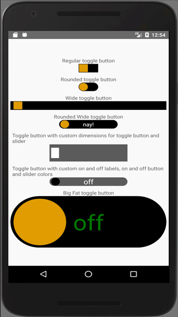
- [Demo](https://github.com/ashishpandey001/react-native-flip-toggle-button#demo)
- [Getting Started](https://github.com/ashishpandey001/react-native-flip-toggle-button#getting-started)
- [API](https://github.com/ashishpandey001/react-native-flip-toggle-button#api)
- [Issues](https://github.com/ashishpandey001/react-native-flip-toggle-button#issues)
- [Contribute](https://github.com/ashishpandey001/react-native-flip-toggle-button#contribute)
## Instructions
1. Run `yarn add react-native-flip-toggle-button` or `npm i react-native-flip-toggle-button --save`.
2. Add `import FlipToggle from 'react-native-flip-toggle-button'` in your react-native application's source code.
## Demo
- [FlipToggleSample](https://github.com/ashishpandey001/react-native-flip-toggle-button/tree/master/FlipToggleSample)
 ## Getting Started
import the FlipToggle component into your app's js file.
Then, use the FlipToggle component as shown below
```javascript
console.log(`toggle is ${this.state.isActive ? `on` : `off`}`)}
onToggleLongPress={() => console.log('toggle long pressed!')}
/>
```
## API
|prop|propType|required|default|description|
|----|:------:|:------:|:-----:|-----------|
|value|boolean|yes|n/a|default state of the flip toggle button|
|buttonWidth|number|yes|n/a|Width of the flip toggle button|
|buttonHeight|number|yes|n/a|Height of the flip toggle button|
|onToggle|function|yes|n/a|function that will be executed after toggle state is changed, returns the new state of the toggle|
|onToggleLongPress|function|no|no|function that will be executed after toggle button is long pressed, returns the new state of the toggle|
|changeToggleStateOnLongPress|boolean|no|true|flag to set whether state of the toggle button should be updated on long press|
|disabled|boolean|no|false|flag to disable the toggling of the flip toggle button|
|buttonRadius|number (0 - 100)|no|0|border radius of the flip toggle button, expressed in terms of % of buttonWidth|
|sliderWidth|number|no|90 % of buttonHeight|Width of the slider|
|sliderHeight|number|no|90 % of buttonHeight|Height of the slider|
|sliderRadius|number (0 - 100)|no|0(will use the buttonRadius as default if it is set)|border radius of the flip toggle button, expressed in terms of % of buttonWidth|
|onLabel|string|no|null|Text to be displayed within the button when it is on|
|offLabel|string|no|null|Text to be displayed within the button when it is off|
|labelStyle|object|no|{ color: 'white', fontSize: '16' }|Style object for the text displayed within the flip toggle button|
|margin|number|no|2 % of the buttonWidth|margin / spacing between the flip toggle button and the slider|
|buttonOnColor|'string'|no|'#000'|background color of the flip toggle button when it is on|
|buttonOffColor|'string'|no|'#000'|background color of the flip toggle button when it is off|
|disabledButtonOnColor|'string'|no|'#666'|background color of the flip toggle button when the toggling is disabled but set at on|
|disabledButtonOffColor|'string'|no|'#666'|background color of the flip toggle button when the toggling is disabled but set at off|
|sliderOnColor|'string'|no|'#dba628'|background color of the slider when it is on|
|sliderOffColor|'string'|no|'#dba628'|background color of the slider when it is off|
|disabledSliderOnColor|'string'|no|'#444'|background color of the slider when the toggling is disabled but set at on|
|disabledSliderOffColor|'string'|no|'#444'|background color of the slider when the toggling is disabled but set at off|
## Issues
If you face any issues with implementing this component or have a feature request or queries, please create a new [issue](https://github.com/ashishpandey001/react-native-flip-toggle-button/issues).
## Contribute
Improve this project and help the community by creating PRs.
PRs will be reviewed once every week, and will only be merged if they add to the project's value.
A proper description and necessary steps to reproduce the issue are mandatory for any issue to be considered.
## Getting Started
import the FlipToggle component into your app's js file.
Then, use the FlipToggle component as shown below
```javascript
console.log(`toggle is ${this.state.isActive ? `on` : `off`}`)}
onToggleLongPress={() => console.log('toggle long pressed!')}
/>
```
## API
|prop|propType|required|default|description|
|----|:------:|:------:|:-----:|-----------|
|value|boolean|yes|n/a|default state of the flip toggle button|
|buttonWidth|number|yes|n/a|Width of the flip toggle button|
|buttonHeight|number|yes|n/a|Height of the flip toggle button|
|onToggle|function|yes|n/a|function that will be executed after toggle state is changed, returns the new state of the toggle|
|onToggleLongPress|function|no|no|function that will be executed after toggle button is long pressed, returns the new state of the toggle|
|changeToggleStateOnLongPress|boolean|no|true|flag to set whether state of the toggle button should be updated on long press|
|disabled|boolean|no|false|flag to disable the toggling of the flip toggle button|
|buttonRadius|number (0 - 100)|no|0|border radius of the flip toggle button, expressed in terms of % of buttonWidth|
|sliderWidth|number|no|90 % of buttonHeight|Width of the slider|
|sliderHeight|number|no|90 % of buttonHeight|Height of the slider|
|sliderRadius|number (0 - 100)|no|0(will use the buttonRadius as default if it is set)|border radius of the flip toggle button, expressed in terms of % of buttonWidth|
|onLabel|string|no|null|Text to be displayed within the button when it is on|
|offLabel|string|no|null|Text to be displayed within the button when it is off|
|labelStyle|object|no|{ color: 'white', fontSize: '16' }|Style object for the text displayed within the flip toggle button|
|margin|number|no|2 % of the buttonWidth|margin / spacing between the flip toggle button and the slider|
|buttonOnColor|'string'|no|'#000'|background color of the flip toggle button when it is on|
|buttonOffColor|'string'|no|'#000'|background color of the flip toggle button when it is off|
|disabledButtonOnColor|'string'|no|'#666'|background color of the flip toggle button when the toggling is disabled but set at on|
|disabledButtonOffColor|'string'|no|'#666'|background color of the flip toggle button when the toggling is disabled but set at off|
|sliderOnColor|'string'|no|'#dba628'|background color of the slider when it is on|
|sliderOffColor|'string'|no|'#dba628'|background color of the slider when it is off|
|disabledSliderOnColor|'string'|no|'#444'|background color of the slider when the toggling is disabled but set at on|
|disabledSliderOffColor|'string'|no|'#444'|background color of the slider when the toggling is disabled but set at off|
## Issues
If you face any issues with implementing this component or have a feature request or queries, please create a new [issue](https://github.com/ashishpandey001/react-native-flip-toggle-button/issues).
## Contribute
Improve this project and help the community by creating PRs.
PRs will be reviewed once every week, and will only be merged if they add to the project's value.
A proper description and necessary steps to reproduce the issue are mandatory for any issue to be considered.