# react-native-image-slider-box
[](https://www.npmjs.com/package/react-native-image-slider-box) 
> I need someone to help me maintain the project. Feel free to send me an email.
[How to send a pull-request for this lib??? > Please Read this section before send a pull request
](#how-to-send-a-pull-request)
---


## Install
1. First, install our library | use below npm script
> npm i react-native-image-slider-box
> yarn add react-native-image-slider-box
2. (Optional) : if you want to use third-party image library such as FastImage
> npm i react-native-fast-image
> yarn add react-native-fast-image
Well-done.
## Usage :
### list of available props for customization SliderBox:
| Props | Value Type | Description |
| ---------------------------- | ------------------------------------- | ------------------------------------------------------------------------------------------------------------------------------------------------------- |
| `ImageComponent` | Image component, default as `Image` | default value is React-native Image, if you use third-party library like FastImage use this property |
| images | Array of image path(or url) as string | Set array of images path- these paths can contain `http url link` or `local images path` using `require('./pathOfImage')` |
| onCurrentImagePressed | handler function callback | callback for get pressed image index (index start from 0) |
| currentImageEmitter | handler function callback | callback for get current image index (index start from 0) |
| disableOnPress | boolean | if present, then onCurrentImagePressed will be disabled |
| activeOpacity | number | default value = 0.85, Determines the opacity when touch is active. The value should be between 0 and 1
| sliderBoxHeight | int value | default value = 200, you can change height of image slider box |
| parentWidth | int | default = screen.width ; in advance mode, if parent is smaller, you can change it. best practice is use onLayout handler in parent component or screen. |
| dotColor | color string code | change color of paging dot |
| inactiveDotColor | color string code | change color of inactive paging dot |
| dotStyle | style object | default style is : {width: 10,height: 10,borderRadius: 5,marginHorizontal: 0,padding: 0,margin: 0,} change style of paging dots if you want |
| paginationBoxVerticalPadding | int value | default = 10 ; change the height of paging dots from bottom of Slider-Box |
| autoplay | bool value | default = false |
| circleLoop | boolean - attribute | if set, when user swiped to last image circularly return to the first image again. |
| paginationBoxStyle | object,default values use lib style | customize pagination box |
| dotStyle | object,default use lib style | customize dot styles |
| resizeMethod | string | default is `resize` |
| resizeMode | string | default is `cover` |
| ImageComponentStyle | object | {} style object for ImageComponent |
| imageLoadingColor | string | default is `#E91E63` , image loading indicator color |
| ImageLoader | React component, default as `ActivityIndicator` | default value is React-native ActivityIndicator.
| firstItem | number | default is 0 , index of image to display when slider box loads |
| LoaderComponent | component | default is ActivityIndicator , you can pass any component to show as Loader |
| autoplayInterval | number | default is 3000ms |
### 1- add below import in your code :
```js
import { SliderBox } from "react-native-image-slider-box";
```
### 2- Define your image array source, for below examples i create array in state.
```js
export default class App extends Component {
constructor(props) {
super(props);
this.state = {
images: [
"https://source.unsplash.com/1024x768/?nature",
"https://source.unsplash.com/1024x768/?water",
"https://source.unsplash.com/1024x768/?girl",
"https://source.unsplash.com/1024x768/?tree", // Network image
require('./assets/images/girl.jpg'), // Local image
]
};
}
// other component code ...
}
```
### 3- Use SliderBox such as these below examples :
### Example 1 : SliderBox without and handler or customization
```js
```
### Example 2 : SliderBox with image press handler and currentImageEmitter
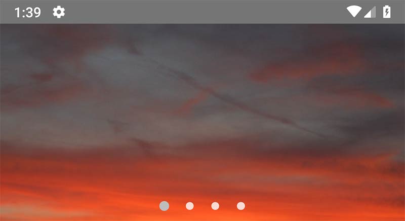
```js
console.warn(`image ${index} pressed`)}
currentImageEmitter={index => console.warn(`current pos is: ${index}`)}
/>
```
### Example 3 : SliderBox with image press handler and change slider height (default is 200)

```js
console.warn(`image ${index} pressed`)}
/>
```
### Example 4 : SliderBox with custom width from parent. use `onLayout` function by calling it from `root View` of component.
```js
onLayout = e => {
this.setState({
width: e.nativeEvent.layout.width
});
};
```
```js
render() {
return (
console.warn(`image ${index} pressed`)
}
parentWidth={this.state.width}
/>
);
}
```
### Example 5 : SliderBox with custom dots color
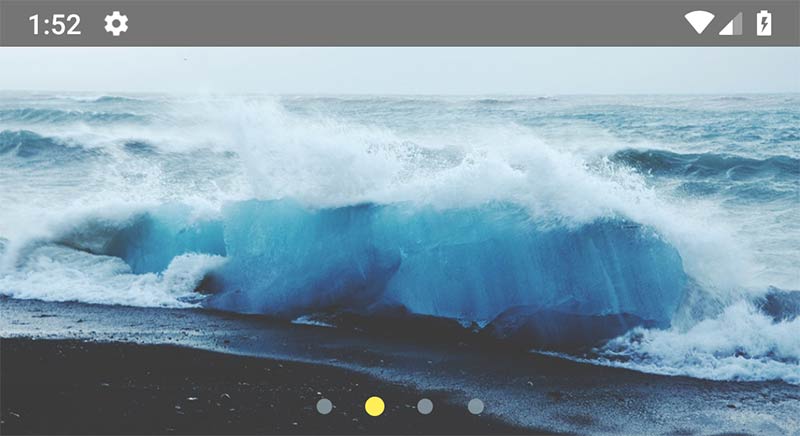
```js
console.warn(`image ${index} pressed`)}
dotColor="#FFEE58"
inactiveDotColor="#90A4AE"
/>
```
### Example 6 : SliderBox with custom dot style
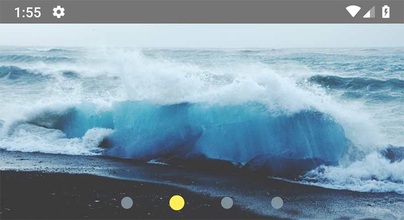
```js
console.warn(`image ${index} pressed`)}
dotColor="#FFEE58"
inactiveDotColor="#90A4AE"
dotStyle={{
width: 15,
height: 15,
borderRadius: 15,
marginHorizontal: 10,
padding: 0,
margin: 0
}}
/>
```
### Example 7 : SliderBox with change paging box padding (Vertical height from bottom of SliderBox) + add `autoplay` and `circleLoop` attribute for jump to the first image after swipe the last one.
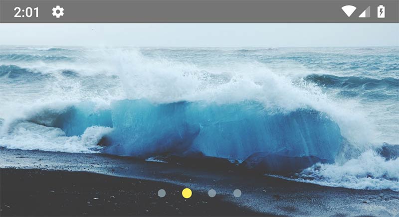
```js
console.warn(`image ${index} pressed`)}
dotColor="#FFEE58"
inactiveDotColor="#90A4AE"
paginationBoxVerticalPadding={20}
autoplay
circleLoop
/>
```
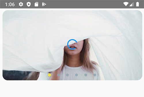
### Example 8 : use `Custom Image Component`, customize pagination, image `modes` and dotStyles:
```js
console.warn(`image ${index} pressed`)}
dotColor="#FFEE58"
inactiveDotColor="#90A4AE"
paginationBoxVerticalPadding={20}
autoplay
circleLoop
resizeMethod={'resize'}
resizeMode={'cover'}
paginationBoxStyle={{
position: "absolute",
bottom: 0,
padding: 0,
alignItems: "center",
alignSelf: "center",
justifyContent: "center",
paddingVertical: 10
}}
dotStyle={{
width: 10,
height: 10,
borderRadius: 5,
marginHorizontal: 0,
padding: 0,
margin: 0,
backgroundColor: "rgba(128, 128, 128, 0.92)"
}}
ImageComponentStyle={{borderRadius: 15, width: '97%', marginTop: 5}}
imageLoadingColor="#2196F3"
/>
```
### Example 9 : SliderBox with activeOpacity:

```js
```
## Full-Component(Screen) Example:
```js
import React, { Component } from "react";
import { StyleSheet, Text, View } from "react-native";
import { SliderBox } from "react-native-image-slider-box";
export default class App extends Component {
constructor(props) {
super(props);
this.state = {
images: [
"https://source.unsplash.com/1024x768/?nature",
"https://source.unsplash.com/1024x768/?water",
"https://source.unsplash.com/1024x768/?girl",
"https://source.unsplash.com/1024x768/?tree",
require('./assets/images/girl.jpg'),
]
};
}
render() {
return (
console.warn(`image ${index} pressed`)
}
/>
);
}
}
const styles = StyleSheet.create({
container: {
flex: 1
}
});
```
# Contribute And Update the Library
Please Edit and use `dist/SliderBox.js` file as src component file.
## How to send a pull-request
To send a pull-request please follow these rules for naming the commit message. Based on the commit messages, increment the version from the lastest release.
- If the string "`BREAKING CHANGE`" is found anywhere in any of the commit messages or descriptions the major version will be incremented.
- If a commit message begins with the string "`feat`" then the minor version will be increased. b"feat: new API" and "feature: new API".
- All other changes will increment the `patch version`.
### ! `Important: Please update the README.MD file corresponding with your added features.`
## Please subscribe and contribute with me to develop this lib
---
## Notice:
This library use `react-native-snap-carousel` and make easier way to create image slider box with full customization ability.
See original Library [https://github.com/archriss/react-native-snap-carousel](https://github.com/archriss/react-native-snap-carousel)
we dont edit or modify original library, we just use it with some additional style. (BSD 3 License)
---
### License MIT