# `` 徽章
Badge 组件定义一个徽章, 可用于图标角标显示数字、字母、原点等, 也可以自定义显示其它内容。
## Props
| Prop | Type | Default | Note |
|---|---|---|---|
| [View props...](https://facebook.github.io/react-native/docs/view.html) | | | Badge 组件继承 View 组件的全部属性。
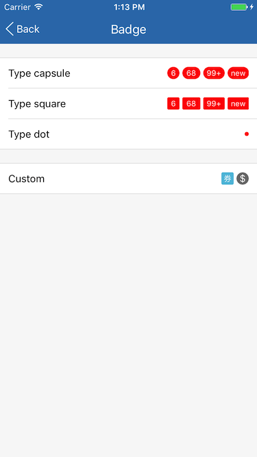
| type | string | 'capsule' | 徽章类型。
- capsule: 胶囊
- square: 圆角矩形
- dot: 圆点
显示效果参见[Screenshots](#screenshots)。
| count | string
number | | 徽章显示数字。
| countStyle | 同Text.style | | 徽章显示数字样式。
| maxCount | number | 99 | 最大值, 当 count 大于此值时显示为 maxCount 后接一个加号, 如'99+', 当 count 不是数字时无效。
## Example
简单用法
```
```
圆角矩形
```
```
圆点
```
```
自定义
```
$
```
## Screenshots