# `PopoverPicker{}` 气泡选择器
PopoverPicker 为气泡选择器静态类, 一般用于触发显示一个数据列表供用户选择, 表现形式为从触发源组件弹出的气泡。
PopoverPicker 基于 [Overlay{}](./Overlay.md) 实现。
## Static Methods
| Method | Params | Returns | Notes |
|---|---|---|---|
| [Overlay methods](./Overlay.md) | | | PopoverPicker 继承 Overlay 的全部静态方法。
| show | fromBounds, items, selectedIndex, onSelected, options | key | 显示一个气泡选择器, 重写 [Overlay{}](./Overlay.md) 中的同名函数, 输入参数 fromBounds 为弹出气泡源组件 bounds, items 为可选项列表, selectedIndex 为已选项编号, onSelected 为选择某项时的回调函数, options(可空)为 PopoverPicker.PopoverPickerView 其它属性, 参数类型参见 [PopoverPickerView](#popoverpickerpopoverpickerview--props)。
返回唯一的浮层 key 值。
## Static Props
| Prop | Type | Default | Note |
|---|---|---|---|
| [PopoverPickerView](#popoverpickerpopoverpickerview--props) | class | | PopoverPicker 内容显示组件。
## `` Props
| Prop | Type | Default | Note |
|---|---|---|---|
| [Overlay.PopoverView props...](./Overlay.md#overlaypopoverview--props) | | | PopoverPicker.PopoverPickerView 组件继承 Overlay.PopoverView 组件的全部属性。
| items | array | | 可选项列表, 数组元素可以是任何类型。
| selectedIndex | number | | 当前已选择项编号。
| getItemText | func | | 取 items 数组元素的显示文本, 传入参数为(item, index), item = items[index], 默认直接使用 item
| shadow | bool | true | 是否显示阴影(iOS only)。
| direction | string | 'down' | 继承自 Overlay.PopoverView 并修改默认值。
| align | string | 'center' | 继承自 Overlay.PopoverView 并修改默认值。
| showArrow | bool | true | 继承自 Overlay.PopoverView 并修改默认值。
## `` Events
| Event Name | Returns | Notes |
|---|---|---|
| [Overlay.PopoverView events...](./Overlay.md#overlaypopoverview--props) | | PopoverPicker.PopoverPickerView 组件继承 Overlay.PopoverView 组件的全部事件。
| onSelected | item, index | 当选择器选择 items 数组某项时调用, item = items[index]。
## `` Static Props
| Prop | Type | Default | Note |
|---|---|---|---|
| [Item](#popoverpickerpopoverpickerviewitem--props) | class | | PopoverPicker 可选项显示组件。
## `` Props
| Prop | Type | Default | Note |
|---|---|---|---|
| [TouchableOpacity props...](https://facebook.github.io/react-native/docs/touchableopacity.html) | | | PopoverPicker.PopoverPickerView.Item 组件继承 TouchableOpacity 组件的全部属性。
| title | string
number
element | | 标题, 可以是字符串、数字或 React Native 组件。
| selected | bool | | 是否已选中。
## Example
简单用法, fromView 必须是支持 NativeMethodsMixin 的 React Native 原生组件, 如为复合组件需自行实现 measureInWindow 函数, 可参照[Select.js](/components/Select/Select.js)
```
let items = [
'Apple',
'Banana',
'Cherry',
'Durian',
'Filbert',
'Grape',
'Hickory',
'Lemon',
'Mango',
];
fromView.measureInWindow((x, y, width, height) => {
PopoverPicker.show(
{x, y, width, height},
items,
this.state.selectedIndex,
(item, index) => this.setState({selectedIndex: index})
);
});
```
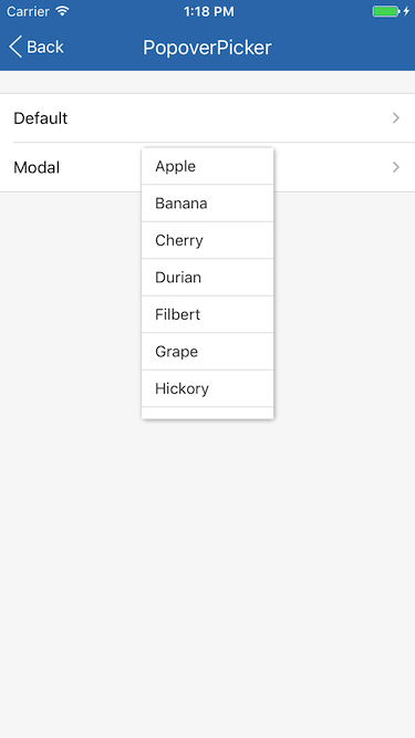
## Screenshots