# react-native-lq-toast
A **lightweight and customizable toast notification library** for React Native. It supports animations, different toast variants, and allows users to pass a custom component for the toast design.
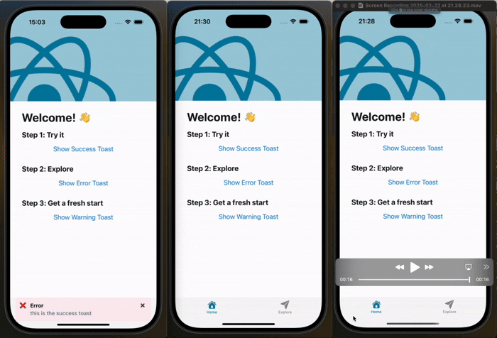
## 🎥 Demo
Here’s how the toast appears from the **top** and **bottom**:
## 📦 Installation
```sh
npm install react-native-lq-toast
```
or using Yarn:
```sh
yarn add react-native-lq-toast
```
## 🚀 Usage
### **1⃣ Wrap Your App with `ToastProvider`**
To use the toast system, wrap your app with the `ToastProvider`.
```tsx
import React from "react";
import { ToastProvider } from "react-native-lq-toast";
import HomeScreen from "./HomeScreen";
const App = () => {
return (
);
};
export default App;
```
### **2⃣ Use `useToast()` Hook to Show Toasts**
Inside any component, you can use the `useToast` hook to show or hide toasts.
```tsx
import React from "react";
import { View, Button } from "react-native";
import { useToast } from "react-native-lq-toast";
const HomeScreen = () => {
const { showToast } = useToast();
return (
);
};
export default HomeScreen;
```
### **3⃣ Customize Toast Position and Animation**
By default, the toast appears at the **top** of the screen with a **slide** animation, but you can customize both:
```tsx
```
### **4⃣ Passing a Custom Toast Component**
You can pass a **custom component** for the toast UI while still using the built-in animation:
```tsx
const CustomToast = ({ title, description, onDismiss }) => {
return (
{title}{description}
);
};
(
console.log("closed")}
/>
)}
>
;
```
### **5⃣ Setting Toast Duration and Offsets**
You can control how long the toast remains visible using the `duration` prop in both `ToastProvider` and `showToast`.
Additionally, you can adjust the toast's position using `offsetTop` and `offsetBottom`.
```tsx
```
```tsx
showToast({
title: "Info",
description: "This message will disappear in 5 seconds.",
variant: "warning",
duration: 4000,
});
```
## What’s Improved?
```
✅ Toast moves above the keyboard when position="bottom"
✅ Uses Keyboard.addListener() to track the keyboard height dynamically
✅ Keeps original offsetTop and offsetBottom behavior intact
✅ Supports animationType prop: "slide" and "fade"
```
## 🎨 Toast Variants
| Variant | Icon | Default Background |
| ------- | ---- | ------------------ |
| success | ✅ | `#EFFAF6` |
| error | ❌ | `#FDEDF0` |
| warning | ⚠️ | `#FFF4E5` |
## 🛠 API Reference
### **`ToastProvider` Props**
| Prop | Type | Default | Description |
| ---------------------- | ------------------------------- | --------- | ------------------------------------------------- |
| `position` | `'top' \| 'center' \| 'bottom'` | `'top'` | Position of the toast. |
| `animationType` | `'slide' \| 'fade'` | `'slide'` | Animation type for toast appearance. |
| `customToastComponent` | `ReactNode` | `null` | Custom toast component. |
| `duration` | `number` | `4000ms` | Duration before toast disappears (ms). |
| `offsetTop` | `number` | `60` | Offset from the top when position is "top". |
| `offsetBottom` | `number` | `100` | Offset from the bottom when position is "bottom". |
### **`useToast()` Methods**
| Method | Arguments | Description |
| ----------- | --------------------------------------------------------------------------------------------------------------------------------------------------------------------------------------- | ------------------------ |
| `showToast` | `{ title: string, description?: string, variant?: 'success' \| 'error' \| 'warning', animationType?: 'slide' \| 'fade', duration?: number, offsetTop?: number, offsetBottom?: number }` | Displays a toast. |
| `hideToast` | `()` | Hides the current toast. |
This makes sure the toast never overlaps the keyboard when appearing at the bottom! 🚀
## 📝 License
This project is licensed under the **MIT License**.
---
Now you're all set to use **react-native-lq-toast** in your project! 🚀🔥
---