# react-native-modal
[](https://badge.fury.io/js/react-native-modal)
[](https://github.com/prettier/prettier)
An enhanced, animated and customizable react-native modal.
## Features
* Smooth enter/exit animations
* Plain simple and flexible APIs
* Customizable backdrop opacity, color and timing
* Listeners for the modal animations ending
* Resize itself correctly on device rotation
* Swipeable
## Demo


## Setup
This library is available on npm, install it with: `npm install --save react-native-modal` or `yarn add react-native-modal`.
## Usage
Since react-native-modal is an extension of the original react native modal, it works in a similar fashion [react-native original modal](https://facebook.github.io/react-native/docs/modal.html).
1. Import react-native-modal:
```javascript
import Modal from "react-native-modal";
```
2. Create a modal and nest its content inside of it:
```javascript
render () {
return (
I am the modal content!
)
}
```
3. Then simply show it by setting the `isVisible` prop to true:
```javascript
render () {
return (
I am the modal content!
)
}
```
The `isVisible` prop is the only prop you'll really need to make the modal work: you should control this prop value by saving it in your state and setting it to `true` or `false` when needed.
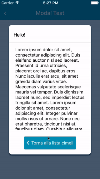
## A complete example
The following example consists in a component (`ModalTester`) with a button and a modal.
The modal is controlled by the `isModalVisible` state variable and it is initially hidden, since its value is `false`.
Pressing the button sets `isModalVisible` to true, making the modal visible.
Inside the modal there is another button that, when pressed, sets `isModalVisible` to false, hiding the modal.
```javascript
import React, { Component } from "react";
import { Text, TouchableOpacity, View } from "react-native";
import Modal from "react-native-modal";
export default class ModalTester extends Component {
state = {
isModalVisible: false
};
_toggleModal = () =>
this.setState({ isModalVisible: !this.state.isModalVisible });
render() {
return (
Show Modal
Hello!
Hide me!
);
}
}
```
For a more complex example take a look at the `/example` directory.
## Available props
| Name | Type | Default | Description |
| ------------------------------ | ---------------- | -------------- | -------------------------------------------------------------------------------------------- |
| animationIn | string or object | 'slideInUp' | Modal show animation |
| animationInTiming | number | 300 | Timing for the modal show animation (in ms) |
| animationOut | string or object | 'slideOutDown' | Modal hide animation |
| animationOutTiming | number | 300 | Timing for the modal hide animation (in ms) |
| avoidKeyboard | bool | false | Move the modal up if the keyboard is open |
| backdropColor | string | 'black' | The backdrop background color |
| backdropOpacity | number | 0.70 | The backdrop opacity when the modal is visible |
| backdropTransitionInTiming | number | 300 | The backdrop show timing (in ms) |
| backdropTransitionOutTiming | number | 300 | The backdrop hide timing (in ms) |
| children | node | **REQUIRED** | The modal content |
| isVisible | bool | **REQUIRED** | Show the modal? |
| onBackButtonPress | func | () => null | Called when the Android back button is pressed |
| onBackdropPress | func | () => null | Called when the backdrop is pressed |
| onModalHide | func | () => null | Called when the modal is completely hidden |
| onModalShow | func | () => null | Called when the modal is completely visible |
| onSwipe | func | null | Called when the `swipeThreshold` has been reached |
| swipeThreshold | number | 100 | Swiping threshold that when reached calls `onSwipe` |
| swipeDirection | string | null | Defines the direction where the modal can be swiped (can be 'up', 'down', 'left, or 'right') |
| useNativeDriver | bool | false | Defines if animations should use native driver |
| hideModalContentWhileAnimating | bool | false | Enhances the performance by hiding the modal content until the animations complete |
| style | any | null | Style applied to the modal |
## Frequently Asked Questions
### The component is not working as expected
Under the hood `react-native-modal` uses react-native original [Modal component](https://facebook.github.io/react-native/docs/modal.html).
Before reporting a bug, try swapping `react-native-modal` with react-native original Modal component and, if the issue persists, check if it has already been reported as a [react-native issue](https://github.com/facebook/react-native/issues).
### How can I hide the modal by pressing outside of its content?
The prop `onBackdropPress` allows you to handle this situation:
```javascript
this.setState({ isVisible: false })}
>
I am the modal content!
```
### How can I hide the modal by swiping it?
The prop `onSwipe` allows you to handle this situation (remember to set `swipeDirection` too!):
```javascript
this.setState({ isVisible: false })}
swipeDirection="left"
>
I am the modal content!
```
### The modal flashes in a weird way when animating
Unfortunately this is a [know issue](https://github.com/react-native-community/react-native-modal/issues/92) that happens when `useNativeDriver=true` and must still be solved.
In the meanwhile as a workaround you can set the `hideModalContentWhileAnimating` prop to `true`: this seems to solve the issue.
Also, do not assign a `backgroundColor` property directly to the Modal. Prefer to set it on the child container.
### The modal background doesn't animate properly
Are you sure you named the `isVisible` prop correctly? Make sure it is spelled correctly: `isVisible`, not `visible`.
### The modal doesn't change orientation
Add a `supportedOrientations={['portrait', 'landscape']}` prop to the component, as described [in the React Native documentation](https://facebook.github.io/react-native/docs/modal.html#supportedorientations).
## Available animations
Take a look at [react-native-animatable](https://github.com/oblador/react-native-animatable) to see the dozens of animations available out-of-the-box. You can also pass in custom animation definitions and have them automatically register with react-native-animatable. For more information on creating custom animations, see the react-native-animatable [animation definition schema](https://github.com/oblador/react-native-animatable#animation-definition-schema).
## Acknowledgements
Thanks [@oblador](https://github.com/oblador) for react-native-animatable, [@brentvatne](https://github.com/brentvatne) for the npm namespace and to anyone who contributed to this library!
Pull requests, feedbacks and suggestions are welcome!