# react-native-multiple-tags
Multiple Select using Tags
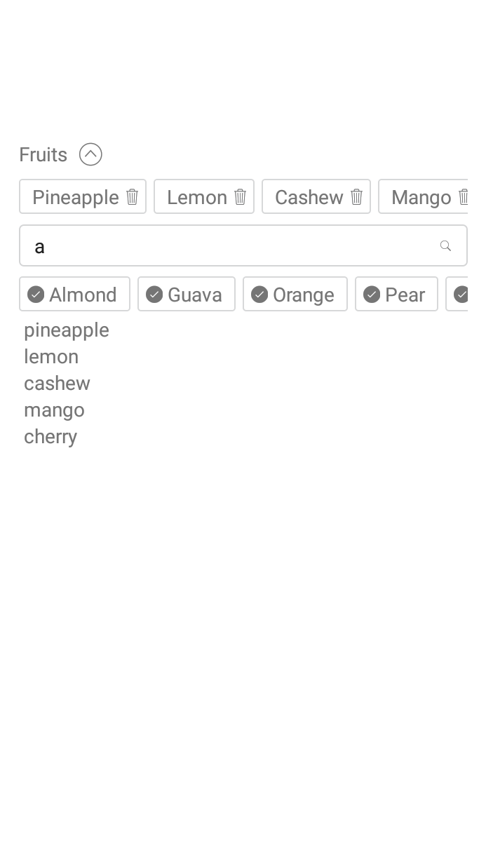
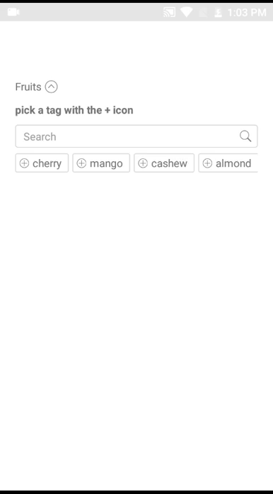
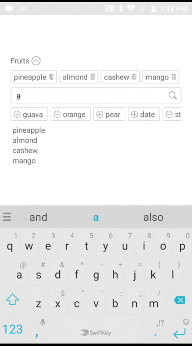
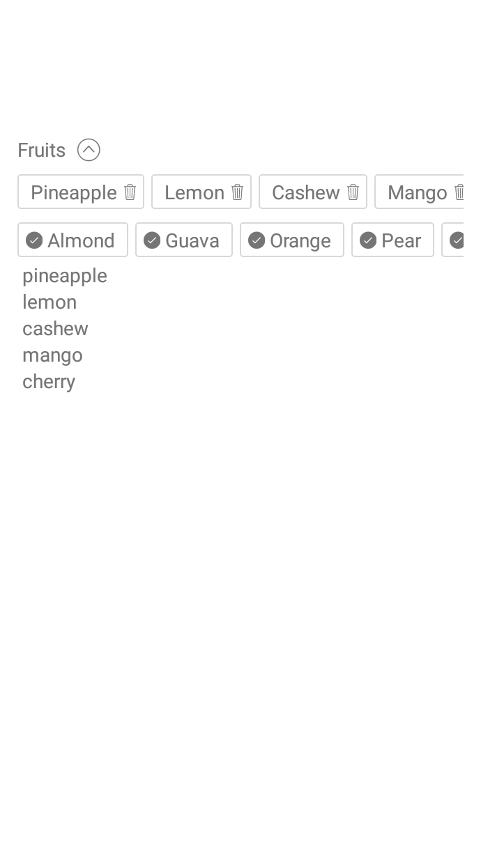
# Demo
 # Installation
```s
npm i -S react-native-multiple-tags
```
# Usage
```js
import React, { Component } from 'react';
import {
View,
Text,
} from 'react-native';
import MultipleTags from 'react-native-multiple-tags';
const tags = [
'cherry',
'mango',
'cashew',
'almond',
'guava',
'pineapple',
'orange',
'pear',
'date',
'strawberry',
'pawpaw',
'banana',
'apple',
'grape',
'lemon',
];
const objectTags = [
{
key: 'id_01',
value: 'cherry',
},
{
key: 'id_02',
value: 'mango',
},
{
key: 'id_03',
value: 'cashew',
},
{
key: 'id_04',
value: 'almond'
},
{
key: 'id_05',
value: 'guava'
},
{
key: 'id_06',
value: 'pineapple'
},
{
key: 'id_07',
value: 'orange'
},
{
key: 'id_08',
value: 'pear'
},
{
key: 'id_09',
value: 'date'
}
]
class WelcomeComponent extends Component {
constructor(props) {
super(props);
this.state = {
content: [],
contentx: [],
};
}
render() {
return (
{ this.setState({ content }); }}
title="Fruits"
/>
{
(() => this.state.content.map(item => {item.key}: {item.value} ))()
}
{ this.setState({ contentx }); }}
title="Fruits"
/>
{
(() => this.state.contentx.map(item => {item} ) )()
}
);
}
}
export default WelcomeComponent;
```
## Props
---
| Prop | Required | Types | Purpose |
| --- |---| ---|---|
| tags | Yes | array | List of tags/items to display for selection. This can be array of objects or just an array of strings |
| preselectedTags | No | array | List of tags/items to be selected on default. tags can be array of objects or array of strings. |
| objectKeyIdentifier | No | string | when using array of objects you can signify the key property of the object i.e objectTags = `[{ id: 'id_01', name: 'cherry' }]` and that becomes `objectKeyIdentifier = 'id'` , default is key |
| objectValueIdentifier | No | string | when using array of objects you can signify the value property of the object i.e objectTags = `[{ id: 'id_01', name: 'cherry' }]` and that becomes `objectValueIdentifier = 'name'`, default is value |
| search | No | boolean | set search to false to hide the search bar. |
| onChangeItem | Yes | function | JavaScript function passed in as an argument. This function is called whenever items are added or removed in the component. |
| title | No | string | The Name or Category of tags. |
| iconAddName | No | string | Name of icon to be used instead of the regular +, icon name must be of Ionicons in react-native-vector-icons |
| searchHitResponse | No | string | Text to display when search query hits nothing. |
| defaultInstructionClosed | No | string | Text to instruct users what to do when closed |
| defaultTotalRenderedTags | No | number | Total number of tags to show or render, default is 30
| defaultInstructionOpen | No | string | Text to instruct users what to do when opened |
| sizeIconTag | No | number | Size Icon of add (plus) item. |
| showIconAdd | No | boolean | Set false if you want hide the Add Icon. |
| labelActiveTag | No | object | Custom style for active tag label. |
| tagActiveStyle | No | object | Custom style for active tag. |
| visibleOnOpen | No | boolean |
# Todo
- [x] Supports array of objects.
PR's are welcome
# Installation
```s
npm i -S react-native-multiple-tags
```
# Usage
```js
import React, { Component } from 'react';
import {
View,
Text,
} from 'react-native';
import MultipleTags from 'react-native-multiple-tags';
const tags = [
'cherry',
'mango',
'cashew',
'almond',
'guava',
'pineapple',
'orange',
'pear',
'date',
'strawberry',
'pawpaw',
'banana',
'apple',
'grape',
'lemon',
];
const objectTags = [
{
key: 'id_01',
value: 'cherry',
},
{
key: 'id_02',
value: 'mango',
},
{
key: 'id_03',
value: 'cashew',
},
{
key: 'id_04',
value: 'almond'
},
{
key: 'id_05',
value: 'guava'
},
{
key: 'id_06',
value: 'pineapple'
},
{
key: 'id_07',
value: 'orange'
},
{
key: 'id_08',
value: 'pear'
},
{
key: 'id_09',
value: 'date'
}
]
class WelcomeComponent extends Component {
constructor(props) {
super(props);
this.state = {
content: [],
contentx: [],
};
}
render() {
return (
{ this.setState({ content }); }}
title="Fruits"
/>
{
(() => this.state.content.map(item => {item.key}: {item.value} ))()
}
{ this.setState({ contentx }); }}
title="Fruits"
/>
{
(() => this.state.contentx.map(item => {item} ) )()
}
);
}
}
export default WelcomeComponent;
```
## Props
---
| Prop | Required | Types | Purpose |
| --- |---| ---|---|
| tags | Yes | array | List of tags/items to display for selection. This can be array of objects or just an array of strings |
| preselectedTags | No | array | List of tags/items to be selected on default. tags can be array of objects or array of strings. |
| objectKeyIdentifier | No | string | when using array of objects you can signify the key property of the object i.e objectTags = `[{ id: 'id_01', name: 'cherry' }]` and that becomes `objectKeyIdentifier = 'id'` , default is key |
| objectValueIdentifier | No | string | when using array of objects you can signify the value property of the object i.e objectTags = `[{ id: 'id_01', name: 'cherry' }]` and that becomes `objectValueIdentifier = 'name'`, default is value |
| search | No | boolean | set search to false to hide the search bar. |
| onChangeItem | Yes | function | JavaScript function passed in as an argument. This function is called whenever items are added or removed in the component. |
| title | No | string | The Name or Category of tags. |
| iconAddName | No | string | Name of icon to be used instead of the regular +, icon name must be of Ionicons in react-native-vector-icons |
| searchHitResponse | No | string | Text to display when search query hits nothing. |
| defaultInstructionClosed | No | string | Text to instruct users what to do when closed |
| defaultTotalRenderedTags | No | number | Total number of tags to show or render, default is 30
| defaultInstructionOpen | No | string | Text to instruct users what to do when opened |
| sizeIconTag | No | number | Size Icon of add (plus) item. |
| showIconAdd | No | boolean | Set false if you want hide the Add Icon. |
| labelActiveTag | No | object | Custom style for active tag label. |
| tagActiveStyle | No | object | Custom style for active tag. |
| visibleOnOpen | No | boolean |
# Todo
- [x] Supports array of objects.
PR's are welcome