# react-native-otp-input-box



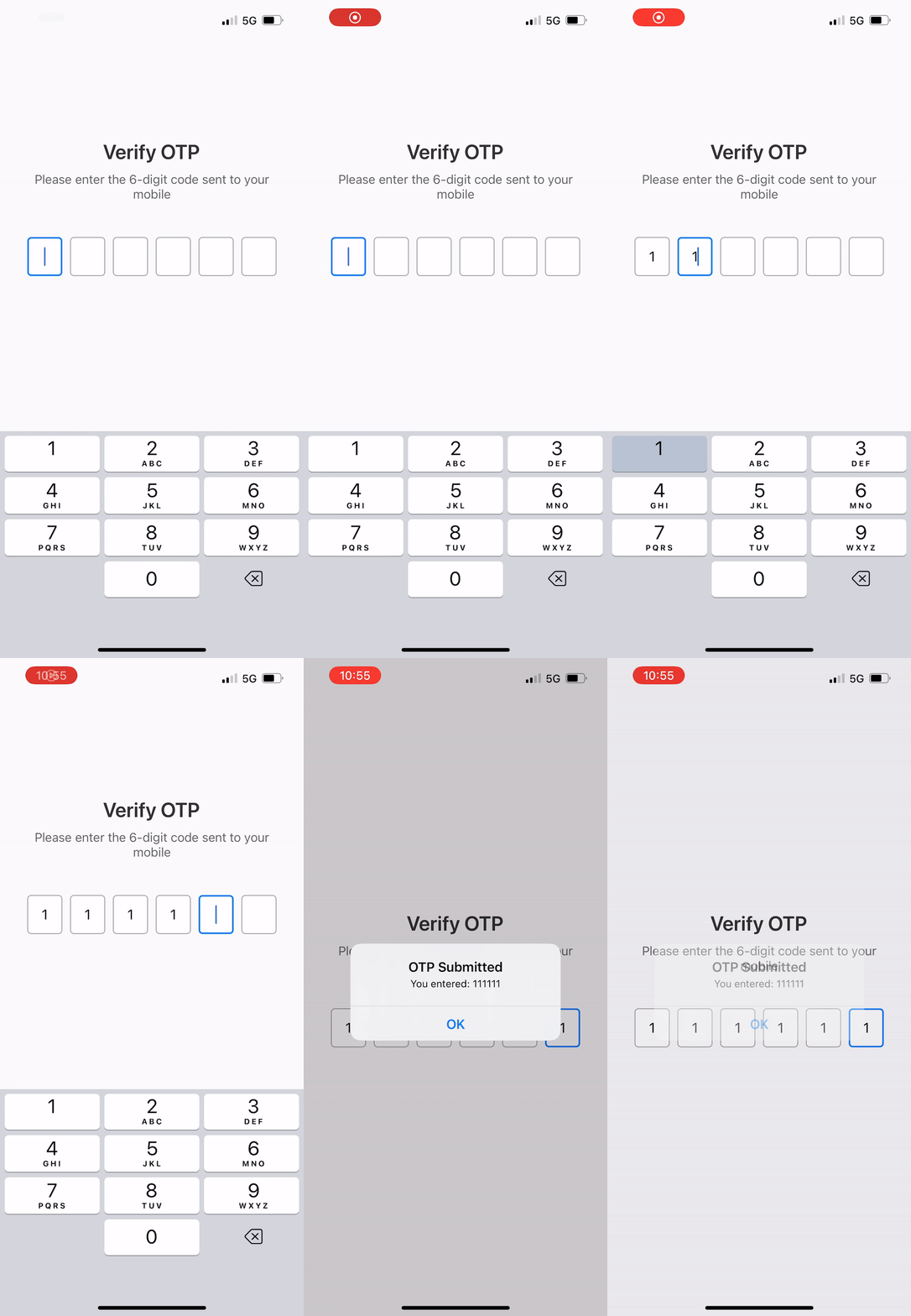
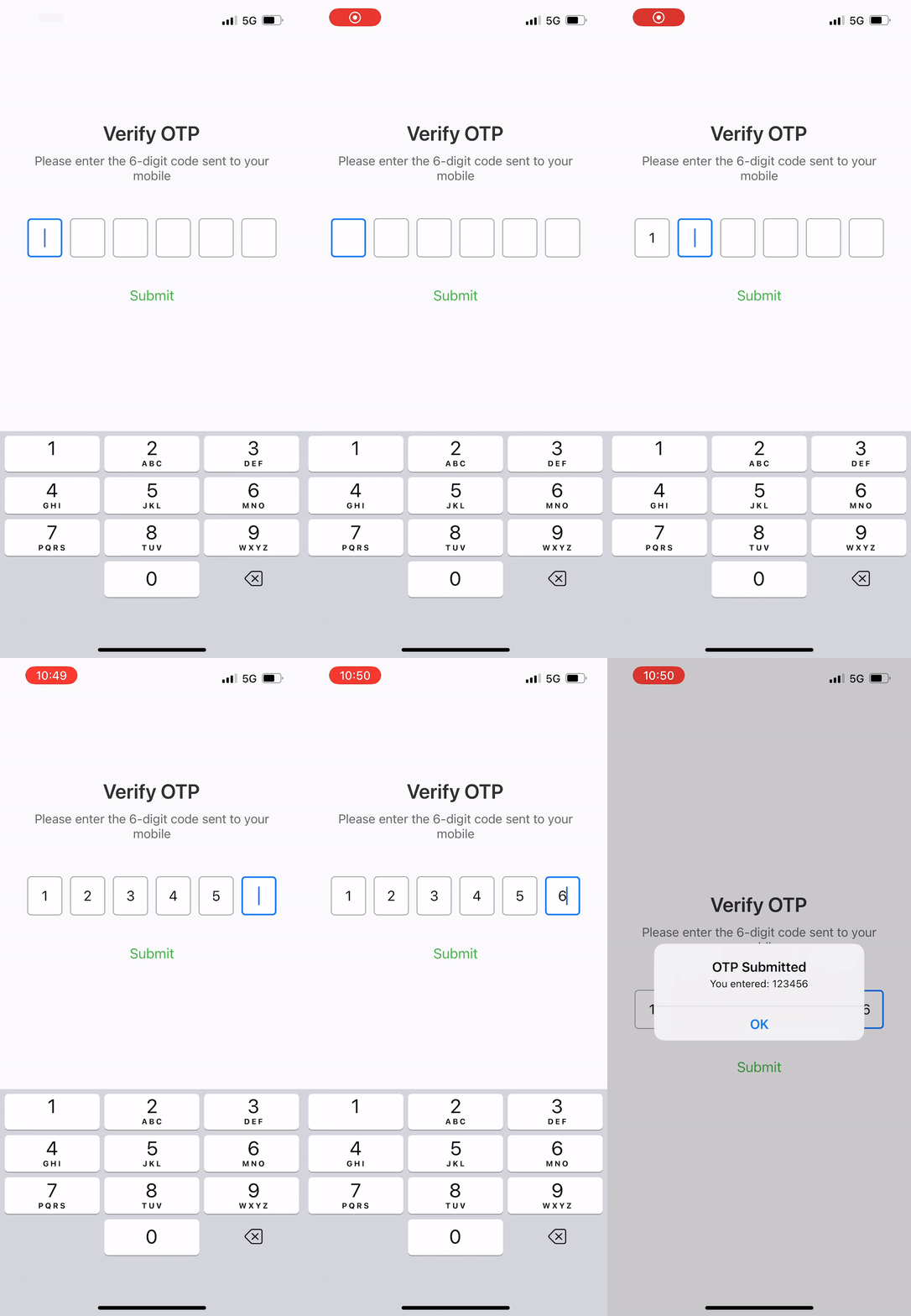
A customizable, lightweight OTP/PIN input component for React Native with paste support, SMS autofill, secure entry, ref methods, and more.
---
## ✨ Features
- **Paste support** – Paste full OTP from clipboard; digits are distributed across boxes
- **SMS auto-fill** – iOS & Android support for one-time codes from SMS
- **Secure text entry** – Mask characters for PIN/security use cases
- **Controlled & uncontrolled** – Use `value`/`onOtpChange` or `defaultValue`
- **Ref methods** – `clear()`, `focus()`, `blur()`, `setValue()`, `getValue()`
- **onOtpComplete** – Callback when all digits are entered (ideal for auto-submit)
- **Error & disabled states** – Built-in styling and props
- **Placeholder character** – Optional character when boxes are empty
- **Accessibility** – `accessibilityLabel`, `testID` for testing
- **Auto-blur on complete** – Optionally blur keyboard when OTP is complete
- **Configurable gap** – Spacing between input boxes
---
## 📦 Installation
```bash
npm install react-native-otp-input-box
# or
yarn add react-native-otp-input-box
```
---
## Usage
### Basic
```jsx
import { OtpInput } from "react-native-otp-input-box";
console.log(otp)}
/>
```
### Auto-submit on complete
```jsx
verifyOtp(otp)}
blurOnComplete
/>
```
### SMS autofill (iOS / Android)
```jsx
verifyOtp(otp)}
/>
```
### PIN mode (secure, masked)
```jsx
verifyPin(otp)}
/>
```
### Controlled mode with error state
```jsx
const [otp, setOtp] = useState("");
const [error, setError] = useState(false);
{
verifyOtp(otp).catch(() => setError(true));
}}
/>
```
### Using ref methods
```jsx
// JavaScript: use useRef(null) - no type needed
const otpRef = useRef(null);
// TypeScript: optionally add type for autocomplete
// import type { OtpInputRef } from "react-native-otp-input-box";
// const otpRef = useRef(null);
// Later:
otpRef.current?.clear(); // Clear and focus first
otpRef.current?.focus(2); // Focus 3rd box
otpRef.current?.setValue("123456");
otpRef.current?.getValue(); // "123456"
otpRef.current?.blur(); // Dismiss keyboard
```
---
## Props
| Prop | Type | Default | Description |
|------|------|---------|-------------|
| `length` | `number` | `6` | Number of OTP input boxes |
| `onOtpChange` | `(otp: string) => void` | - | Callback when OTP changes |
| `onOtpComplete` | `(otp: string) => void` | - | Callback when all digits are entered |
| `value` | `string` | - | Controlled value |
| `defaultValue` | `string` | `""` | Initial value (uncontrolled) |
| `keyboardType` | `"number-pad" \| "default" \| "numeric" \| "email-address"` | `"number-pad"` | Keyboard type |
| `autoFocus` | `boolean` | `true` | Auto-focus first input on mount |
| `secureTextEntry` | `boolean` | `false` | Mask characters (PIN mode) |
| `disabled` | `boolean` | `false` | Disable all inputs |
| `error` | `boolean` | `false` | Show error state styling |
| `placeholderCharacter` | `string` | `""` | Character when box is empty (e.g. `"•"`) |
| `blurOnComplete` | `boolean` | `false` | Blur keyboard when OTP complete |
| `gap` | `number` | `5` | Gap between boxes |
| `autoComplete` | `"sms-otp" \| "one-time-code" \| "off"` | `"off"` | Enable SMS autofill |
| `inputStyle` | `TextStyle` | - | Style for input boxes |
| `focusedInputStyle` | `TextStyle` | - | Style for focused input |
| `errorInputStyle` | `TextStyle` | - | Style for error state |
| `disabledInputStyle` | `TextStyle` | - | Style when disabled |
| `containerStyle` | `ViewStyle` | - | Style for container |
| `accessibilityLabel` | `string` | `"OTP input"` | Accessibility label |
| `testID` | `string` | `"otp-input"` | Test ID for testing |
---
## Ref methods
| Method | Description |
|--------|-------------|
| `clear()` | Clear all inputs and focus first |
| `focus(index?)` | Focus a specific box (default: 0) |
| `blur()` | Blur all inputs |
| `setValue(value)` | Set OTP value programmatically |
| `getValue()` | Get current OTP value |
---
## Types
```ts
import type { OtpInputProps, OtpInputRef } from "react-native-otp-input-box";
```
---
## License
MIT © [coder-shubh](https://github.com/coder-shubh)