# 📱 react-native-phone-country-picker-input
A fully customizable and lightweight phone number input with country picker for **React Native**, featuring flag emojis, dial codes, and search modal support. Made using Expo and TypeScript. No third party dependencies used. Built-in support for all countries.
## 🐍️ Version
**v1.0.7** - Release date: **2025-05-30**.
## ✨ Features
- 🌍 Built-in list of countries with flag, name, ISO code, and dial code
- 📞 Phone number input with country selector
- 🔍 Searchable modal for selecting countries
- 🎨 Full style customization support
- 🧩 Custom modal support
- ⚛️ Fully typed with TypeScript
## 📸 Screenshots
React Native Phone Country Picker Input
## 📚 Table of Contents
- [📱 react-native-phone-country-picker-input](#-react-native-phone-country-picker-input)
- [🐍️ Version](#️-version)
- [✨ Features](#-features)
- [📸 Screenshots](#-screenshots)
- [📚 Table of Contents](#-table-of-contents)
- [📦 Installation](#-installation)
- [🧠 Usage](#-usage)
- [⚙️ Props](#️-props)
- [PhonePickerInputProps](#phonepickerinputprops)
- [🌐 Utility Functions](#-utility-functions)
- [Functions](#functions)
- [🧩 Types](#-types)
- [Country](#country)
- [CustomStyles](#customstyles)
- [🎨 CustomStyles Reference](#-customstyles-reference)
- [Component Structure with Custom Styles](#component-structure-with-custom-styles)
- [Example Usage](#example-usage)
- [🛠 Roadmap](#-roadmap)
- [💬 Contributing](#-contributing)
- [📄 License](#-license)
- [🙌 Credits](#-credits)
## 📦 Installation
Zero third-party dependencies — no need to install anything else! Plain vanilla React Native code.
```bash
npm install react-native-phone-picker
# or
yarn add react-native-phone-picker
```
## 🧠 Usage
```tsx
import React from 'react';
import {PhonePickerInput} from 'react-native-phone-picker';
export default function App() {
return (
{
setSelectedCountry(country); // parent state setter . Value of @type {Country} from types.
}}
customStyles={
wrapperScrollViewStyle={{
justifyContent: 'center',
alignItems: 'center',
},
phoneTextInputStyle: {
// custom style for phone text input.
backgroundColor: 'white',
fontSize: 18,
marginBottom: 10,
},
flagStyle: {fontSize: 18, padding: 15}, // custom style for flag component
countryListContainer: {justifyContent: 'space-between'}, // custom style for country list container inside modal.
}}
/>
);
}
```
## ⚙️ Props
### PhonePickerInputProps
| Prop | Type | Description |
| ----------------------------------- | --------------------------------------------- | ------------------------------------------------ |
| `phoneValue` | `string` | The current phone number value. |
| `onPhoneNumberValueChange` | `(text: string) => void` | Callback for when the phone input changes. |
| `disableTextInput` | `boolean` | Disables the phone number input. |
| `keyboardType` | `KeyboardTypeOptions` | Input keyboard type. Defaults to `phone-pad`. |
| `defaultplaceholder` | `string` | Placeholder for the phone input field. |
| `defaultFlag` | `string` | Initial flag emoji shown before selecting. |
| `defaultCountryCode` | `string` | Initial dial code (e.g., `+1`). |
| `onSelectCountry` | `(country: Country) => void` | Called when a country is selected. |
| `openCountryModal` | `boolean` | Opens the country picker modal programmatically by setting internal state. | |
| `customModalComponent` | `React.Node` | Your custom modal content. Use `getAllCountries()` to get the array of countries then make your own modal component and pass as prop.
| `customArrowIconComponent` | `React.Node` | Your custom arrow down component to replace the default e.g. `react-native-vector-icons` or `expo-vector-icons` and pass as prop. Reason for using image was to avoid any package or dependancy to keep it light. Must customize for more dynamic icon. |
| `countrySearchPlaceholder` | `string` | Search bar placeholder inside modal. |
| `otherCountrySearchTextInputProps` | `TextInputProps` | Props for customizing search input inside the modal. |
| `searchIcon` | `string \| ReactNode` | Emoji or icon for the search bar. |
| `otherFlatListProps` | `FlatListProps` | Extra props for the country list `FlatList` component. |
| `customStyles` | `CustomStyles` | Custom styles for all components. |
| `customTextInputProps` | `TextInputProps` | Extra props for the phone number TextInput. |
| `disableWrapperScrollView` | `boolean` | Use View instead of ScrollView if true at the top/outer most wrapper of the entire component tree. When true, replaces ScrollView wrapper with a simple View
Useful when ScrollView causes issues with parent scrollable components. ScrollView was used as default to handle keyboard dismissal. | |
| `wrapperScrollViewKeyboardPersists` | `'handled' \| 'always' \| 'never' \| boolean` | Keyboard tap behavior for the top most ScrollView wrapper in the component tree. |
## 🌐 Utility Functions
Available from `phonePickerUtils`:
```ts
import {
getIsoCode,
getDialCode,
getCountryFlag,
getCountryName,
getCountryObject,
getAllCountries,
} from 'react-native-phone-picker/phonePickerUtils';
```
### Functions
| Function | Description |
| -------------------------------------- | ------------------------------------------------- |
| `getIsoCode(dialCode: string)` | Get ISO country code from dial code('+1' -> 'US') |
| `getDialCode(isoCode: string)` | Get Dial code from ISO code('US' -> '+1') |
| `getCountryFlag(identifier: string)` | Get flag emoji from ISO or dial code |
| `getCountryName(identifier: string)` | Get country name from ISO or dial code |
| `getCountryObject(identifier: string)` | Get full country object |
| `getAllCountries()` | Returns an array of all supported country objects |
## 🧩 Types
### Country
```ts
type Country = {
name: string;
iso2: string;
dialCode: string;
flag: string;
};
```
### CustomStyles
Define styles for all customizable components like flags, inputs, modals, lists, etc.
- **Custom styles are ment to override default styles and not merge for almost all cases.**
- Only exception is top most `wrapperScrollViewStyle` and `wrapperViewStyle`. Recommend that disableWrapperScrollView = true is used if parent component has `` as wrapper.
## 🎨 CustomStyles Reference
Complete styling options for every component in the library:
| Style Property | Applies To | Type | Description |
|-------------------------------|-------------------------------------|--------------------|-----------------------------------------------------------------------------|
| `wrapperScrollViewStyle` | Top most ScrollView wrapper | `ViewStyle` | Styles for the root ScrollView container |
| `wrapperViewStyle` | Fallback top most View wrapper | `ViewStyle` | Styles when `disableWrapperScrollView=true` |
| `mainInputContainer` | Main input container | `ViewStyle` | Styles for the View containing both flag picker and text input |
| `flagPickerContainer` | Flag/code selector button | `ViewStyle` | Styles for the Pressable flag/country code container |
| `customPressedStyle` | Flag button pressed state | `ViewStyle` | Custom pressed effect styles (overrides default opacity) |
| `flagStyle` | Flag emoji | `TextStyle` | Styles for the flag emoji Text component |
| `downArrowIcon` | Dropdown arrow | `ImageStyle` | Styles for the caret-down Image component |
| `countryCodeText` | Dial code text (+1, +44) | `TextStyle` | Styles for the country code Text component |
| `phoneTextInputStyle` | Phone number input | `TextStyle` | Styles for the phone number TextInput |
| `modalOverlay` | Modal background | `ViewStyle` | Styles for the modal backdrop overlay |
| `modalContent` | Modal content container | `ViewStyle` | Styles for the white modal content box |
| `modalTitle` | Modal title text | `TextStyle` | Styles for "Select Country" title |
| `modalSearchContainer` | Search bar container | `ViewStyle` | Styles for the search input container |
| `modalSearchIcon` | Search icon | `TextStyle` | Styles for the search icon (when using string emoji) |
| `modalSearchInput` | Search input field | `TextStyle` | Styles for the search TextInput |
| `countryListContainer` | Country list item | `ViewStyle` | Styles for each country's container in the list |
| `countryListFlag` | Country flag in list | `TextStyle` | Styles for list item flag emoji |
| `countryName` | Country name in list | `TextStyle` | Styles for the country name text (e.g. "United States") |
| `countryListDialCode` | Dial code in list | `TextStyle` | Styles for the dial code text (e.g. "+1") |
### Component Structure with Custom Styles
```tsx
{/*Use `View` if default scroll view is creating problems with parent scrollable components.disableWrapperScrollView = true*/}
customStyles.customPressedStyle>
// Country Flag
{/**
* - Conditionally render an Image or custom component
* - Reason for using image was to avoid any package or dependancy to keep it light.
* - Must customize for more dynamic icon.
*/}
{!customArrowIconComponent ?
:
customArrowIconComponent
}
// Dial code like +91
{!disableTextInput &&
}
{/**
* - Conditionally render a custom modal component or default country picker modal.
* - IF you use customModalComponent, you can get the list of countries by calling `getAllCountries()`.
*/}
{!customModalComponent ?
// Closes the modal on press
// Modal title
{typeof searchIcon === 'string' ?
// Search icon :
searchIcon
}
opacity 0.7>
// Flag
// Country Name
// (+91)
: customModalComponent}
```
### Example Usage
```tsx
```
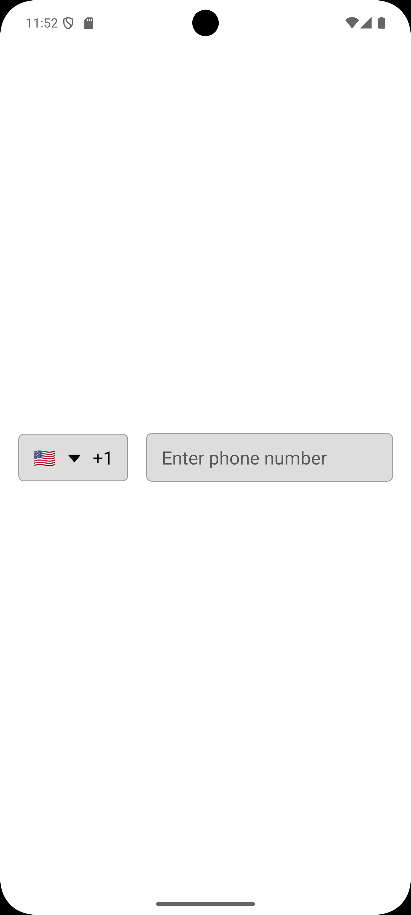
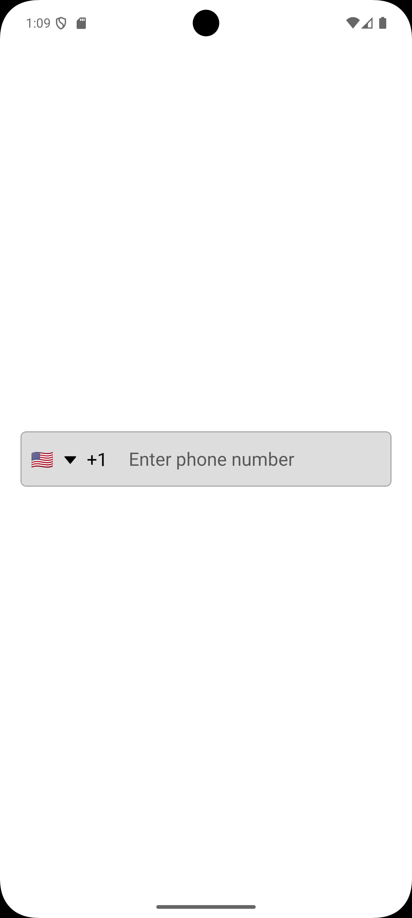
**Result**
Before
After
## 🛠 Roadmap
- [ ] Support for web.
- [ ] utility functions for excluding countries from search.
- [ ] Prioritize country list in search.
- [ ] Accessibility improvements.
## 💬 Contributing
- Pull requests are welcome. For major changes, please open an issue first to discuss what you would like to change.
- Suggestions for improvement are also welcomed.
## 📄 License
MIT
## 🙌 Credits
Inspired by UI patterns from
- [react-native-phone-input](https://www.npmjs.com/package/react-native-phone-input)
- [react-native-country-codes-picker](https://www.npmjs.com/package/react-native-country-codes-picker)

