
# React-Native-Picker

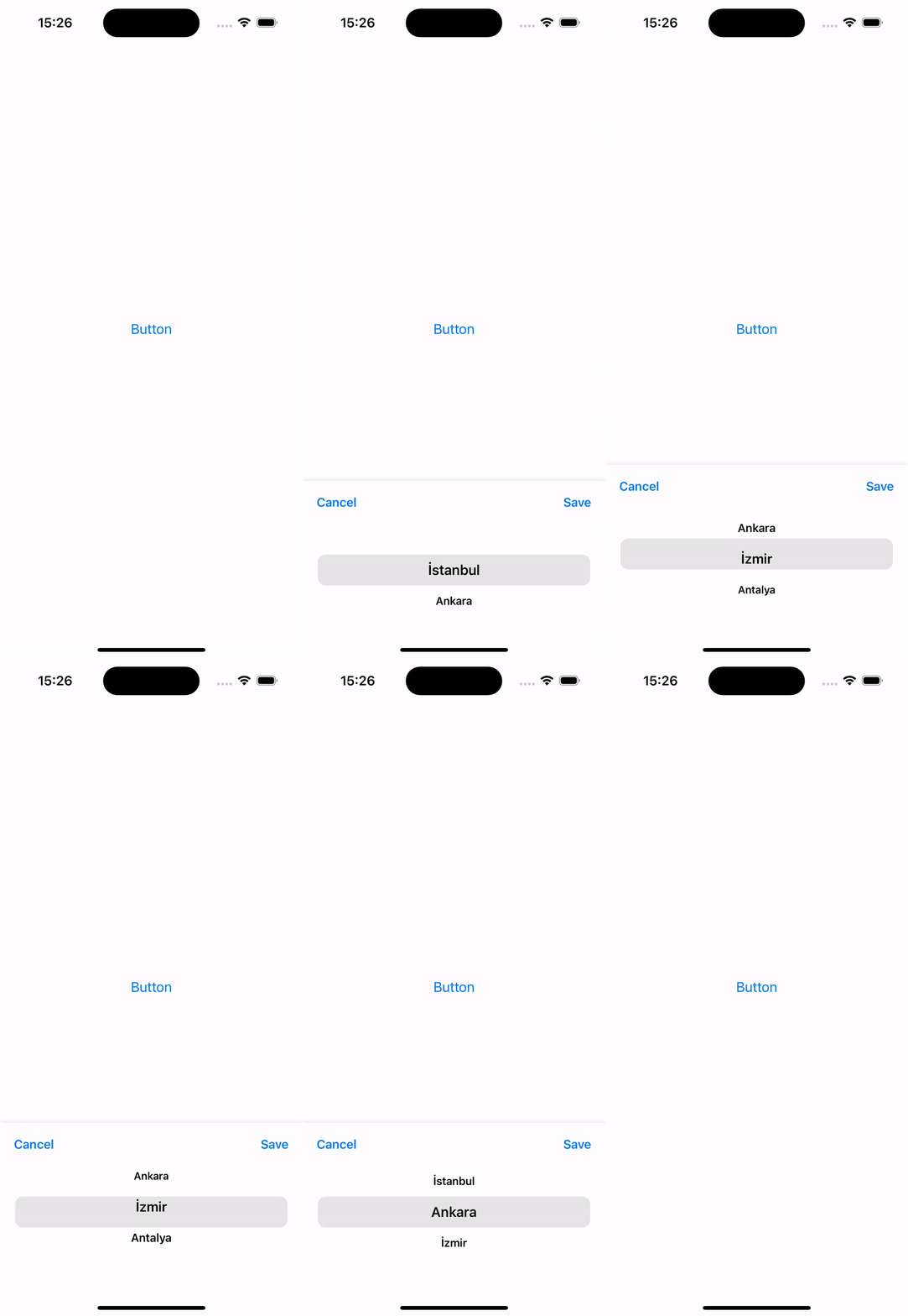
***React-Native-Picker*** component is a customizable and easy-to-use package for implementing a wheel picker UI in your React Native applications. This component allows users to select options by spinning a wheel-like interface, making it ideal for scenarios where you need to choose values from a list or perform date and time selections.

Suitable for both Android and Iphone

## Installation
```
npm i react-native-picker-component
```

## Usage
```
import Picker from 'react-native-picker-component'
```


## Preview
<table>
  <tr >
    <th>IOS</th>
    <th>Android</th>
  </tr>
  <tr>
    <td>
      <img src="./assets/ios.gif" width="250"/>
    </td>
    <td>
      <img src="./assets/android.gif" width="250"/>
     </td>
  </tr>
</table>

## Usage

```javascript
export default function App() {

  const data = [
    {
      id: 1,
      city: "İstanbul"
    },
    {
      id: 2,
      city: "Ankara"
    },
    {
      id: 3,
      city: "İzmir"
    },
    {
      id: 4,
      city: "Antalya"
    },
    {
      id: 5,
      city: "Bursa"
    }
  ]

  const [visible, setVisible] = useState(false)

  return (
    <View style={styles.container}>
      <TouchableOpacity onPress={() => { setVisible(true) }} style={styles.button}>
        <Text style={styles.buttonText}>Button</Text>
      </TouchableOpacity>

      <Picker
        data={data}
        selectText={"city"}
        selectedItem={(item) => { console.log("Selected Item", item) }}
        visible={visible}
        setVisible={setVisible}
      />
    </View>
  );
}
```

## Props
<table>
  <tr>
    <th>Props</th>
    <th>Required</th>
    <th>Description</th>
  </tr>
  <tr>
    <td>data</td>
    <td>true</td>
    <td>Array</td>
  </tr>
  <tr>
    <td>selectedText</td>
    <td>true</td>
    <td>item of object that will be shown on picker</td>
  </tr>
  <tr>
    <td>selectedItem</td>
    <td>true</td>
    <td>returns selected object</td>
  </tr>
  <tr>
    <td>visible</td>
    <td>true</td>
    <td>show modal state</td>
  </tr>
  <tr>
    <td>setVisible</td>
    <td>true</td>
    <td>close modal state</td>
  </tr>
  </tr>
  <tr>
    <td>cancelButtonText</td>
    <td>false</td>
    <td>cancel button text chould change</td>
  </tr>
  </tr>
  <tr>
    <td>saveButtonText</td>
    <td>false</td>
    <td>save button text chould change</td>
  </tr>
</table>