# react-native-progress-bar-animated
[](https://badge.fury.io/js/react-native-progress-bar-animated)
📊 Simple, customizable and animated progress bar for React Native
## Features
- Flexible style
- Plain simple and flexible API
- Listeners for actions
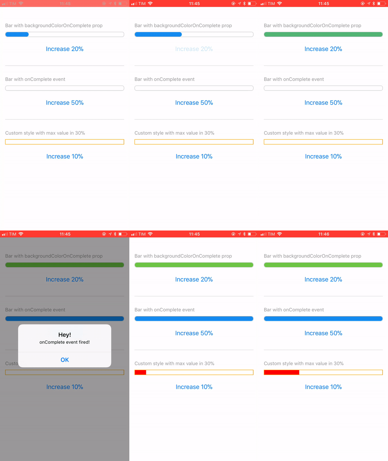
## Demo
You can try on expo: https://expo.io/@rafaelmotta021/react-native-progress-bar-animated-demo
## Setup
`yarn add react-native-progress-bar-animated`
or
`npm install --save react-native-progress-bar-animated`
## Usage
```javascript
import React from 'react';
import {
View,
StyleSheet,
Dimensions,
Button,
Alert,
Text,
} from 'react-native';
import ProgressBarAnimated from 'react-native-progress-bar-animated';
export default class App extends React.Component {
state = {
progress: 20,
progressWithOnComplete: 0,
progressCustomized: 0,
}
increase = (key, value) => {
this.setState({
[key]: this.state[key] + value,
});
}
render() {
const barWidth = Dimensions.get('screen').width - 30;
const progressCustomStyles = {
backgroundColor: 'red',
borderRadius: 0,
borderColor: 'orange',
};
return (
Bar with backgroundColorOnComplete propBar with onComplete event {
Alert.alert('Hey!', 'onComplete event fired!');
}}
/>
Custom style with max value in 30%
);
}
}
const styles = StyleSheet.create({
container: {
flex: 1,
backgroundColor: '#FFF',
marginTop: 50,
padding: 15,
},
buttonContainer: {
marginTop: 15,
},
separator: {
marginVertical: 30,
borderWidth: 0.5,
borderColor: '#DCDCDC',
},
label: {
color: '#999',
fontSize: 14,
fontWeight: '500',
marginBottom: 10,
},
});
```
## Available props
| Name | Type| Default | Description |
| --- | --- | --- | --- |
| value | number | 0 | Progress value |
| maxValue | number | 500 | Max percentage bar can have |
| barEasing | string | 'linear' | Easing animation type(bounce, cubic, ease, sin, linear, quad) |
| barAnimationDuration | number | [] | Duration in ms of bar width animation |
| backgroundAnimationDuration | number | null | Duration in ms of bar background color change |
| width | number | REQUIRED | Width of bar |
| height | number | 15 | Height of bar |
| backgroundColor | string | '#148cF0' | Color that will complete the bar |
| backgroundColorOnComplete | string | null | Optional color that will overwrite background color when reach the max value prop |
| borderWidth | number | 1 | Style prop |
| borderColor | string | '#148cF0' | Style prop |
| borderRadius | number | 6 | Style prop |
| onComplete | function | null | Callback after bar reach the max value prop |