# react-native-simple-accordian
_Animated collapsible component for React Native_
Pure JavaScript, supports dynamic content heights and components that is aware of its `collapsed` state (good for toggling arrows etc) with custom styling.
## Installation
```
npm install --save react-native-simple-accordian
```
## Accordion Usage
This is a convenience component for a common use case,you can see demo below.
```js
import SimpleAccordion from 'react-native-simple-accordian';
;
```
## Properties
| Prop | Description |
| ------------------------------------------------------- | --------------------------------------------------------------------------------------------------------------- |
| **`sections`** | An array of sections passed to the render methods |
| **`renderHeader(content, index, isActive, sections)`** | A function that should return a renderable representing the header |
| **`renderContent(content, index, isActive, sections)`** | A function that should return a renderable representing the content |
| **`renderSectionTitle(content, index, isActive)`** | A function that should return a renderable representing the title of the section outside the touchable element |
| **`onChange(index)`** | An optional function that is called when currently active section is changed, `index === false` when collapsed |
| **`initiallyActiveSection`** | Set which index in the `sections` array is initially open. Defaults to none. |
| **`activeSection`** | Control which index in the `sections` array is currently open. Defaults to none. If false, closes all sections. |
| **`underlayColor`** | The color of the underlay that will show through when tapping on headers. Defaults to black. |
| **`touchableComponent`** | The touchable component used in the Accordion. Defaults to `TouchableHighlight` |
| **`touchableProps`** | Properties for the `touchableComponent` |
| **`disabled`** | Set whether the user can interact with the Accordion |
| **`align`** | See `Collapsible` |
| **`duration`** | See `Collapsible` |
| **`easing`** | See `Collapsible` |
| **`expandFromBottom`** | Expand content from the bottom instead of the top |
| **`style`** | Optional styling for the container |
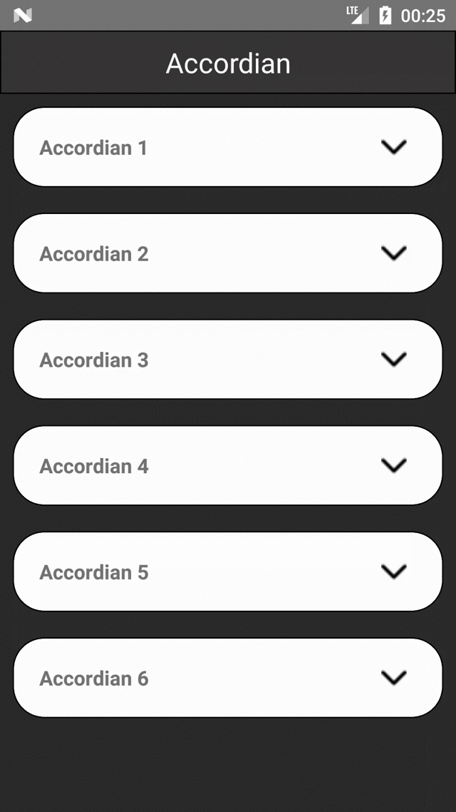
## Demo
## Example
```
npm install --save react-native-simple-accordian lodash
```
```js
import React, { Component } from 'react';
import { StyleSheet, Text, View, TouchableOpacity,Image,Dimensions,ScrollView } from 'react-native';
import SimpleAccordion from 'react-native-simple-accordian';
const deviceWidth = Dimensions.get('window').width
const accordianData = 'This is sample Accordian Text....';
import * as _ from 'lodash'
const sampleAccordianData = [
{
title: 'Accordian 1 ',
content: accordianData
},
{
title: 'Accordian 2',
content: accordianData
},
{
title: 'Accordian 3',
content: accordianData
},
{
title: 'Accordian 4 ',
content: accordianData
},
{
title: 'Accordian 5',
content: accordianData
},
{
title: 'Accordian 6',
content: accordianData
},
];
export default class AccordianExample extends Component {
constructor(props){
super(props)
this.state = ({
content:'',
open: false,
});
}
onChangeAccordian(section) {
this.setState({ open: section });
}
renderHeader(section, i, isOpen) {
return (
{section.title}
);
}
renderContent(section, i, isOpen) {
return (
{section.content}
);
}
render() {
return (
Accordian
);
}
}
const styles = StyleSheet.create({
container: {
flex: 1,
justifyContent: 'center',
backgroundColor:'#2c2c2c'
},
headerText1:{
color:'white',
textAlign:'center',
fontSize:22
},
headerTextView:{
height:50,
borderWidth:1,
backgroundColor:'#383636',
justifyContent:'center',
},
title: {
textAlign: 'center',
fontSize: 22,
fontWeight: '300',
marginBottom: 20,
color:'#ffffff'
},
header:{
flex:1
},
headerText: {
textAlign: 'center',
fontSize: 16,
fontWeight: '500',
},
content: {
padding: 20,
backgroundColor: '#ffffff'
},
});
```