# react-native-tableview-simple
[](https://www.patreon.com/purii)
[](https://travis-ci.org/Purii/react-native-tableview-simple)
[](https://www.npmjs.com/package/react-native-tableview-simple)
[](https://www.npmjs.com/package/react-native-tableview-simple)
[](http://packagequality.com/#?package=react-native-tableview-simple)
[](https://snyk.io/test/npm/react-native-tableview-simple)
[](https://raw.githubusercontent.com/Purii/react-native-tableview-simple/master/LICENSE)
:point_right: _This component is used in my production app [**Game ideas**](https://apps.apple.com/us/app/game-ideas-get-inspired/id1450078546). Make sure to check it out!_ :point_left:
This cross-platform component is inspired by the iOS-TableView. Made with pure CSS, the intention is to provide **a flexible and lightweight alternative to a bridged component**. Don't be scared of React-Native upgrades anymore!
A possible use case might be an about- or a settings-screen with a few rows.
For displaying long datalists it is recommended to use the `FlatList` Component together with `Cell` and `Separator` Components. ([see example](#render-with-flatlist) or [live demo with expo](https://snack.expo.io/@purii/react-native-tableview-simple))
:rocket: If you like my component and want to buy me a coffee press the `Sponsor` Button and find out about GitHub Sponsors – Thanks! :point_left:
| | |
| :-------------------------------------------------------------------------------------------: | :---------------------------------------------------------------------------------------: |
|  |  |
Have a look at the [examples below](https://github.com/Purii/react-native-tableview-simple#examples)! :-)
- [Installation](#installation)
- [Extensible](#extensible)
- [Props](#props): [`TableView`](#tableview) [`Cell`](#cell) [`Section`](#section) [`Separator`](#separator)
- [Examples](#examples)
- [Try it out](#try-it-out)
## Installation
1. _Install as dependency:_
```sh
// yarn
yarn add react-native-tableview-simple
// or npm
npm i react-native-tableview-simple --S
```
2. _Add needed components:_
```javascript
import { Cell, Section, TableView } from 'react-native-tableview-simple';
```
## Extensible
`react-native-tableview-simple` provides you with some predefined CSS-styles, inspired by the native TableView.
You can always mix the `Cell`-instances inside a `Section`, with other (React-Native)-Views.
### Override defaults of `Cell`-Component
Don't repeat yourself.
If you override the default props over and over again, just pass them as an object.
```jsx
const cellPropsCustom = {
cellStyle: 'Basic',
title: 'Basic Custom',
backgroundColor: 'black',
};
|
|
```
### Separator BackgroundColor is derived from Cell BackgroundColor
The `Separator`-Component is a line from the left end to the right end.
According to the original iOS TableView there should be an insent on the left end.
This is done by separating the `Separator`-Component in two parts: `SeparatorContainer` (full width) and `SeparatorInner` (width - inset). (See: [`Separator.tsx`](/src/components/Separator.tsx))
The `SeparatorContainer` has the same color that the `Cell`-Component above.
The `SeparatorInner` has the default Separator Color.
Pressing a Cell Component will change the color of `SeparatorInner` to `transparent`.
#### Why is that so complicated?
Because just hiding the separator would make the height of the component jump.
## Props
- [`TableView`](#tableview)
- [`Cell`](#cell)
- [`Section`](#section)
- [`Separator`](#separator)
### `TableView`
The `TableView` component controls the theme.
| Prop | Default | Type | Description |
| :---------------- | :-----: | :----------------: | ----------------------------------------------------------------------------------------------------------------------------------------- |
| children | - | `React.ReactNode` | Children. Should be of type `Section` |
| appearance | `auto` | `string` | `auto`: System Appearance; `light`: Light Appearance; `dark`: Dark Appearance; `[string]`: Appearance defined through `customAppearances` |
| customAppearances | - | `THEME_APPEARANCE` | |
| style | - | `ViewStyle` | Applied to the table wrapper |
### `Section`
The `Section` component is needed to render the `Cells` together with `Separators`.
It's possible to use the `Flatlist` component instead ([Example](#render-with-flatlist)).
| Prop | Default | Type | Description |
| :------------------------ | :---------------------------: | :--------------------: | ------------------------------------------------------------------- |
| allowFontScaling | `true` | `bool` | Respect Text Size accessibility setting on iOS |
| footerComponent | - | `React.Component` | Inject any component to replace original footer (optional) |
| headerComponent | - | `React.Component` | Inject any component to replace original header (optional) |
| footer | - | `string` | Footer value |
| footerTextColor | `#6d6d72` | `string` | Text color of footer |
| footerTextStyle | `{}` | `Text.propTypes.style` | These styles will be applied to the footer `Text`-Component. |
| header | - | `string` | Header value |
| headerTextColor | `#6d6d72` | `string` | Text color of header |
| headerTextStyle | `{}` | `Text.propTypes.style` | These styles will be applied to the header `Text`-Component. |
| hideSeparator | `false` | `bool` | Hide separators |
| hideSurroundingSeparators | `false` | `bool` | Hide surrounding separators, best combined with roundedCorners |
| roundedCorners | `false` | `bool` | Enable rounded corners, best combined with hideSurroundingSeparator |
| sectionPaddingBottom | `15` | `number` | Padding bottom of section |
| sectionPaddingTop | `15` | `number` | Padding top of section |
| sectionTintColor | `#EFEFF4` | `string` | Background color of section |
| separatorInsetLeft | `15` | `number` | Left inset of separator |
| separatorInsetRight | `0` | `number` | Right inset of separator |
| separatorTintColor | `#C8C7CC` | `string` | Color of separator |
| withSafeAreaView | `true / false (on iOS <= 10)` | `bool` | Render section header and footer with SafeAreaView |
### `Cell`
The style of the `Cell` component is inspired by the native `UITableView`.
Because the `Cell` component is created with CSS only, its highly flexible.
The content of the cell is separated in three views, which can all be modified via `props`: `cellImageView` | `cellContentView` | `cellAccessoryView`.
To get an idea what you can modify via `props`, have a look at the [examples below](https://github.com/Purii/react-native-tableview-simple#examples).
| Prop | Default | Type | Description |
| :-------------------------------- | :---------------------------: | :---------------------------------------: | ----------------------------------------------------------------------------------------------------------------------------------------------------------------------------------- |
| accessory | - | `string` | Predefined accessory: `DisclosureIndicator`, `Detail`, `DetailDisclosure`, `Checkmark` |
| accessoryColor | `#007AFF` | `string` | Color of accessory |
| accessoryColorDisclosureIndicator | `#C7C7CC` | `string` | Color of accessory `DisclosureIndicator` |
| allowFontScaling | `true` | `bool` | Respect Text Size accessibility setting on iOS |
| backgroundColor | `#FFF` | `string` | Background color of cell |
| cellStyle | `Basic` | `string` | Predefined styles: `Basic`, `RightDetail`, `LeftDetail`, `Subtitle` |
| cellAccessoryView | - | `React.Component` | Replace accessory view component (_e.g.: add Switch or ActivityIndicator_) |
| cellContentView | - | `React.Component` | Replace content view component |
| cellImageView | - | `React.Component` | Replace image view component |
children | - | `React.Component` | Additional content to be displayed below the cell. (_e.g: Add Picker or DateTimePicker_)
| contentContainerStyle | `{}` | `View.propTypes.style` | These styles will be applied to the content container which wraps all of the child views. Overrides `cellStyle` (_e.g.: Override paddingLeft and paddingRight or set fixed height_) |
| detail | - | `string` or `number` | Detail value |
| detailTextProps | `{}` | `Text.propTypes` | These props will be applied to the (left- / right-) detail `Text`-Component. |
| detailTextStyle | `{}` | `Text.propTypes.style` | These styles will be applied to the (left- / right-) detail `Text`-Component. |
| disableImageResize | `false` | `bool` | Disable resizing of image |
| hideSeparator | `false` | `bool` | Hide the following `Separator`-Component |
| highlightActiveOpacity | `0.8` | `number` | Opacity of cell when touch is active |
| highlightUnderlayColor | `black` | `string` | Color of underlay that will show through when touch is active |
| isDisabled | `false` | `bool` | Cell is disabled. `onPress` will not get triggered |
| image | - | `React.Component (Image)` | Image component displayed on the left. Will resized automatically |
| leftDetailColor | `#007AFF` | `string` | Text color of left detail |
| rightDetailColor | `#8E8E93` | `string` | Text color of right detail |
| subtitleColor | `#000` | `string` | Text color of subtitle |
| subtitleTextStyle | `{}` | `Text.propTypes.style` | These styles will be applied to the subtitle `Text`-Component. |
| testID | `undefined` | `string` | Add testID to root component |
| title | - | `string` or `number` or `React.Component` | Title value |
| titleTextColor | `#000` | `string` | Text color of title |
| titleTextProps | `{}` | `Text.propTypes` | These props will be applied to the title `Text`-Component. |
| titleTextStyle | `{}` | `Text.propTypes.style` | These styles will be applied to the title `Text`-Component (_e.g.: update `fontSize` or `fontFamily`_) |
| titleTextStyleDisabled | `{}` | `Text.propTypes.style` | These styles will be applied to the title `Text`-Component, when the cell is disabled |
| onPress | - | `func` or `false` | If set, cell will be automaticaly initialized with TouchableHighlight |
| onPressDetailAccessory | - | `func` or `false` | Listen to onPress event of detail accessory |
| withSafeAreaView | `true / false (on iOS <= 10)` | `bool` | Render cell with SafeAreaView |
#### Wrap `Cell`
Sometimes custom `Cell` components are needed.
By creating a new component, which is based on `Cell`, its only necessary to set the props once.
However, this comes with certain downsides. In order to keep the API as easy to use as possible, I implemented some automations for the `Sections` component.
For example, the `Cell.backgroundColor` prop will also decide on the `backgroundColor` of the `Separator` component.
Given the following pattern:
```javascript
import {
Cell,
Section,
TableView,
} from 'react-native-tableview-simple';
const CellVariant = (props) => (
{props.title}
}
/>
);
// ...
````
This pattern introduces an additional layer between `Section` and `Cell`: `Section` -> `CellVariant` -> `Cell`.
The `Section` component is expecting a `Cell` component as a child and therefor tries to [access the props as defined for the `Cell` component](https://github.com/Purii/react-native-tableview-simple/blob/5e81f61993eea32784cd9b20fa6e73d1240d77e5/src/components/Section.tsx#L131).
If following the mentioned pattern, this would fail, because `CellVariant.props` only contains the prop `title`.
Instead, I recommend to insert your new default props as description in this section: [Override defaults of `Cell`-Component](##override-defaults-of-cell-component).
If this is not enough for you, and you still need to have a custom cell component, consider merging both approaches:
```javascript
import {
Cell,
Section,
TableView,
} from 'react-native-tableview-simple';
const cellPropsVariant = {
hideSeparator: true,
backgroundColor: 'black',
};
const CellVariant = (props) => (
{props.title}
}
/>
);
// ...
````
### `Separator`
In general the `Separator` component is used internally by the `Section` component.
But additionally this component can be used together with `FlatList`.
See the [example below](#render-with-flatlist).
| Prop | Default | Type | Description |
| :--------------- | :---------------------------: | :------: | ------------------------------------- |
| backgroundColor | `#EFEFF4` | `string` | Background color |
| insetLeft | `15` | `number` | Left inset of separator |
| insetRight | `0` | `number` | Right inset of separator |
| isHidden | `false` | `bool` | Hide separator but keeping its height |
| tintColor | `#C8C7CC` | `string` | Color of separator |
| withSafeAreaView | `true / false (on iOS <= 10)` | `bool` | Render separator with SafeAreaView |
## Examples
The following examples can be found in the folder `example`.
To run the example project, follow these steps:
1. `git clone https://github.com/Purii/react-native-tableview-simple`
1. `cd example`
1. `yarn` or `npm i`
1. run `/example/ios/example.xcodeproj` via Xcode
- [Quick look](#quick-look)
- [Use case: About-screen](#use-case-about-screen)
- [Complete example / vs. native iOS](#react-native-tableview-simple-vs-native-ios)
- [Render with `FlatList`](#render-with-flatlist)
### Quick look
```javascript
// ActivityIndicator as accessory
| }
contentContainerStyle={{ paddingVertical: 4 }} // Adjust height
/>
// Switch as accessory
| }
/>
// TextInput
| }
/>
// Image
|
}
/>
```
### Use case: About-screen
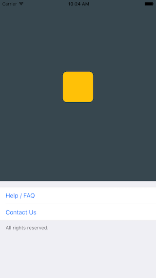
```javascript
/**
* Sample React Native App
* https://github.com/facebook/react-native
* @flow
*/
import React, { Component } from 'react';
import { AppRegistry, ScrollView, StyleSheet, Text, View } from 'react-native';
import { Cell, Section, TableView } from 'react-native-tableview-simple';
export default class App extends Component<{}> {
render() {
return (
console.log('open Help/FAQ')}
/>
| console.log('open Contact Us')}
/>
| |
);
}
}
const styles = StyleSheet.create({
stage: {
backgroundColor: '#EFEFF4',
paddingBottom: 20,
flex: 1,
},
});
```
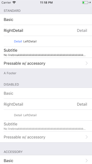
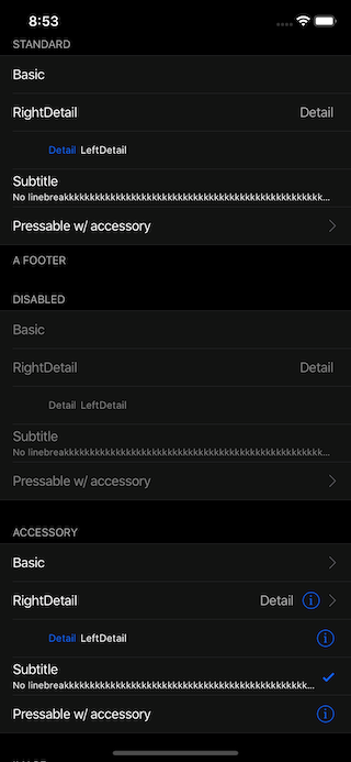
### `react-native-tableview-simple` vs. Native iOS
The left and middle screens are build using `react-native-tableview-simple`. The right one is native.
| `react-native-tableview-simple` (Dark Appearance) | `react-native-tableview-simple` | Native iOS |
| :---------------------------------------------------------------------------------------: | :-----------------------------------------------------------------------------------: | ------------------------------------------------------------------------------------------- |
|  | 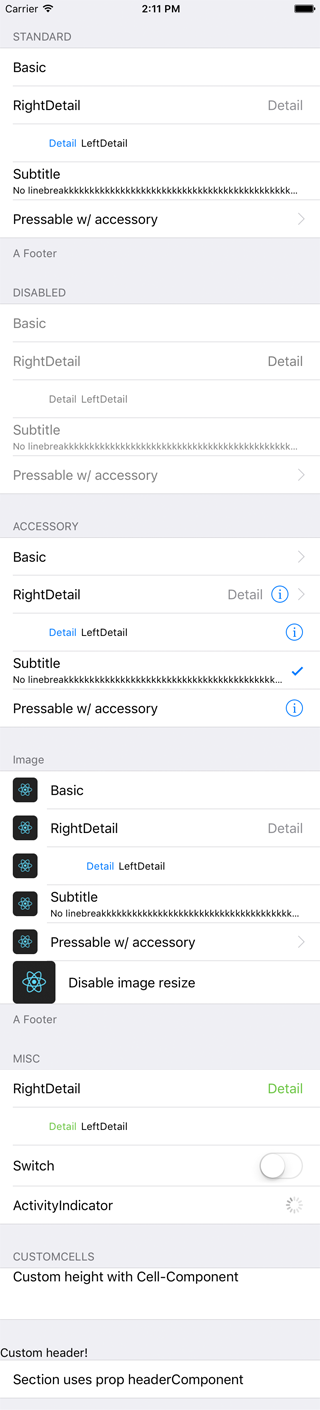 | 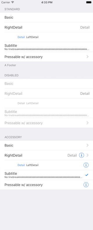 |
```javascript
/**
* Sample React Native App
* https://github.com/facebook/react-native
* @flow
*/
import React, { Component } from 'react';
import {
ActivityIndicator,
AppRegistry,
Dimensions,
Image,
ScrollView,
StyleSheet,
Switch,
Text,
TextInput,
View,
} from 'react-native';
import { Cell, Section, TableView } from 'react-native-tableview-simple';
export default class App extends Component<{}> {
render() {
return (
|
|
|
|
console.log('Heyho!')}
/>
|
|
|
|
|
console.log('Heyho!')}
/>
|
|
|
|
|
console.log('Heyho!')}
/>
|
|
}
/>
|
}
/>
|
}
/>
|
}
/>
console.log('Heyho!')}
image={
}
/>
|
}
/>
|
|
|
| }
contentContainerStyle={{ paddingVertical: 4 }}
/>
| }
/>
|
}
/>
console.log('Heyho!')}
contentContainerStyle={{ alignItems: 'flex-start', height: 60 }}
cellContentView={
Custom height with Cell-Component
}
/>
|
}>
|
console.log('open Help/FAQ')}
/>
| console.log('open Contact Us')}
/>
| |
);
}
}
const styles = StyleSheet.create({
stage: {
backgroundColor: '#EFEFF4',
paddingTop: 20,
paddingBottom: 20,
},
});
```
### Render with `FlatList`
Be aware of the prop [`keyboardShouldPersistTaps`](https://facebook.github.io/react-native/docs/scrollview#keyboardshouldpersisttaps) if using `ScrollView` or similar components. (See #85)
```javascript
import React from 'react';
import { FlatList } from 'react-native';
import { Cell, Separator, TableView } from 'react-native-tableview-simple';
const data = [
{ id: 1, title: '1' },
{ id: 2, title: '2' },
{ id: 3, title: '3' },
{ id: 4, title: '4' },
];
export default ExampleWithFlatList = () => (
item.id}
renderItem={({ item, separators }) => (
|
)}
ItemSeparatorComponent={({ highlighted }) => (
)}
/>
);
```
# Try it out
Try it in Expo: [https://snack.expo.io/@purii/react-native-tableview-simple](https://snack.expo.io/@purii/react-native-tableview-simple)
| |