# react-quizzes
[](http://opensource.org/licenses/MIT)
[](https://www.npmjs.com/package/react-quizzes)
Demo:
[](https://codesandbox.io/s/magical-chandrasekhar-88del?fontsize=14&hidenavigation=1&theme=dark)
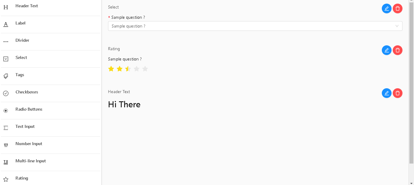
React form builder and form delivery solution for admins and clients that makes forms easy peasy.
Inspired by abandoned project: https://github.com/blackjk3/react-form-builder
Advantages:
- Supports custom inputs
- Rich text questions
- Supports custom styles
- Internationalization ISO'S
- Internationalization on questions and answers
- Internationalization on Builder
- Centralized form builder and from delivery
- Drag & Drop to order/sort questions on ``
## Installation
### Install via NPM
```bash
npm install --save react-quizzes
```
## Style
For components design we use, antd-design componentes and if you just need som simple things we provide the antd style just import it like this:
`import "react-quizzes/lib/assets/antd.css"`
For custom styling check [`Custom styles`](#Custom-styles) section
`react-quizzes` requires `react` and `react-dom` as [`peerDependency`](https://docs.npmjs.com/files/package.json#peerdependencies)
# QuizzBuilder
```html
import { QuizzBuilder } from "react-quizzes" console.log(form)} />
```
## API
QuizzBuilder component objective is to provide the user a nice and smooth interface to build quizzes
| Props | Type | Default | Description |
| -------------- | --------------- | ----------------------- | -------------------------------------------------------------------------------- |
| `onChange` | `Function` | `` | will returns builded quizz in QuizzData type |
| `initialValue` | `QuizzData` | `` | initial value to QuizzBuilder, useful if user wants to edit a saved quizz |
| `toolBox` | `QuizzToolBox` | `default QuizzToolBox` | list of inputs to use, defaults to react-quizz but custom inputs can be supplied |
| `language` | `string` | `en` | Language that QuizzBuilder will show |
| `messages` | `QuizzMessages` | `default QuizzMessages` | Object with each language and each language with each text translation |
# Quiz
A component that provides the final user a quiz/form to fill
```html
import { Quiz } from "react-quizzes"
console.log("form submited values", values)} />
```
## API
| Props | Type | Default | Description |
| -------------- | --------------- | ----------------------- | -------------------------------------------------------------------------------- |
| `data` | `QuizzData` | `` | data to build the final user form to be filled |
| `onSubmit` | `Fucntion` | `` | returns the submitted form values |
| `submitButton` | `boolean` | `true` | shows/hides default submit button\* |
| `toolBox` | `QuizzToolBox` | `default QuizzToolBox` | list of inputs to use, defaults to react-quizz but custom inputs can be supplied |
| `language` | `string` | `en` | Language that Quiz questions and options will show |
| `messages` | `QuizzMessages` | `default QuizzMessages` | Object with each language and each language with each text translation |
- if submit button is hidden the default onSubmit will not work, you must implement a custom submit
## Custom submit
There is a prop `wrappedComponentRef` that gives you access to make basically anything, reset form, set initial values change the values based on something....
[`wrappedComponentRef`](https://github.com/react-component/form#note-use-wrappedcomponentref-instead-of-withref-after-rc-form140)
```jsx
import { Quiz } from "react-quizzes";
saveQuizRef = (quizRef) => {
// saves Quizz component ref
this.quizRef = quizRef;
};
// custom submit function
handleCustomSubmit = () => {
const form = this.quizRef.props.form;
form.validateFields((err, values) => {
if (!err) {
// if no errors, no errors means required answers are filled
console.log("Received values of form: ", values);
form.resetFields(); // resets form after recieveing values
}
});
};
;
```
# Translations/Internationalization
New languages support can be added or replace the existing ones
[Existing translations](./src/translations/TranslatedText.tsx#defaultMessages)
[](https://codesandbox.io/s/react-quizzesexample-ru-locale-wx50m?fontsize=14&hidenavigation=1&theme=dark)
```javascript
import { QuizzBuilder } from "react-quizzes"
import { defaultMessages } from "react-quizzes/lib/translations/TranslatedText";
// existing keys can be found on above link
defaultMessages["pt"]={
"toolbox.textinput.name": "Caixa de Texto",
"confirm.action": "Tem a certeza?",
"btn.yes": "Sim",
"btn.no": "Não",
"btn.add": "Adicionar",
...
}
function App() {
return console.log(form)}
language="pt"
messages={toolBoxItems}
/>
}
```
# Custom Inputs
Custom inputs can be added to Toolbox, but Toolbox already supplies a great variety of inputs, if you have a new input suggestions fell free to contact this library contributors.
The Toolbox is used on QuizzBuilder and Quiz, so if you created a form with custom input on QuizzBuilder supply the same toolbox to Quiz component so it can display the input
[Existing Toolbox](./src/ToolBox/index.tsx)
## How to add custom input
You just have to pass the prop `toolBox` and add your new entry to the existing toolbox items, or if you don't want to reuse the existing one just make your one
```javascript
import { QuizzBuilder } from "react-quizzes"
import defaulttoolBox from "react-quizzes/ToolBox"
import { Avatar } from "antd";
// existing keys can be found on above link
cosnt toolbox=defaulttoolBox()
toolbox.push(
{
key: "MyInput_",
name: "toolbox.input.name", // id of translation
questions: {
"en": "How are you ?"
...
},
// description: "toolbox.headertext.description", // desciption under input on toolbox
icon: , // this will go to Dom so can be string|| jsx component
field_name: "MyInput_", // will add a generated uuidv4
Component: MyInput // component not instanciated
}
)
function App() {
return console.log(form)}
toolBox={toolbox}
/>
}
```
[MyInput example](./src/ToolBox/Components/TextInput.tsx)
Example:
[URL TO FILE]
# Custom styles
Default style is supplied `import "react-quizzes/lib/assets/antd.css"`
but if you need a custom one follow antd-design guidelines and probably you will just want to use less to make it easier
[Antd customize theme](https://ant.design/docs/react/customize-theme)
# License
MIT License
# DEV
Start project
```
npm i
npm start
```
# Build lib
Start project
```
npm i
npm build
```