# react-radio-buttons
Well-designed radio buttons for react
## Installation
```
npm install react-radio-buttons --save
```
Then just add `import { RadioGroup, RadioButton } from 'react-radio-buttons';` into your file.
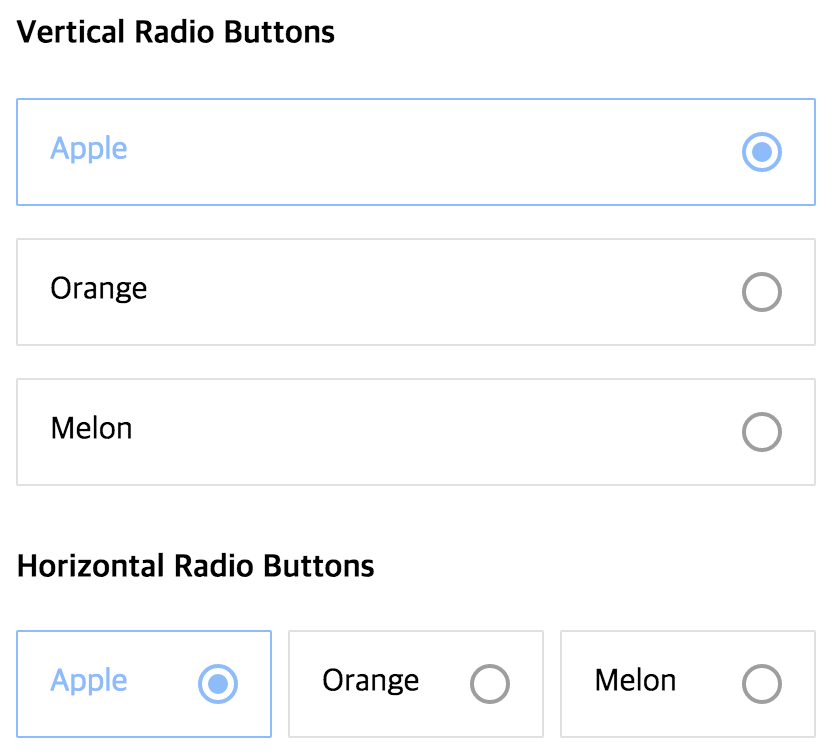
## Screenshot
 ## Usage
This is your average radio group:
```
```
By using `react-radio-buttons`, you can write like this (full example [here](https://github.com/mu29/react-radio-buttons/blob/master/example/example.js)) :
```
Apple
Orange
Melon
Melon
```
## API
### RadioGroup
| name | description |
|----------|----------------|
|onChange|called when select child `RadioButton`|
|value|initial selected value, omit for no selection and set to `''` for first enabled control|
|horizontal|whether to align horizontally|
|children|define your `RadioButton`s|
### RadioButton
| name | description |
|----------|----------------|
|iconSize|size of `RadioIcon`, which appears on the right side of button|
|iconInnerSize|size of `RadioIcon`'s inner icon when selected, **proper value is same as iconSize or half of iconSize**|
|padding|padding size|
|rootColor|color when unselected|
|pointColor|color when selected|
|value|return value when selected|
|children|prefer string|
|disabled|boolean flag that allows you to disable a certain a button|
|disabledColor|color when disabled, including the `RadioIcon`|
## Author
InJung Chung / [@mu29](http://mu29.github.io/)
## License
[MIT](./LICENSE)
## Usage
This is your average radio group:
```
```
By using `react-radio-buttons`, you can write like this (full example [here](https://github.com/mu29/react-radio-buttons/blob/master/example/example.js)) :
```
Apple
Orange
Melon
Melon
```
## API
### RadioGroup
| name | description |
|----------|----------------|
|onChange|called when select child `RadioButton`|
|value|initial selected value, omit for no selection and set to `''` for first enabled control|
|horizontal|whether to align horizontally|
|children|define your `RadioButton`s|
### RadioButton
| name | description |
|----------|----------------|
|iconSize|size of `RadioIcon`, which appears on the right side of button|
|iconInnerSize|size of `RadioIcon`'s inner icon when selected, **proper value is same as iconSize or half of iconSize**|
|padding|padding size|
|rootColor|color when unselected|
|pointColor|color when selected|
|value|return value when selected|
|children|prefer string|
|disabled|boolean flag that allows you to disable a certain a button|
|disabledColor|color when disabled, including the `RadioIcon`|
## Author
InJung Chung / [@mu29](http://mu29.github.io/)
## License
[MIT](./LICENSE)