# React Toastify [](https://travis-ci.org/fkhadra/react-toastify) []() []() []() [](https://coveralls.io/github/fkhadra/react-toastify?branch=master)

🎉 React-Toastify allow you to add notification to your app with ease. No bullshit !
* [Demo](#demo)
* [Installation](#installation)
* [Features](#features)
* [Migrate from v3 to v4](#from-v3-to-v4)
* [Usage](#usage)
+ [One component to rule them all](#one-component-to-rule-them-all)
+ [Positioning toast](#positioning-toast)
+ [Set autoclose delay or disable it](#set-autoclose-delay-or-disable-it)
+ [Render a component](#render-a-component)
+ [Remove a toast programmatically](#remove-a-toast-programmatically)
+ [Prevent duplicate](#prevent-duplicate)
+ [Update a toast](#update-a-toast)
- [Basic example](#basic-example)
- [Update the content](#update-the-content)
- [Apply a transition](#apply-a-transition)
- [Reset option or inherit from ToastContainer](#reset-option-or-inherit-from-toastcontainer)
+ [Define callback](#define-callback)
+ [Listen for change](#listen-for-change)
+ [Set a custom close button or simply remove it](#set-a-custom-close-button-or-simply-remove-it)
- [Override the default one](#override-the-default-one)
- [Define it per toast](#define-it-per-toast)
- [Remove it](#remove-it)
+ [Add an undo option to a toast like google drive](#add-an-undo-option-to-a-toast-like-google-drive)
+ [Replace the default transition](#replace-the-default-transition)
+ [Define a custom enter and exit transition](#define-a-custom-enter-and-exit-transition)
- [Ease your life with the cssTransition helper](#ease-your-life-with-the-csstransition-helper)
* [Handle transition based on the toast position](#handle-transition-based-on-the-toast-position)
- [Create a transition from scratch](#create-a-transition-from-scratch)
+ [Swipe to remove](#swipe-to-remove)
- [Define the width percentage to remove the toast](#define-the-width-percentage-to-remove-the-toast)
- [Disable it](#disable-it)
+ [Le style](#le-style)
- [style with css classes](#style-with-css-classes)
- [style with glamor](#style-with-glamor)
- [Define style globally](#define-style-globally)
- [Right to left support](#right-to-left-support)
+ [Mobile](#mobile)
* [Api](#api)
+ [ToastContainer](#toastcontainer)
+ [toast](#toast)
+ [cssTransition](#csstransition)
* [Browser Support](#browser-support)
* [Release Notes](#release-notes)
* [Contribute](#contribute)
* [License](#license)
## Demo
[A demo is worth thousand word](https://fkhadra.github.io/react-toastify/)
## Installation
```
$ npm install --save react-toastify
$ yarn add react-toastify
```
## Features
- Easy to setup for real, you can make it works in less than 10sec!
- Super easy to customize
- RTL support
- Swipe to close 👌
- Can display a react component inside the toast!
- Don't rely on `findDOMNode` or any DOM hack
- Has ```onOpen``` and ```onClose``` hooks. Both can access the props passed to the react component rendered inside the toast
- Can remove a toast programmatically
- Define behavior per toast
- Pause toast when the browser is not visible thanks to visibility API
- Fancy progress bar to display the remaining time
- Possibility to update a toast
## From v3 to v4
Glamor has been dropped to switch back to scss due to user's feedback. You can read more about that choice if you take a look at the issues history.
- Passing glamor rule to className is still working 😎.
- A css file needs to be imported now.
- Toast are now draggable, you can swipe to close
- New built-in transition added
- Playground for contributor
- You may use glamorous or any other css-in-js library that relies on glamor. (Haven't been tested)
## Usage
### One component to rule them all
The toasts inherit ToastContainer's props. **Props defined on toast supersede ToastContainer's props.**
```javascript
import React, { Component } from 'react';
import { ToastContainer, toast } from 'react-toastify';
import 'react-toastify/dist/ReactToastify.css';
// minified version is also included
// import 'react-toastify/dist/ReactToastify.min.css';
class App extends Component {
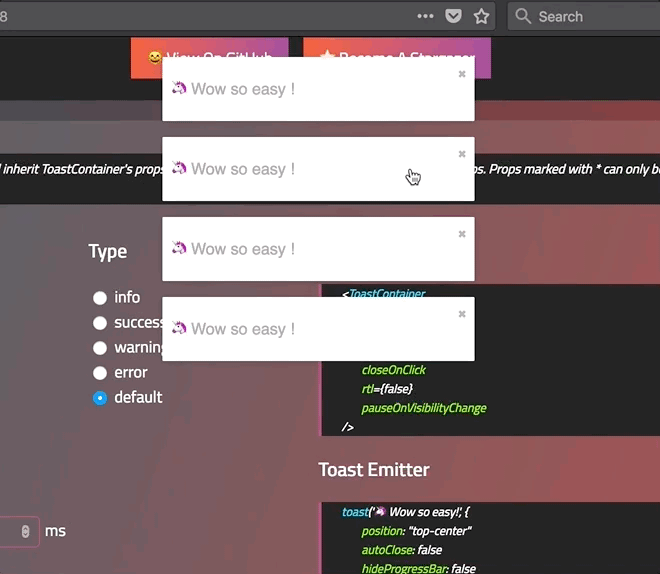
notify = () => toast("Wow so easy !");
render(){
return (
);
}
}
```
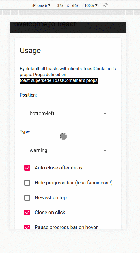
### Positioning toast
By default, all the toasts will be positionned on the top right of your browser. If a position is set on a toast, the one defined on ToastContainer will be replaced.
The following values are allowed: **top-right, top-center, top-left, bottom-right, bottom-center, bottom-left**
For convenience, toast expose a POSITION property to avoid any typo.
```javascript
// toast.POSITION.TOP_LEFT, toast.POSITION.TOP_RIGHT, toast.POSITION.TOP_CENTER
// toast.POSITION.BOTTOM_LEFT,toast.POSITION.BOTTOM_RIGHT, toast.POSITION.BOTTOM_CENTER
import React, { Component } from 'react';
import { toast } from 'react-toastify';
class Position extends Component {
notify = () => {
toast("Default Notification !");
toast.success("Success Notification !", {
position: toast.POSITION.TOP_CENTER
});
toast.error("Error Notification !", {
position: toast.POSITION.TOP_LEFT
});
toast.warn("Warning Notification !", {
position: toast.POSITION.BOTTOM_LEFT
});
toast.info("Info Notification !", {
position: toast.POSITION.BOTTOM_CENTER
});
toast("Custom Style Notification with css class!", {
position: toast.POSITION.BOTTOM_RIGHT,
className: 'foo-bar'
});
};
render(){
return ;
}
}
```
### Set autoclose delay or disable it
- Set the default delay
```js
import React from 'react';
import { ToastContainer } from 'react-toastify';
// close toast after 8 seconds
const App = () => (
);
```
- Set the delay per toast for more control
```js
import React from 'react';
import { ToastContainer, toast } from 'react-toastify';
class App extends Component {
closeAfter15 = () => toast("YOLO", { autoClose: 15000 });
closeAfter7 = () => toast("7 Kingdoms", { autoClose: 7000 });
render(){
return (
);
}
}
```
- Disable it by default
```js
```
- Disable it per toast
```js
toast("hello", {
autoClose: false
})
```
### Render a component
When you render a component, a `closeToast` function is passed as a props. That way you can close the toast on user interaction for example.
```js
import React from 'react';
import { ToastContainer, toast } from "react-toastify";
const Msg = ({ closeToast }) => (
Lorem ipsum dolor
)
const App = () => (
);
```
You can also render a component using a function. More or less like a "render props":
```js
toast(({ closeToast }) => Functional swag 😎
);
```
### Remove a toast programmatically
An id is returned each time you display a toast, use it to remove a given toast programmatically by calling ```toast.dismiss(id)```
Without args, all the displayed toasts will be removed.
```javascript
import React, { Component } from 'react';
import { toast } from 'react-toastify';
class Example extends Component {
toastId = null;
notify = () => this.toastId = toast("Lorem ipsum dolor");
dismiss = () => toast.dismiss(this.toastId);
dismissAll = () => toast.dismiss();
render(){
return (
);
}
}
```
### Prevent duplicate
To prevent duplicates, you can check if a given toast is active by calling `toast.isActive(id)` like the snippet below. With this approach, you can decide with more precision whether or not you want to display a toast.
```javascript
import React, { Component } from 'react';
import { toast } from 'react-toastify';
class Example extends Component {
toastId = null;
notify = () => {
if (! toast.isActive(this.toastId)) {
this.toastId = toast("I cannot be duplicated !");
}
}
render(){
return (
);
}
}
```
### Update a toast
When you update a toast, the toast options and the content are inherited but don't worry you can update them.

#### Basic example
```js
import React, { Component } from 'react';
import { toast } from 'react-toastify';
class Update extends Component {
toastId = null;
notify = () => this.toastId = toast("Hello", { autoClose: false });
update = () => toast.update(this.toastId, { type: toast.TYPE.INFO, autoClose: 5000 });
render(){
return (
)
}
}
```
#### Update the content
If you want to change the content it's straightforward as well. You can render any valid element including a react component. Pass your value to a `render` option as follow:
```js
// With a string
toast.update(this.toastId, {
render: "New content"
type: toast.TYPE.INFO,
autoClose: 5000
});
// Or with a component
toast.update(this.toastId, {
render:
type: toast.TYPE.INFO,
autoClose: 5000
});
```
#### Apply a transition
By default, when you update a toast, there is no transition applied. If you want to apply a transition, it can be done via the `className` or the `transition` option:

```js
// with css
toast.update(this.toastId, {
render: "New Content",
type: toast.TYPE.INFO,
//Here the magic
className: 'rotateY animated'
})
// with glamor
toast.update(this.toastId, {
render: "New Content",
type: toast.TYPE.INFO,
//Here the magic
className: css({
transform: "rotateY(360deg)",
transition: "transform 0.6s"
})
})
// with transition
toast.update(this.toastId, {
render: "New Content",
type: toast.TYPE.INFO,
//Here the magic
transition: Rotate
})
```
#### Reset option or inherit from ToastContainer
If you want to inherit props from the `ToastContainer`, you can reset an option by passing null.
It's particulary usefull when you remove the `closeButton` from a toast and you want it back during the update:
```js
class Update extends Component {
toastId = null;
notify = () => this.toastId = toast("Hello", {
autoClose: false,
closeButton: false // Remove the closeButton
});
update = () => toast.update(this.toastId, {
type: toast.TYPE.INFO,
autoClose: 5000,
closeButton: null // The closeButton defined on ToastContainer will be used
});
render(){
return (
)
}
}
```
### Define callback
You can define two callback on toast. They are really useful when the toast are not used only to display messages.
- onOpen is called inside componentDidMount
- onClose is called inside componentWillUnmount
```javascript
import React, { Component } from 'react';
import { toast } from 'react-toastify';
class Hook extends Component {
notify = () => toast(, {
onOpen: ({ foo }) => window.alert('I counted to infinity once then..'),
onClose: ({ foo }) => window.alert('I counted to infinity twice')
});
render(){
return ;
}
}
```
### Listen for change
If you want to know when a toast is displayed or removed, `toast` expose a `onChange` method:
```js
toast.onChange( numberOfToastDisplayed => {
// Do whatever you want
});
```
### Set a custom close button or simply remove it
#### Override the default one
You can pass a custom close button to the `ToastContainer` to replace the default one.
⚠️ **When you use a custom close button, your button will receive a ```closeToast``` function.
You need to call it in order to close the toast.** ⚠️
```javascript
import React, { Component } from 'react';
import { toast, ToastContainer } from 'react-toastify';
const CloseButton = ({ YouCanPassAnyProps, closeToast }) => (
delete
);
class CustomClose extends Component {
notify = () => {
toast("The close button change when Chuck Norris display a toast");
};
render(){
return (
;
} />
);
}
}
```
#### Define it per toast
```javascript
import React, { Component } from 'react';
import { toast } from 'react-toastify';
// Let's use the closeButton we defined on the previous example
class CustomClose extends Component {
notify = () => {
toast("The close button change when Chuck Norris display a toast",{
closeButton:
});
};
render(){
return ;
}
}
```
#### Remove it
Sometimes you don't want to display a close button. It can be removed globally or per toast. Pass
`false` to `closeButton` props:
- remove it by default
```js
```
- remove it per toast
```js
toast("hello", {
closeButton: false
})
```
### Add an undo option to a toast like google drive
See it in action:
[](https://codesandbox.io/s/l2qkywz7xl)
```javascript
const ToastUndo = ({ id, undo, closeToast }) => {
function handleClick(){
undo(id);
closeToast();
}
return (
Row Deleted
);
}
class App extends Component {
state = {
collection: data,
// Buffer
toRemove: []
};
// Remove the row id from the buffer
undo = id => {
this.setState({
toRemove: this.state.toRemove.filter(v => v !== id)
});
}
// Remove definetly
cleanCollection = () => this.setState({
// Return element which are not included in toRemove
collection: this.state.collection.filter(v => !this.state.toRemove.includes(v.id)),
//Cleanup the buffer
toRemove: []
});
// Remove row from render process
// then display the toast with undo action available
removeRow = e => {
const id = e.target.dataset.rowId;
this.setState({
toRemove: [...this.state.toRemove, id]
});
toast(, {
// hook will be called whent the component unmount
onClose: this.cleanCollection
});
};
renderRows() {
const { collection, toRemove } = this.state;
// Render all the element wich are not present in toRemove
// Im using data-attribute to grab the row id
return collection.filter(v => !toRemove.includes(v.id)).map(v => (
| {v.firstName} |
{v.lastName} |
{v.email} |
|
));
}
render() {
// Dont close the toast on click
return (
| name |
firstname |
gender |
|
{this.renderRows()}
);
}
}
```
### Replace the default transition
There is 4 built-in transition provided:
Bounce
Slide
Zoom
Flip
Bounce is used by default but you can replace it by your own transition or by one of the list above:
```js
import { Slide, Zoom, Flip, Bounce } from 'react-toastify';
//...
```
You get the idea...
### Define a custom enter and exit transition
The toast relies on `react-transition-group` for the enter and exit transition. Any transition built with react-transition-group should work !
I'll use the zoom animation from animate.css. Of course, you could create your own animation.
```css
/* style.css*/
@keyframes zoomIn {
from {
opacity: 0;
transform: scale3d(.3, .3, .3);
}
50% {
opacity: 1;
}
}
.zoomIn {
animation-name: zoomIn;
}
@keyframes zoomOut {
from {
opacity: 1;
}
50% {
opacity: 0;
transform: scale3d(.3, .3, .3);
}
to {
opacity: 0;
}
}
.zoomOut {
animation-name: zoomOut;
}
/* Not needed with the cssTransition helper */
.animate {
animation-duration: 800ms;
}
```
#### Ease your life with the cssTransition helper
The easiest way to roll your own transition is by using the `cssTransition` helper. Doing so you don't need to deal with `react-transition-group`. You only need to provide the `enter` and the `exit` class name, the transition `duration` is set
to `750ms` by default but it can be overridden:
```js
import React, { Component } from 'react';
import { toast, cssTransition } from 'react-toastify';
import './style.css';
const Zoom = cssTransition({
enter: 'zoomIn',
exit: 'zoomOut',
// default to 750ms, can be omitted
duration = 750,
});
class App extends Component {
notify = () => {
toast("ZoomIn and ZoomOut", {
transition: Zoom,
autoClose: 5000
});
};
render(){
return ;
}
}
```
##### Different duration for enter and exit
If you want the transition duration to be different between the enter and exit transition pass an array:
```js
import React, { Component } from 'react';
import { toast, cssTransition } from 'react-toastify';
import './style.css';
const Zoom = cssTransition({
enter: 'zoomIn',
exit: 'zoomOut',
duration: [500, 800]
});
class App extends Component {
notify = () => {
toast("ZoomIn and ZoomOut", {
transition: Zoom,
autoClose: 5000
});
};
render(){
return ;
}
}
```
##### Handle transition based on the toast position
Some transitions are based on the toast position. This is the case for the default one. If you pass `appendPosition` to the `cssTransition` helper as shown below, the current position will be appended to the `enter` and `exit` class name:
```js
import React, { Component } from 'react';
import { toast, cssTransition } from 'react-toastify';
import './style.css';
const Zoom = cssTransition({
// zoomIn will become zoomIn--top-right or zoomIn--top-left and so on
enter: 'zoomIn',
// zoomIn will become zoomOut--top-right or zoomOut--top-left and so on
exit: 'zoomOut',
// default to false
appendPosition: true
});
class App extends Component {
notify = () => {
toast("ZoomIn and ZoomOut", {
transition: Zoom,
autoClose: 5000
});
};
render(){
return ;
}
}
```
#### Create a transition from scratch
```js
import React, { Component } from 'react';
import { toast } from 'react-toastify';
import Transition from 'react-transition-group/Transition';
import './style.css';
const ZoomInAndOut = ({ children, position, ...props }) => (
node.classList.add('zoomIn', 'animate')}
onExit={node => {
node.classList.remove('zoomIn', 'animate');
node.classList.add('zoomOut', 'animate');
}}
>
{children}
);
class App extends Component {
notify = () => {
toast("ZoomIn and ZoomOut", {
transition: ZoomInAndOut,
autoClose: 5000
});
};
render(){
return ;
}
}
```
### Swipe to remove
You can swipe the toast to remove it:
#### Define the width percentage to remove the toast
You need to drag 80% of the toast width to remove it. This can be changed to fit your need:
- Replace the default one:
```js
```
- Replace per toast:
```js
toast('Hello', {
draggablePercent: 60
});
```
#### Disable it
- Disable by default for all toast:
```js
```
- Disable per toast:
```js
toast('Hello', {
draggable: false
});
```
### Le style
#### style with css classes
```javascript
toast("Custom style",{
className: 'black-background',
bodyClassName: "grow-font-size",
progressClassName: 'fancy-progress-bar'
});
```
#### style with glamor
```javascript
import { css } from 'glamor';
toast("Custom style",{
className: css({
background: 'black'
}),
bodyClassName: css({
fontSize: '60px'
}),
progressClassName: css({
background: "repeating-radial-gradient(circle at center, red 0, blue, green 30px)"
})
});
```
#### Define style globally
```js
```
#### Right to left support
Your app need to support rtl content? Set the rtl props to `true`:
```javascript
render(){
return(
{/*Component*/}
{/*Component*/}
);
}
```
### Mobile
On mobile the toast will take all the available width.
## Api
### ToastContainer
| Props | Type | Default | Description |
|-------------------------|------------------------|-----------|-----------------------------------------------------------------------------------------------------|
| position | string | top-right | One of top-right, top-center, top-left, bottom-right, bottom-center, bottom-left |
| autoClose | false or number | 5000 | Delay in ms to close the toast. If set to false, the notification need to be closed manualy |
| closeButton | React Element or false | - | A React Component to replace the default close button or `false` to hide the button |
| transition | function | - | A reference to a valid react-transition-group/Transition component |
| hideProgressBar | bool | false | Display or not the progress bar below the toast(remaining time) |
| pauseOnHover | bool | true | Keep the timer running or not on hover |
| rtl | bool | false | Support right to left content |
| closeOnClick | bool | true | Dismiss toast on click |
| newestOnTop | bool | false | Display newest toast on top |
| className | string\|object | - | Add optional classes to the container |
| style | object | - | Add optional inline style to the container |
| toastClassName | string\|object | - | Add optional classes to the toast |
| bodyClassName | string\|object | - | Add optional classes to the toast body |
| progressClassName | string\|object | - | Add optional classes to the progress bar |
| pauseOnVisibilityChange | bool | true | Pause on document visibility change(reducing the window for instance) |
| draggable | bool | true | Allow toast to be draggable |
| draggablePercent | number | 80 | The percentage of the toast's width it takes for a drag to dismiss a toast(value between 0 and 100) |
### toast
All the method of toast return a **toastId** except `dismiss` and `isActive`.
The **toastId** can be used to remove a toast programmatically or to check if the toast is displayed.
| Parameter | Type | Required | Description |
| --------- | ------- | ------------- | ------------------------------------------------------------- |
| content | string or React Element | ✓ | Element that will be displayed |
| options | object | ✘ | Options listed below | |
- Available options :
- `type`: Kind of notification. One of "default", "success", "info", "warning", "error". You can use `toast.TYPE.SUCCESS` and so on to avoid any typo.
- `onOpen`: Called inside componentDidMount
- `onClose`: Called inside componentWillUnmount
- `autoClose`: same as ToastContainer.
- `closeButton`: same as ToastContainer.
- `transition`: same as ToastContainer.
- `closeOnClick`: same as ToastContainer.
- `hideProgressBar`: same as ToastContainer.
- `position`: same as ToastContainer
- `pauseOnHover`: same as ToastContainer
- `className`: same as ToastContainer toastClassName
- `bodyClassName`: same as ToastContainer
- `progressClassName`: same as ToastContainer
- `draggable`: same as ToastContainer
- `draggablePercent`: same as ToastContainer
- `render`: string or React Element, only available when calling update
:warning:️ *Toast options supersede ToastContainer props* :warning:
```javascript
const Img = ({ src }) => ;
const options = {
onOpen: props => console.log(props.foo),
onClose: props => console.log(props.foo),
autoClose: 6000,
closeButton: ,
type: toast.TYPE.INFO,
hideProgressBar: false,
position: toast.POSITION.TOP_LEFT,
pauseOnHover: true,
transition: MyCustomTransition,
// and so on ...
};
const toastId = toast(![]() , options) // default, type: 'default'
toast(({ closeToast }) =>
, options) // default, type: 'default'
toast(({ closeToast }) => Render props like
, options);
toast.success("Hello", options) // add type: 'success' to options
toast.info("World", options) // add type: 'info' to options
toast.warn(![]() , options) // add type: 'warning' to options
toast.error(
, options) // add type: 'warning' to options
toast.error(![]() , options) // add type: 'error' to options
toast.dismiss() // Remove all toasts !
toast.dismiss(toastId) // Remove given toast
toast.isActive(toastId) //Check if a toast is displayed or not
toast.update(toastId, {
type: toast.TYPE.INFO,
render:
, options) // add type: 'error' to options
toast.dismiss() // Remove all toasts !
toast.dismiss(toastId) // Remove given toast
toast.isActive(toastId) //Check if a toast is displayed or not
toast.update(toastId, {
type: toast.TYPE.INFO,
render: ![]() });
```
### cssTransition
| Parameter | Type | Required | Default | Description |
|----------------|--------|----------|---------|------------------------------------------------------------------------------------------------------------|
| enter | string | ✓ | - | The class name that will be used when the toast enter |
| exit | string | ✓ | - | The class name that will be used when the toast exit |
| duration | number\| Array | ✘ | 750 | The transition duration in ms. |
| appendPosition | bool | ✘ | false | Append or not the position to the class name: `yourClassName--top-right`, `yourClassName--bottom-left`... |
```js
import { cssTransition } from 'react-toastify';
const Zoom = cssTransition({
enter: 'zoomIn',
exit: 'zoomOut',
duration: 750,
appendPosition: false
});
const Zoom = cssTransition({
enter: 'zoomIn',
exit: 'zoomOut',
duration: [500, 600],
appendPosition: false
});
```
## Browser Support
 |  |  |  |  | 
--- | --- | --- | --- | --- | --- |
IE 11+ ✔ | Latest ✔ | Latest ✔ | Latest ✔ | Latest ✔ | Latest ✔ |
## Release Notes
### V4.0.0
- Switch back to css
- Added built-in transition
- Added playground for contributor
- Upgrade to webpack 4
- Draggable 👌
### V3.4.3
- Fix position on mobile
### V3.4.2
- Fix exit animation bug
### V3.4.1
- Fix rtl on mobile
### V3.4.0
- Add `rtl` props to support right to left content.
### V3.3.5
- Add `fontFamily` to typescript definition
### V3.3.4
- `toast.update` run now at the end of the call stack. For more details, check [issue #135](https://github.com/fkhadra/react-toastify/issues/135)
### V3.3.3
- Clean animation on entered. This was preventing any update transition to works.
### V3.3.1
- Fix height [issue #124](https://github.com/fkhadra/react-toastify/issues/124)
- Update typescript definition
### V3.3.0
- Better accessibility, relate to [issue #121](https://github.com/fkhadra/react-toastify/issues/121)
- Reviewed exit animation. No more clipping.
### V3.2.2
- Add comment to typescript definition.
### V3.2.1
- Fix typescript definition. Relate to [issue #110](https://github.com/fkhadra/react-toastify/issues/110)
### V3.2.0
- Allow "render props" rendering. Relate to [issue #106](https://github.com/fkhadra/react-toastify/issues/106)
- Can set fontFamily via the style helper. Relate to [issue #107](https://github.com/fkhadra/react-toastify/issues/107)
- Can override position default values via style helper. Realte to [issue #108](https://github.com/fkhadra/react-toastify/issues/108)
### V3.1.2
- Fix [issue #103](https://github.com/fkhadra/react-toastify/issues/103) for real...
- Fix [issue #104](https://github.com/fkhadra/react-toastify/issues/104) Incorrect TS definition for `toast.dismiss`
### V3.1.1
- Fix [issue #103](https://github.com/fkhadra/react-toastify/issues/103)
### V3.1.0
- Add ability to update an existing toast
- Allow to define the zIndex via the style helper
- Get rid of all inline style
### V3.0.0
- Switched to styled component with glamor
- Added style helper to replace sass variables
- Test suite improved
- Typescript definition improved
### V2.2.1
- Fix [issue #71](https://github.com/fkhadra/react-toastify/issues/71)
### V2.2.0
- Sass variables are now namespaced
### V2.1.7
- Can now use [sass variable default](http://sass-lang.com/documentation/file.SASS_REFERENCE.html#Variable_Defaults___default) thanks to [vikpe](https://github.com/vikpe)
### V2.1.5
- Test suites improved
### V2.1.4
- Fix broken typescript dependencies
### V2.1.3
- Added typescript definition
- Toast will pause when page is not visible thanks to page visibility api.
### V2.1.2
- Previous version was breaking compatibility with react < 16
### V2.1.1
#### Bugfix
- Remove toast from react dom when not displayed. Because of that the `onClose` callback on the toast was never called. Relate to [issue #50](https://github.com/fkhadra/react-toastify/issues/50)
### V2.1.0
#### New Features
- Can set a custom transition when the toat enter and exit the screen :sparkles:
#### Others
- Upgrade to react v16
- Upgrade to enzyme v3
- Switched to react-app preset for eslint
- Upgrade to webpack v3
- Upgrade to react-transition-group v2
### V2.0.0
This version may introduce breaking changes due to redesign. My apologies.
But, it brings a lots of new and exciting features !
#### New Features
- The default design has been reviewed. The component is now usable out of the box without the need to touch the css. Relate to [issue #28](https://github.com/fkhadra/react-toastify/issues/28)
- The toast timer can keep running on hover. [issue #33](https://github.com/fkhadra/react-toastify/issues/33)
- Added a possibility to check if a given toast is displayed or not. By using that method we can prevent duplicate. [issue #3](https://github.com/fkhadra/react-toastify/issues/3)
- Can decide to close the toast on click
- Can show newest toast on top
- Can define additionnal className for toast[issue #21](https://github.com/fkhadra/react-toastify/issues/21)
- Much more mobile ready than the past
#### Bug Fixes
- The space in of left boxes from window & right boxes from window is different.[issue #25](https://github.com/fkhadra/react-toastify/issues/25)
- Partial support of ie11. I still need to fix the animation but I need a computer with ie11 for that xD [issue #26](https://github.com/fkhadra/react-toastify/issues/26)
### v1.7.0
#### New Features
- Toast can now be positioned individually !
### v1.6.0
#### New Features
- Can now remove a toast programmatically. When you display a toast, the function return a **toastId**. You can use it
as follow to remove a given toast `toast.dismiss(toastId)`
- If the container is not mounted, the notification will be added to a queue and dispatched as soon as the container is mounted.
For more details check [issue #4](https://github.com/fkhadra/react-toastify/issues/4)
#### Others
- Added --no-idents flag to cssnano to avoid animation name collision with others libs.
- Tests are no longer transpiled
### v1.5.0
- That version does not bring any features but it brings tests made with the amazing jest and aslo Travis CI integration.
### v1.4.3
- React and react-dom are now peer dependencies
### v1.4.2
- Don't try to pass down the props when we render a string like so : `toast(
});
```
### cssTransition
| Parameter | Type | Required | Default | Description |
|----------------|--------|----------|---------|------------------------------------------------------------------------------------------------------------|
| enter | string | ✓ | - | The class name that will be used when the toast enter |
| exit | string | ✓ | - | The class name that will be used when the toast exit |
| duration | number\| Array | ✘ | 750 | The transition duration in ms. |
| appendPosition | bool | ✘ | false | Append or not the position to the class name: `yourClassName--top-right`, `yourClassName--bottom-left`... |
```js
import { cssTransition } from 'react-toastify';
const Zoom = cssTransition({
enter: 'zoomIn',
exit: 'zoomOut',
duration: 750,
appendPosition: false
});
const Zoom = cssTransition({
enter: 'zoomIn',
exit: 'zoomOut',
duration: [500, 600],
appendPosition: false
});
```
## Browser Support
 |  |  |  |  | 
--- | --- | --- | --- | --- | --- |
IE 11+ ✔ | Latest ✔ | Latest ✔ | Latest ✔ | Latest ✔ | Latest ✔ |
## Release Notes
### V4.0.0
- Switch back to css
- Added built-in transition
- Added playground for contributor
- Upgrade to webpack 4
- Draggable 👌
### V3.4.3
- Fix position on mobile
### V3.4.2
- Fix exit animation bug
### V3.4.1
- Fix rtl on mobile
### V3.4.0
- Add `rtl` props to support right to left content.
### V3.3.5
- Add `fontFamily` to typescript definition
### V3.3.4
- `toast.update` run now at the end of the call stack. For more details, check [issue #135](https://github.com/fkhadra/react-toastify/issues/135)
### V3.3.3
- Clean animation on entered. This was preventing any update transition to works.
### V3.3.1
- Fix height [issue #124](https://github.com/fkhadra/react-toastify/issues/124)
- Update typescript definition
### V3.3.0
- Better accessibility, relate to [issue #121](https://github.com/fkhadra/react-toastify/issues/121)
- Reviewed exit animation. No more clipping.
### V3.2.2
- Add comment to typescript definition.
### V3.2.1
- Fix typescript definition. Relate to [issue #110](https://github.com/fkhadra/react-toastify/issues/110)
### V3.2.0
- Allow "render props" rendering. Relate to [issue #106](https://github.com/fkhadra/react-toastify/issues/106)
- Can set fontFamily via the style helper. Relate to [issue #107](https://github.com/fkhadra/react-toastify/issues/107)
- Can override position default values via style helper. Realte to [issue #108](https://github.com/fkhadra/react-toastify/issues/108)
### V3.1.2
- Fix [issue #103](https://github.com/fkhadra/react-toastify/issues/103) for real...
- Fix [issue #104](https://github.com/fkhadra/react-toastify/issues/104) Incorrect TS definition for `toast.dismiss`
### V3.1.1
- Fix [issue #103](https://github.com/fkhadra/react-toastify/issues/103)
### V3.1.0
- Add ability to update an existing toast
- Allow to define the zIndex via the style helper
- Get rid of all inline style
### V3.0.0
- Switched to styled component with glamor
- Added style helper to replace sass variables
- Test suite improved
- Typescript definition improved
### V2.2.1
- Fix [issue #71](https://github.com/fkhadra/react-toastify/issues/71)
### V2.2.0
- Sass variables are now namespaced
### V2.1.7
- Can now use [sass variable default](http://sass-lang.com/documentation/file.SASS_REFERENCE.html#Variable_Defaults___default) thanks to [vikpe](https://github.com/vikpe)
### V2.1.5
- Test suites improved
### V2.1.4
- Fix broken typescript dependencies
### V2.1.3
- Added typescript definition
- Toast will pause when page is not visible thanks to page visibility api.
### V2.1.2
- Previous version was breaking compatibility with react < 16
### V2.1.1
#### Bugfix
- Remove toast from react dom when not displayed. Because of that the `onClose` callback on the toast was never called. Relate to [issue #50](https://github.com/fkhadra/react-toastify/issues/50)
### V2.1.0
#### New Features
- Can set a custom transition when the toat enter and exit the screen :sparkles:
#### Others
- Upgrade to react v16
- Upgrade to enzyme v3
- Switched to react-app preset for eslint
- Upgrade to webpack v3
- Upgrade to react-transition-group v2
### V2.0.0
This version may introduce breaking changes due to redesign. My apologies.
But, it brings a lots of new and exciting features !
#### New Features
- The default design has been reviewed. The component is now usable out of the box without the need to touch the css. Relate to [issue #28](https://github.com/fkhadra/react-toastify/issues/28)
- The toast timer can keep running on hover. [issue #33](https://github.com/fkhadra/react-toastify/issues/33)
- Added a possibility to check if a given toast is displayed or not. By using that method we can prevent duplicate. [issue #3](https://github.com/fkhadra/react-toastify/issues/3)
- Can decide to close the toast on click
- Can show newest toast on top
- Can define additionnal className for toast[issue #21](https://github.com/fkhadra/react-toastify/issues/21)
- Much more mobile ready than the past
#### Bug Fixes
- The space in of left boxes from window & right boxes from window is different.[issue #25](https://github.com/fkhadra/react-toastify/issues/25)
- Partial support of ie11. I still need to fix the animation but I need a computer with ie11 for that xD [issue #26](https://github.com/fkhadra/react-toastify/issues/26)
### v1.7.0
#### New Features
- Toast can now be positioned individually !
### v1.6.0
#### New Features
- Can now remove a toast programmatically. When you display a toast, the function return a **toastId**. You can use it
as follow to remove a given toast `toast.dismiss(toastId)`
- If the container is not mounted, the notification will be added to a queue and dispatched as soon as the container is mounted.
For more details check [issue #4](https://github.com/fkhadra/react-toastify/issues/4)
#### Others
- Added --no-idents flag to cssnano to avoid animation name collision with others libs.
- Tests are no longer transpiled
### v1.5.0
- That version does not bring any features but it brings tests made with the amazing jest and aslo Travis CI integration.
### v1.4.3
- React and react-dom are now peer dependencies
### v1.4.2
- Don't try to pass down the props when we render a string like so : `toast(hello
)`
#### Bug fix
- Fixed the test to check if the toast can be rendered
### v1.4.0
- React v16 ready : moving to prop-types and react-transition-group
- Internal rewrite of components. The implementation wasn't bad but it wasn't good either. A better props validation has been added has well.
- Removed useless dependencies. I was using the Object.values polyfill when a one line forEach can do the same is my case.
- Now I believe it's even easier to style the components. The sass sources files are now included when you install the package via yarn or npm
- The default close button has been replaced.
#### New Features
- A progress bar is now visible to track the remaining time before the notification is closed. Of course if you don't like it, you are free to disable it.
- You can choose to display a close button or not.
- Event pointer is set to none to avoid losing pointer events on everything beneath the toast container when no toast are displayed
- The `closeToast` callback is also passed down to your component.
### v1.3.0
- PropTypes package update
- Dead code elimination
#### New Features
- Possibility to use a custom close button. Check the api docs of ToastContainer and toast.
### v1.2.2
I was storing react component into state which is a bad practice. [What should Go in State](http://web.archive.org/web/20150419023006/http://facebook.github.io/react/docs/interactivity-and-dynamic-uis.html)
This is no more the case now. The separation of concern between the data and the view is respected.
#### Bug fix
- Was calling cloneElement on undefined which cause your console bleed. See issue [#2](https://github.com/fkhadra/react-toastify/issues/2)
### v1.2.1
#### Bug fix
- Added Object.values polyfill otherwise won't work with IE or EDGE. I ♥ IE.
### v1.1.1
#### Bug fix
- OnClose and OnOpen can access all the props passed to the component. Before
only the props passed using toast options were accessible
#### New Features
- Passing prop using toast option will be removed at the next release. It doesn't
make sense to keep both way to pass props. Use the react way instead
### v1.1.0
#### New Features
- Added onOpen callback
- Added onClose callback
## Contribute
Show your ❤️ and support by giving a ⭐. Any suggestions and pull request are welcome !
Try the playground:
```js
npm start
```
## License
Licensed under MIT