# reactjs-draggable-slider

[![NPM Downloads]()]()
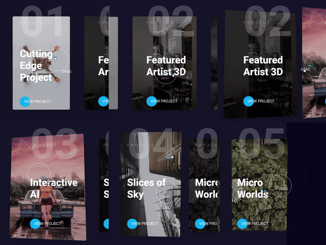
NPM package for my custom Draggable React Slider using React Spring and GSAP.
by Mobin veisy

## Installation
```
npm install react-draggable-slider --save-dev
```
### Demo
## Usage
Add `` component with sliderSettings object, the only required setting an array of slider items.
```jsx
import { Slider } from "react-draggable-slider";
import { projectList } from "./data";
function App() {
const sliderSettings = {
data: projectList,
speed: 3000,
easing: "elastic",
bgColor: "rgba(255, 255, 255, 0.05)",
buttonHref: "https://www.google.com",
buttonTarget: "_self",
buttonText: "View project",
showButton: true,
};
return ;
}
```
Use the following structure for your slider items:
```javascript
export const projectList = [
{
title: "Cutting Edge Project",
image: "https://source.unsplash.com/collection/347317/",
description: "Praesent quis congue nisi...",
},
{
title: "Featured Artist 3D",
image: "https://source.unsplash.com/collection/3573299/",
description: "Duis at tellus vitae velit aliquet varius...",
},
];
```
> **Note:** although the above example uses hooks, react-draggable-slider is compatible with Class-based components. However, since it internally uses hooks, it requires React `16.8+`.
### Props
The sliderSettings prop in `` component accepts the following props:
| Name | Type | Description | Default Value |
| ------------ | --------- | ------------------------------------------------------------------------------------ | --------------------------- |
| `data` | `array` | array of slider items, see below which structure you may use | `[]` |
| `speed` | `number` | speed of sliding to next item when dragged in milliseconds | 3000 (3 seconds) |
| `easing` | `string` | 4 available GSAP easings to animate the sliding: "power", "back", "elastic", "expo". | ease |
| `bgColor` | `string` | Set background-color of the whole slider, accepts HEX and RGB(A). | `rgba(255, 255, 255, 0.05)` |
| `buttonText` | `string` | Text inside button per item | `View case study` |
| `showButton` | `boolean` | If a button should be shown for all items | `true` |
### Using
- React Spring
- GSAP
- Styled Components
#### Mobin Veisy - 2022