# React Native custom Alert and Prompt
[Spanish documentation](https://github.com/FerRiv3ra/rn-custom-alert-prompt/blob/main/README-es.md)
## Installation
1. Install library
```bash
npm i rn-custom-alert-prompt
```
or
```bash
yarn add rn-custom-alert-prompt
```
## Configuration and personalization
2. Import and use AlertContainer
Now, we need to import the AlertContainer component. Normally you would do this in your input file, such as App.js or App.tsx.
```js
import {AlertContainer} from 'rn-custom-alert-prompt';
export const App = () => {
return (
{/* Rest of your app code */}
);
};
```
### Properties
You can send some optional properties in order to customize your alerts.
| Prop | Description | Type | Default |
| ------------------- | -------------------------------------------------------- | ----------------------------- | ------------------------ |
| **`animationType`** | Choose the animation with which your alert will appear. | `'none' \| 'fade' \| 'slide'` | _'none'_ |
| **`appearance`** | Choose between light and dark appearance for your alert. | `'light' \| 'dark'` | _Device appearance_ |
| **`personalTheme`** | Completely customize how your alert will appear. | `PersonalTheme` | _PersonalTheme defaults_ |
| **`theme`** | Choose the theme between iOS and Android for your alert. | `'ios' \| 'android'` | _Auto detect OS_ |
#### PersonalTheme Props
| Prop | Description | Type | Default iOS | Default Android |
| -------------------------- | -------------------------------------------------------- | ------------ | ------------------------------------- | --------------------------------------------- |
| **`backgroundColor`** | Background color around your alert. | `rgba color` | _rgba(0,0,0,0.4)_ | _rgba(0,0,0,0.4)_ |
| **`backgroundInputColor`** | Background color of the text input in the prompt. | `string` | `Light: '#1C1C1E' \| Dark: '#FFFFFF'` | `Light: 'transparent' \| Dark: 'transparent'` |
| **`cardBackgroundColor`** | Alert color. | `string` | `Light: '#EEEEEE' \| Dark: '#222222'` | `Light: '#282F2C'\| Dark: '#FFFFFF'` |
| **`descriptionColor`** | Color of your alert description. | `string` | `Light: '#000000' \| Dark: '#FFFFFF'` | `Light: '#000000'\| Dark: '#FFFFFF'` |
| **`inputBorderColor`** | Border color for your prompt input. | `string` | `Light: '#C3C3C3' \| Dark: '#616161'` | `Light: '#00D982'\| Dark: '#00D982'` |
| **`inputColor`** | Color of the text input in the prompt. | `string` | `Light: '#000000' \| Dark: '#FFFFFF'` | `Light: '#000000' \| Dark: '#FFFFFF'` |
| **`lineColor`** | Color of the line border to separate buttons -iOS Only-. | `string` | `Light: '#C3C3C3' \| Dark: '#616161'` | `N/A` |
| **`placeholderColor`** | Color of the placeholder in the prompt. | `string` | `Light: '#C3C3C3' \| Dark: '#666666'` | `Light: '#C3C3C3' \| Dark: '#666666'` |
| **`textButtonColor`** | Color of the text on the buttons. | `string` | `Light: '#4F87FF' \| Dark: '#4F87FF'` | `Light: '#00D982' \| Dark: '#00D982'` |
| **`titleColor`** | Color of your alert title. | `string` | `Light: '#000000' \| Dark: '#FFFFFF'` | `Light: '#000000' \| Dark: '#FFFFFF'` |
## Usage
3. Use components
### `Alert` component
This is the typical system alert with the big difference that we can customize it and it returns a promise with the user's response.
#### Basic usage
```js
import {Text, TouchableOpacity, View} from 'react-native';
import {Alert} from 'rn-custom-alert-prompt';
const MyComponent = () => {
const handlePress = () => {
Alert.alert('Title', 'Description')
}
return (
Open Alert
)
```
#### Examples
> iOS
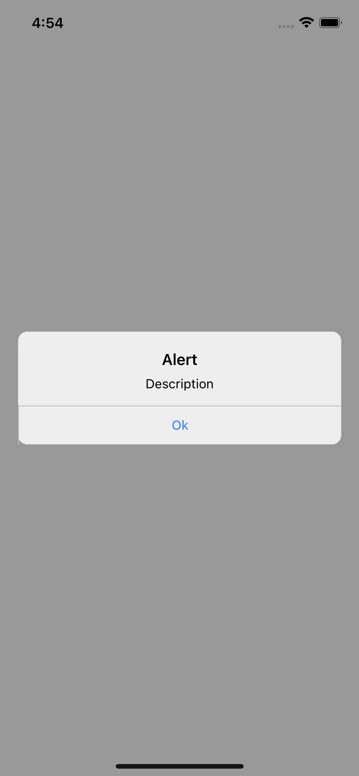
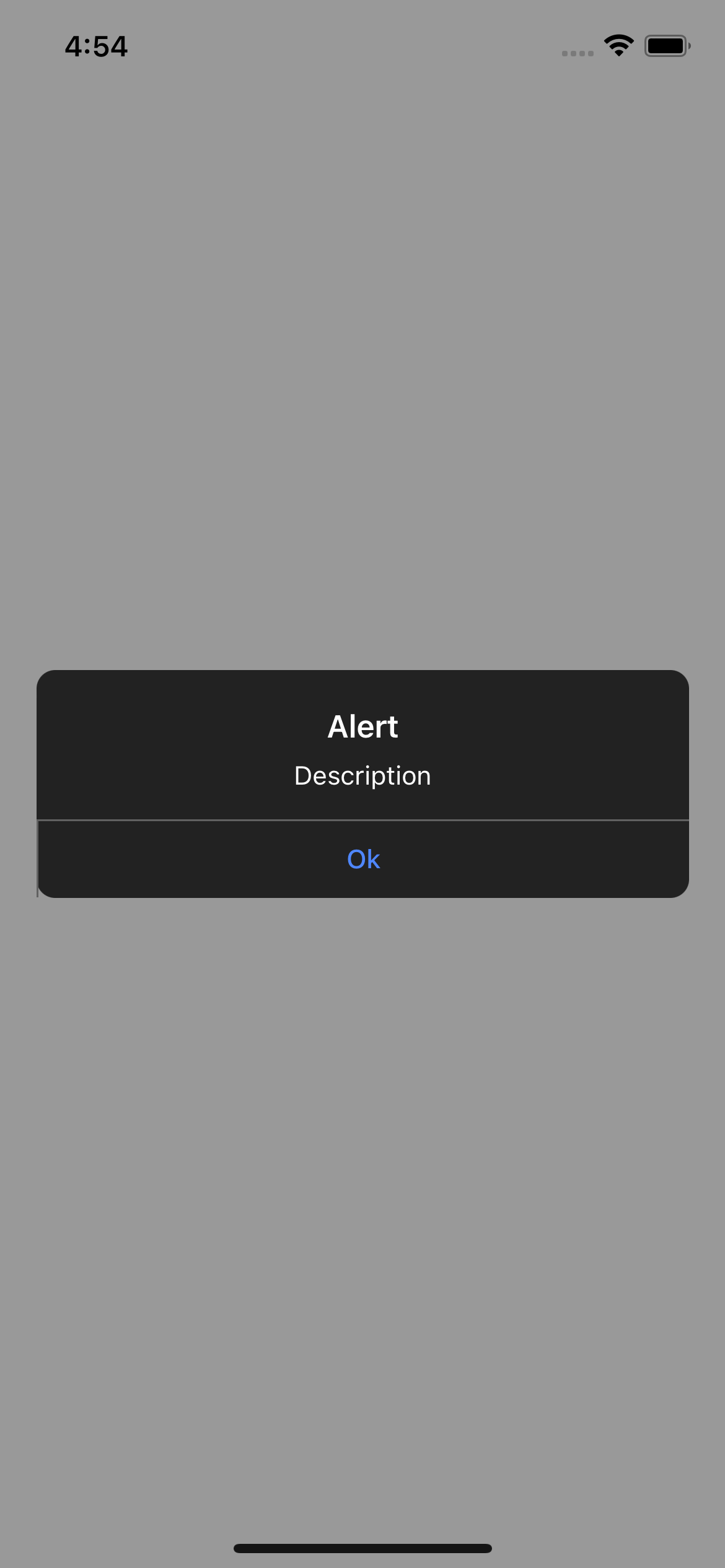
> Android
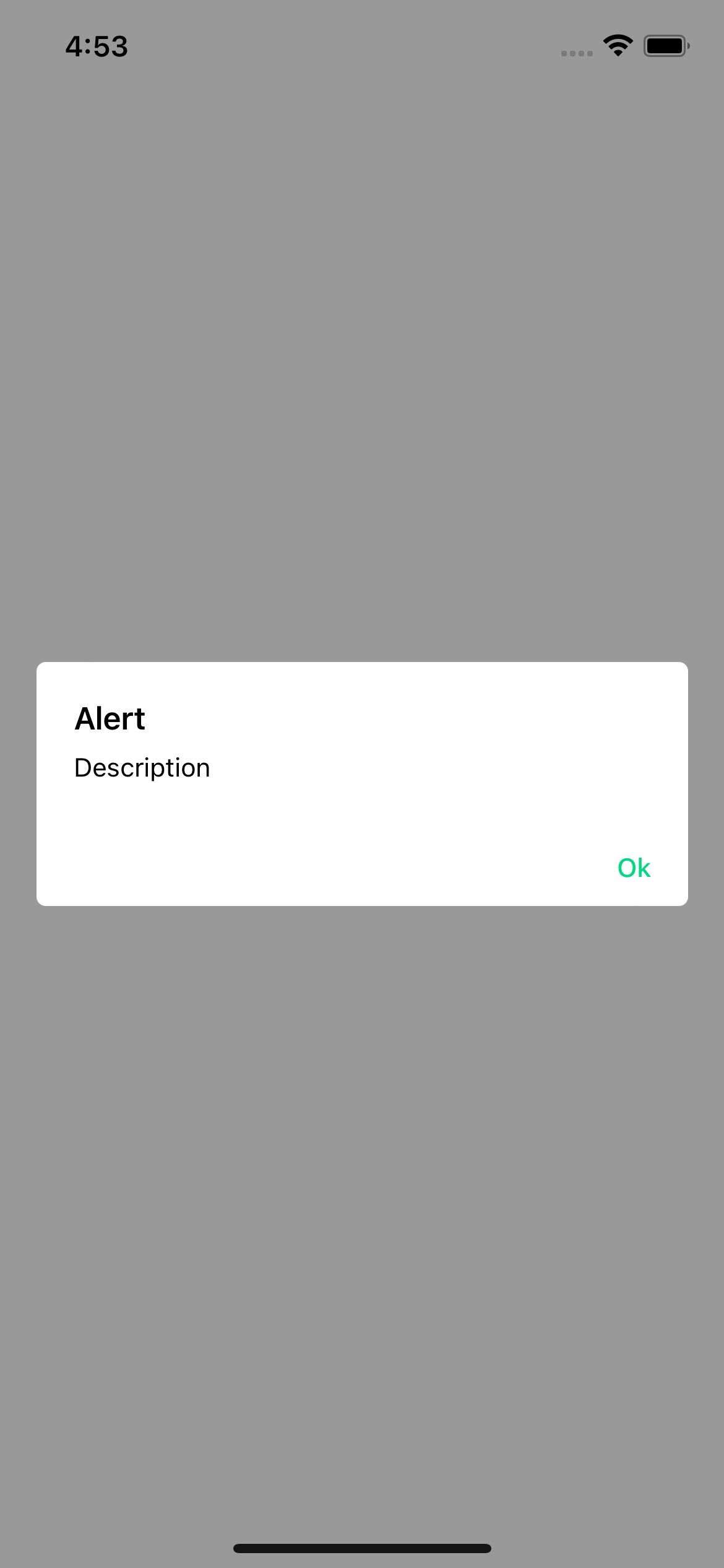
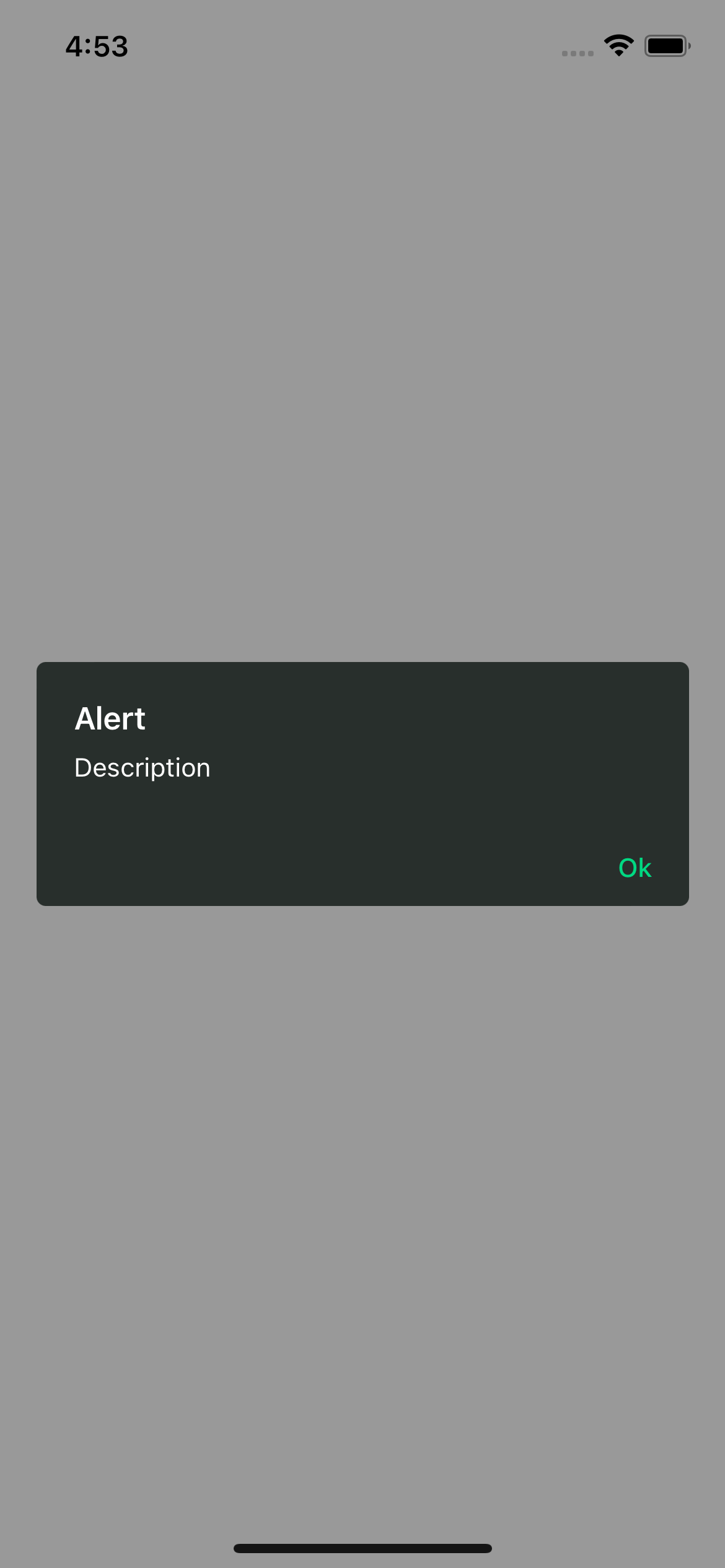
### With props
```js
import {Text, TouchableOpacity, View} from 'react-native';
import {Alert} from 'rn-custom-alert-prompt';
const MyComponent = () => {
const handlePress = async () => {
const response = await Alert.alert({
title: 'Alert',
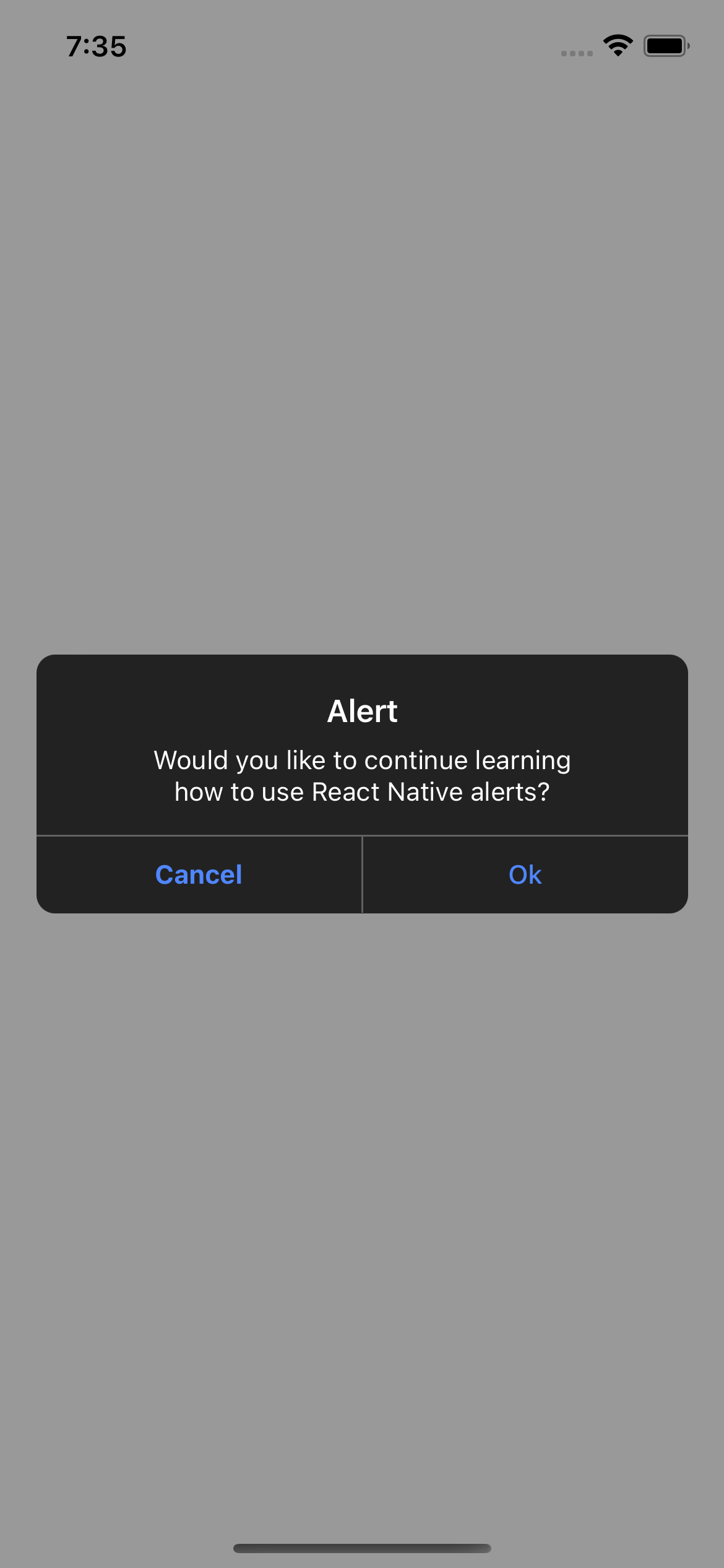
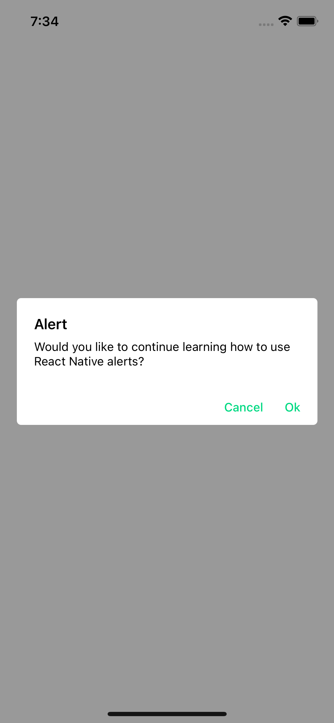
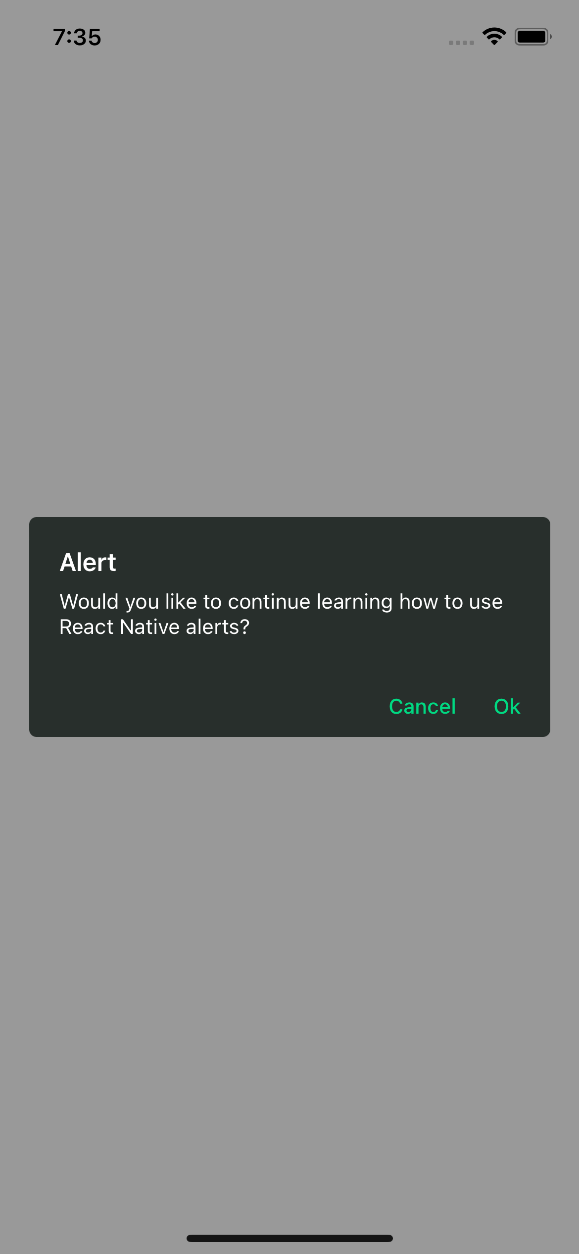
description: 'Would you like to continue learning how to use React Native alerts?',
showCancelButton: true,
})
console.log(response) // true or false
}
return (
Open Alert
)
```
#### Alert props
| Prop | Description | Type | Required |
| ---------------------- | ------------------------------------ | ---------------------------------------------- | -------- |
| **`title`** | Title for your alert. | `string` | **Yes** |
| **`buttons`** | Personalized buttons for your alert. | `Button[]` | _No_ |
| **`cancelColorText`** | Cancel button text color. | `string` | _No_ |
| **`cancelText`** | Cancel button text. | `string` | _No_ |
| **`confirmColorText`** | Confirm button text color. | `string` | _No_ |
| **`confirmText`** | Confirm button text. | `string` | _No_ |
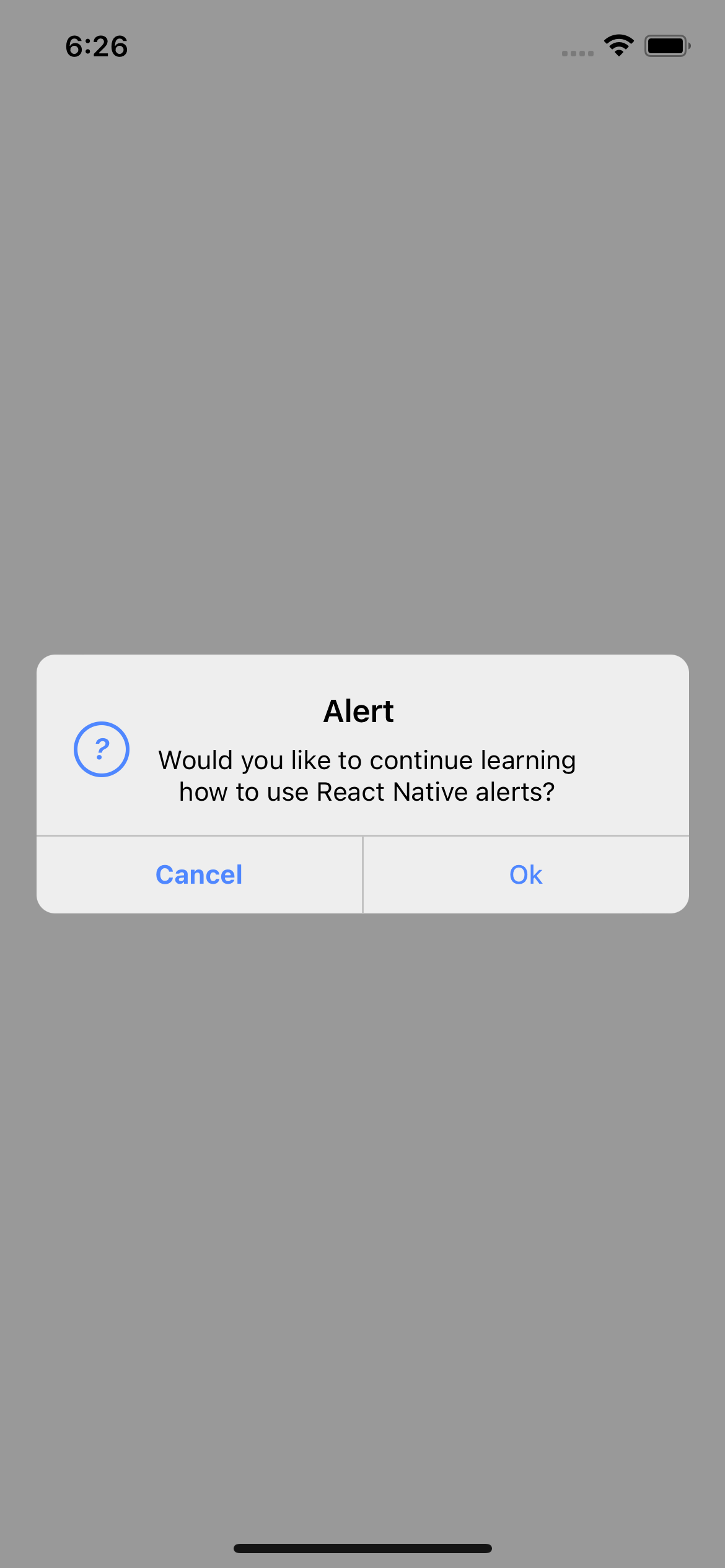
| **`icon`** | Alert icon. | `'error' \| 'info' \| 'success' \| 'question'` | _No_ |
| **`iconColor`** | Icon color. | `string` | _No_ |
| **`showCancelButton`** | Shows the cancel button. | `boolean` | _No_ |
#### Button props
| Prop | Description | Type | Required |
| --------------- | ----------------------------------------------------- | ---------------------- | -------- |
| **`text`** | Button text. | `string` | **Yes** |
| **`textStyle`** | Personalized styles for your text button. | `StyleProp` | _No_ |
| **`onPress`** | Function that is executed when the button is pressed. | `function` | _No_ |
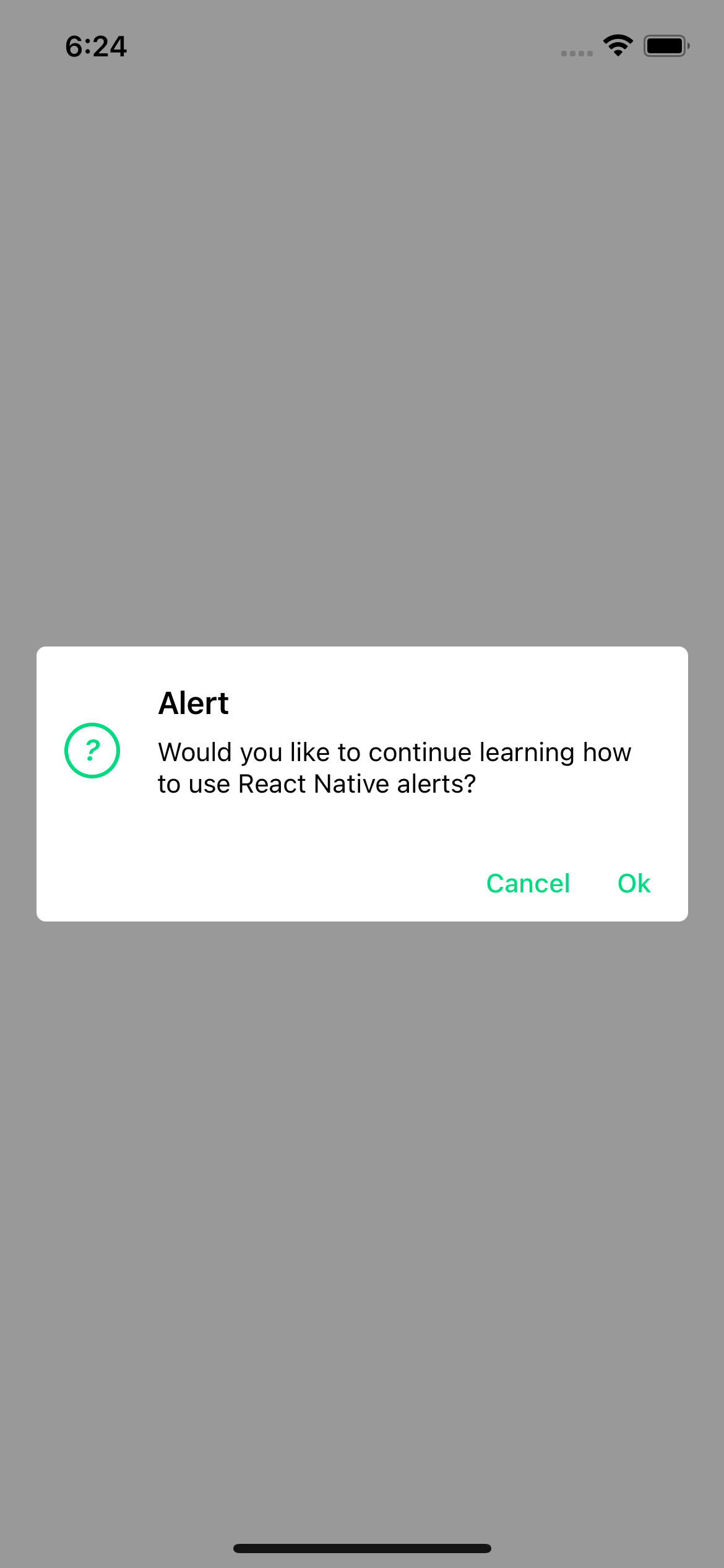
#### Examples
> iOS

> Android
> With icon
## Prompt
### `Prompt` component
This is the system prompt that we can use in iOS, with the big difference that we can customize it and it returns a promise with the text entered by the user.
#### Basic usage
```js
import {Text, TouchableOpacity, View} from 'react-native';
import {Alert} from 'rn-custom-alert-prompt';
const MyComponent = () => {
const handlePress = () => {
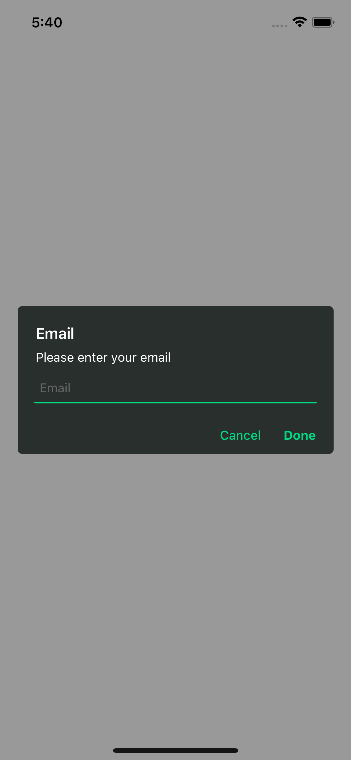
const response = await Alert.prompt('Email', 'Please enter your email');
console.log(response) // string | undefined
}
return (
Open Prompt
)
```
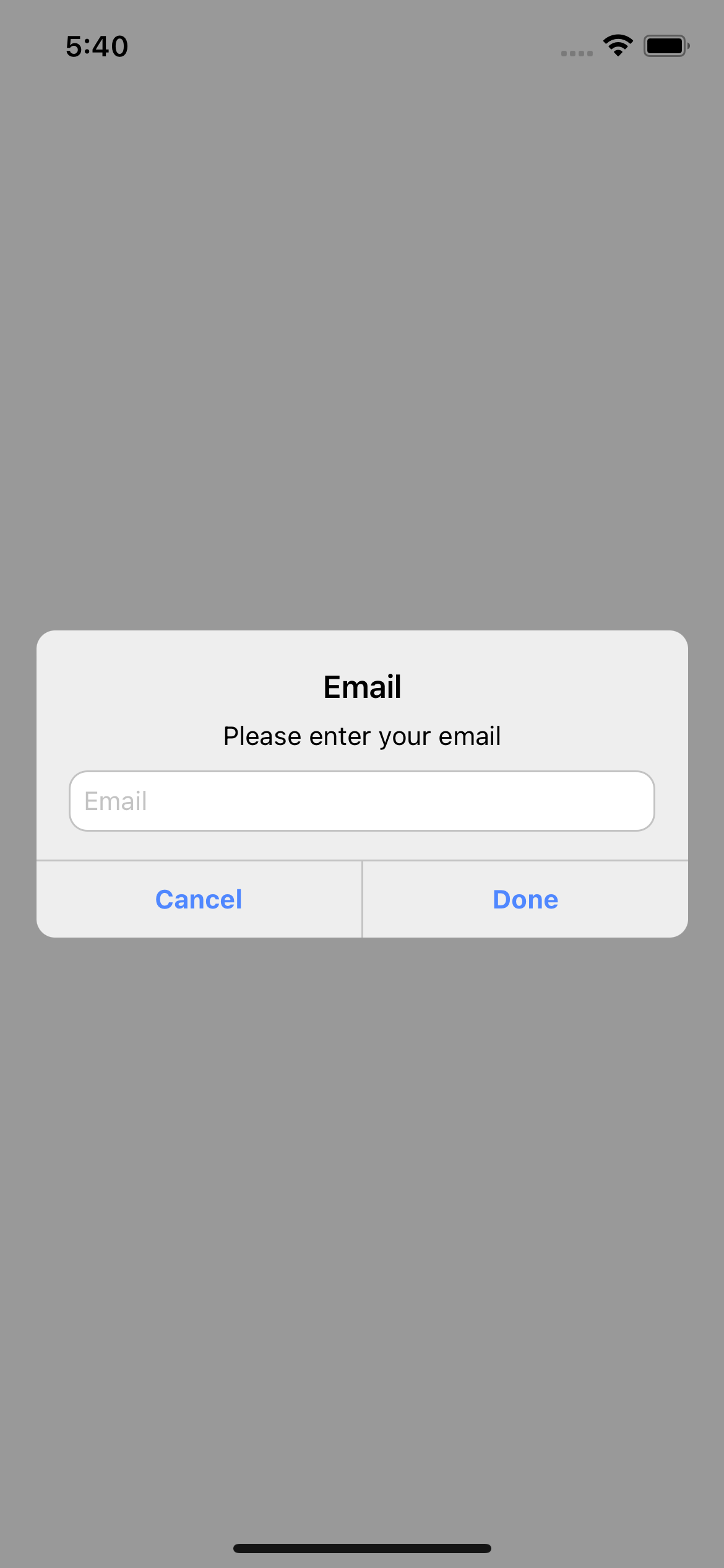
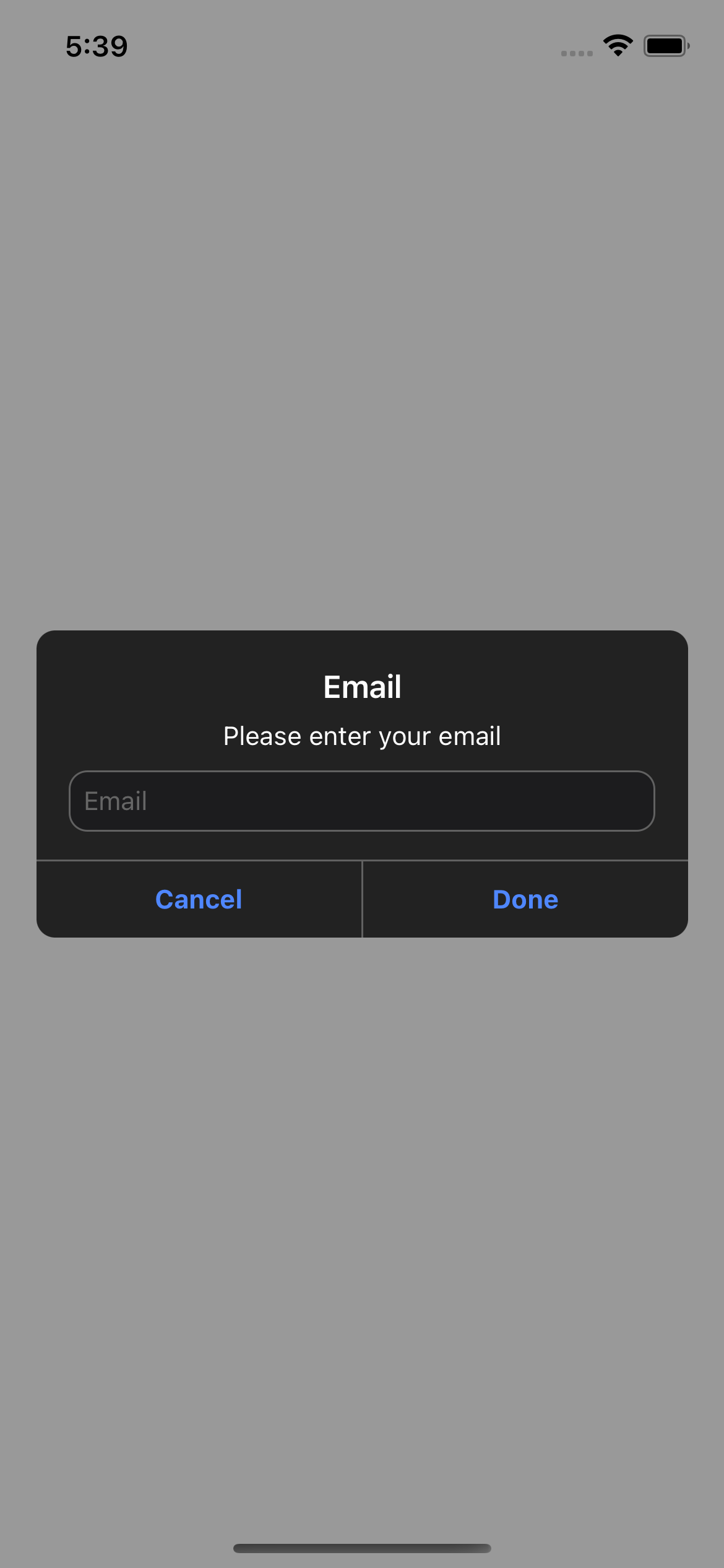
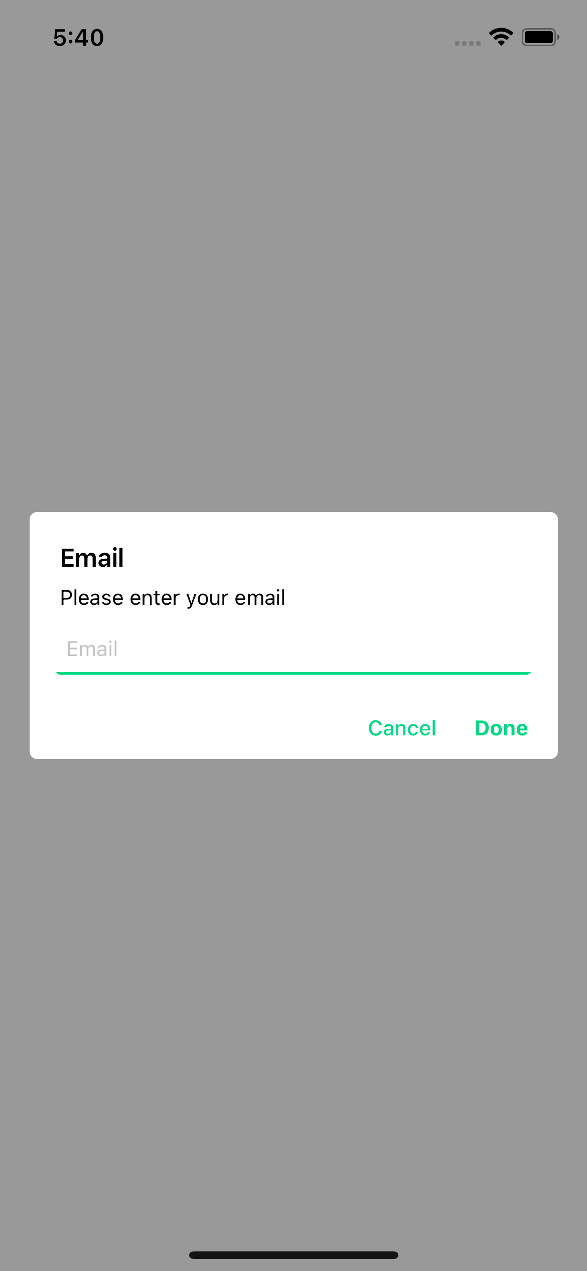
#### Examples
> iOS
> Android
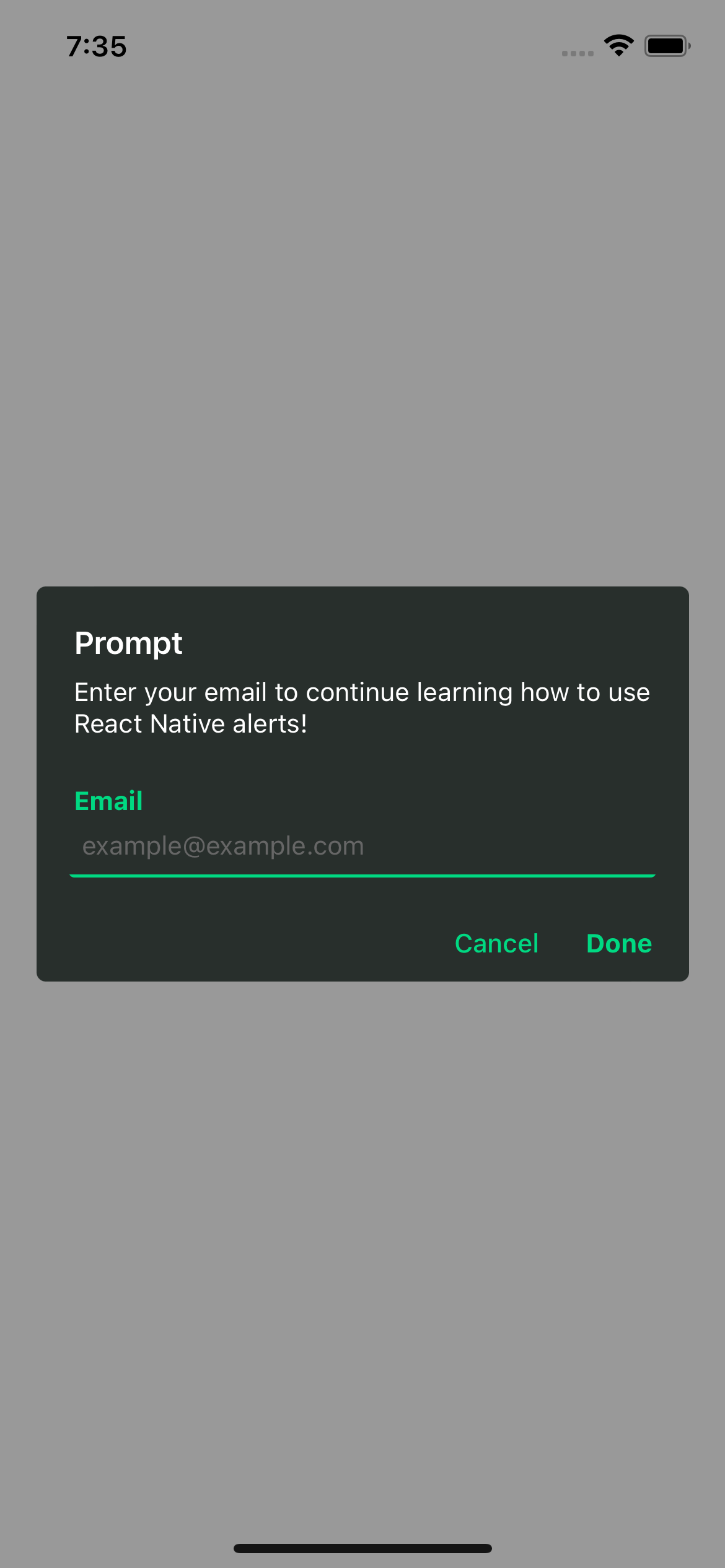
#### With props
```js
import {Text, TouchableOpacity, View} from 'react-native';
import {Alert} from 'rn-custom-alert-prompt';
const MyComponent = () => {
const handlePress = async () => {
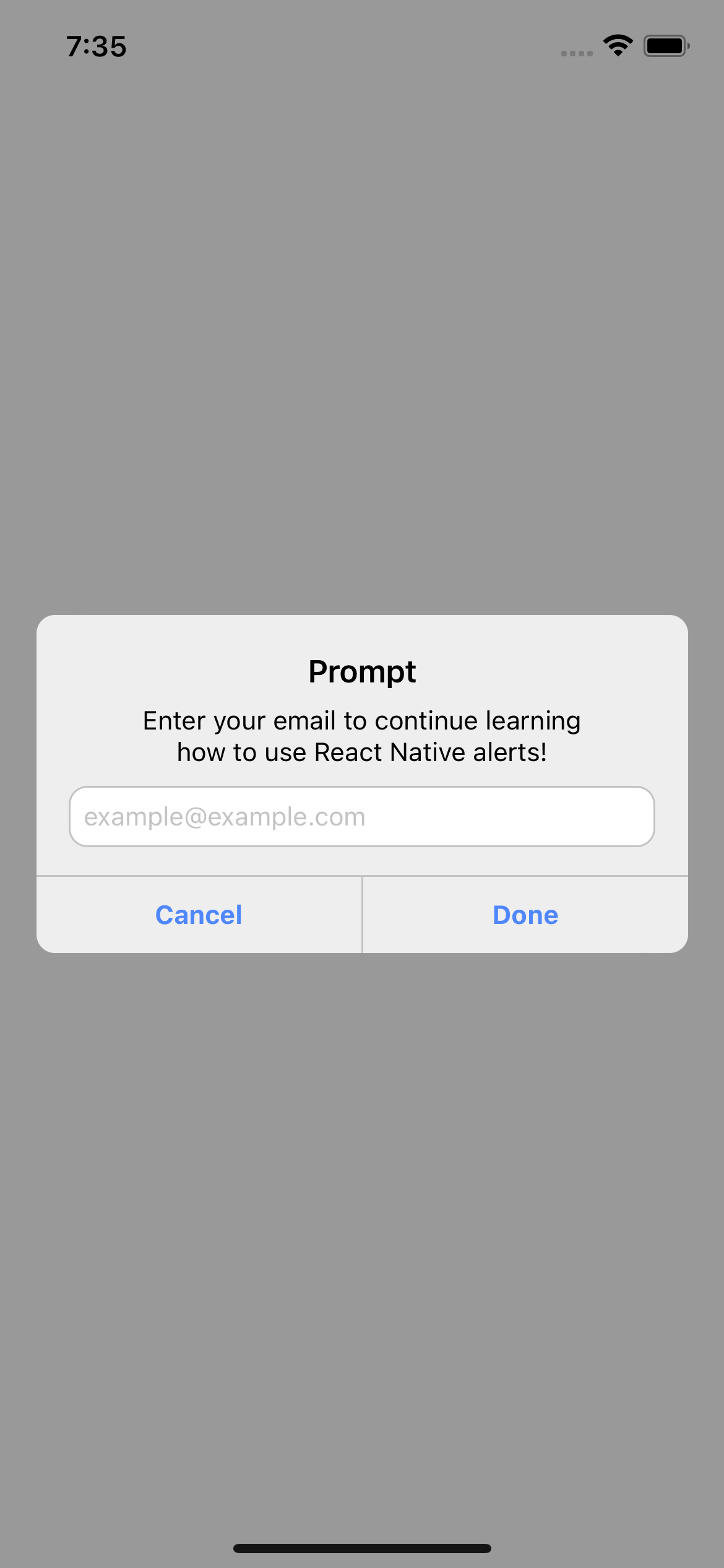
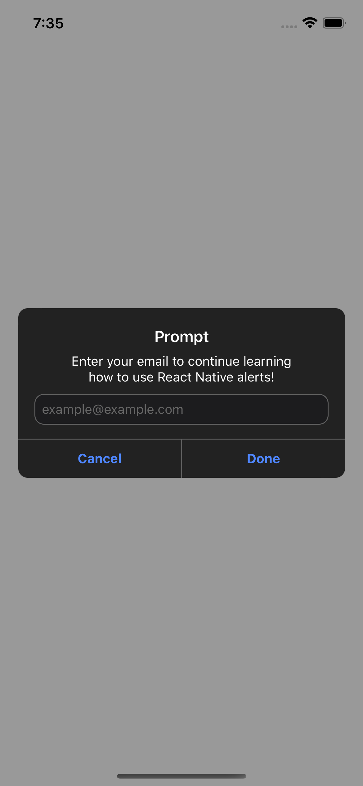
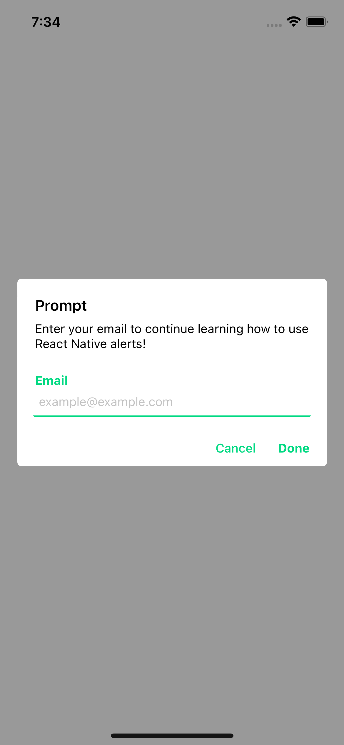
const response = await Alert.prompt({
title: 'Prompt',
description: 'Enter your email to continue learning how to use React Native alerts!',
label: 'Email',
placeholder: 'example@example.com',
})
console.log(response) // string | undefined
}
return (
Open Prompt
)
```
### Prompt props
| Prop | Description | Type | Required |
| ---------------------- | --------------------------------------------- | -------- | -------- |
| **`title`** | Title for your alert. | `string` | **Yes** |
| **`cancelColorText`** | Cancel button text color. | `string` | _No_ |
| **`cancelText`** | Cancel button text. | `string` | _No_ |
| **`confirmColorText`** | Confirm button text color. | `string` | _No_ |
| **`confirmText`** | Confirm button text. | `string` | _No_ |
| **`label`** | Label for input -Android only-. | `string` | _No_ |
| **`placeholder`** | Input placeholder. **default:** _title value_ | `string` | _No_ |
#### Examples
> iOS
> Android
## License
This project is licenced under the [MIT License](http://opensource.org/licenses/mit-license.html).