# semantic-ui-react-numberinput
Numeric input control with step buttons for [Semantic UI React]
[![version][version-badge]][package]
[![build][build]][circleci]
[![Downloads][downloads]][package]
[![coverage][coverage]][codecov]
[](https://sonarcloud.io/dashboard?id=pksilen_semantic-ui-react-numberinput)
[](https://sonarcloud.io/dashboard?id=pksilen_semantic-ui-react-numberinput)
[](https://sonarcloud.io/dashboard?id=pksilen_semantic-ui-react-numberinput)
[![MIT License][license-badge]][license]

## Prerequisites
"react": "^16.0.0",
"react-dom": "^16.0.0",
"semantic-ui-react": "^0.87.0"
## Installation
npm install --save semantic-ui-react-numberinput
## Demo
NumberInput [demo]
## Example usage
```jsx
import React from 'react';
import NumberInput from 'semantic-ui-react-numberinput';
class NumberInputExample extends React.Component {
constructor(props) {
super(props);
this.state = {
value: '0'
};
}
changeValue = (newValue) => {
this.setState({ value: newValue });
}
render() => {(
)};
}
```
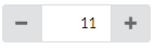
Render NumberInput with step buttons on left and right side of the input (this is default behavior, if buttonPlacement is not specified)
```jsx
```
Render NumberInput with step buttons on the right side of the input
```jsx
```
Specify allowed number range to be between 0 and 100
```jsx
```
Specify buttons to increment/decrement by 5
```jsx
```
Specify decimal NumberInput with increment/decrement step of 0.25 and default precision of 2
```jsx
```
Specify decimal NumberInput with increment/decrement step of 0.1 and precision of 1
```jsx
```
More examples in `demo/demo.js` file
## Mandatory NumberInput properties
value: string, // must be parseable to integer or decimal number depending on valueType
onChange: (newValue: string) => void,
## Optional NumberInput properties
| property | description |
| -------------------- | -------------------------------------------------------------------------------------------------------------------------------|
| allowEmptyValue | Specifies if value can be empty |
| allowMouseWheel | Specifies if mouse wheel can used to change input value |
| buttonPlacement | Specifies how step buttons are placed |
| id | id for HTML outer div element |
| className | class name(s) for HTML outer div element |
| defaultValue | Specifies default value to be used when value is empty (must be integer or decimal number depending on valueType) |
| disabled | Specifies if NumberInput is disabled
| doubleClickStepAmount| Specifies how much double click of a button increments/decrements the value, zero value disables double click feature |
| minValue | Minimum value accepted for NumberInput (must be integer or decimal number depending on valueType) | |
| maxValue | Maximum value accepted for NumberInput (must be integer or decimal number depending on valueType) |
| maxLength | Maximum length of HTML input value (must be a positive integer) |
| placeholder | Placeholder text for input element when value is empty, applicable only when allowEmptyValue is true |
| precision | Decimal number precision when valueType is 'decimal' |
| showError | Specifies if HTML input element should show error style |
| showTooltips | Specifies if tooltips are shown |
| size | Specifies the size of the control |
| stepAmount | Specifies how much buttons increment/decrement the value (must be a positive integer or decimal number depending on valueType) |
| valueType | Specifies if value is integer or decimal number |
## Optional NumberInput property types
```ts
allowEmptyValue: boolean,
allowMouseWheel: boolean,
buttonPlacement: 'right' | 'leftAndRight' | 'none',
id: string,
className: string,
defaultValue: number,
disabled: boolean,
doubleClickStepAmount: number,
minValue: number,
maxValue: number,
maxLength: number,
placeholder: string,
precision: number,
showError: boolean,
showTooltips: boolean,
size: 'mini' | 'small' | 'large' | 'big' | 'huge' | 'massive',
stepAmount: number,
valueType: 'integer' | 'decimal'
```
## Default values for optional properties
```js
allowEmptyValue: false,
allowMouseWheel: false,
buttonPlacement: 'leftAndRight',
id: undefined,
className: undefined,
defaultValue: undefined,
disabled: false,
doubleClickStepAmount: 0,
minValue: 0,
maxValue: 9999999999,
maxLength: 10,
placeholder: 'Enter a value',
precision: 2,
showError: false,
showTooltips: true,
size: 'small',
stepAmount: 1,
valueType: 'integer'
```
## Keyboard actions
| Key | Action |
| -------------------- | -------------------------------------------------------------------------------------------------------------------------------|
| ArrowUp | Increments value by stepAmount |
| ArrowDown | Decrements value by stepAmount |
| + | Increments value by stepAmount |
| - | Decrements value by stepAmount |
| PageUp | Increments value by doubleClickStepAmount |
| PageDown | Decrements value by doubleClickStepAmount |
| Ctrl + ArrowUp | Increments value by doubleClickStepAmount |
| Ctrl + ArrowDown | Decrements value by doubleClickStepAmount |
| Ctrl + + | Increments value by doubleClickStepAmount |
| Ctrl + - | Decrements value by doubleClickStepAmount |
## Styling example

styles.css
```css
.numberInput .ui.button {
background-color: red;
border-radius: 0 !important;
color: white;
}
.numberInput .ui.input > input {
border-color: red;
color: red;
font-weight: bold;
width: 50px;
}
```
Applying CSS using className
```jsx
```
## License
MIT License
## My other Semantic UI React components
* [Scrollbar](https://github.com/pksilen/semantic-ui-react-scrollbar)
* [Date Time Input](https://github.com/pksilen/semantic-ui-react-datetimeinput)
* [Slider](https://github.com/pksilen/semantic-ui-react-slider)
* [Text Input with integrated label](https://github.com/pksilen/semantic-ui-react-labeledinput)
* [Line style Text Input](https://github.com/pksilen/semantic-ui-react-lineinput)
[license-badge]: https://img.shields.io/badge/license-MIT-green
[license]: https://github.com/pksilen/semantic-ui-react-numberinput/blob/master/LICENSE
[version-badge]: https://img.shields.io/npm/v/semantic-ui-react-numberinput.svg?style=flat-square
[package]: https://www.npmjs.com/package/semantic-ui-react-numberinput
[downloads]: https://img.shields.io/npm/dm/semantic-ui-react-numberinput
[build]: https://img.shields.io/circleci/project/github/pksilen/semantic-ui-react-numberinput/master.svg?style=flat-square
[circleci]: https://circleci.com/gh/pksilen/semantic-ui-react-numberinput/tree/master
[coverage]: https://img.shields.io/codecov/c/github/pksilen/semantic-ui-react-numberinput/master.svg?style=flat-square
[codecov]: https://codecov.io/gh/pksilen/semantic-ui-react-numberinput
[demo]: https://pksilen.github.io/semantic-ui-react-numberinput/
[Semantic UI React]: https://react.semantic-ui.com/